
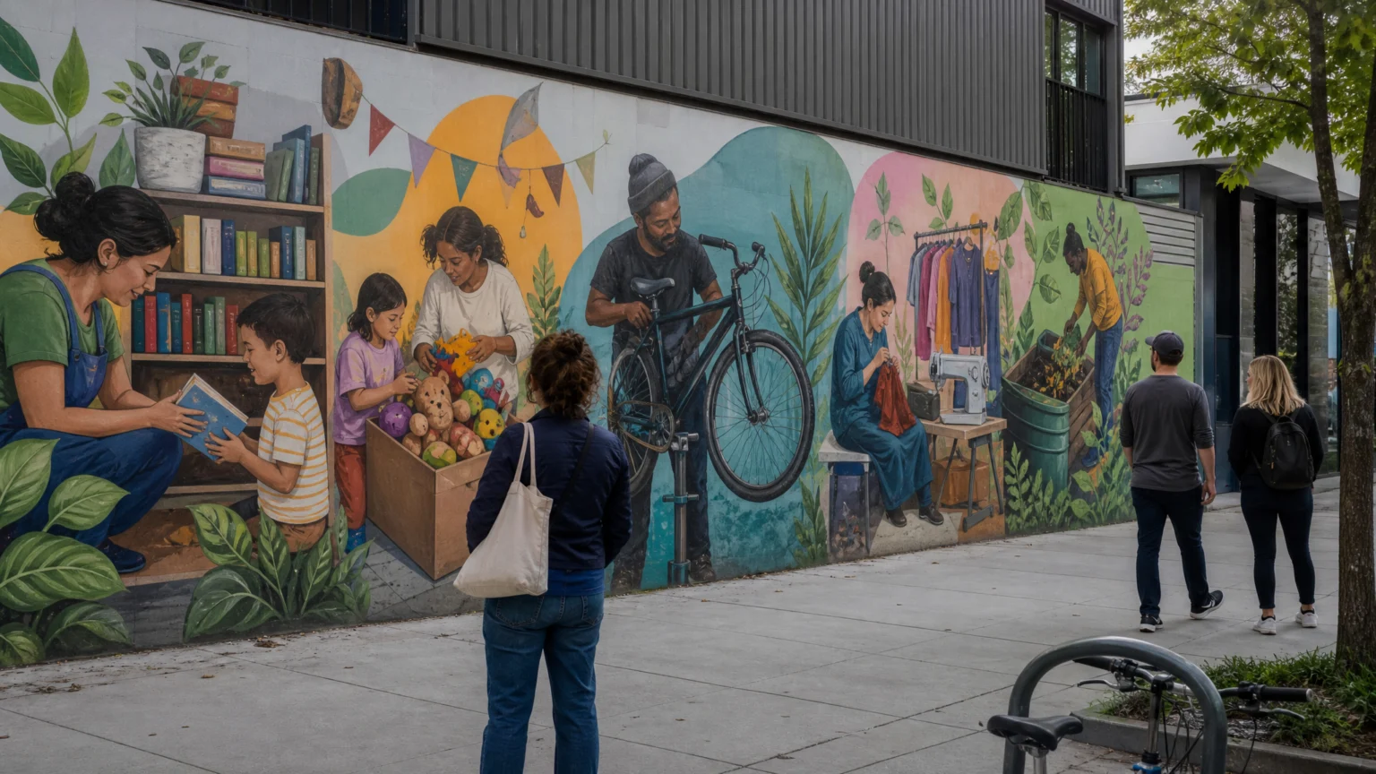
A wall this long can disappear into the route around it. At 42 metres, it can also do the opposite: slow the eye, give scattered services a shared face, and explain a community hub before anyone steps inside.
That is what happened at ReActon, Ealing’s circular economy community hub, where three University of West London graphic design students created a public mural. The piece does more than brighten a passage. It shows how the hub works, turning sustainability from an abstract idea into visible actions.
Design that shows what a place does
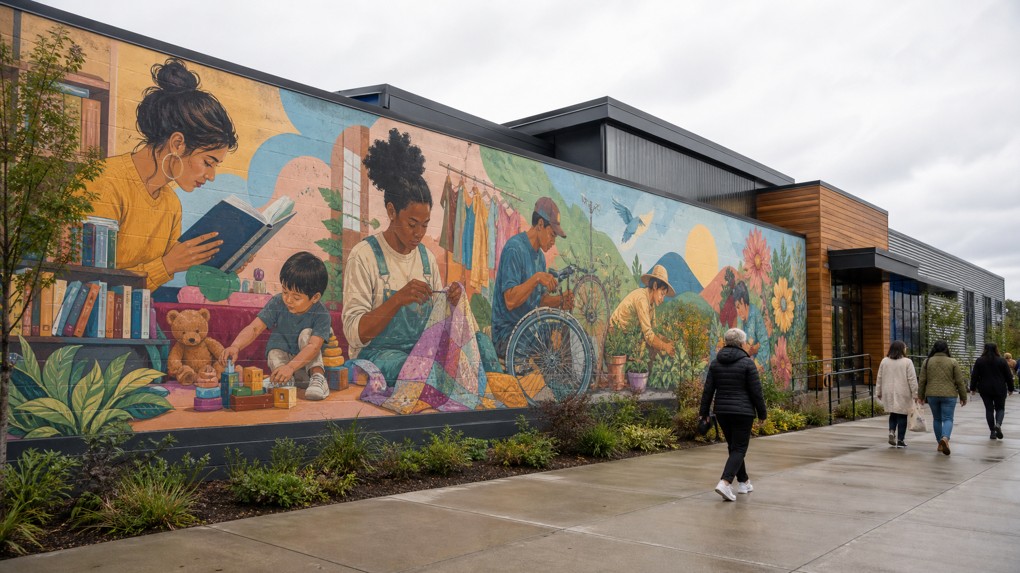
The mural tells the story of ReActon’s circular economy initiatives, including a pre-loved uniform hub, book and toy swaps, bike repair services, clothing repair workshops, and compost giveaways. Services like these are often useful yet visually disconnected. People may like the idea and still miss what is actually available.
A mural can help when it works as public information rather than surface dressing. It gives the hub a clear visual signature and lets different offers read as parts of one system. The wall starts handling wayfinding, storytelling, and place identity at the same time.
Repair carries a different social meaning from ordinary retail. Giving repair, reuse, and exchange equal visual weight helps those activities feel central rather than secondary.
Why a live brief changes the work
The project began as a live client brief. That gave the students professional experience with stakeholder feedback, public-facing design, and the full path from concept to implementation.
This is usually where student work either sharpens or softens. Designing for a community hub wall means testing ideas against actual use, actual sightlines, and actual expectations. The feedback loop changes the timing of decisions, because a good screen concept still has to work at scale, in weather, in local context, and under public attention.
That process also makes something plain for any designer working in civic or service settings: clarity rarely comes from one voice alone. It comes through negotiation. Stakeholders press on meaning, tone, and practical limits, and the final work is stronger when it holds all three without strain.
Selection rewarded design and presentation
A judging panel selected the winning proposal from more than a dozen students. The decision rested on two things together: design quality and professionalism in presentation.
That pairing matters. Public design is rarely judged on visuals alone. People need confidence that a team can explain decisions, respond to concerns, and handle a visible commission responsibly.
For early-career designers, that is a practical lesson. Public-facing work asks for two performances at once: one in the design itself, and one in the way the design is framed, explained, and defended before it is made.
Community input gave the mural local texture
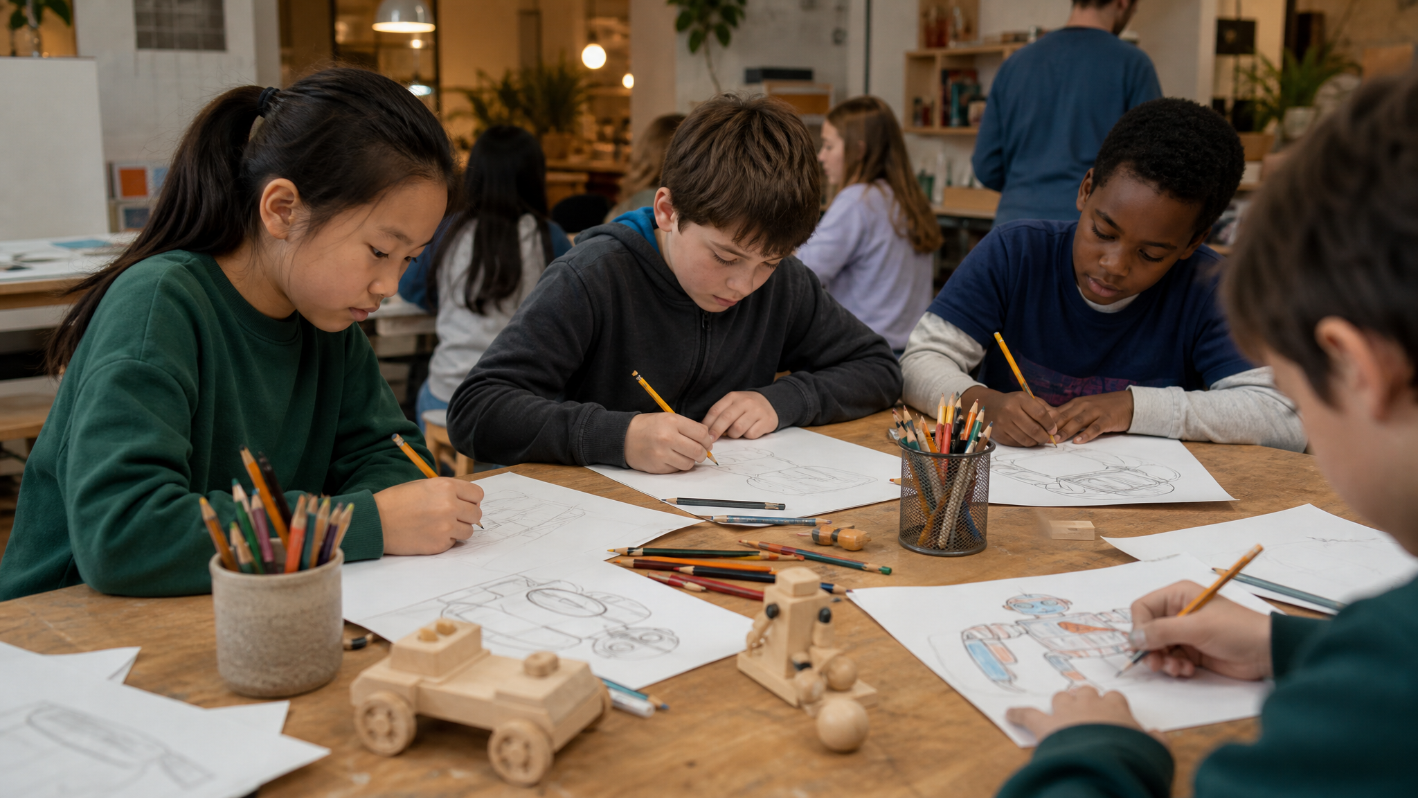
Local schoolchildren were invited to submit ideas for toys they would like to see in a toy swap, and those ideas were incorporated into the mural. That move does more than add friendly detail. It shifts authorship in a quiet, meaningful way.
Public murals often work best when they leave room for recognition. A resident may never know the full design process, but they can still feel when a wall belongs to the place rather than landing on it from above. Bringing in children’s toy-swap ideas gives the mural local texture and a warmer direction.
This kind of participation also helps circular economy services feel ordinary in the best sense. Swapping toys, repairing clothes, fixing bikes, and collecting compost are daily habits. Community contributions keep the imagery close to that everyday use, which is where these services need to live if they are going to be used.
Translation from screen to wall needed craft
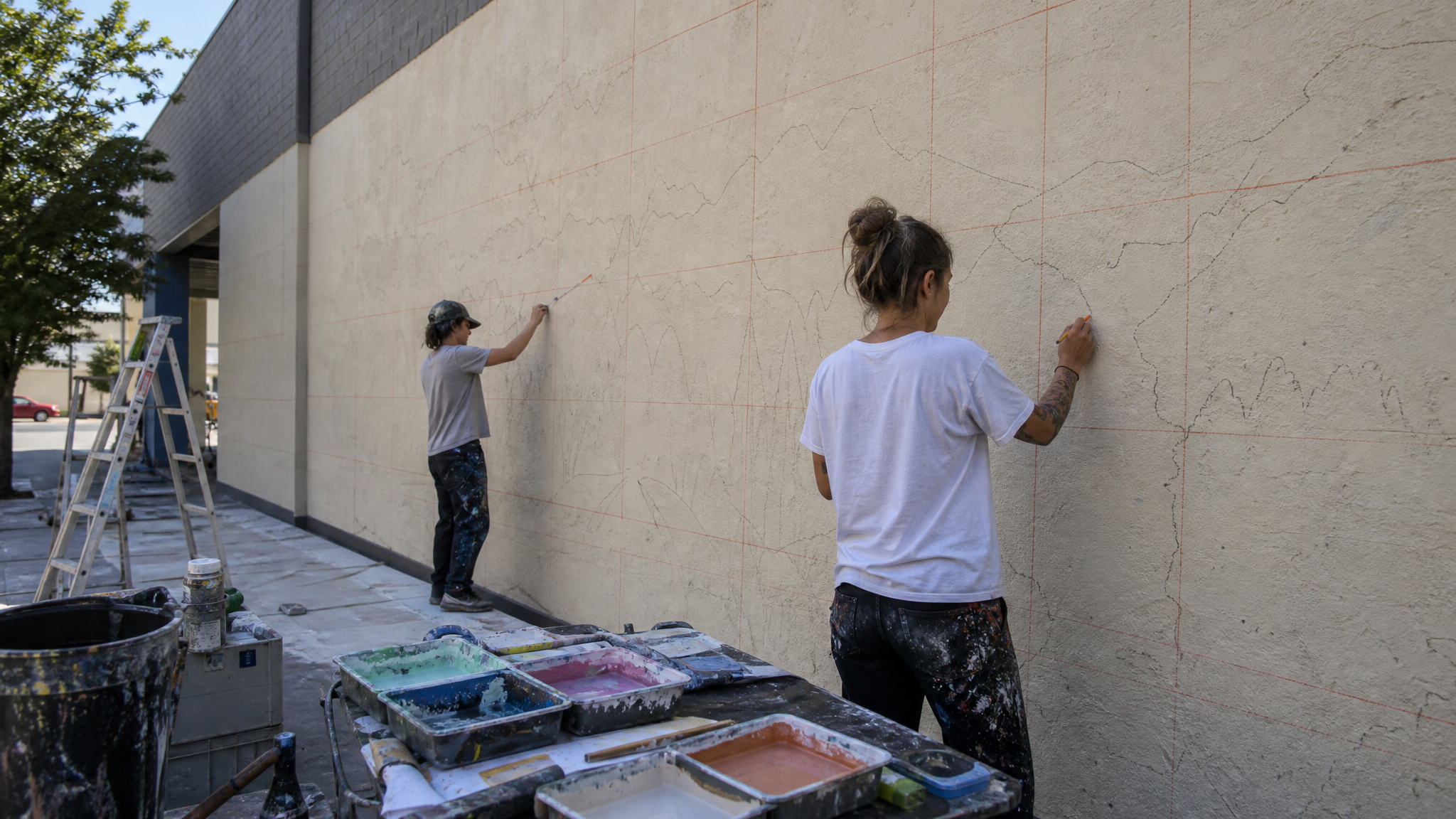
Professional mural makers translated the digital design onto the wall using recycled paint for the base coat and virtual reality to turn the computer file into sketches on the surface. That pairing of material care and technical method says a lot about how large public graphics are made now.
Recycled paint aligns the production method with the mural’s subject, which gives the project internal consistency. The use of virtual reality for wall transfer points to another truth about large-format design: scale changes everything. Curves, spacing, and visual rhythm that feel balanced on a monitor can fall apart on masonry if the transfer is imprecise.
A mural of this length has to hold together across distance, angles, and motion. It needs enough energy to catch the eye up close and enough order to stay legible from farther away.
What this wall makes clear
Several lessons sit in plain view here. Services become easier to grasp when they are shown as actions instead of left as program names. One visual language can connect different offers without flattening their differences.
The project also shows why feedback matters early, why local contribution adds specificity, and why fabrication choices shape meaning as much as sketches do. When a community hub offers several forms of reuse and repair, design can help people read those offers as a coherent whole. That coherence is not cosmetic. It supports understanding, trust, and use.
Making sustainability concrete
Sustainability language often turns vague too quickly. This mural brings it back to objects and routines: uniforms, books, toys, bikes, clothes, compost. Concrete nouns do a lot of work in public design because they give people something they can picture themselves carrying, fixing, swapping, or taking home.
That is what gives the project its force. A broad civic idea takes form through a public surface, a collaborative process, and a readable visual system. On a 42-metre wall, the message does not need to shout. It just needs to stay visible long enough for people to understand what is possible there.
 Photo Template
 Icon Template
 Photo Template
 Icon Template


