Some heritage marks get weighed down by the amount they want to say. This one becomes stronger by narrowing the idea: two family emblems, one letterform, one creature, and a separate role for the older mark that still has work to do.
Ahascragh Distillery has unveiled a new logo ahead of its 2027 whiskey release. The identity is described as rooted in family, place, and the founders’ shared vision, which gives the redesign a clear brief from the start. It does not chase novelty. It organizes meaning.
One shape carries two lineages
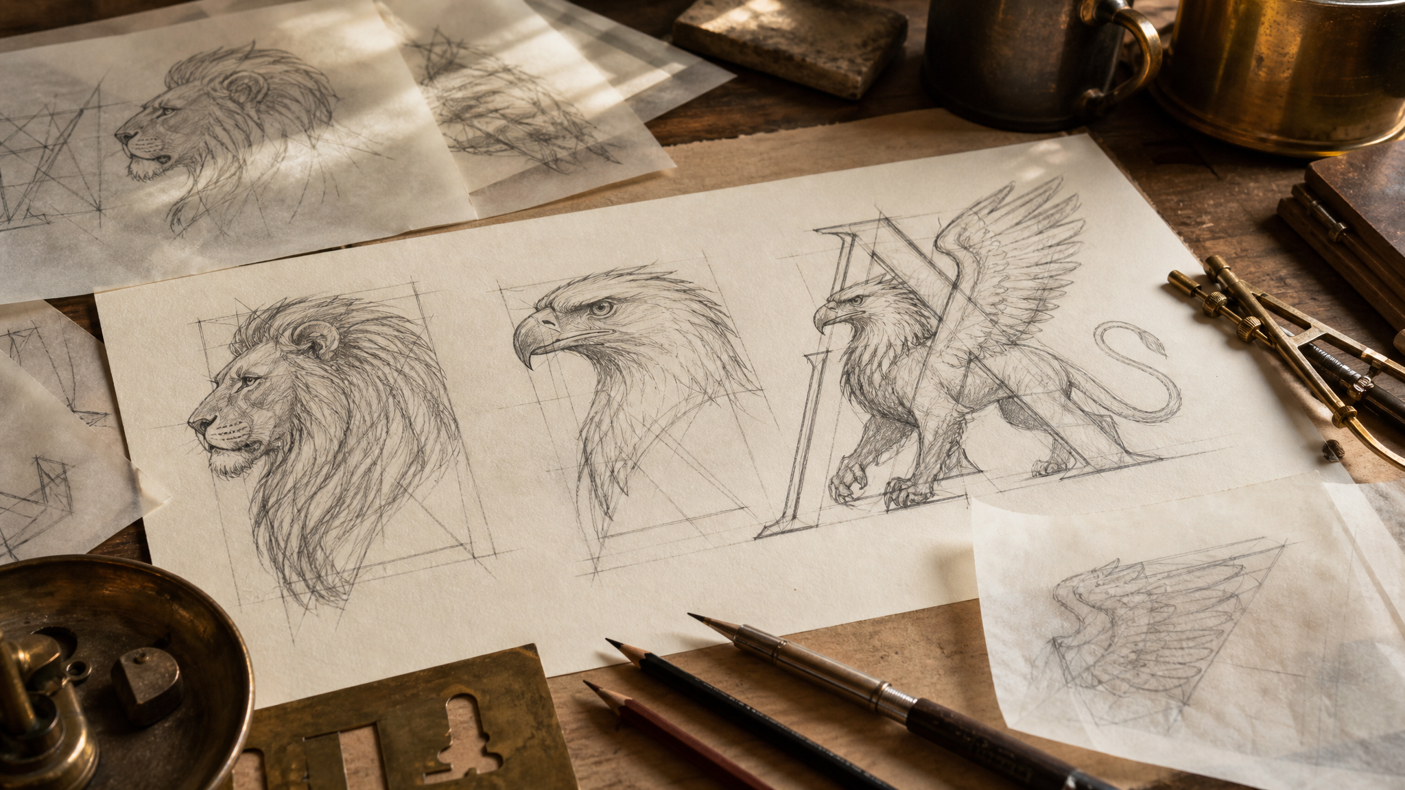
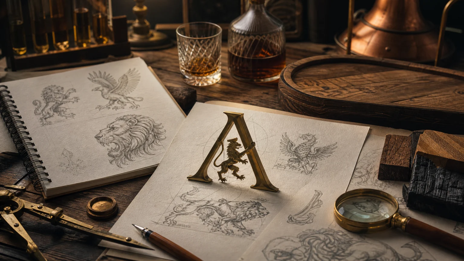
At the center of the new identity are two heraldic symbols taken from the founders’ family crests: a lion and a golden eagle. Instead of placing them side by side as separate badges, the design merges them into a Griffin within the letter A.
That choice keeps the mark from turning into a collage of references. The Griffin creates one signature from both families, and the letter A gives the symbol a firm edge and clear direction. History stays present, but it does not spill into ornament.
This is often where identity work gets sharper. Keeping multiple identities legible inside one system usually depends less on adding more cues and more on deciding exactly where they can meet.
Heritage moves from story into structure
The strongest part of the logo is its hierarchy. Family heritage sits at the center, but it has been translated into a form that can operate as an identity rather than as a story that needs retelling around it.
That difference matters in daily use. Many brands with deep local or family roots lean on crests, shields, animals, and metallic styling that feel ceremonial on first view but become cumbersome across ordinary applications. Here the visual sequence is tighter: heraldic reference enters the mark, then is disciplined by the Griffin and the A.
The result is more likely to hold together across packaging, print, signage, and digital surfaces because one idea leads. Even without the full backstory, the logo reads as intentional rather than crowded.
Place gives the symbol its footing
The identity is described as rooted in family, place, and shared vision. That middle term does important work. It keeps the logo from feeling purely genealogical and gives it a reason to belong to a distillery rather than a family archive.
The letter A helps again here. It ties the creature directly to Ahascragh, so the mark is not only about ancestry. It also connects to naming, location, and recognition.
Regional identity often succeeds on this point. A civic logo can work harder when place leads the identity, and the same principle applies to product brands with local roots. Place gives abstraction an anchor.
The existing eagle still has a clear role

One of the smartest decisions in the rollout is restraint. The contemporary golden eagle logo will remain in use for the Clan Colla series of premium whiskies.
That separation avoids a familiar brand-system mistake: replacing a defined mark everywhere simply because a new master identity has arrived. By keeping the eagle for Clan Colla, the distillery preserves existing recognition while letting the new logo define the broader house brand.
This is practical brand architecture. Different marks can coexist when each has a clear assignment, and that usually causes less confusion than asking one symbol to cover every product tier, audience, and moment.
Early timing puts more pressure on the mark
The logo arrives ahead of a 2027 whiskey release, which means the identity has to do advance work before the bottle fully enters the market.
In that gap, the mark carries extra weight. It needs to signal ambition and continuity now, while staying flexible enough to support future packaging and communication later. A compact emblem built from a lion, a golden eagle, a Griffin, and the letter A has a better chance of doing that than a looser, more illustrative crest.
If the brand later wants motion for launch assets, a restrained symbol like this is also easier to extend into logo reveal animation without losing its core shape. The best candidates for motion usually have a strong silhouette and a clear sequence of parts.
Unity is visible because the construction proves it
A founder quote frames the redesign as a new chapter of strength, heritage, the values of both families, unity, and future ambitions. The logo supports that claim because unity is visible in the construction itself.
That is the useful distinction here. Plenty of identity systems talk about togetherness while presenting disconnected elements. In this case, two emblems are intertwined inside one letter and resolved as one creature.
Good identity design often works this way. It lets the idea perform inside the mark instead of asking copy to explain what the eye cannot find.
This kind of symbol is built to stay legible
Marks with historical references tend to last when they avoid literal overload. The Griffin gives this identity enough mythic force to feel established, while the letter A keeps it specific and legible.
That balance matters over time. If a brand is preparing for a major release in 2027, the logo has to survive repeated use, not just a reveal moment. It needs to look credible on a label, calm on stationery, and distinct at small sizes.
For teams planning rollout assets, this is also a strong case for testing the symbol early across static and moving formats. A compact emblem with nested meaning can be especially effective in transparent logo animation for packaging promos or digital launch material, because the mark already contains its own sequence: letter, creature, lineage, brand.
Ahascragh Distillery’s new logo succeeds by choosing synthesis over accumulation. It takes two inherited emblems, fuses them into a Griffin, anchors that form in the letter A, and leaves the existing eagle to keep serving Clan Colla. The result is careful identity work with clear roles and a shape that can carry the brand forward.
 Logo Template
 Photo Template
 Icon Template
 Photo Template