
A signature style starts with repeatable visual choices
Bryan Hearns’ creative practice offers a clear example of how a designer builds a recognizable world. His work centers on fashion, but the lessons are broader: choose a small set of materials, push them hard, and make them say something consistent.
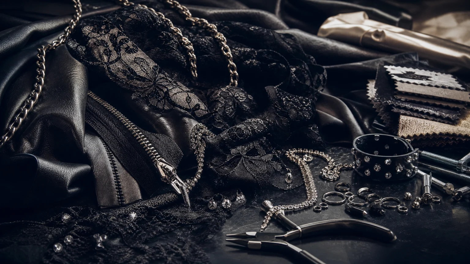
In Hearns’ case, that visual language is unusually concrete. He is described as having created stylish looks with hardware for more than 15 years. His studio is associated with rhinestones, zippers, chains, and pliers. His collections are linked with leather, lace, hardware, sexiness, edginess, and fun.
That matters because strong aesthetics are easier to identify when they are built from specific ingredients rather than vague mood words. A designer does not need endless options to become memorable. Often, the opposite is true: a tighter set of choices makes the work easier to recognize.
A distinct visual identity is not just a taste level. It is a system of materials, tools, and repeated decisions.
Why materials matter more than abstract branding language
When people talk about visual identity, the conversation often drifts into broad descriptors. Hearns’ example pulls it back to the physical level. Hardware is not just a theme in his work; it is part of the construction logic. Leather and lace are not just aesthetic references; they shape how softness and edge sit together in the same look.
This is a useful reminder for anyone working in image-making, styling, motion, or brand presentation. Memorable design tends to become easier when you can answer practical questions like these:
- What materials or textures show up again and again?
- What contrast defines the work?
- What tools or construction habits are part of the look?
- What emotional effect should the finished piece leave behind?
Hearns’ work suggests that contrast is especially important. Leather and lace already create tension. Hardware adds force. Rhinestones add shine. The result is not one-note. It is a visual language that can hold softness, structure, glamour, and aggression at the same time.
Resourcefulness can sharpen authorship
Hearns’ explanation of working with limited money and access is especially practical. He said that he bought rings and bolts at Home Depot, added them to clothes, stretched a yard of fabric, and used patchwork. He also said that having less money makes you more creative.
That idea is easy to romanticize, but the more useful reading is structural. Constraints forced decisions. Limited access led to material experimentation. A lack of budget pushed him toward combinations that became part of his signature.
For creative people, this is one of the strongest practical takeaways:
- Start with what you can actually get. Access shapes style.
- Let limitation drive technique. Stretching fabric and using patchwork are not just survival moves; they can become visual habits.
- Use unconventional sourcing to develop character. Rings and bolts changed the vocabulary of the garments.
There is a wider design lesson here for digital creators too. A distinctive look does not always come from more assets or more effects. It can come from a narrow toolkit used with intent. That same discipline shows up in focused visual systems, whether someone is working on apparel, editorial imagery, or motion assets inside a tool like Studio.
Professional relevance grows from a consistent point of view
Hearns’ professional relevance is clear through named collaborations and projects. He has designed for Mariah Carey, Ariana Grande, and Kylie Jenner. It also notes that he became a key collaborator for Cardi B beginning with the 2017 “Motorsport” music video, later creating custom looks for performances, red carpet moments, and a Met Gala after-party look.
These details matter not as celebrity proof alone, but as evidence that a clear point of view travels well across contexts. Music video styling, performance wear, red carpet work, and after-party dressing all have different demands. Consistency across those settings suggests that Hearns’ visual identity is flexible without becoming generic.
That balance is difficult. Many creators become either too rigid or too reactive. A stronger model is to keep the core language stable while letting the application change. The recognizable part stays intact; the expression adapts.
What stays constant
- Material signatures such as leather, lace, and hardware
- Emotional tone including sexiness, edginess, and fun
- Construction sensibility rooted in embellishment and visible detail
What can change
- Use case from music video to red carpet
- Level of drama depending on the event
- Silhouette and finish as the persona evolves
This is also the logic behind strong visual systems in branded content. A creator can move between formats while preserving identity. For teams exploring adaptable presentation styles, template-driven workflows such as Animation Templates work best when the visual rules are already clear.
Process becomes visible in the finished work
His process becomes especially visible in the details of his 14th collection. He said that two beaded dresses took over a month because every bead was hand beaded and sewn on. He also explained that the collection started with “Game of Thrones” inspiration before shifting into a softer aesthetic.
There are two valuable ideas here.
First, labor leaves evidence. When every bead is hand applied, the finished result carries that intensity. Craft is not just a backstage story; it changes the surface, weight, rhythm, and presence of the garment.
Second, inspiration does not have to remain fixed. A collection can begin with one reference point and move somewhere else during development. That shift from a “Game of Thrones” starting place into a softer aesthetic shows that process is not a straight line. Strong creators edit the initial idea instead of obeying it too literally.
For visual practitioners, this is a useful working method:
- Begin with a strong reference.
- Test it through materials and form.
- Let the work evolve if a better direction appears.
- Keep enough trace of the original tension to preserve identity.
Not designing for trends is a practical discipline
One of Hearns’ clearest creative principles concerns trends. He says, “I don’t design to be trendy,” and adds, “Everything is always in, it just depends on how it’s done.”
This approach can sound philosophical, but it is also highly practical. Trend-chasing often weakens authorship because it shifts decision-making away from the creator’s system and toward external timing. Hearns’ position suggests a different framework: focus less on whether a visual code is currently popular and more on how convincingly it is executed.
That mindset can help creative teams avoid a common problem: using visual elements because they are circulating widely rather than because they belong to the work. The stronger question is not Is this in? but Does this fit the logic of the piece?
Everything is always in can be read as permission to build from enduring ingredients instead of temporary noise.
Persona-building gives style a point of view
Hearns also describes the “Bryan Hearns woman” as memorable, bold, sexy, and feminist, and says she has become more sure of who she is over time. This is more than audience targeting. It is a statement about persona-building as a design tool.
When a creator knows who the work is for, styling decisions become easier. Materials, silhouette, finish, and attitude can all be measured against that imagined wearer. The persona acts as an internal brief.
Even outside fashion, this is valuable. A brand, campaign, or visual series becomes stronger when its intended character is specific. If the audience presence is too abstract, the work often becomes flatter. If the persona is vivid, choices gain confidence.
What creators can take from Hearns’ example
Hearns’ practice offers a practical model for anyone trying to build a distinct body of work:
- Choose signature ingredients. Hearns’ world is legible because the materials keep returning.
- Use constraints to develop originality. Limited access led to unconventional sourcing and patchwork thinking.
- Let craft show. Time-intensive handwork changes the result in visible ways.
- Adapt across contexts without losing identity. Collaboration works when the core language stays intact.
- Resist trend dependence. Execution matters more than trend alignment.
- Design for a persona. A clear wearer or character sharpens decision-making.
Ultimately, Hearns’ work demonstrates that distinct style is not an accident. It comes from repeated choices, material conviction, and a point of view strong enough to survive changing references and public attention. That is what makes a visual language feel authored rather than assembled.
 Logo Template
 Photo Template
 Photo Template
 Icon Template


