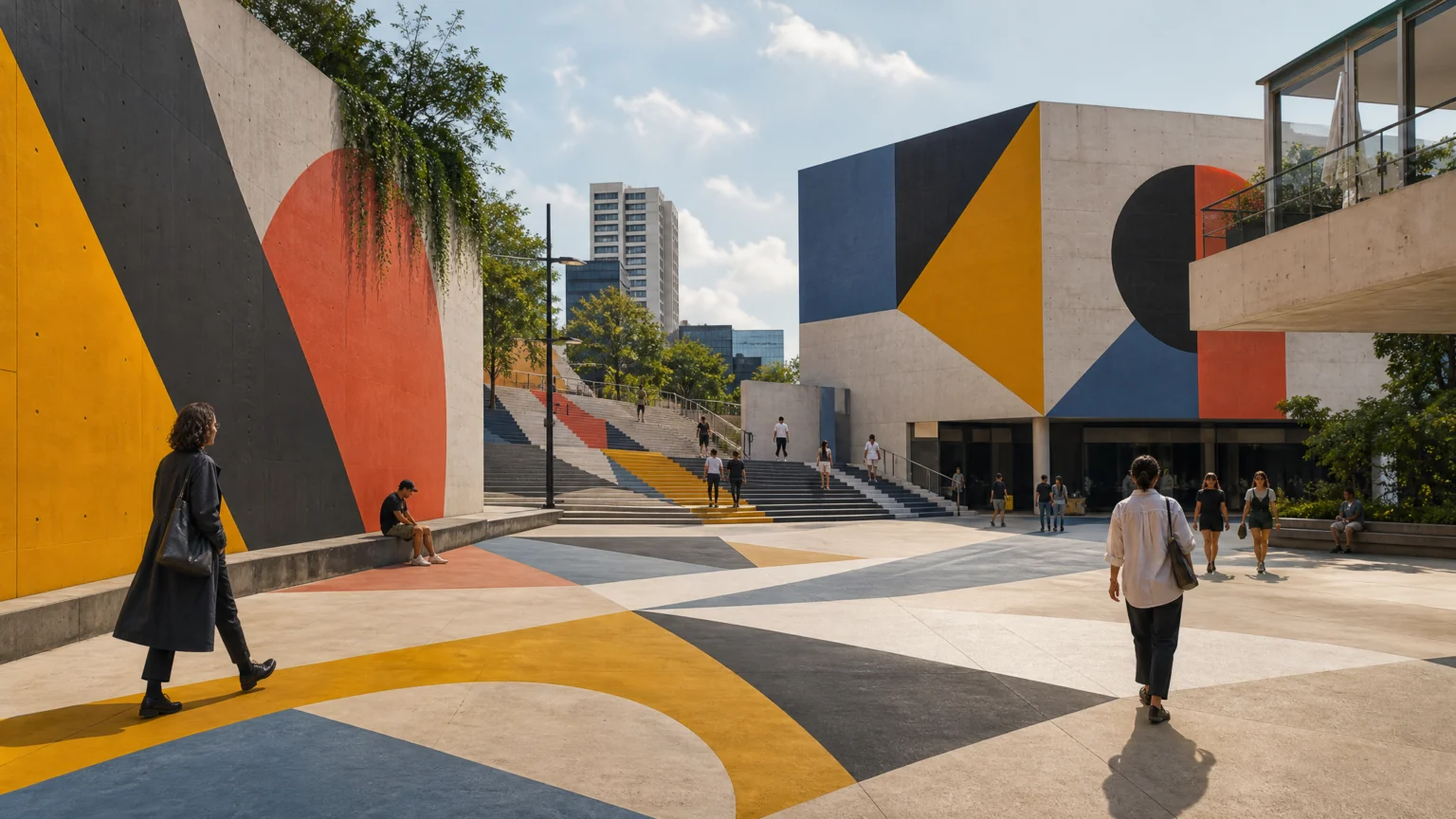
A bold mark across a wall can change a place before anyone reads a sign. That tension drives Supergraphic Landscapes: From Public Art to Urban Design, a book published in September by University of Illinois professors Joseph Altshuler and Nekita Thomas.
Altshuler teaches architecture. Thomas teaches graphic design. Together, they look at the point where those disciplines meet in urban settings, starting from a clear premise: intentional design can change how urban spaces are perceived.
One city, read through two design lenses
The collaboration works because it does not keep architecture and graphic design in separate lanes. Altshuler and Thomas describe their approach as trans-disciplinary, mixing both ways of seeing public space.
That feels true to how cities are actually experienced. People take in form, surface, scale, color, message, and use all at once. A doorway may guide movement, but a graphic treatment can sharpen that direction, soften it, or recast the mood around it.
DanceLogo has looked at a related idea in event brands that do more than act like signage. At an urban scale, the same principle holds: visual systems work best when they belong to the environment rather than sit on top of it.
A public build set the partnership in motion
The two professors first met while working together at the Chicago Sukkah Design Festival, a community design-and-build event. That beginning suits the subject. Temporary structures, shared making, and public use tend to make design decisions visible very quickly.
In that kind of setting, architecture and graphics stop reading like separate departments. One shapes enclosure and proportion; the other cues meaning, access, and attention. It helps explain why the book stays grounded in lived urban experience instead of drifting into theory alone.
Public graphics carry social meaning
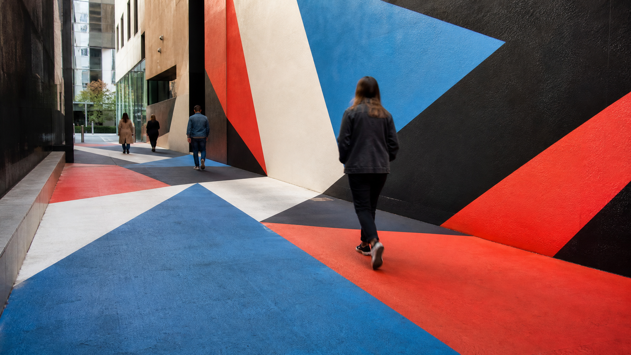
One of the book’s most useful ideas is easy to overlook in daily life: graphics in public space are not merely decorative, and they are not only informational. They say something about the people in a place, who belongs there, and how interaction with the environment is expected to happen.
That makes every large-scale visual choice more consequential. When a city, campus, venue, or neighborhood adds color, symbols, murals, or environmental graphics, those elements do more than fill empty surfaces. They set tone, establish a social signature, and signal whether a place feels civic, commercial, guarded, playful, or open.
This sits close to the logic behind clear visual guidance on a page, though the stakes here are more physical. People do not just scan and click. They approach, hesitate, enter, gather, pass through, or turn away.
Perception shifts before text does its job
Wayfinding is often discussed as if it begins with words. In practice, perception usually changes earlier. A graphic field across a wall, a super-scaled shape, or a color intervention can alter the timing of attention before anyone reads a line.
That early shift matters in public space, where people make quick judgments about what feels open, restricted, cared for, or shared. When graphic design works architecturally, it enters that decision window and helps structure how space is read.
- Scale affects perceived openness and authority.
- Placement influences how people orient themselves.
- Color and form can signal welcome, caution, or identity before language appears.
- Integration with the built environment usually reads more convincingly than applied decoration.
Shared authorship tends to produce stronger environments

There is something refreshing in a book built by an architect and a graphic designer without asking one discipline to dominate. Environmental work is often split into structure first and graphics later, as if meaning can be added after the main decisions are done.
Altshuler and Thomas suggest another model. Their trans-disciplinary approach points to earlier collaboration, when surface, message, material, and use can still influence each other. The result is often a more coherent visual rhythm between building and graphic layer.
That applies beyond cities. Museums, campuses, festivals, and multi-use venues all benefit when identity is treated as part of the spatial plan instead of an afterthought. The strongest spaces tend to feel considered from edge to edge.
The archive will keep expanding
The project does not end with the book. Altshuler and Thomas plan to extend it with a website that will continue collecting examples of supergraphic landscapes.
That next step fits the subject. Public graphics are easiest to understand in accumulation. Seen one by one, they can look like isolated visual gestures. Seen together, patterns emerge in how places use scale, surface, and image to shape belonging and interaction.
For designers, that growing archive could become practical quickly. It offers a way to compare strategies across contexts and notice what happens when graphics stop labeling space and begin helping construct it.
A better test for visual interventions in public space
The sharpest question here is not whether a city needs bigger murals or bolder surfaces. It is whether a visual intervention changes perception with purpose. Does it help people understand where they are, how to move, and whether they are invited in?
Once that connection becomes visible, urban space stops looking like buildings with signage attached. It reads more clearly as a field of form, message, and use shaped together.
 Photo Template
 Logo Template
 Logo Template
 Photo Template