Event branding usually has to land in an instant and stay coherent over time. That pressure is what makes a student-built identity for a university homecoming worth studying: the work has to feel lively on first glance, then keep its shape across the many pieces students actually see, carry, and remember.
A senior graphic design major created the full visual identity for UTC Homecoming 2026, translating the theme Mocs Y2K into illustrations and graphics that push the event beyond a name. The result is useful because the concept does not stop at surface style. It becomes a system.
Color sorts the idea before text arrives
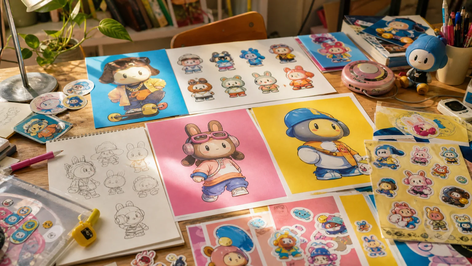
The palette does the first piece of work. Bright blues, pinks, and yellows establish a Y2K mood quickly enough that the theme reads as an environment, not a caption.
That kind of early clarity matters in event graphics, where people often glance, move on, and only later decide what stuck. Color gives the identity an immediate sense of era, energy, and audience, much like the poster environments discussed in how color can organize meaning before text does. Once the palette holds, the rest of the visual performance has a stable base.
- Choose a palette that signals the idea fast.
- Make sure the colors can repeat across small and large assets.
- Let color carry part of the concept so every graphic does not have to explain itself.
Scrappy stays familiar while the styling shifts
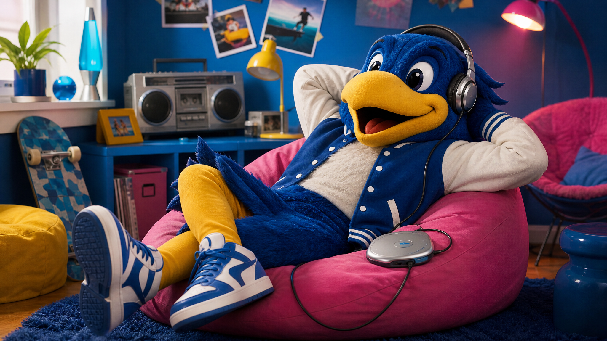
The sharpest decision in this identity may be what it refuses to do. Rather than redesigning UTC’s mascot to fit the Y2K aesthetic, the work captures the personality seen in Scrappy as a student.
That restraint protects recognition. A mascot already carries memory, and a heavy redraw can break that bond. Here, early-2000s-inspired accessories, outfits, and activities create a fresh signature without losing the character people already know.
The illustrations make the choice visible. Scrappy appears relaxing on a beanbag with music, rolling on roller skates, and chatting on the phone. Those scenes do more than decorate. They give the system direction by showing a campus figure living inside the theme rather than simply modeling it.
The same principle often appears in sports and fan culture: familiar forms hold attention better when the update respects memory. Sports branding that gives memory a visible shape works for the same reason.
Sticker sheets carry the identity into daily use
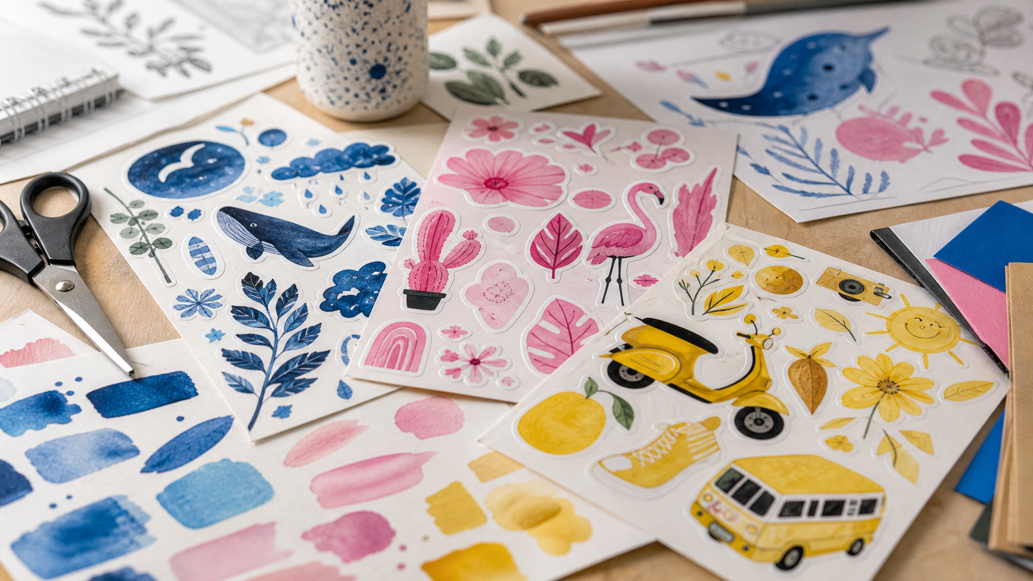
Sticker sheets featuring Scrappy are more than extras. They are portable brand pieces students can keep, share, and place in their own spaces.
That changes the role of the identity. A poster addresses a crowd for a moment, but a sticker can stay on a laptop or notebook for months. At that point, the branding stops behaving like temporary signage and starts working as a lived visual system.
- Pick artifacts people actually keep.
- Design them with the same care as the headline piece.
- Use illustration to reward close viewing.
The labor behind those pieces is easy to miss. Even something as simple as stickers can demand far more design work than viewers assume, which is a good reminder that small outputs often rely on careful drawing, iteration, and timing to feel easy.
Research keeps experimentation from drifting
The project stands out because it is not presented as style alone. Its strength comes from balancing creativity with strategy, including research into the theme, attention to purpose, and clear decisions about how to make the visuals distinct.
That balance is where many student projects either stiffen or sprawl. Some become too careful and lose personality. Others chase novelty and forget the system has to work across formats. Here, experimentation has a job to do.
- Research the theme before sketching visuals.
- Define the purpose of the assets.
- Decide where to break rules for effect.
- Keep one or two recognizable anchors consistent.
That last point matters most when illustration leads the work. Once the character, palette, and recurring motifs stay steady, the rest of the identity has room to move.
Illustration gives the event a social world
A mascot placed in everyday scenes can do something a generic event graphic rarely manages. It suggests how the celebration feels between official moments.
That is why the beanbag, roller skates, phone, and music details work so well. They turn the theme into a small social world. You do not just read Y2K; you see a character inhabiting it.
This approach suits universities especially well because campus brands need warmth without losing coherence. Illustration can supply that warmth while still staying inside a planned system of color, character treatment, and repeated motifs.
If those scenes later need light motion for social posts or digital promos, a limited animated treatment can extend the same idea without rebuilding it from scratch. A simple animated logo for social media or short social media photo animation can preserve the original look while adding energy to digital placements.
The lasting lesson is hidden in the workload
The Y2K styling makes the project visible, but the deeper lesson is process. Event branding that looks playful on the surface often rests on patient work underneath: drawing, revising, applying the concept across formats, and checking that each piece still belongs to the same family.
That is a useful correction for students and clients alike. Good visual identities do not become coherent by accident, and simple-looking outputs are often built from many small decisions made in sequence.
In this case, the result is a campus event identity with clear color logic, a recognizable mascot, and enough personality to travel across illustrations and stickers without losing shape. The trend catches the eye. The system makes it stay memorable.
 Logo Template
 Logo Template
 Photo Template
 Photo Template