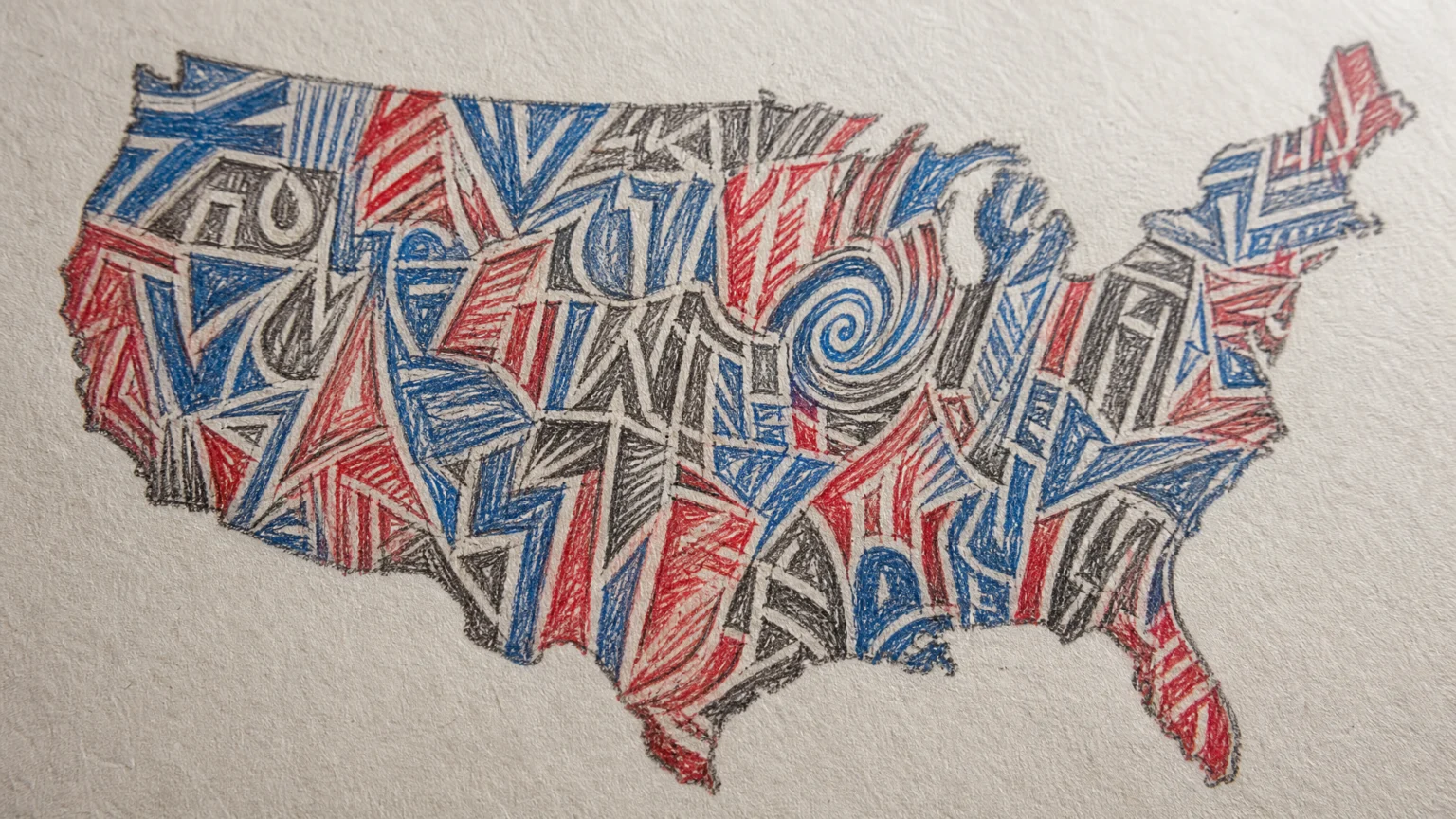
Some logos look settled. This one looks pressed in from all sides. The words crowd each other inside a tight shape, and that discomfort gives the mark its force.
The logo was created for a theatre initiative by Paula Scher, with Bruno Bergallo and Olivia Ray. Its central idea was to visualize women being squeezed out of democracy, and every major decision stays close to that thought.
When the lettering carries the burden
Many advocacy marks place a symbol beside a title and let the emblem do the talking. Here, the title does the work itself. The words are compressed into a frame that approximates the map of the lower 48 states, so the argument sits inside the lettering rather than around it.
Women is scrunched above Democracy. Democracy breaks across two rows without a hyphen, and + on the Edge of scribbles up, around, and down the East Coast. The arrangement creates direction without leaning on illustration in the usual way.
That is a practical lesson as much as a conceptual one. When the subject is constraint, spacing can often say more than a polished symbol.
Why the rough drawing matters
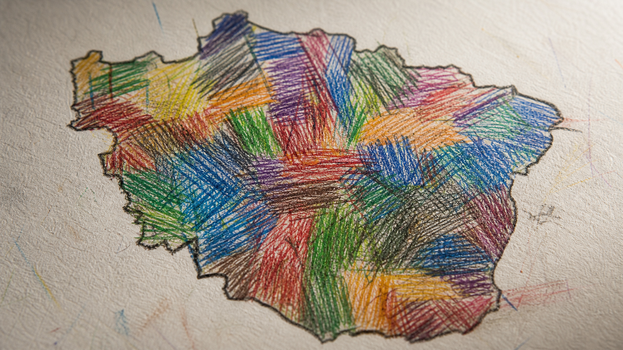
The lettering was drawn by hand in colored pencil on paper in a sketch-like style. That choice changes the emotional temperature of the mark. A cleaner finish would have made it feel more controlled and more distant.
Scher wanted the logo to feel raw, and that requirement shaped the medium as much as the form. The hand-drawn line brings slight irregularities in weight, edge, and timing, which keeps the piece from becoming a tidy typographic exercise.
That difference matters in identity work tied to public issues. If the craft becomes too refined, the design can lose urgency at the exact moment it needs to feel close to the body and the hand.
Rejected type says something useful about process
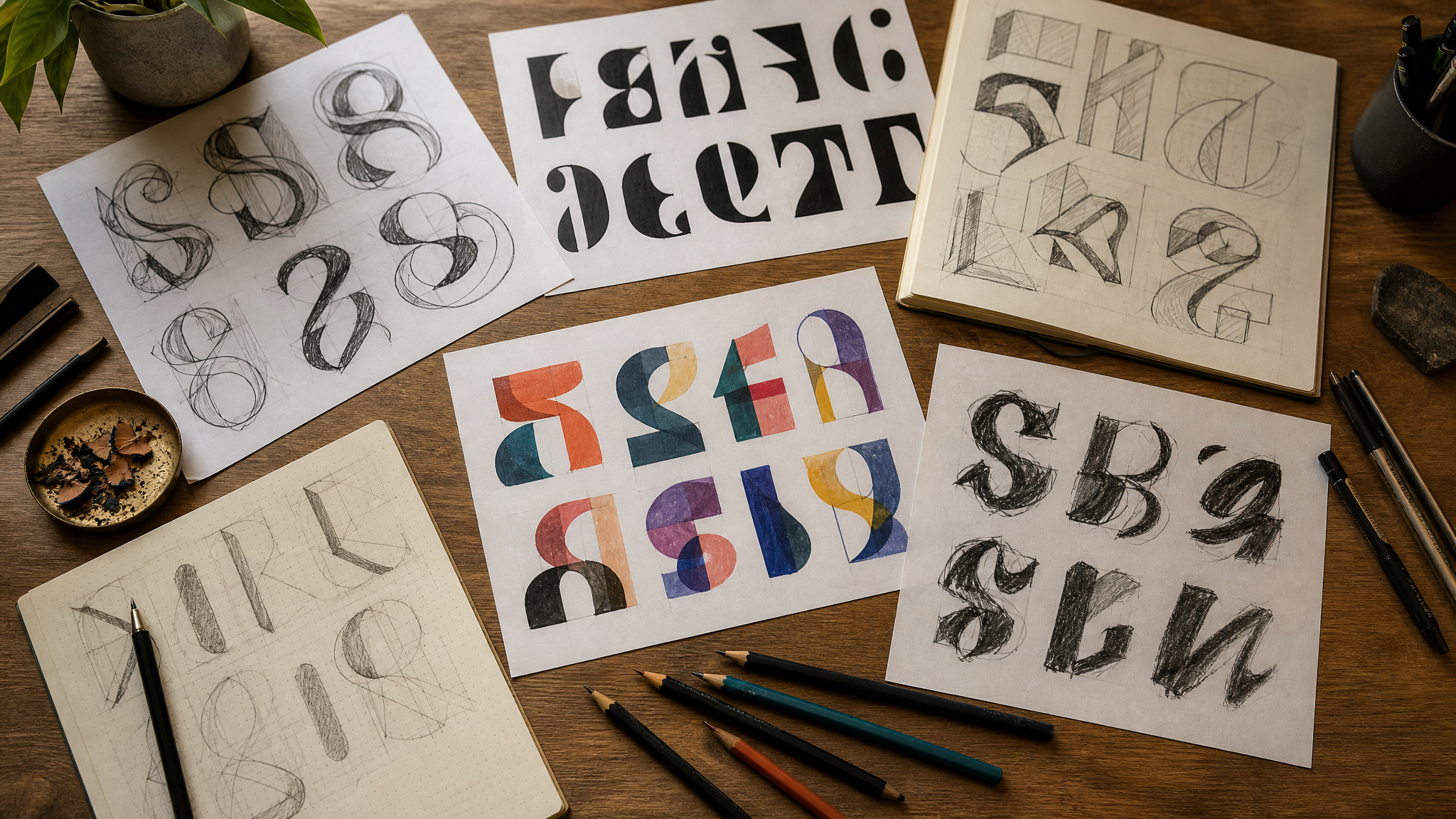
Some iterations did not look raw enough. Real typography was also tried, and it did not have the needed impact. That detail clarifies the process: the team was not adding hand-drawn texture as a style preference alone. They were testing which visual language could actually hold the idea.
That distinction is easy to miss. Custom drawing is not automatically more expressive. It works here because the form had to make the viewer feel the squeeze before fully parsing the words.
This kind of concept-first thinking also appears in event brands that stop acting like signage. The strongest marks behave like part of the argument, not just a label attached to it.
The map shape gives context, then steps back
The silhouette approximating the lower 48 states adds context without taking over. It reads first as a boundary and second as a reference. That order matters, because the compressed title remains the center of attention.
This balance is difficult to achieve. If the map were more literal, the logo could slip into illustration. If it were too vague, the reference would disappear. Keeping the outline approximate lets the lettering stay in the lead.
That restraint is often what makes contextual design cues effective. They guide interpretation without overexplaining it.
Legibility has a different job here
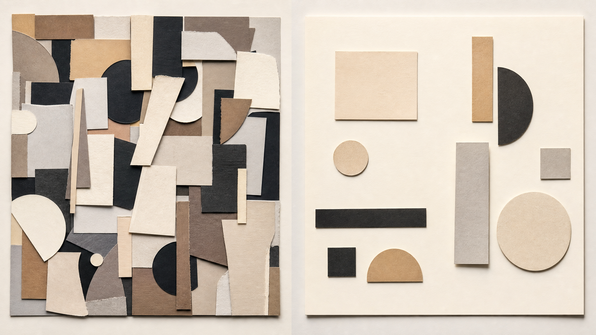
At first glance, this logo does not aim for effortless reading. It asks for a second look. In many identities that would be a flaw, but here the friction supports the meaning.
The packed words create a visual rhythm of interruption and crowding. You read, pause, adjust, and read again. That small effort echoes the larger theme built into the mark.
This does not mean harder-to-read logos are inherently better. It means legibility can serve different purposes. Sometimes the task is instant identification. Sometimes the design needs to make a condition felt before it is fully named.
- Immediate clarity suits straightforward identification.
- Managed friction can sharpen emotional or political emphasis.
- Form-led meaning is strongest when every decision points the same way.
That alignment between form and meaning is often what separates distinctive identities from generic ones, a point that also runs through moments when logo options start feeling interchangeable.
Concept discipline is the real lesson
This logo is a compact study in design discipline. The frame, the compression, the hand-drawn line, and the rejected typographic routes all move in one direction. Nothing feels added just to decorate the surface.
For a theatre initiative, that makes particular sense. Theatre identities often need to hold language, mood, and public urgency at once. This mark shows that concept and execution do not have to split roles when the structure is strong enough.
- Start by naming the condition you want people to feel, not just the topic you need to reference.
- Test whether spacing, stacking, or scale can embody that condition before reaching for symbols.
- Choose a medium whose texture supports the idea.
- Reject polished solutions if polish weakens the point.
If a team later wanted to extend a hand-drawn identity like this into motion, the smart choice would be to preserve the pressure and irregular edges rather than smooth them away. Tools built for logo reveal animation or transparent logo animation are most useful when they respect the original character of the mark instead of replacing it with generic effects.
The clearest lesson here is also the simplest. A logo can make an argument when shape, material, and wording work together closely enough.
 Photo Template
 Logo Template
 Logo Template
 Icon Template