
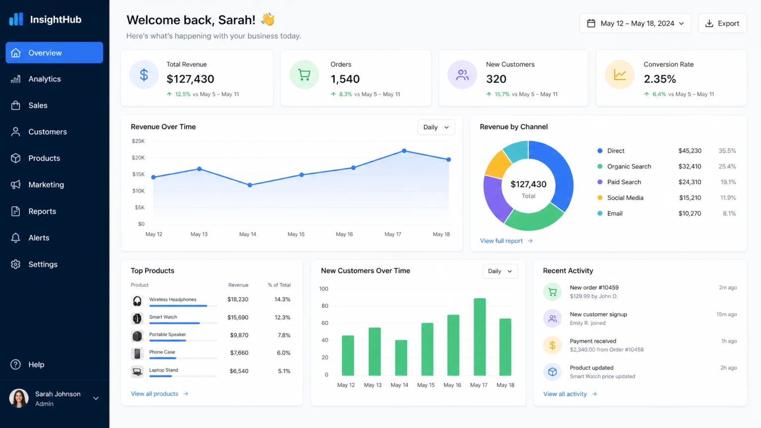
Imagine a sales dashboard that presents every single transaction in a dense, overwhelming table. Now, picture one that immediately highlights top-performing products, regional trends, and conversion rates through targeted visualizations. The latter offers immediate value, guiding a sales manager to key areas for action rather than forcing them to sift through minutiae. This distinction underscores the power of a deliberate design workflow.
Raw data often feels like a sprawling, disconnected landscape. Without a clear path, users can get lost in a sea of numbers, struggling to find meaning or make informed decisions. The goal of a dashboard isn’t just to display data, but to translate it into a coherent visual narrative that guides the eye and clarifies insights. This process moves beyond simply charting numbers to building an accessible, hierarchical system that serves its audience effectively.
Step 1: Understand Data and User Needs
Before any visual element takes shape, understand the data itself and, more importantly, the people who will use it. Begin by auditing all available data sources, identifying what metrics are present, their reliability, and how frequently they update. This initial audit prevents designing a dashboard around data that isn’t robust or readily available.
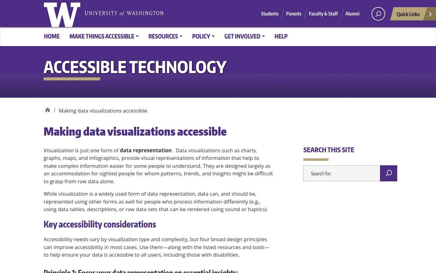
Simultaneously, define the primary users and their core questions. What decisions do they need to make? What critical information helps them achieve their goals? For instance, a marketing team might need to see campaign performance by channel and conversion rates, while an executive team might only require a high-level overview of overall revenue and customer acquisition trends. Focusing on essential insights means removing unnecessary data and avoiding excessive complexity or density that can overwhelm users. If multi-dimensional data is present, consider if split views or incremental additions of dimensions are more effective than trying to force everything into one chart. For a documented checkpoint, compare this step with Making data visualizations accessible.
To deepen this understanding, conduct user interviews or surveys. Ask about their current pain points with data, what information they frequently seek, and how they currently make decisions. This direct feedback is invaluable for tailoring the dashboard to real-world needs. Also, consider the technical proficiency of your audience. A dashboard for data scientists might incorporate more complex interactive elements, while one for general management should prioritize simplicity and immediate comprehension. Document these user personas and their specific requirements to ensure the design remains user-centric throughout the process.
Step 2: Select Effective Visualizations
Once you understand the data and user needs, choose visualization types that best convey the intended message. Not every dataset benefits from a bar chart, nor does every trend require a line graph. The selection should align with the data’s nature and the insight you want to highlight. For example, a pie chart might show parts of a whole, but a stacked bar chart could better illustrate changes in those parts over time.
Accessibility is a critical consideration here. Avoid relying on color alone to convey meaning, as this can exclude users with color vision deficiencies. Instead, use patterns, textures, or direct labels in addition to color. Ensure strong contrast between data elements and their backgrounds, and choose charting tools that support these accessibility features well. Highcharts, for example, recommends a text summary, an accessible table, and non-color cues.
When selecting visualizations, consider the type of relationship you want to show: comparison, composition, distribution, or relationship. For comparisons, bar charts or column charts are often effective. To show composition, consider stacked bar charts or tree maps. Scatter plots excel at revealing relationships between two variables. Always prioritize clarity and directness. A complex chart that requires significant mental effort to decipher defeats the purpose of a dashboard. Test different visualization types with sample data to see which best communicates the intended insight quickly and accurately.
Step 3: Structure Information Hierarchy and Layout
A well-designed dashboard guides the user’s eye through the information, presenting the most critical data first. This involves establishing a clear information hierarchy. What is the single most important metric? Where should the user’s attention go immediately? Use visual weight—size, position, and contrast—to emphasize key performance indicators (KPIs) and primary trends.
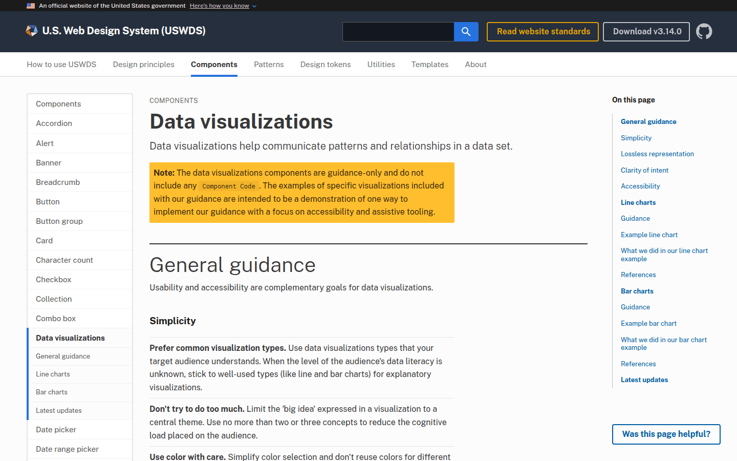
The U.S. Web Design System (USWDS) recommends limiting each visualization to a central theme, providing equivalent access with semantic headings and descriptions. Arrange related visualizations logically, perhaps grouping all sales-related charts together or placing a summary metric at the top. For complex dashboards, consider a modular layout that allows users to drill down into details or switch between different views without losing context. Another useful checkpoint is Data visualizations | U.S. Web Design System (USWDS).
Consider the F-pattern or Z-pattern for Western readers, where the eye naturally scans from left to right, then down. Place the most crucial information in the top-left corner. Group related metrics and visualizations using proximity and visual containers. For instance, all charts related to customer acquisition could be within one section, while financial performance occupies another. Use whitespace effectively to reduce visual clutter and create clear separation between different components. A grid system can help maintain alignment and consistency across the dashboard, making it feel organized and professional. This structured approach ensures that users can quickly locate the information they need without feeling overwhelmed by a jumble of data points.
Step 4: Design for Interaction and Responsiveness
Dashboards are rarely static; users need to interact with the data to explore it further. Design interactive elements such as filters, sorting options, and drill-down capabilities. Crucially, ensure these interactions are keyboard accessible and that hover-revealed information is reachable by screen readers. Visible focus indicators are essential so users know where they are on the page.
Beyond interaction, consider how the dashboard will adapt to different screen sizes and devices. A desktop layout might allow for multiple complex charts side-by-side, but a mobile view will likely require a simplified presentation, perhaps stacking charts vertically or offering a summary view with options to expand. Responsive behavior ensures that the dashboard remains usable and informative regardless of the viewing context.
When designing interactions, prioritize intuitive controls. Filters should be clearly labeled and their effects immediately visible. Drill-down options should lead to relevant, more detailed views without disorienting the user. For responsiveness, consider a mobile-first approach, designing the most critical information for smaller screens first, then progressively enhancing for larger displays. this helps that the core insights are always accessible, regardless of the device. Test interactions thoroughly across various browsers and devices to catch any usability issues before deployment. This proactive testing prevents frustration and ensures a smooth user experience.
Step 5: Verify Accessibility and Provide Context
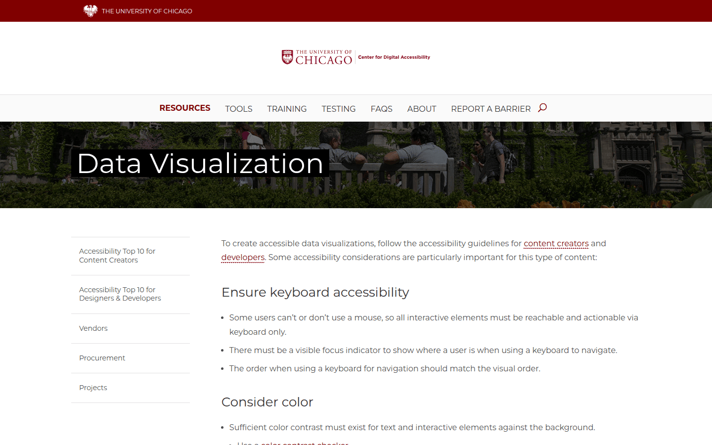
The final step involves rigorous testing and ensuring that the dashboard is genuinely accessible to all users. This goes beyond automated checks; manual testing is vital to confirm that interactive elements work as expected with keyboard navigation and screen readers. The University of Chicago’s guidance emphasizes that keyboard order should match visual order, and chart summaries or data links should be provided for dashboards that are hard to access directly.
In addition to technical accessibility, provide clear descriptions and interpretive context for all visualizations. What does this number mean? What trend should the user observe? This might include tooltips, brief explanatory text, or links to more detailed reports. Presenting data in multiple forms, such as an accessible table alongside the visual representation, further enhances comprehension and inclusivity. A dashboard that is visually compelling but inaccessible fails its fundamental purpose.
To ensure your dashboard effectively communicates, consider the following checkpoints throughout the design process. First, confirm that all data sources are reliable and updated frequently enough for the user’s decision-making cycle. Second, validate that the chosen visualizations directly answer the key questions identified in Step 1, avoiding generic charts that don’t serve a specific purpose. Third, test the information hierarchy with actual users to see if their eyes are drawn to the most critical metrics first. Fourth, verify that all interactive elements are intuitive and fully accessible, including keyboard navigation and screen reader compatibility. Finally, review the contextual information provided for clarity and completeness, ensuring users can interpret the data without ambiguity. By systematically addressing these points, you can transform raw metrics into clear, actionable visual narratives that empower every user.
Regularly solicit feedback from users after the dashboard is deployed. User behavior and data needs can evolve, so a dashboard should not be a static artifact. Implement a feedback mechanism, such as a simple survey or a dedicated contact point, to gather insights on usability and effectiveness. This iterative approach allows for continuous improvement, ensuring the dashboard remains a valuable tool over time. For example, if users consistently struggle to find a specific metric, it might indicate a need to adjust the layout or add a more prominent filter. This ongoing refinement is crucial for maintaining the dashboard’s relevance and impact.
 Icon Template
 Photo Template
 Icon Template
 Logo Template