Why Typography Decisions Matter on Product Pages
Imagine a customer scanning a product page. Their eyes dart from the product image to the price, then to the description, and finally to the “Add to Cart” button. If the text is difficult to read, if key information blends into the background, or if the overall visual flow feels chaotic, that customer is more likely to abandon their cart. Typography isn’t just about choosing pretty fonts; it’s about guiding the user’s attention and making information digestible, especially on ecommerce product pages where every detail counts toward a conversion.
The challenge isn’t merely aesthetic; it’s functional. A poorly structured typography system can obscure critical details like pricing, product features, or shipping information, leading to frustration and lost sales. Conversely, a well-designed system enhances readability, establishes a clear visual hierarchy, and ensures accessibility for all users. This guide outlines how to build such a system, focusing on font pairing, text spacing, and responsive scaling.
Pair Fonts Strategically for Clarity
The foundation of an effective typography system for product pages often lies in strategic font pairing. Rather than using many different typefaces, a practical approach emphasizes assigning fonts by their role. Typically, this means selecting one font for headings and another for body text and UI elements. A third typeface should only be introduced if it serves a distinct, clear purpose, such as for a specific call-out or promotional text, to avoid visual clutter.
For example, a strong sans-serif for product titles and subheadings can create immediate impact and readability, while a slightly more traditional serif or a clean, legible sans-serif works well for detailed product descriptions. This contrast helps differentiate information at a glance. The goal is to create a harmonious yet distinct visual language, where each font choice reinforces its content’s importance and function.
Establish Visual Hierarchy Beyond Font Choice
While font pairing is crucial, visual hierarchy on product pages extends beyond merely selecting different typefaces. Effective hierarchy guides the user’s eye through the page, prioritizing information. This is achieved not just through font choice, but also through variations in size, weight, color, and position. A product title, for instance, should be significantly larger and potentially bolder than the product description, making it the primary focal point.
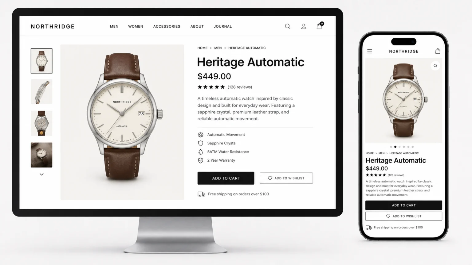
Consider the hierarchy of information on a typical product page: product name, price, key features, detailed description, and calls to action. Each element needs a distinct visual treatment to communicate its importance. A product price might use a larger font size and a contrasting color to stand out, while supporting information like shipping details could use a smaller, lighter weight font. The consistent application of these visual cues across all product pages builds a predictable and intuitive user experience.
Optimize Text Spacing for Readability and Accessibility
Even the most carefully chosen fonts can become unreadable with poor text spacing. Ensuring proper line height, paragraph spacing, letter spacing, and word spacing is critical for both readability and accessibility. The Web Content Accessibility Guidelines (WCAG) 2.1 provide specific minimums that serve as an excellent baseline for any ecommerce site. Another useful checkpoint is Web Content Accessibility Guidelines (WCAG) 2.1.
WCAG 1.4.12 Text Spacing Success Criterion recommends a line height of at least 1.5 times the font size, which prevents lines of text from feeling cramped. Paragraph spacing should be at least 2 times the font size to clearly separate blocks of text. For individual characters, letter spacing (tracking) should be at least 0.12 times the font size, and word spacing should be at least 0.16 times the font size. Adhering to these guidelines significantly improves the legibility of product descriptions and other textual content, especially for users with visual impairments or cognitive disabilities. Testing these settings across different devices and screen sizes is essential to confirm their effectiveness. For a documented checkpoint, compare this step with Understanding Success Criterion 1.4.12: Text Spacing | WAI.
Implement Responsive Typography for All Devices
Ecommerce product pages are viewed on a vast array of devices, from large desktop monitors to small mobile screens. Responsive typography ensures that your text remains readable and visually appealing regardless of the viewport size. This involves using relative units for font sizes and implementing rules that adapt typography to different contexts.
For example, using rem units instead of fixed px values allows fonts to scale proportionally with the root element’s font size, making global adjustments easier. For headings, the CSS clamp() function is particularly useful, as it allows you to set a preferred font size within a minimum and maximum range. This prevents headings from becoming too large on desktop or too small on mobile. Crucially, titles, body text, prices, buttons, and supporting information should each have separate responsive rules to maintain their distinct roles and legibility across all screen sizes. This granular control ensures that the hierarchy you’ve established remains effective everywhere.
Distinguish Key Information Visually
On a product page, certain pieces of information demand immediate attention. Prices, calls to action (like “Add to Cart”), and critical product specifications need to stand out without screaming for attention. This distinction is achieved through deliberate visual choices that go beyond basic font selection.
For instance, a product price might be rendered in a bolder weight and a slightly larger size than the surrounding text, perhaps even in a brand accent color. Button text requires clear contrast against its background and sufficient padding to be easily tappable. Product features could use bullet points with ample line spacing to break up dense text, making them scannable. The goal is to create a visual roadmap for the user, highlighting what’s most important at each stage of their decision-making process. Regularly reviewing product pages for visual clarity helps ensure that no crucial information gets lost in the design.
By systematically applying these principles—strategic font pairing, robust hierarchy, accessible spacing, and responsive scaling—you can build an ecommerce typography system that not only looks professional but also actively supports the user journey and drives conversions. The visible decisions you make about type directly impact how easily customers find, understand, and ultimately purchase your products.
Checkpoints for Your Ecommerce Typography System
As you build and refine your typography system, consider these checkpoints to ensure its effectiveness and accessibility:
- Font Selection: Have you chosen fonts that are highly legible across various screen sizes and resolutions? Are your chosen fonts available in sufficient weights and styles to support your hierarchy without introducing too many distinct typefaces?
- Hierarchy Clarity: Is there a clear visual distinction between headings, subheadings, body text, prices, and calls to action? Can a user quickly scan the page and understand the most important information?
- Readability and Spacing: Do your line height, letter spacing, and word spacing meet or exceed WCAG recommendations? Is there enough space between paragraphs to prevent text blocks from feeling dense and overwhelming?
- Responsiveness: Does your typography adapt gracefully to different devices, from mobile phones to large desktop monitors? Are font sizes, line lengths, and spacing adjusted to maintain readability and visual appeal on every screen?
- Accessibility: Have you considered users with visual impairments or cognitive disabilities? Is there sufficient color contrast between text and background? Are interactive elements clearly distinguishable?
- Brand Consistency: Does your typography system align with your overall brand identity? Does it convey the desired tone and professionalism?
Regularly testing your product pages with real users and across different devices can reveal areas for improvement. Pay attention to feedback regarding text legibility, ease of navigation, and overall visual comfort. A well-executed typography system is a continuous effort, evolving with user needs and technological advancements. By focusing on these principles, you create a more intuitive and effective shopping experience.
 Photo Template
 Logo Template
 Logo Template
 Logo Template