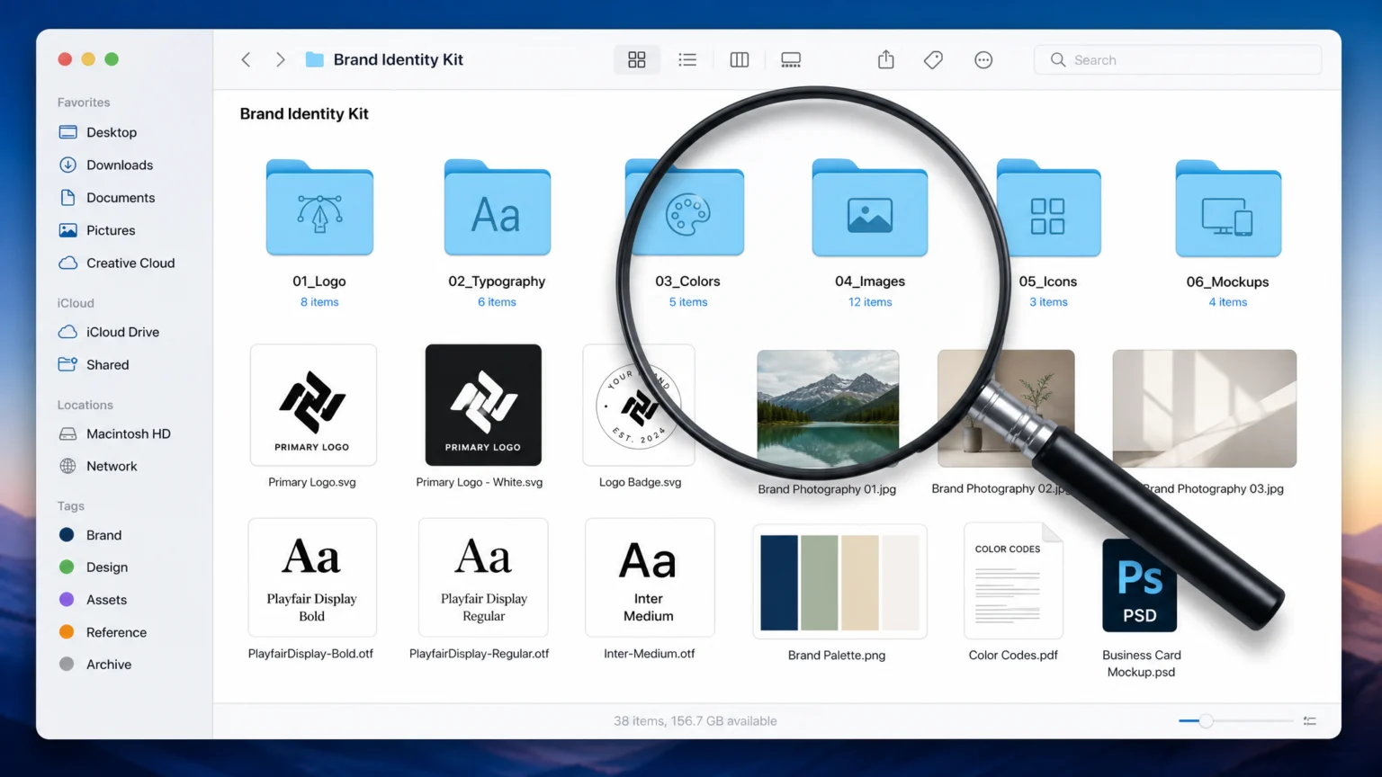
A brand’s visual identity can easily lose its way if the underlying asset library is incomplete or poorly structured. Imagine a meticulously crafted logo appearing pixelated on a website, or a brand color shifting unexpectedly in print. These inconsistencies, often born from missing file variants or unclear usage instructions, chip away at brand recognition and impact. The challenge for designers extends beyond creating compelling visuals; it’s about ensuring those visuals are consistently and correctly applied by everyone who interacts with the brand.
This checklist offers a systematic approach to verifying that all essential brand assets are present, properly formatted, and accompanied by clear guidance. By addressing common pitfalls proactively, designers can empower teams to implement the brand with precision across all mediums, from digital interfaces to physical collateral. This focus on practical application safeguards the visual coherence and integrity of the brand, preventing frustrating rework and maintaining a strong, unified presence.
Logo Files for Every Application
Logos are the visual shorthand for a brand, but their effectiveness hinges on their adaptability. A comprehensive asset library must provide logo files tailored for diverse applications. For web use, SVG (Scalable Vector Graphics) is crucial for crisp, scalable display across all screen sizes without pixelation. PNG files are essential for logos requiring transparency, especially when placed over varied backgrounds or in specific color variants. When logos are integrated into photographic content, JPGs are often preferred for their efficient compression. For print, PDF files ensure high-quality output, preserving vector integrity and color accuracy. Each format serves a distinct purpose, and providing a full suite prevents downstream conversion issues and maintains visual fidelity.
Consistent Naming and Versioning
Beyond file types, the organization of logo assets significantly impacts usability. Implement stable and descriptive naming conventions instead of vague labels. For instance, instead of logo.png, use something like brandname_logo_primary_transparent_web.png. This clarity helps users quickly identify the correct asset without opening multiple files. Additionally, integrate version labels into file names or folder structures to track changes over time. This practice is crucial for managing updates, ensuring that everyone is always working with the most current approved logo, and providing a clear history of modifications.
Color Palettes and Usage Guidance
Brand colors are fundamental to recognition, but their consistent application requires more than just listing hex codes. The asset library must provide explicit usage guidance for each color. This includes defining primary and secondary palettes, specifying when to use accent colors, and detailing rules for color combinations, such as primary-on-white or dark-background variants. Without these instructions, teams may inadvertently use colors in ways that diminish brand impact or create visual clutter. Consider providing examples of acceptable and unacceptable color pairings to reinforce understanding.
Color Modes and Profiles
Color reproduction varies significantly between digital and print mediums. Therefore, the asset library should clearly recommend matching color modes to their destination. RGB (Red, Green, Blue) is the standard for screen-based applications, ensuring vibrant and accurate display across digital devices. For print materials, CMYK (Cyan, Magenta, Yellow, Key/Black) is necessary to achieve consistent results on physical media. Providing both sets of values, along with any specific Pantone or spot color equivalents, eliminates guesswork and prevents common color shifts between digital proofs and printed output. This attention to detail ensures that the brand’s visual identity remains cohesive regardless of the medium.
Typography Assets and Hierarchy
Typography is a powerful, often subtle, element of brand identity. The asset library should contain all approved brand fonts, including their various weights and styles. Crucially, it should also outline a clear typographic hierarchy. This means specifying which fonts are used for headlines, subheadings, body text, and captions, along with recommended sizes, line spacing, and tracking. Providing these guidelines ensures that all communications maintain a consistent visual rhythm and readability, reinforcing the brand’s voice. Without clear guidance, designers might choose fonts that clash or create an inconsistent visual experience.
Licensing and Accessibility Considerations
Beyond the font files themselves, include documentation regarding font licensing. This prevents legal issues and ensures that all users of the brand assets are aware of any usage restrictions. Additionally, consider accessibility guidelines for typography, such as minimum font sizes for readability on different devices and sufficient color contrast between text and background. These details ensure the brand’s message is accessible to the widest possible audience. For example, specifying a minimum font size of 16px for body text on web ensures better readability for most users.
Visual Assets: Illustrations, Photography, and Patterns
Visual assets like illustrations, photography, and patterns contribute significantly to a brand’s personality. The asset library needs to categorize these elements clearly. For illustrations, provide vector files (like AI or EPS) for scalability and high-resolution raster files (like PNG or JPG) for web use. For photography, include a selection of approved images that align with the brand’s visual style, ensuring they are high-resolution and properly cropped or retouched. Any brand-specific patterns should also be provided in scalable formats. this helps that all visual elements maintain a cohesive aesthetic.
Resolution and Usage Specifications
Resolution targets are critical for maintaining visual quality across different outputs. For screen-based assets, a resolution of 72 to 150 ppi (pixels per inch) is generally sufficient. Print materials, however, require a much higher resolution, typically 300 ppi, to ensure sharp details. For large-format outputs, such as billboards or banners, a resolution of 100 to 150 ppi is often adequate, as these are viewed from a greater distance. Clearly label each asset with its intended resolution and use case to prevent common errors like pixelation in print or unnecessarily large file sizes for web. Made Visual Studio provides a useful guide on these specifications, emphasizing the importance of matching resolution to output.
Comprehensive Brand Guidelines
The asset library is only as effective as the guidelines that accompany it. A comprehensive brand guideline document should cover all core elements: logo usage (including clear do’s and don’ts), precise color values, typography specifications, and the overall style for photography or illustration. This document acts as the central reference point, ensuring that all brand applications are consistent and on-message. Checkflow’s Brand Asset Management Checklist Template highlights the importance of these guidelines for maintaining brand integrity.
Do’s and Don’ts and Version Control
Crucially, the guidelines should include explicit examples of correct and incorrect usage. Showing what not to do can be as important as showing what to do, preventing common misinterpretations. For instance, demonstrating incorrect logo scaling or color alterations provides immediate visual clarity. Furthermore, implement robust version control for the guidelines themselves. A clear record of changes between versions, including dates and descriptions of updates, ensures that the guidelines remain current and that all stakeholders are working from the latest approved version. This prevents confusion and maintains the integrity of the brand over time.
Final Review and Accessibility
Before final handoff, conduct a thorough review of the entire asset library and its accompanying documentation. Check for any broken links, missing files, or outdated information. Ensure that the folder structure is intuitive and that all files are clearly labeled according to the established naming conventions. Consider how easily a new team member could navigate and understand the library without prior instruction. A well-organized and clearly documented asset library reduces friction and empowers teams to maintain brand consistency effortlessly. This final check is crucial for ensuring the library is truly ready for use.
A complete brand asset library is an investment in future consistency. By meticulously checking each component against these criteria, designers can ensure their work translates into a coherent and impactful brand experience across all touchpoints. This proactive approach minimizes rework, streamlines collaboration, and ultimately strengthens the brand’s visual identity in every application. The effort invested upfront in organizing and documenting assets pays dividends in long-term brand equity and operational efficiency.
Consider implementing a digital asset management (DAM) system if your brand assets are extensive or managed by a large team. DAM systems provide centralized storage, version control, access permissions, and search functionalities that can significantly streamline the management and distribution of brand assets. This can be particularly beneficial for global brands or organizations with multiple agencies and internal teams needing access to the same resources. Evaluate the scale and complexity of your asset needs to determine if a dedicated DAM solution would provide a worthwhile return on investment, ensuring that your brand assets remain organized, accessible, and consistently applied.
 Logo Template
 Logo Template
 Logo Template
 Icon Template