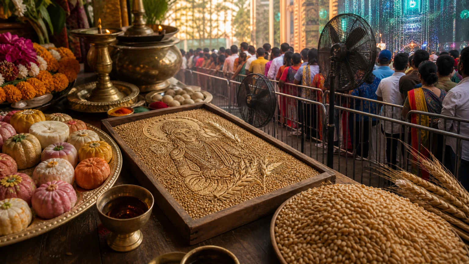
A logo is rarely the first thing people notice during a festival. They notice a grain, a sweet, a queue, a puja item, or a small task a family already planned to do.
That is the central tension in recent Ganesh Chaturthi brand work. The most natural campaigns do not try to dominate the celebration. They find a modest place inside it, then shape that place with care.
Participation reads differently than promotion
Several recent executions point to the same instinct. One brand gave Mushak a digital role in an arpan experience. Another brought cooling relief to the darshan queue at Lalbaugcha Raja. A food brand invited families to make modakams at home through a DIY kit. A biscuit collaboration turned Bourbon into a chocolate modak shape.
These formats are different, but the design principle is consistent: the brand enters through something people enjoy, need, or already recognize during the festival. That is a stronger starting point than adding festive color to ordinary advertising and hoping atmosphere will carry the idea.
This is close to the logic behind event brands that stop acting like signage. Presence becomes more persuasive when it behaves like part of the setting instead of an interruption pasted over it.
Specific details do the persuasive work
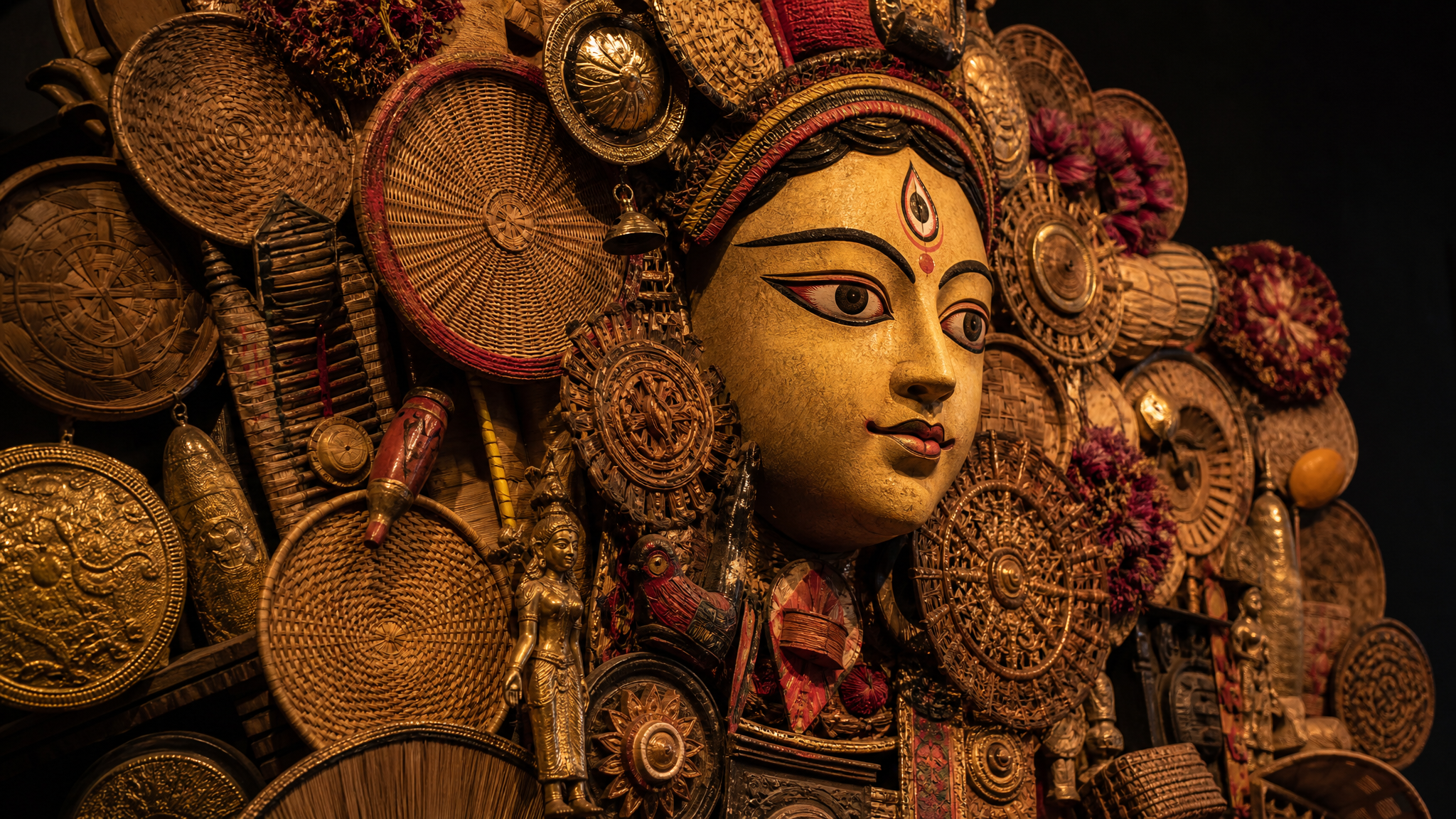
The details matter because they show intent. An eight-foot anamorphic Ganpati installation used more than 400 puja items. Images of Ganesha were engraved on individual wheat grains. In one digital experience, Mushak appears and carries the chosen arpan to Bappa.
None of those choices feels generic. Each one takes a familiar object or symbol and gives it a clear visual job. That specificity creates trust because people can see the idea was built from the celebration outward, not from a campaign template inward.
For designers, that is the real lesson. Relevance is often visible before it is explained. Materials, scale, texture, and direction tell people whether a brand understands the occasion or is simply borrowing it.
A smaller role often leaves the cleaner memory
Festival marketing gets crowded quickly. Loud branding, oversized claims, and decorative overload tend to compete with the event instead of supporting it. The better examples take a smaller role and perform it clearly.
A practical service in a queue solves discomfort. A household making activity gives families time together. A festive reinterpretation of a familiar product adds novelty without needing much explanation. A digital offering ritual gives interaction a simple emotional structure.
Each move is limited, and that is exactly why it works. People do not need to decode the brand’s purpose. They can feel it in use.
“The brand becomes associated with a moment people have helped create.”
That idea is especially strong during festivals because participation has its own rhythm. When people assemble, offer, shape, wait, share, and notice together, the brand gains memory by supporting the moment instead of trying to own it.
Ritual should shape the form
A practical creative rule runs through these examples: begin with something relevant and build from there. A grain, a puja item, a flavour, a household activity, or a practical service gives the work a believable foundation.
That keeps the visual system honest. If the concept starts with a real object or action, the color, scale, materials, interface, and copy are more likely to follow that logic. If the concept starts with a promotion calendar, the work often slips into costume design: festive on the surface, thin underneath.
The same discipline appears in festive jewellery campaigns where culture sets the frame. The strongest work does not decorate itself with occasion. It lets the occasion shape the structure.
Utility can carry brand value quietly
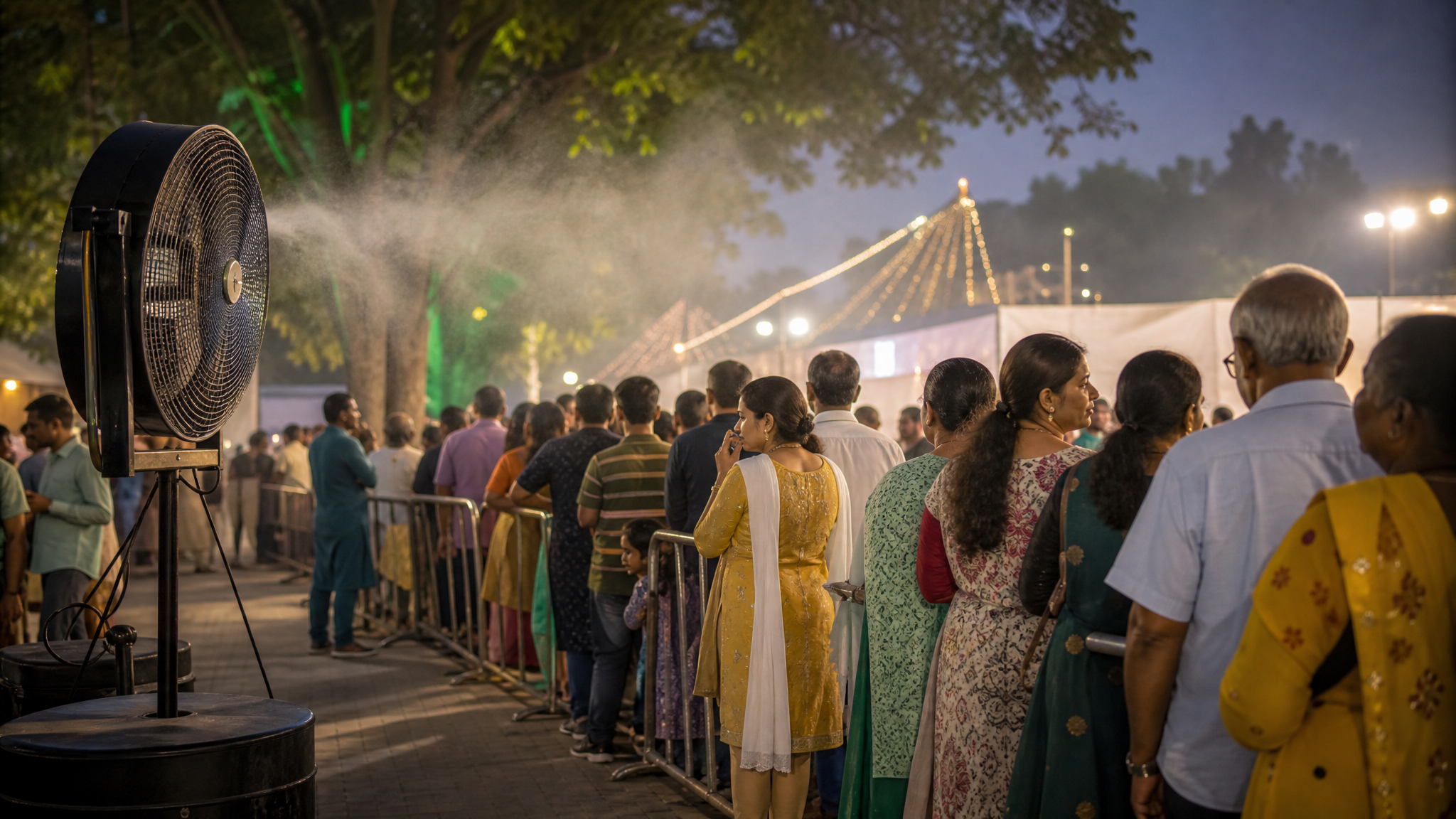
Not every festival activation needs a large physical build, but experiential thinking helps even small campaigns. The cooling installation at Lalbaugcha Raja is a good example of utility doing brand work. People remember comfort differently from display.
The same is true of the digital Mushak interaction. It gives symbolic movement to the act of offering, which makes the interface feel less transactional and more aligned with the setting. That is a useful reminder for teams building digital festival assets, microsites, or social pieces: motion should clarify meaning, not simply decorate the screen.
For brands exploring lightweight digital executions, a restrained tool such as logo reveal animation can work when the animation follows the idea’s emotional timing rather than overpowering it. The identity should arrive as part of the experience, not as a curtain drop.
Short leaps make product ideas believable
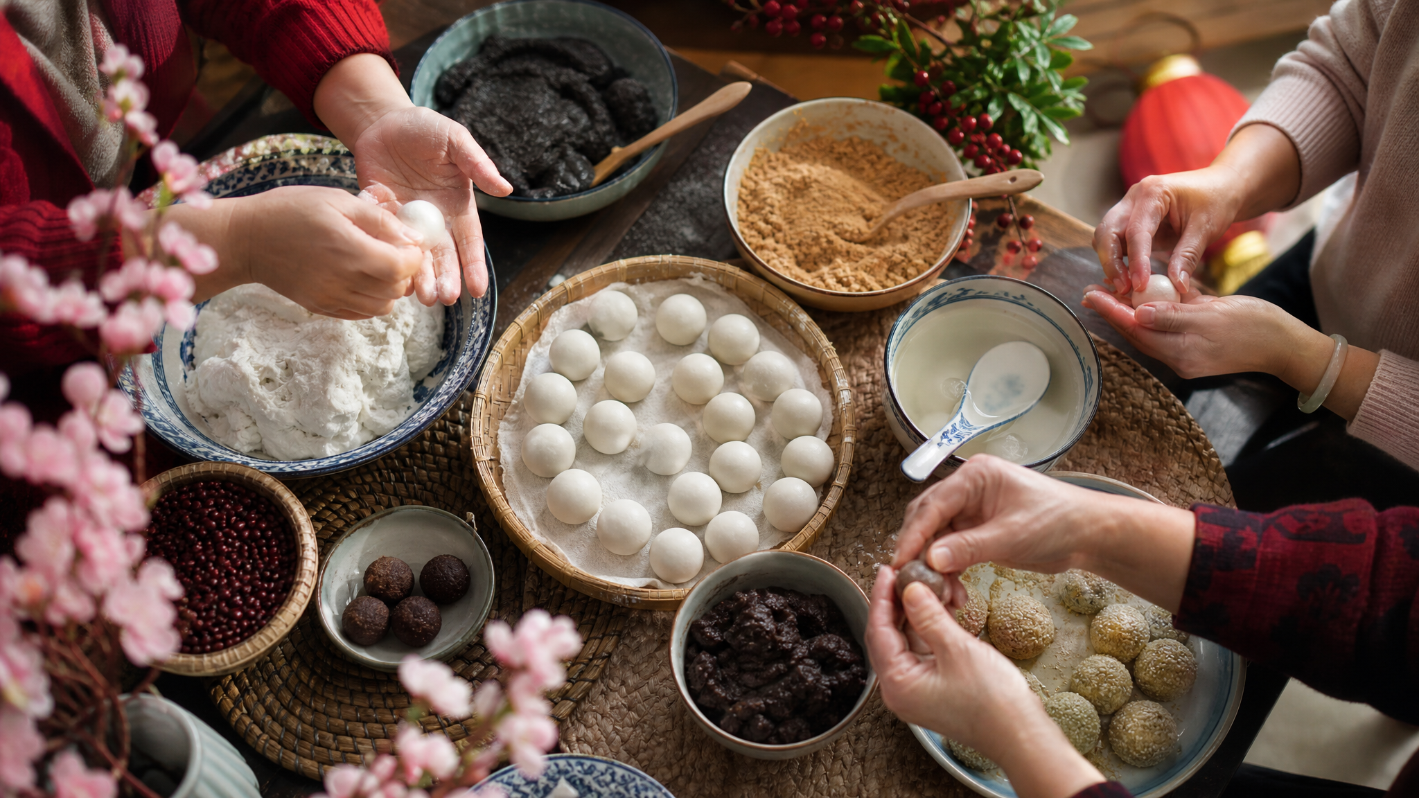
The Bourbon chocolate modak is a useful reminder that product design can join a festival without turning into a costume version of itself. The move is simple: a known taste meets a known festive form. The leap is short, so the idea lands quickly.
The DIY Modakam Kit works for a similar reason. It gives the brand a role in a real home activity that already belongs to the season. That is far more grounded than using the festival as a backdrop for unrelated messaging.
Designers working on seasonal packaging can borrow this approach. Keep one foot in the product people know, and let the festive adaptation happen through shape, use, or preparation. When the adjustment is legible, the concept feels thoughtful instead of forced.
Questions worth asking before the brief starts
For creative teams, these cases suggest a short checklist worth keeping nearby:
- What existing ritual, object, or need gives the brand permission to appear?
- Can the idea be understood through form and use before copy explains it?
- Is the brand helping people make, offer, wait, share, or notice something?
- Does the execution fit the scale of the moment, or is it trying to overpower it?
- Will people remember the interaction as useful, delightful, or considerate?
These questions shift the brief away from festive styling and toward genuine fit. They also protect teams from overbranding, which is often the first thing audiences notice and the fastest thing they forget.
The work feels strongest when it seems invited in
That may be the clearest standard of all. A good festival campaign should not feel inserted into the celebration after the fact. It should feel invited in by the logic of its materials, service, product, or interaction.
When a brand takes that path, even a small activation can leave a lasting signature. The work earns attention through care, not volume. During a culturally meaningful moment, that is usually the better design choice.
 Logo Template
 Icon Template
 Icon Template
 Logo Template