Festive jewellery advertising has a familiar risk. It can get loud before it gets meaningful, filling feeds and storefronts with gold, sparkle, and offers while missing the emotional reason people are paying attention in the first place.
Ganesh Chaturthi brings that tension into focus. Jewellery brands are trying to enter the festival conversation in distinct ways, and the stronger choices start with cultural relevance before they push commercial relevance. That order matters because festive buying is already active; the design task is to make the brand feel present for the right reason.
Cultural meaning has to arrive first
Festive marketing by jewellery brands during Ganesh Chaturthi marks an early starting point in seasonal advertising. Brands are looking for a place alongside the puja thali, which means the visual field is already crowded with symbolism, family rituals, and expectation.
In that setting, visibility on its own is thin. Stronger campaign performance depends on a more distinctive experience that combines value, emotion, and cultural relevance. That is less about adding decorative cues and more about choosing the right direction for the whole campaign.
Consumer behavior supports that approach. Hansa Research’s Festive Season 2026 analysis found that 95 per cent of consumers consider the festive season an important period for shopping, while 35 per cent expect cultural and emotional storytelling. The opportunity is large, but the audience is not asking for volume alone.
Theme choices shape brand position

One useful detail in this festive wave is that several brands are not saying the same thing. Divine Solitaires uses the theme of new beginnings. Senco leans into faith and auspiciousness. Kalyan Jewellers centers family.
Those are not interchangeable festive labels. Each one sets a different emotional frame, changes the casting of the campaign, and affects which product details feel appropriate. A family-led message asks for warmth and closeness; a faith-led message needs reverence and restraint; a new-beginnings theme benefits from freshness and optimism.
This is where brand recall gets built. People may remember the jewellery, but they are more likely to remember the piece when it is attached to a clear feeling and a usable occasion. Early listening before launch becomes especially valuable in moments like this, because brands need to hear which emotional lane already belongs to them and which one will sound borrowed.
Motifs matter when product form carries them well
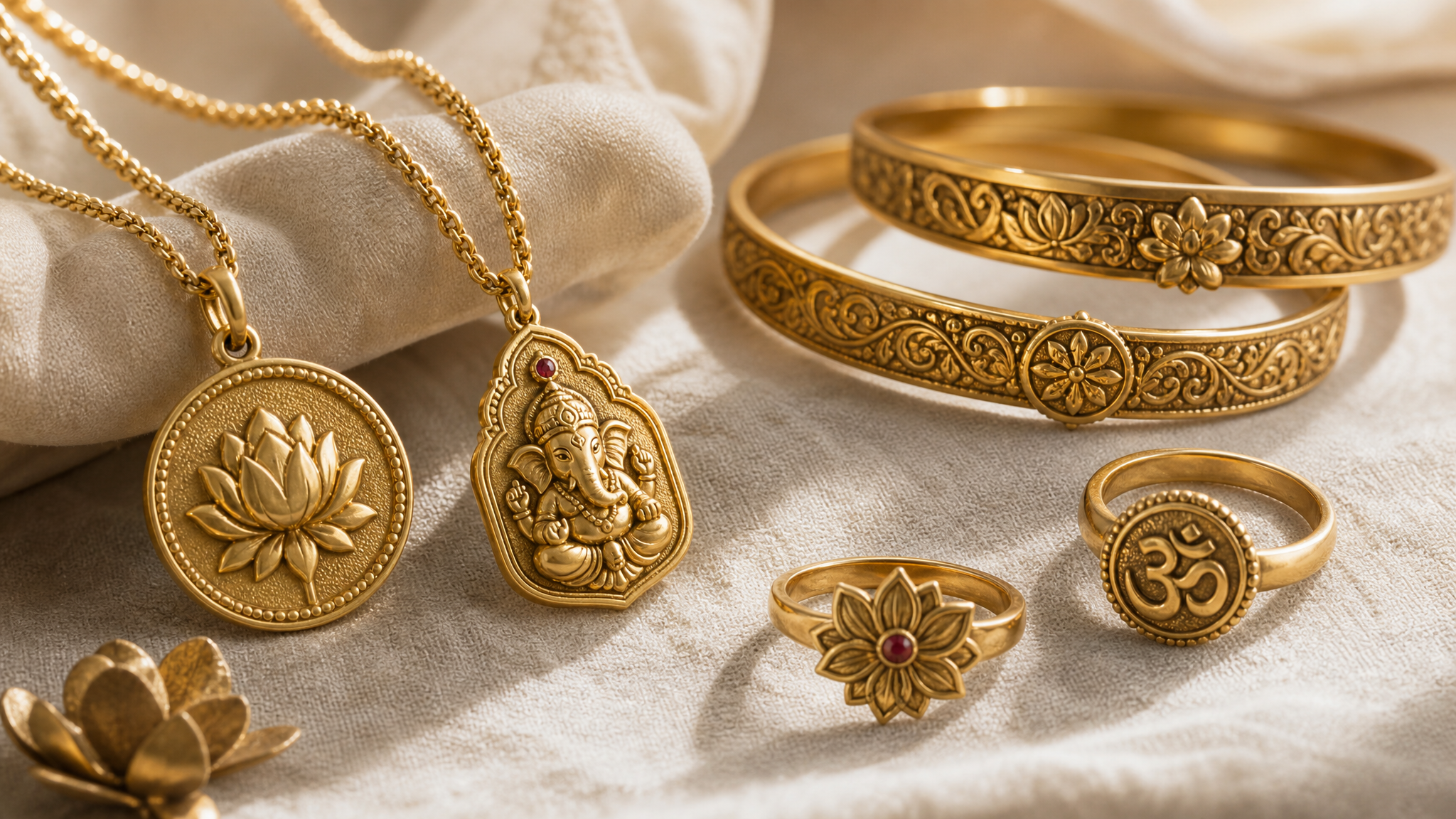
Senco’s festive work includes pendants, rings, and bangles built around Ganesha and other auspicious symbols. That matters beyond merchandising. It shows how campaign positioning can move directly into product form, rather than stopping at ad styling.
Motif-based design is delicate work. A symbol can make an object feel intimate and timely, but only when the handling is careful enough to keep it from becoming costume. Describing these pieces as shaped by timeless design sensibilities points to a practical balance: make the reference visible, then keep the form wearable.
That balance is useful for any designer working with heritage cues. The symbol should not do all the labor. Scale, line, finish, spacing, and material weight still decide whether the object feels devotional, giftable, ceremonial, or simply overworked. Regional and cultural detail often works best when it is built into the object itself, not pasted onto the surface at the last minute.
Recall comes from coherence, not saturation
Festive periods tempt brands to spread outward. More placements, more edits, more shine, more urgency. But campaign effectiveness in a dense season comes from coherence: product, message, symbolism, and audience expectation need to move in the same rhythm.
If a brand says family and shows only isolated glamour, the message splits. If it says auspiciousness but treats sacred motifs like trend graphics, trust thins out. If it says new beginnings without giving the visual system any sense of freshness, the story lands as copy rather than experience.
Coherence is often easiest to spot in the negative. When it is missing, every asset starts to feel like a separate performance. When it is present, even simple touchpoints carry a recognizable signature.
Richness needs restraint to stay legible
Jewellery campaigns often have permission to look lavish, but lavish is not the same as legible. Festivals already bring dense color, ornament, gifting cues, and emotional intensity. The brand that adds too much can flatten its own presence.
Restraint helps the meaningful detail show up. A single auspicious motif, a clearly framed family interaction, or a product composition that leaves room around the form can do more than a crowded festive collage. The point is not minimalism for its own sake. The point is timing: knowing which visual note should arrive first.
That same thinking applies when these campaigns move into motion. Subtle reveals, light movement, or gently staged product emphasis can support reverence better than aggressive effects. For teams adapting festive assets into short-form posts, a focused tool such as animated logos for social media is most useful when the motion reinforces mood instead of competing with it.
The full campaign has to hold together
The most practical line in this category is simple: visibility alone does not guarantee impact. Distinctive experiences do. For festive jewellery brands, that experience can begin in campaign theme, continue in symbol-led product design, and hold together across packaging, store displays, social edits, and gifting moments.
That makes festive marketing less like a one-off ad burst and more like a connected system. The same cultural logic should guide still photography, short video, display styling, and close-up product storytelling. When brands need product imagery to carry atmosphere without rebuilding the whole shoot, animated product photos can add a controlled sense of presence while keeping the object central.
Ganesh Chaturthi jewellery campaigns make one lesson clear. People are ready to shop, but they are also ready to judge tone, meaning, and fit. The brands that stay memorable are the ones that understand festive design is not a layer added to commerce. It is the structure that helps commerce make sense.
 Photo Template
 Photo Template
 Logo Template
 Photo Template