Open briefs sound generous until the blank page starts asking for answers. With no preset to hide behind, each visual decision has to stand on its own.
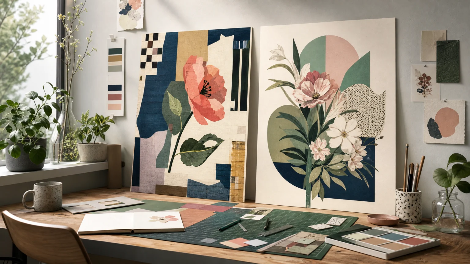
That pressure sits at the center of a brand partnership built around creative software and commissioned design work. Melina K and Rob Farmer were invited to create pieces inspired by a place, space, or moment where they feel most creatively free. The result stayed concrete: two posters, plus downloadable design kits built from elements of each poster.
That second layer is the useful part. A poster can hold a personal idea, but a kit has to expose structure. It asks whether the work can produce parts that other people can actually use.
Open briefs still need form
Melina K described the freedom to approach a project in her own way as a blessing for a creative person. Rob Farmer framed the same condition from the other side: open briefs can be the hardest, even when they make room for something a little different than usual.
Most designers know that tension. Freedom is real, but it is not neutral. It demands direction and judgment at the same time.
These commissions become more interesting because the brief did not stop at expression. Each designer also turned parts of the finished work into downloadable assets. Melina supplied Affinity files, and Rob supplied a Cavalry file alongside elements from his poster. That move from artwork to toolkit is exactly where a workflow proves itself.
A poster that breaks into parts travels farther
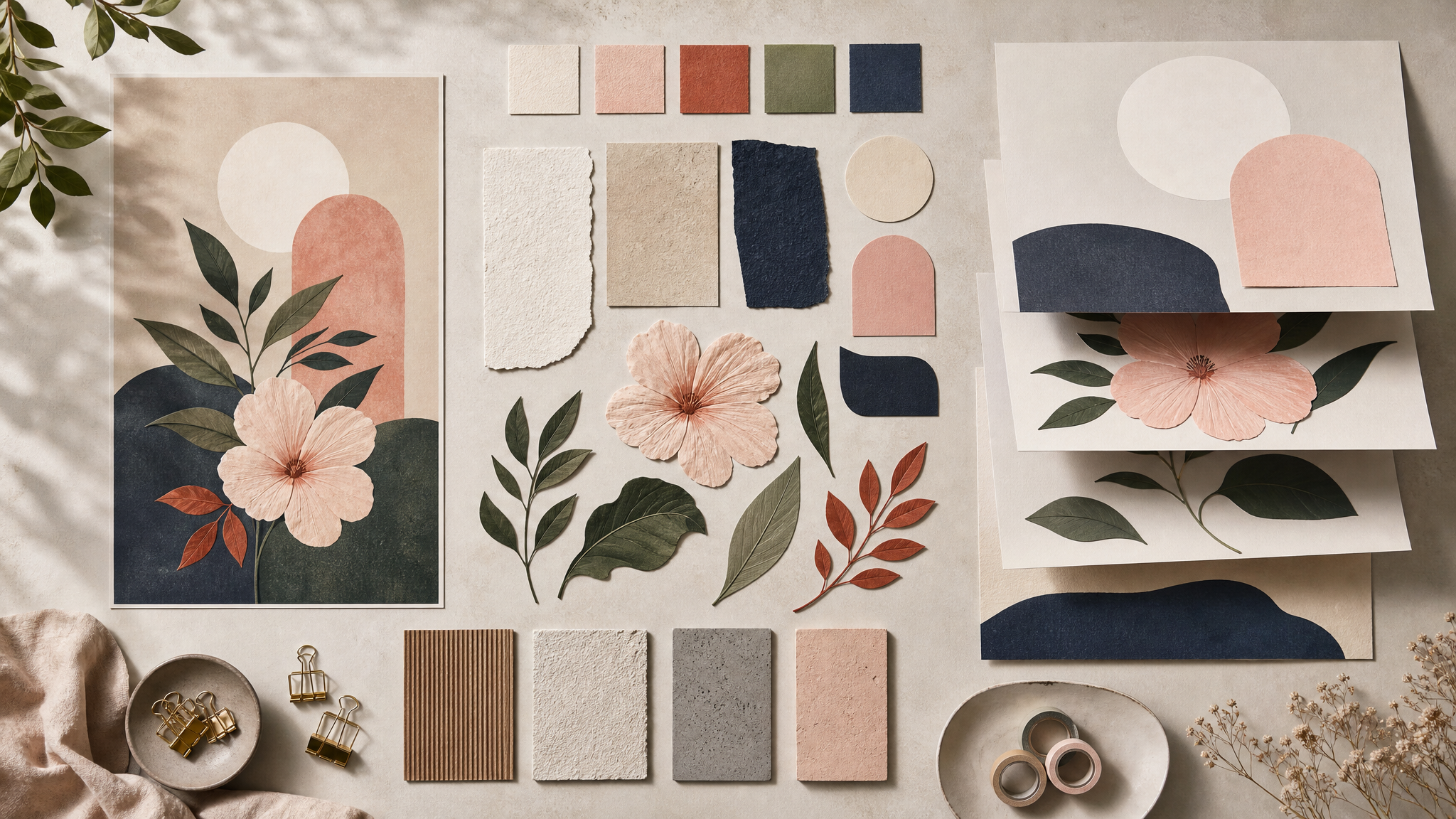
Reusable assets are not the glamorous side of design, but they reveal how a piece was built. If a poster depends on fragile edits, hidden fixes, or effects that do not survive beyond one export, it remains a one-off. If its elements can be separated and packaged clearly, the work keeps going.
The same logic shapes any strong visual library. Editable parts matter because they make repetition easier to manage without flattening the signature of the original piece.
DanceLogo has covered that approach before in modular illustration libraries that scale with a brand. The point holds here too: when tools support structure early, personal work is easier to extend into shared assets later.
Melina keeps vector and pixel decisions close
Melina highlighted how easily she could move between Affinity studios such as Vector and Pixel without leaving the app. That sounds minor until you consider how mixed-media work actually happens. Every software switch breaks attention, changes the feel of the controls, and slows the decision that was just gaining momentum.
Keeping vector and pixel tasks inside one canvas supports a more fluid process. A designer can test shape, texture, edge quality, and image treatment while the idea is still fresh. Fewer handoffs usually mean fewer compromises.
She also pointed to Live Filters and background eraser tools as part of preserving detail while keeping the process fluid. That pairing says a lot about the poster’s construction. Detail stayed intact, and experimentation did not have to stop for cleanup.
For layered compositions, that is the practical standard. Features matter most when they reduce friction between neighboring tasks and let the work stay editable while decisions are still in motion.
Rob uses motion logic inside a static frame
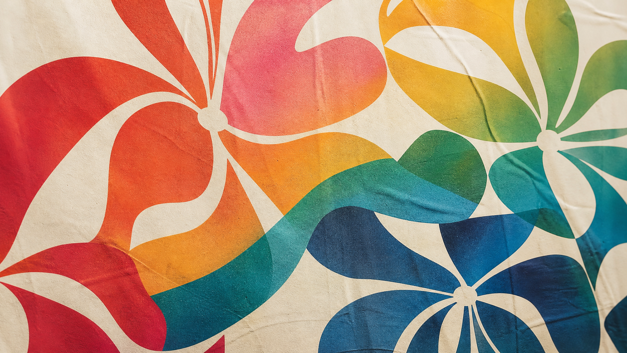
Rob’s side of the project is especially useful for designers who think across still and animated work. He called out Cavalry’s Deformers and named the oscillator as a favorite. Those choices are not abstract preferences; they connect directly to what appears in the poster.
The oscillator shaped the movement of color across the text that formed the flowers in his poster. In other words, the tool did more than add surface treatment. It helped generate the internal behavior of the composition, even though the final piece is static.
That is where motion-aware tools start to change the look of design before anything animates on screen. Repetition feels less mechanical. Color transitions gain a clearer sense of timing. Forms built from text or repeated components can feel more alive without losing control.
For readers thinking beyond print, that logic connects naturally to tools built for seamless logo loops and other repeatable motion systems. A convincing animated identity usually starts with the same discipline: controlled variation, editable parts, and behavior that serves the form.
Visible outcomes matter more than long feature lists
Software coverage often collapses into inventories. This project is more useful because the features are tied to visible results. Melina’s tools supported detail retention and fluid editing. Rob’s tools shaped color movement across text-built flowers.
That is a better way to evaluate any design platform. A feature only earns its place when you can draw a clear line from the control to the page. If the result is hard to name, the feature may be impressive but unnecessary.
Designers handling brand assets run into this constantly. The wrong tool can offer more options while delivering less clarity. The right one shortens the distance between decision and result, and makes that result easier to repeat.
- Useful software preserves momentum when a project moves between related tasks.
- Useful software protects detail without making edits brittle.
- Useful software creates reusable parts instead of trapping value in one final file.
- Useful software links controls to outcomes so the visual result stays legible.
Downloadable kits make the craft visible
The most generous part of this partnership may be the downloadable design kits. Finished posters can inspire, but editable files teach something more specific. They expose layers, structure, and decisions that polished presentation usually conceals.
That raises the standard for how creative work gets shared. The poster is not treated as a sealed artifact. Instead, other creatives can inspect, adapt, and learn from working parts.
It also reflects a broader shift in design culture. Access to process often matters more than access to a flattened image. DanceLogo touched that point in lowering the floor without flattening the build: wider participation works best when the craft itself remains visible.
Trust grows when software leaves room for difference
The clearest takeaway is not that one workflow should become another. It is that different creative voices need tools that do not force the same visual accent.
Melina’s process leans on fluid movement between vector and pixel work, with close attention to detail. Rob’s process leans on deformers, oscillation, and color behavior across typographic forms. Same commission structure, different results. That is a healthy sign.
Creative software earns trust when it lets designers keep their habits, preferences, and visual signatures intact while making the work easier to build. If the tool steps back just enough for the idea to sharpen, it has done its job.
And when that same process can produce both a finished poster and a reusable kit, the work keeps moving after the first reveal. That is a practical kind of creative freedom, and it tends to make the design stronger.
 Logo Template
 Icon Template
 Icon Template
 Logo Template