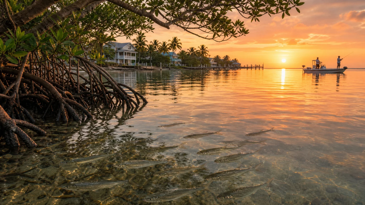
Generic civic marks usually give themselves away quickly. A sun, a shoreline, a broad claim about community, and the place starts to blur into every other coastal identity. The Greater Pine Island Civic Association’s new logo takes a firmer route by choosing imagery with real local weight.
Unveiled at the organization’s August 2026 membership meeting, the logo centers local identity and environmental protection. That pairing carries the association’s long history in visual form, since it has worked since 1957 to protect Pine Island from overdevelopment and to keep native habitats intact. The mark is not simply naming a place. It is showing what the organization believes deserves care.
Specific imagery gives the logo its strength
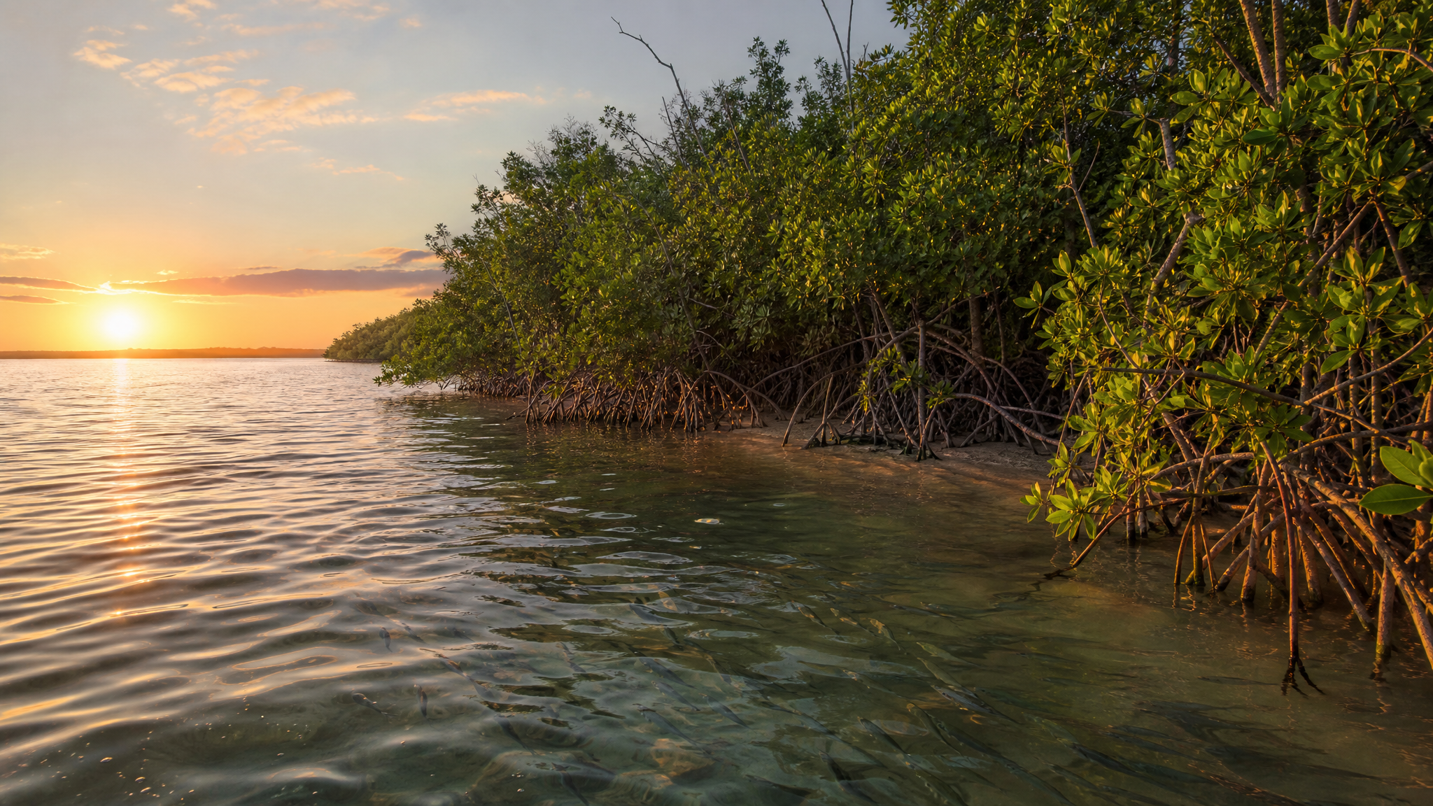
The logo features mangroves, mullet, and a sunset view. Those elements do more than decorate the mark. Each one acts as a local signal with a distinct role.
Mangroves suggest habitat, shoreline structure, and ecological defense. Mullet brings in living water and visible motion. The sunset view opens the scene and adds atmosphere, which keeps the logo from reading like a technical environmental badge.
That combination makes the identity feel credible. A logo is easier to remember when it chooses forms tied to an actual place instead of relying on familiar coastal shorthand.
Mission and image move together
The association presents the logo as a reflection of its anti-overdevelopment and habitat-preservation mission. That alignment is where the design does its best work. When visual choices mirror institutional purpose, the logo stops feeling like a surface update and starts reading as a public statement.
For civic and nonprofit organizations, that matters in everyday use. People encounter the mark in meeting notices, community communications, and advocacy settings. A logo that carries the mission clearly can narrow the gap between what an organization says and what it appears to stand for.
There is restraint here too. Overdevelopment is a charged issue, but the logo does not push through confrontation. It shows what is being protected instead, which gives the identity a steadier performance over time.
A local designer was the right fit for a local mark
The logo was designed by Bokeelia artist and graphic designer Nancy R. Koucky of NRK Designs. That detail matters because civic identity often improves when the designer understands the textures of the place being represented.
Local knowledge does not guarantee good design, but it can sharpen selection. Choosing mangroves, mullet, and a sunset view suggests attention to what residents would recognize as part of Pine Island’s visual signature, not just what visitors might expect. That makes the result feel more rooted in the community and less borrowed from a template.
This kind of fit is especially useful for an organization that needs to look distinctive without becoming overly narrow. A civic mark has to hold its shape across many contexts while still feeling specific enough to remember.
Good process often sounds simple from the outside
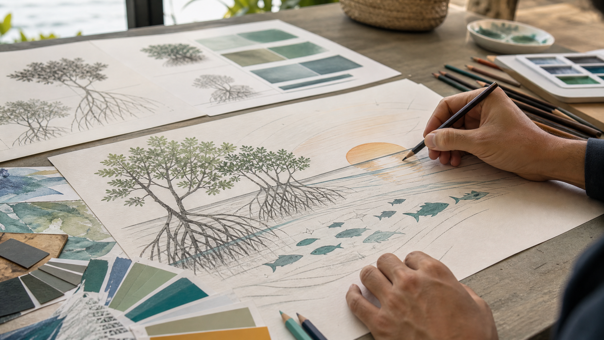
One small detail in the logo’s development stands out: the board’s ideas were translated into a final image that the organization believes represents it well. The phrasing sounds ordinary, but it points to the real work of identity design.
Boards usually speak in priorities, memories, concerns, and attachments. Designers have to turn that material into form. They decide what to combine, what to leave out, and how to keep the mark from becoming a crowded checklist.
When that translation works, the finished identity can seem obvious in retrospect. In practice, that kind of clarity comes from selection, editing, and timing.
Why this kind of logo tends to last
Place-based civic logos tend to last when they avoid two common problems: vague symbolism and overloaded messaging. This one appears to avoid both. Its imagery is concrete, and its purpose is coherent.
Mangroves, mullet, and a sunset view are enough to create a recognizable scene without turning the mark into an illustration that cannot scale across formats. Just as important, those elements connect to a long-running mission of protecting the island and its habitats. That gives the logo a reason to exist beyond novelty.
The practical lesson is straightforward. If an organization already knows what it defends, the identity does not need to invent meaning. It needs to arrange existing meaning into a clear visual rhythm.
What other civic groups can learn from it
This logo shows that small organizations do not need grand visual systems to say something distinct. They need careful selection. A few elements, chosen well and tied directly to mission, can carry more weight than a polished but generic emblem.
It also shows the value of designing from what is protected rather than from what is promoted. That shift changes the emotional tone of the identity. Instead of selling an image of place, the logo honors the place itself.
For communities dealing with growth pressure, habitat loss, or identity drift, that is a useful model. Start with what residents know, what the landscape actually contains, and what the organization has spent years defending. Strong civic marks often come from that sequence, and they tend to hold their form long after the unveiling moment passes.
 Photo Template
 Icon Template
 Photo Template
 Icon Template