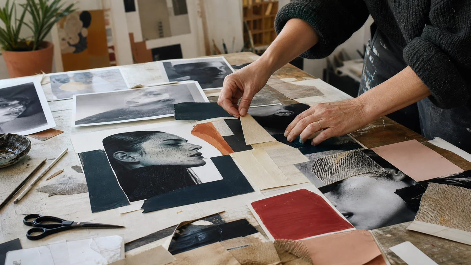
A photograph usually promises a clean instant. Handmade collage photography breaks that promise in a useful way. The camera captures the starting point, then paint, scissors, drawing, and reassembly turn it into something slower, rougher, and more personal.
That shift matters because it shows where a real visual signature often begins. Some styles are easy to recognize and difficult to account for. Here, the answer sits in the method: every piece starts with a photograph, and everything after that is made by hand through painting, cutting, drawing, and whatever else the work needs.
Style holds when the process can carry it
A distinct look often collapses when it is treated as a finish added at the end. In this work, the opposite happens. The collage effect is not a filter laid over the image; it is built through a chain of physical decisions until the photograph changes character.
That difference has practical value. When style grows out of process, it can move across portraits, editorial work, and commissions without feeling like a copy of itself. Consistency comes less from repeating one surface trick and more from repeating the same way of seeing and making.
Why the handmade steps change the image
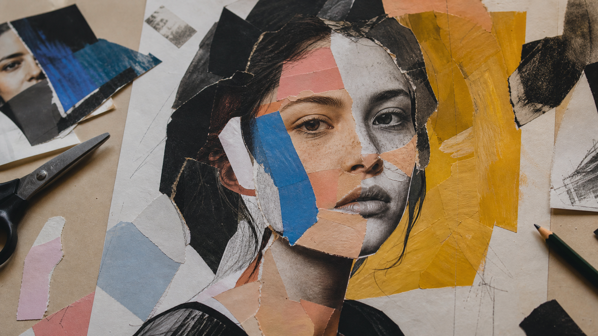
Painting over prints, cutting them up, and collaging them back together introduces friction. Edges stop behaving perfectly. Colour becomes a block instead of a gradient. Space feels assembled rather than captured in a single moment.
The viewer reads that change immediately. A polished photograph often asks to be consumed quickly, while a handmade collage slows the eye and redirects attention toward layers, interruptions, and visible choices. You can feel where the maker stepped in.
For brand and editorial designers, that is a useful correction. Precision is not always the same as clarity. A small amount of visible construction can make an image more memorable because it gives form a human pulse.
References work best when they direct choices
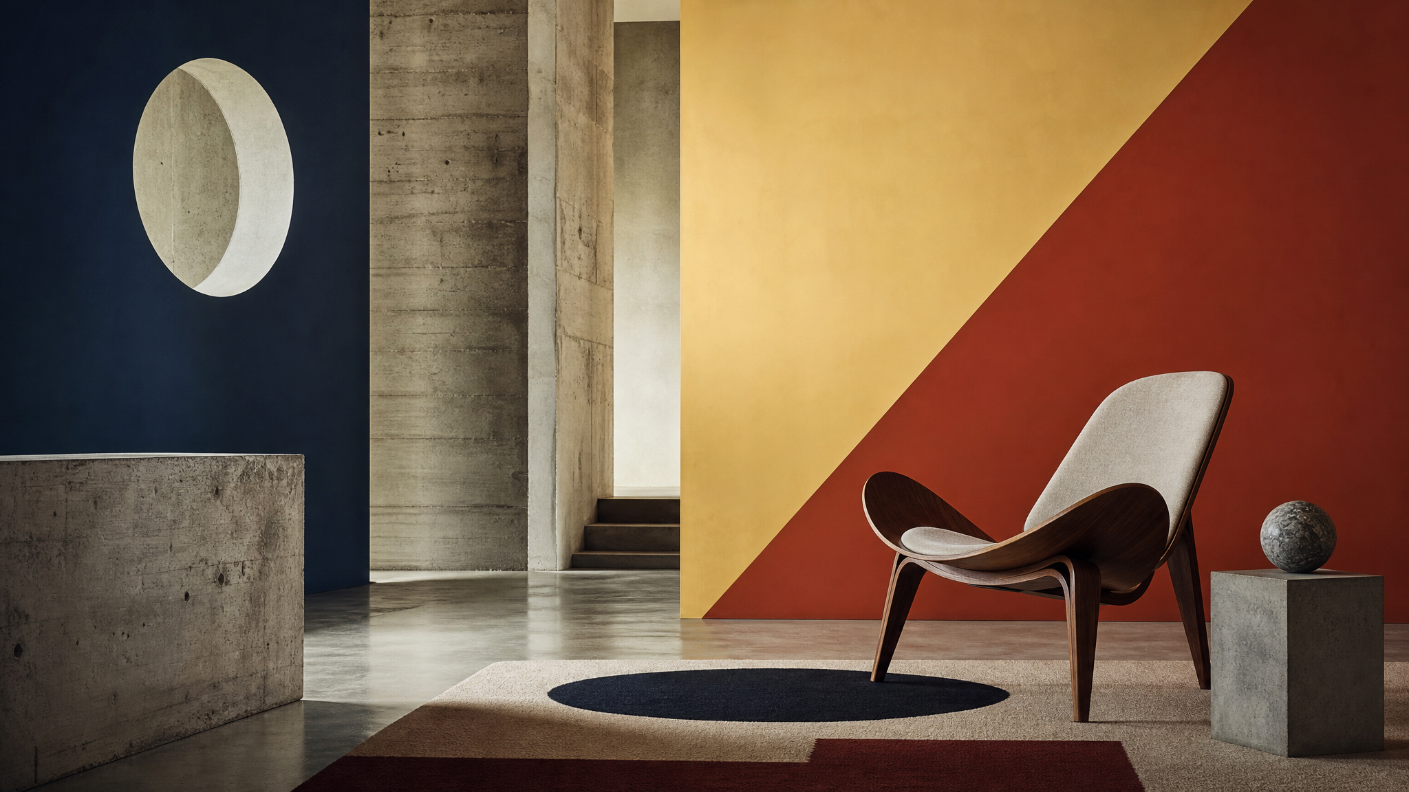
The visual world around this practice is broad but coherent. Influences include Bill Brandt and Richard Avedon, old Olympic posters, and the mid-century presence of a Panton chair designed by Verner Panton. There is also inspiration in the Design Museum’s Brutalist and Bauhaus feel.
None of those references sit in the work as decoration. They act more like structural cues. Brandt and Avedon point toward photographic control and character, Olympic posters suggest bold graphic simplification, the Panton chair introduces sculptural form and design history, and the museum references push the composition toward shape, contrast, and disciplined arrangement.
Designers often gather references too loosely, then wonder why the final piece feels scattered. The stronger approach is to give each reference a job. One guides proportion, another colour blocking, another posture, another backdrop.
Career momentum often follows a clear point of view
There is a simple professional lesson in how this work moved. Posting the painterly collage style online led directly to early commissions from Carhartt and Isabel Marant. Later projects included work connected with Speedo, Little Simz, and Nigo for the Design Museum.
That sequence is worth noticing. It is easy to assume commissioned work appears only after a portfolio proves enough range. In practice, clients often respond first to a strong point of view because they can imagine how it will behave in their world.
A specific signature gives people something to remember and something to request. It does not fit every brief, but it improves recall. In crowded visual fields, recall does a lot of work.
Why hybrid practice can feel more alive than screen-only making
There is also a deeper working philosophy inside this approach. The route runs from Jersey to art college, then Manchester Met, then assisting under Antony Crook, before settling into a practice that mixes photography with physical making. That development helps explain the balance in the work: photographic discipline on one side, tactile experimentation on the other.
The appeal is easy to understand. Screen-based workflows can flatten decision-making into endless reversible edits. A handmade process creates commitment, because once you print, paint, cut, and paste, each move leaves evidence.
That evidence becomes part of the finished image. Even for teams that are not literally making collages, the lesson is clear: build stages into the workflow that force real choices. Print contact sheets, mark them up by hand, and reduce the number of revisions before selecting a direction.
A visual signature gets stronger when the maker chooses a process that leaves traces of judgment behind.
What designers can borrow without copying the look
The most useful lesson here is not to imitate painterly cut-and-paste photographs. It is to ask which part of your own process could play the same role. That might be a habit of reducing backgrounds into bold planes, a preference for sculptural furniture, poster-like framing, or a hand-drawn interruption that cuts through perfect polish.
These are not decorative extras. They are decision systems. Repeated across enough projects, they become your signature.
Three practical takeaways
- Start with a dependable base. In this case, every image begins with a photograph. Your own base might be a grid, a sketch, a still frame, or a material study.
- Add one layer of human intervention that cannot be mistaken for software default. Paint, crop, trace, mask, rearrange, or rebuild.
- Choose references that control specific decisions. Let one source guide shape, another tone, another composition, rather than collecting mood indiscriminately.
Handmade collage photography makes a strong case for style as a consequence of method. Memorable images do not need more decoration. They need clearer decisions, stronger references, and a process sturdy enough to carry both.
 Photo Template
 Photo Template
 Photo Template
 Photo Template