When a Slow Load Costs a Booking
Imagine a potential guest, scrolling through hotel options on their phone during a commute. They tap a promising link, expecting a smooth experience, but the page loads slowly, images stutter, and the layout feels cramped. This initial friction often leads to an immediate bounce, a lost booking, and a missed opportunity for direct revenue. A mobile-optimized hotel booking engine must load quickly on mobile connections, avoiding these slow first impressions that can derail the entire journey.
The challenge isn’t just about speed; it’s about adapting the entire booking experience to the unique constraints and behaviors of mobile users. What works on a desktop with a large screen and stable connection often fails on a phone with a smaller display, touch interface, and potentially unreliable cellular data. Hotels frequently lose direct bookings because their mobile interfaces are not truly optimized, instead relying on desktop-style forms that are cumbersome on a phone.
Streamlining the Path: Aiming for Three Screens or Fewer
One of the most significant friction points in mobile booking flows is excessive screen count. Users on mobile devices prefer a concise, direct path to completion. Hospitality booking guidance suggests that the entire booking path should ideally fit into three primary screens or fewer. Each additional tap or page load introduces a new opportunity for abandonment.
Consider a traditional desktop booking process that asks for guest details, room preferences, add-ons, and payment information across five or six distinct pages. On a mobile device, this becomes a frustrating gauntlet. Instead, consolidating information, using accordions for optional details, and presenting essential choices clearly on fewer screens can dramatically improve completion rates. This approach respects the user’s limited attention span and the physical constraints of mobile interaction. For example, combining guest details and room preferences onto a single scrollable screen, using clear section headers, reduces the perceived effort. This design choice directly addresses the common mobile user behavior of preferring to scroll rather than navigate multiple pages.
Visible Calls to Action and Real-time Availability
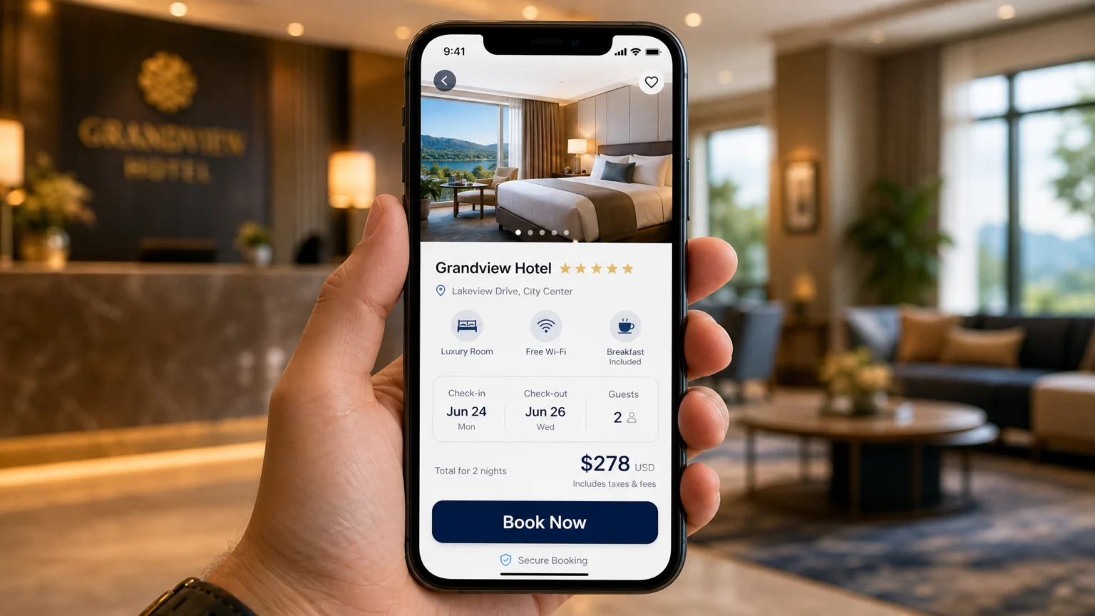
Once a guest has found a suitable room, the call to action (CTA) must be unmistakable. On a small screen, a subtle button can easily be overlooked or mis-tapped. Responsive design principles emphasize visible CTAs that are large enough for easy tapping and clearly communicate the next step, such as “Book Now” or “Confirm Reservation.” These buttons should stand out visually through contrast and placement, guiding the user forward without ambiguity.
Beyond clarity, accuracy is paramount. There’s nothing more frustrating for a guest than selecting a room, only to find it unavailable during the final steps. To prevent this, live availability should come directly from the Property Management System (PMS). This direct integration reduces the risk of inventory mismatches, ensuring that what the guest sees as available is genuinely bookable, fostering trust and reducing last-minute cancellations due to system errors. This real-time data flow is crucial for maintaining user confidence and preventing frustration, which often leads to abandonment.
Simplifying Forms and Payment for Mobile Users
Long, multi-field forms are notorious conversion killers on mobile. Typing on a small virtual keyboard is tedious, and errors are common. A hotel booking UX case study example highlights the importance of minimizing form fields and supporting autofill where possible. For instance, instead of requiring a full address entry, consider using location services or smart suggestions to pre-populate fields. Only ask for information that is absolutely essential for the booking. This might mean collecting only the guest’s name, email, and phone number initially, and deferring less critical details until after the booking is confirmed, or using progressive disclosure to reveal fields only when necessary.
The payment process is often the final hurdle. Mobile booking guidance from Stripe stresses the need for payment flows optimized for cellular connections, large tap targets for card details, and autofill support. Offering mobile-friendly payment options like digital wallets (e.g., Apple Pay, Google Pay) can significantly streamline this step, allowing guests to complete transactions with a single tap or biometric authentication, bypassing manual card entry entirely. This not only speeds up the process but also enhances security and convenience for the user.
Pricing Transparency and Detail Visibility
Hidden fees or unexpected charges at the end of the booking process are a major cause of abandonment. A transparent approach builds trust and confidence. The same UX case study example recommends showing ratings and pricing early in the process. Furthermore, all fees and taxes should be clearly listed and itemized before the guest reaches the final payment screen. this helps there are no surprises, allowing guests to make informed decisions without feeling misled. Presenting a clear breakdown of costs, including room rate, taxes, and any resort fees, upfront helps manage expectations and reduces last-minute drop-offs.
Similarly, room details and amenities should be easily accessible without navigating away from the main booking flow. Concise bullet points, clear icons, and expandable sections can present information effectively on a small screen. This visibility helps guests confirm their choice and reduces anxiety about what they are booking. For instance, a small expandable section detailing “Room Features” or “Amenities Included” allows users to quickly verify key aspects without cluttering the main view.
Maintaining Brand Consistency Across the Journey
A consistent brand experience from the initial search to the final confirmation email reinforces trust and professionalism. A hotel booking flow should keep the brand experience consistent and avoid sending guests to a separate, generic booking site. When a user is unexpectedly redirected, it can feel jarring and raise security concerns, leading to abandonment. The design, colors, typography, and tone should remain consistent with the hotel’s main website, creating a cohesive and reassuring journey. This seamless transition builds confidence and reinforces the hotel’s identity throughout the booking process.
This consistency extends to how information is presented. For example, offering both map and list-based sorting options for rooms or properties caters to different user decision styles, maintaining a flexible yet on-brand experience. Analytics should track the full booking journey, including search, room views, cart actions, and payment abandonment, to identify exactly where brand consistency might be breaking down or where users are encountering unexpected friction. Understanding these points allows for targeted improvements, ensuring a smooth and branded experience from start to finish.
Verifying Your Mobile Booking Flow
To ensure your hotel’s mobile booking flow is truly optimized, conduct regular audits against established UX best practices and hospitality-specific guidance. Focus on loading speed, aiming for near-instant responsiveness on various mobile networks. Test the booking path on different devices to confirm it truly fits into three screens or fewer, minimizing unnecessary steps. Verify that CTAs are prominent and actionable, and that all forms are as short as possible with autofill enabled. Consider using tools like Google’s PageSpeed Insights to identify and address performance bottlenecks.
Crucially, confirm that pricing is transparent from the outset and that payment options are secure and mobile-friendly. By systematically addressing these friction points, hotels can transform high bounce rates into confirmed bookings, turning mobile browsing into a reliable revenue stream. For a deeper dive into visual hierarchy and pacing on mobile, consider how mobile typography choices impact readability and user flow. Additionally, explore strategies for winning mobile bookings to further enhance your direct booking capabilities. Regularly reviewing user feedback and A/B testing different design elements can also provide valuable insights for continuous improvement.
 Photo Template
 Logo Template
 Icon Template
 Logo Template