
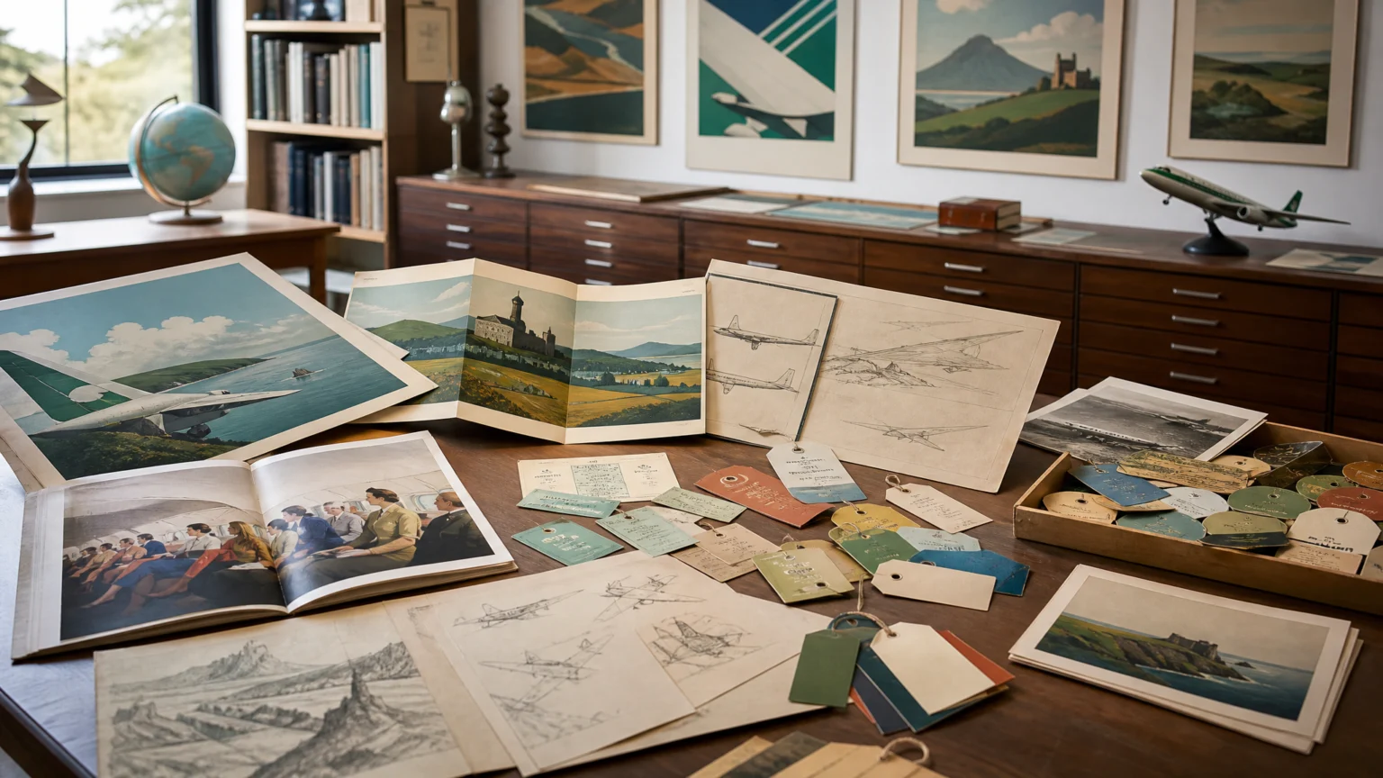
A travel poster can look effortless on the wall and still carry a serious public job. In Ireland, aviation and tourism graphics helped turn movement, print, and national image into a shared visual language for a modern country.
Design history is often flattened into style, as if color and composition sit apart from politics or infrastructure. Irish visual culture offers a sharper view. Flight worked as a practical system and a symbolic one at the same time, and graphic design made both visible.
Design as a public face for modernization
Flight served as a central thread for understanding how design and print helped construct Irish national identity, support modernization, fuel economic expansion, and position Ireland politically on an international stage. That is a wide brief for graphic design, but the logic is plain. When a country is shaping how it appears abroad, every printed surface starts to count.
That is what makes aviation and tourism material so valuable to study. A ticket is small, a poster takes the wall, a brochure sits in the hand, and an in-flight publication extends the experience over time. Together, these pieces set a clear direction. They show what the country looks like, how modern it feels, and what kind of future it claims.
For brand teams now, the lesson is immediate. Identity is rarely built by one hero mark. It is built through repeated contact across formats, each piece carrying the same signature in a slightly different register.
The artifacts show how identity takes form
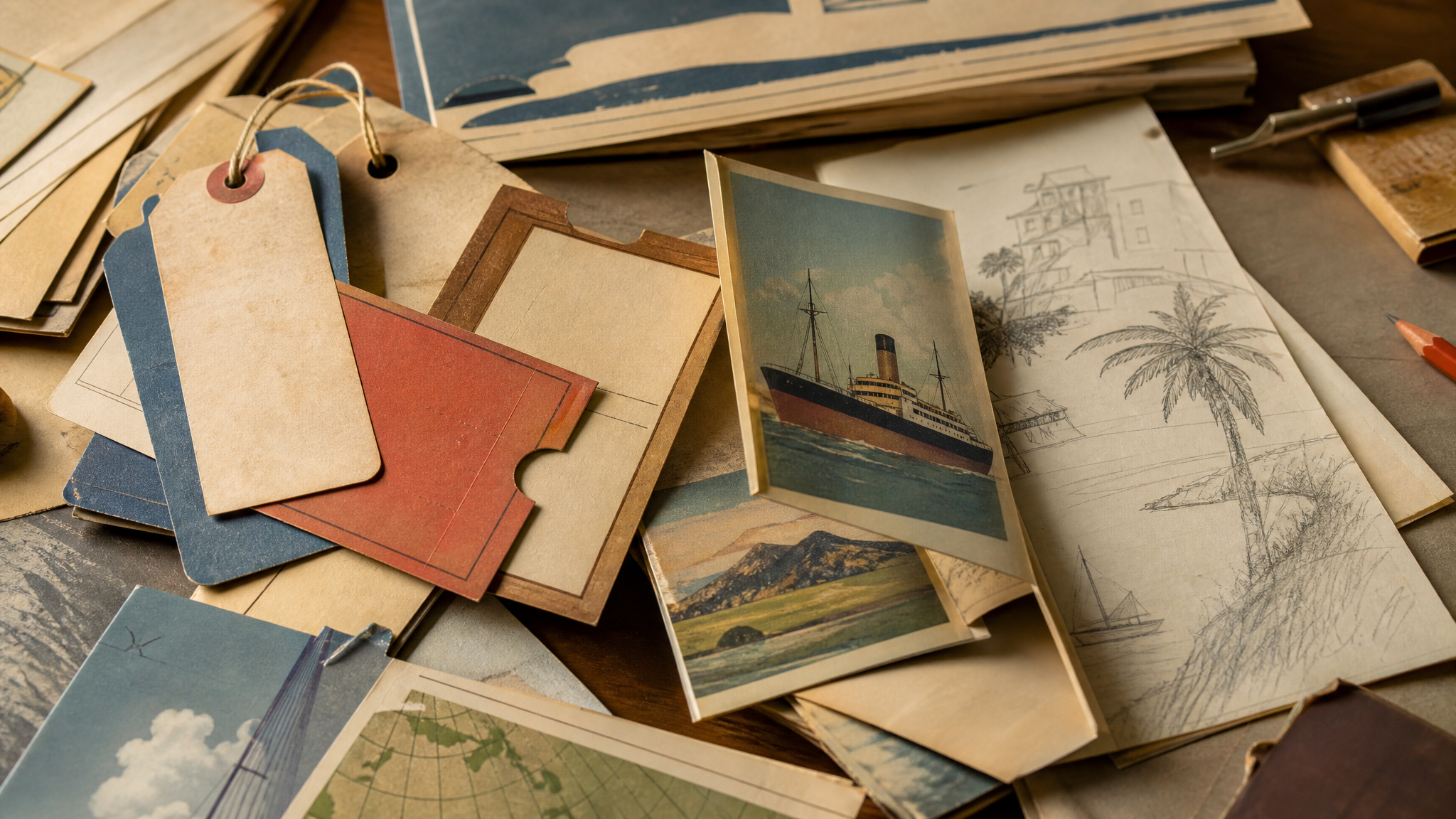
The surviving materials are specific and varied: travel posters, original sketches, brochures, tickets, baggage labels, in-flight publications, and newsreels. That range matters because it shows design working across spectacle and routine. Some objects call for attention at a distance; others quietly organize the experience in the background.
Posters usually hold the most visual drama. They can compress landscape, aspiration, transport, and national image into a single frame. But tickets and baggage labels tell an equally useful story, because they bring branding into the ordinary mechanics of travel, where trust and clarity matter as much as charm.
Original sketches are especially revealing because they show decisions before they settle into finished form. You can see what needed emphasis, what could be simplified, and which image was chosen for repetition. Newsreels widen the frame again, adding circulation and performance to the printed record.
Imported talent helped shape local design practice
Irish visual culture in this period was not sealed off or purely domestic. Dutch designers who arrived in Ireland from 1951 onward, including Guus Melai, Jan de Fouw, and Willem van Velzen, had a huge impact on Irish design development. That matters because national identity often takes shape through exchange, adaptation, and outside expertise working inside local institutions.
There is no contradiction in that. A national image does not weaken because international designers helped shape it. In many cases, distance sharpens observation. Designers arriving from elsewhere can spot what feels distinctive, what needs structure, and which visual habits are ready to change.
For branding work, that is a practical point about authorship. A visual identity may stand for a place, but it is often built collaboratively by people with different training, references, and methods. The result can feel more coherent when the system is disciplined.
The work extended beyond aviation
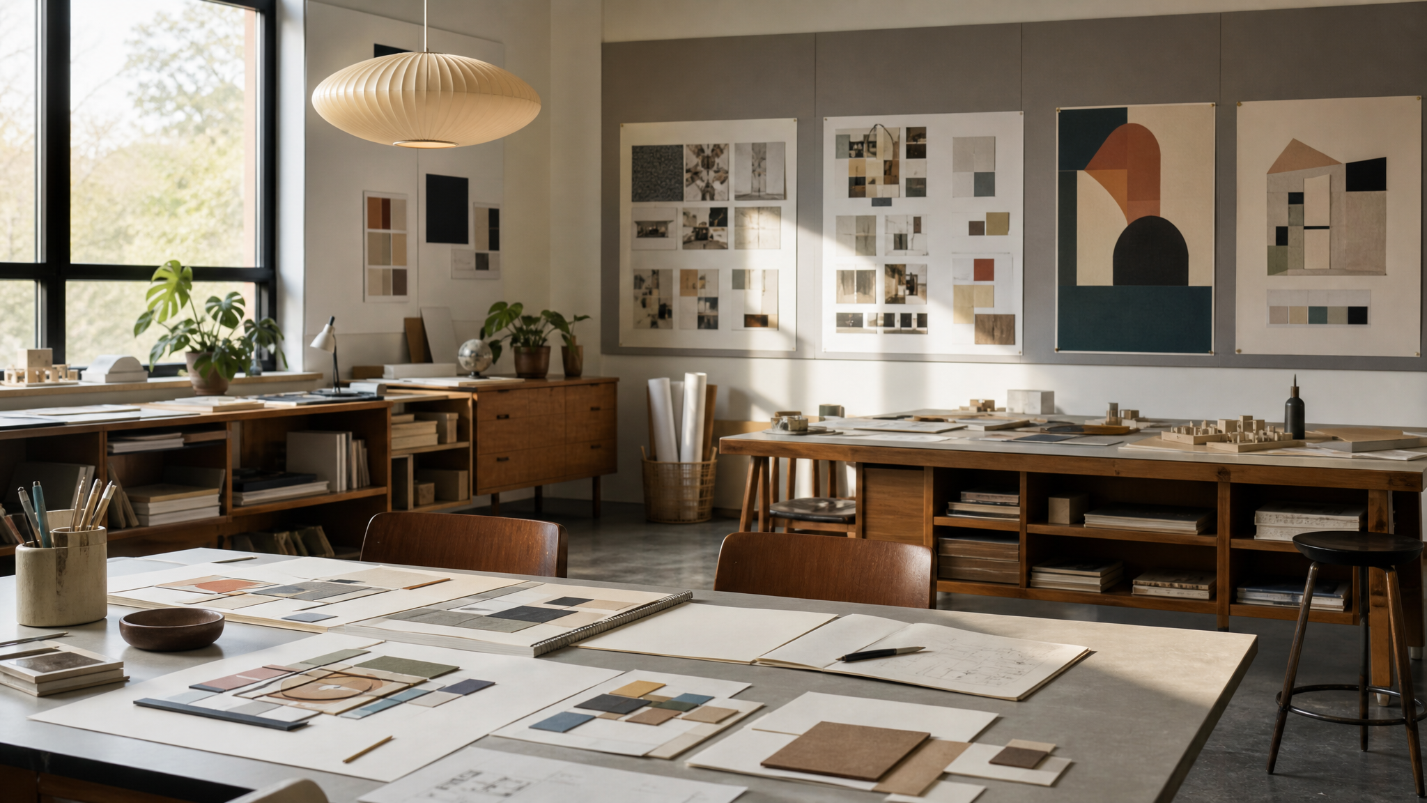
These designers did not remain tied to aviation alone. They became highly sought after and were commissioned by other influential Irish companies and institutions, including Bord Fáilte, John Hinde, RTÉ, and Guinness. That shift is one of the clearest signs that a design approach has force. It moves from one assignment into a broader commercial and cultural field.
Once a visual method proves it can organize public attention, other institutions want the same clarity. Tourism boards need persuasive imagery. Broadcasters need recognizability. Consumer brands need memorability without clutter. The same core skills travel well: simplify, frame, repeat, and keep information legible.
This spread across clients also suggests that modernization was not expressed through one isolated campaign. It was reinforced across sectors. A traveler, viewer, or shopper could meet related standards of design in different settings, and that repetition would make modernity feel less like a slogan and more like everyday life.
Education turned style into practice
The story does not end with commissions. Some of these designers also worked as adjunct faculty in Dublin art and design schools, influencing Irish design education as well. That role is easy to underestimate, but it may be the most durable part of the story.
When practitioners teach, they pass on more than taste. They transmit process, standards, critique habits, and professional expectations. A recognizable visual culture lasts longer when it enters the classroom and becomes part of how younger designers learn to see and make.
This is where professionalization takes shape. Design stops looking like a series of isolated jobs and becomes a discipline with methods, peers, and continuity. For a country building a visual identity, that matters as much as any single poster.
Why this history still feels current
The Irish example is useful because it shows design operating at several scales at once. It sells travel, supports institutions, frames national self-image, and shapes how future designers work. That layered value is still what the strongest identity systems aim for.
It also pushes back against the habit of treating branding as surface decoration. In this case, visual choices took part in how a nation presented itself during modernization and economic expansion. Palette, image construction, printed matter, and message circulation all contributed to a broader public image.
The practical lesson is simple: look beyond the hero asset. Study the full family of materials, from the attention-grabbing poster to the disposable label, because brand meaning often settles in the pieces people handle most.
When design helps a place appear modern, credible, and distinct, it is doing cultural work as well as commercial work.
These Irish artifacts remain more than attractive historical objects. They show how visual systems can give a country a face, a tone, and a sense of arrival through repetition, circulation, and careful use across the whole journey.
 Icon Template
 Photo Template
 Logo Template
 Photo Template


