
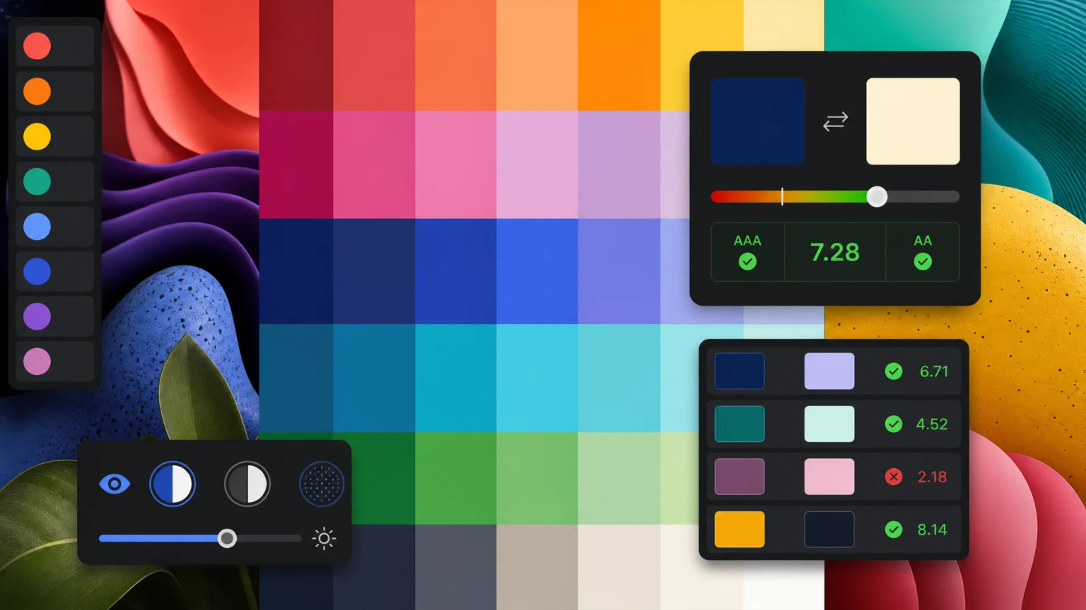
Prioritize Brand Primaries and Their Attributes
Imagine a vibrant, expressive brand that uses a signature bright yellow. While visually striking, this yellow might struggle to meet accessibility standards when paired with white text. Instead of discarding such a core color, the process begins by acknowledging its emotional weight and how it defines the brand’s personality. The goal is to systematically ensure accessible application without diluting the primary’s impact. This means understanding a color’s role in the overall visual message, not just its aesthetic appeal.
For example, a brand aiming for a sophisticated, minimalist feel might select a deep charcoal as a primary. This color conveys elegance, but its contrast with white text could be insufficient in certain contexts. The solution isn’t to switch to a stark black. Instead, explore how that charcoal interacts with other approved brand colors. Or, introduce a lighter accent that provides the necessary contrast without compromising the primary’s character. The University of Arizona’s accessibility guidelines suggest starting with brand primaries and documenting approved pairings, a practical first step for any design team.
Systematically Calculate Contrast Ratios for All Pairings
Once primary brand colors are established, the next critical step is to rigorously test their contrast ratios. The Web Content Accessibility Guidelines (WCAG) provide specific thresholds to ensure readability for users with various visual impairments. For normal text, a contrast ratio of at least 4.5:1 is required. Large text, defined as 18pt or 14pt bold, needs a minimum ratio of 3:1. Crucially, non-text UI components and graphical objects, such as icons or input fields, also require a 3:1 contrast ratio against adjacent colors to be perceivable. The WCAG 2.1 Success Criterion 1.4.3 and 1.4.11 detail these requirements, with the contrast ratio calculated using the formula (L1 + 0.05) / (L2 + 0.05), where L1 is the relative luminance of the lighter color and L2 is the relative luminance of the darker color, ranging from 1 to 21. For a documented checkpoint, compare this step with Color contrast – MDN Web Docs.
This isn’t a one-time check but an iterative process. Consider a brand using a light pastel green for headlines and a slightly darker green for body text. While these colors might feel cohesive, their contrast could fall below the 4.5:1 threshold for normal text. To resolve this, one might darken the body text color or lighten the background color, carefully re-evaluating the ratio after each adjustment. Numerous online tools are available to help calculate these ratios, making it easier to test combinations quickly and efficiently. UCLA’s brand guide emphasizes the importance of using approved color combinations that meet WCAG AA and AAA contrast thresholds, underscoring the need for documented, tested pairings across all brand applications. Another useful checkpoint is Contrast ratio – WCAG WG.
Integrate Utility Colors and Semantic Meaning
Beyond primary and secondary brand colors, a complete palette includes utility colors for specific functions. These might include error messages, success notifications, or interactive states. These colors also need to adhere to accessibility standards while maintaining brand consistency. For instance, a brand might use a vibrant red for errors. While visually striking, if this red is placed on a light gray background, its contrast might be insufficient. The solution involves selecting a shade of red that is both on-brand and meets the 4.5:1 contrast ratio against the background color, or ensuring the background itself provides sufficient contrast. This careful selection ensures that functional colors are both effective and inclusive.
Furthermore, consider the semantic meaning of colors. Red often signifies danger or error, green for success, and blue for information. These associations are deeply ingrained and should be respected, but never relied upon exclusively. For users with color vision deficiency, relying solely on color to convey meaning can create significant barriers. Always pair color cues with other visual indicators, such as icons, text labels, or patterns. For example, an error message should not just be red text; it should also include an error icon and clear descriptive text, ensuring the message is understood regardless of color perception. This multi-modal approach strengthens communication for all users.
Test in Context and Simulate Color Blindness
A color palette might look good on paper or in a style guide, but its true test comes in real-world application. Colors interact differently depending on the surrounding elements, screen brightness, and viewing environment. Testing colors in context means applying them to actual UI components, marketing materials, and digital interfaces. This allows designers to catch issues that might not be apparent during isolated testing. For example, a brand’s primary blue might have excellent contrast with white text. However, when used as a button background next to a complex photographic image, its legibility might decrease due to visual clutter. This contextual testing is vital for identifying practical limitations.
Simulating various forms of color blindness is another critical step. Approximately 8% of men and 0.5% of women have some form of color vision deficiency. Tools that simulate conditions like protanopia (red-green blindness), deuteranopia (red-green blindness), and tritanopia (blue-yellow blindness) can reveal problematic color combinations. For instance, a brand using a red-green combination to distinguish between two data points might find that for a significant portion of its audience, these points appear indistinguishable. In such cases, adding texture, patterns, or direct labels becomes essential, as recommended by the University of Arizona’s guidelines. this helps that critical information is conveyed effectively to everyone, regardless of their color perception.
Document Approved Pairings and Usage Guidelines
The final step in building an accessible brand color palette is to document all approved color combinations and their specific usage guidelines. This living document, often part of a comprehensive brand style guide, should clearly outline primary, secondary, and utility colors, along with their hexadecimal, RGB, and CMYK values. Crucially, it must specify which color pairings meet WCAG contrast requirements for different content types (normal text, large text, UI elements). This detailed documentation serves as a reliable reference for all brand applications.
Consider a brand with a vibrant yellow as a primary color. The guidelines might specify that this yellow can only be used for large headlines against a dark background, and never for body text. It might also detail an approved darker shade of yellow or a complementary dark accent color that provides sufficient contrast when the primary yellow is used as a background. Clear examples of correct and incorrect usage, along with the calculated contrast ratios for each pairing, empower designers and content creators to maintain consistency and accessibility across all brand touchpoints. This proactive approach ensures that brand expression never comes at the expense of inclusivity, providing a robust framework for visual communication.
Refining Your Palette for Diverse Applications
An accessible color palette isn’t static; it evolves with your brand and its applications. Once the core palette is established and documented, consider how it translates across different mediums. A color that works well on a brightly lit digital screen might appear muted or lose contrast in print, or on a projected presentation. This requires a nuanced understanding of color reproduction and how various display technologies render hues. For example, a brand’s signature blue might need slight adjustments in saturation or lightness to maintain its intended impact and accessibility across both web and print materials. Regularly reviewing and adapting your palette for new contexts ensures its longevity and effectiveness.
Furthermore, think about the emotional impact of your colors in different cultural contexts. While some color associations are universal, others are culturally specific. A color that signifies joy in one region might convey mourning in another. While accessibility focuses on legibility, cultural sensitivity ensures your brand message is received as intended globally. This doesn’t mean creating entirely separate palettes for every region, but rather being aware of potential misinterpretations and, where necessary, offering alternative color combinations or visual cues. This thoughtful approach extends accessibility beyond mere contrast ratios to encompass a broader understanding of user experience.
Maintaining and Evolving Your Accessible Brand Palette
Building an accessible color palette is an ongoing commitment, not a one-time task. As digital standards evolve and new technologies emerge, your brand’s visual identity must adapt. Regularly audit your existing color applications against the latest WCAG guidelines, especially as new versions are released. This might involve re-evaluating contrast ratios for new UI components or testing how your colors perform on emerging display types, such as high-dynamic-range (HDR) screens. Establishing a schedule for these audits ensures your brand remains compliant and inclusive over time.
Consider creating a dedicated accessibility champion or team within your organization. This individual or group can be responsible for maintaining the color guidelines, educating new team members, and advocating for accessibility best practices. They can also serve as a resource for designers and marketers, helping them make informed decisions about color usage in specific projects. By embedding accessibility into your brand’s operational workflow, you foster a culture where inclusive design is a fundamental principle, not an afterthought. This proactive management ensures your brand’s personality shines through, clearly and accessibly, for every audience member.
 Photo Template
 Icon Template
 Logo Template
 Logo Template