Multi-country event branding usually hits the same friction point. Push too hard on unity and local character disappears; lean too far into each host and the system starts to split. AFCON PAMOJA 2027 solves that problem with one form sturdy enough to carry both.
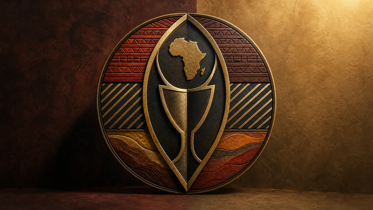
CAF has unveiled the official logo and visual identity for the 2027 Africa Cup of Nations, branded as AFCON PAMOJA 2027. The name is central to the idea: pamoja means together in Swahili, and the identity uses that idea to express unity among Kenya, Tanzania, and Uganda.
The shield sets the idea in place

The main formal inspiration is the traditional East African shield. That is a strong choice because the object already carries identity, protection, pride, and belonging, so the mark begins with cultural meaning instead of asking the viewer to supply it.
It also gives the system a clear point of origin. Rather than reaching for a generic sports badge, the identity starts from a regional object with real recognition, which keeps the design anchored to place.
Geometry keeps the form steady
The shield shape is built from two intersecting circles of equal radius. That construction detail helps explain why the outline feels controlled and balanced instead of loosely drawn.
This kind of geometry does quiet practical work. It supports cleaner reproduction, makes the mark easier to redraw consistently, and gives the identity a dependable signature across tickets, screens, signage, and merchandise.
That balance between symbolism and structure is worth noticing alongside Brisbane 2032’s disciplined use of a shared outline. In both cases, a strong outer form makes room for layered meaning without losing clarity.
The center stacks meaning carefully
At the center of the shield stands the silhouette of the AFCON trophy, crowned by the outline of the African continent. The hierarchy is compact and clear: the trophy names the competition immediately, while the continent widens the frame beyond any single venue or host nation.
That stacking matters because sports marks can crowd themselves quickly. Here, the outer shield contains the central symbols and keeps the composition readable.
Color creates unity without sameness
The official logo brings together the colors of the three host nations. That works symbolically, but it is also a practical design move, because shared color is one of the fastest ways to show that separate parts belong to one system.
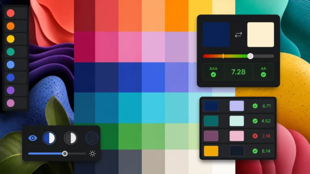
Distributed identities often need that kind of structure. The same principle appears in accessible color palettes that still express distinct brand personality: a palette needs enough order to stay coherent and enough variation to avoid flattening everything into one voice.
Here, the palette does not read like a compromise. It feels built into the core mark, which makes the wider visual rhythm easier to maintain across applications.
Patterns turn the logo into a working system
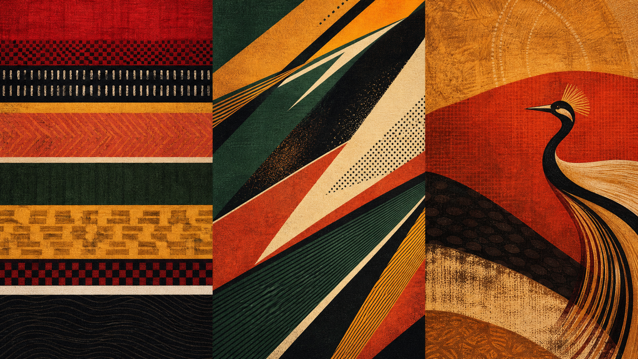
The identity extends beyond the central logo through a family of 12 shield patterns. That is where the branding becomes especially useful, because a tournament of this scale needs more than one emblem. It needs surfaces, repeats, backdrops, borders, environmental graphics, and digital assets that can carry the same character without placing the logo everywhere.
This is a familiar sign of mature identity design. The logo acts as one part of a broader kit, and the patterns give the system reach across different sizes, formats, and moments of use.
If those patterns are ever animated, a restrained logo reveal animation or subtle patterned build could reinforce the shield construction without overwhelming it. Intersecting geometry often responds well to careful motion because the movement can explain the form instead of distracting from it.
Each host keeps a distinct visual voice
The country-specific motifs are concrete. Kenya’s identity draws on bold horizontal bands. Tanzania’s design uses diagonal lines inspired by its national flag. Uganda’s identity brings in warm, layered colors and the crested crane.
That specificity gives the larger system flexibility with boundaries. Horizontal bands, diagonals, and a bird motif do different jobs on the page, so each host can look distinct while still belonging to the same shield-based family.
Many event identities promise flexibility but offer only one visual move. AFCON PAMOJA 2027 appears to avoid that by giving each country its own cues inside a disciplined framework.
Togetherness works because the form does the talking
Togetherness is easy to claim and harder to picture. Here, it is built into the name, the combined color strategy, the shared shield structure, and the extension into country-specific patterns.
That is what makes the concept convincing. The identity shows how three hosts can appear connected without becoming visually identical.
Local specificity gives the brand its grip
International sports identities often fall back on familiar shorthand: a ball, a swoosh, a flame, a generic crest. AFCON PAMOJA 2027 takes a narrower route. By rooting the mark in the traditional East African shield and extending it through country-linked patterns, the system chooses specificity over neutrality.
That choice makes the identity more memorable and more usable at the same time. It can stand for a continental football tournament while still showing where this edition is being hosted and how those hosts relate to one another.
 Photo Template
 Logo Template
 Icon Template
 Icon Template