
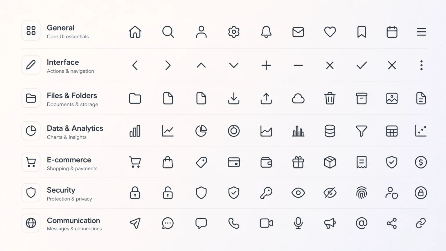
Imagine a brand expanding its digital presence, launching new products, or entering new markets. Without a clear, adaptable icon system, each new interface or feature risks introducing inconsistent visuals. Icons, small as they are, carry significant brand weight. They communicate complex ideas quickly, guide users, and reinforce identity. A fragmented approach leads to visual noise, slows down design workflows, and ultimately dilutes brand recognition. The core challenge is not just creating a set of icons, but establishing a framework that allows that set to grow and change without breaking.
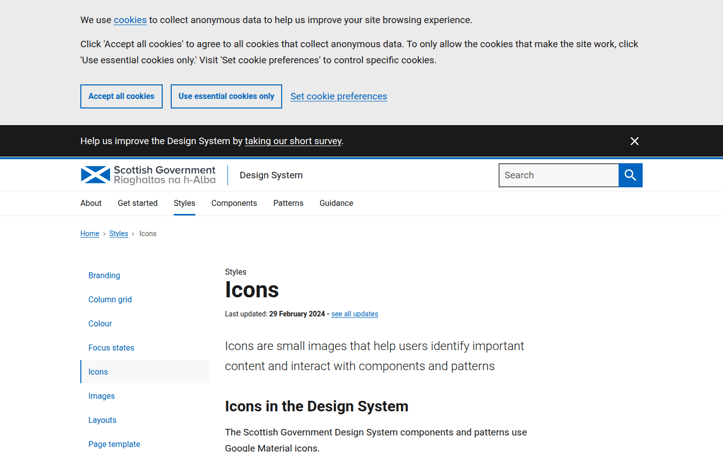
A modular icon system addresses this by providing a structured way to manage visual assets. It’s about setting clear rules for how icons are designed, used, and extended, ensuring they remain cohesive even as the brand’s needs evolve. This approach saves time, maintains visual integrity, and supports a consistent user experience across all touchpoints. For instance, the Scottish Government Design System explicitly uses established icon sets like Google Material icons and requires a clear user need before any new icon is added, preventing arbitrary expansion.
Laying the Groundwork: Core Principles for Iconography
Before designing a single icon, establish the foundational principles that will govern your entire system. These principles act as a compass, guiding all future decisions and ensuring consistency. Consider the overall brand aesthetic: is it minimalist, playful, technical, or approachable? Your icons should reflect this identity.
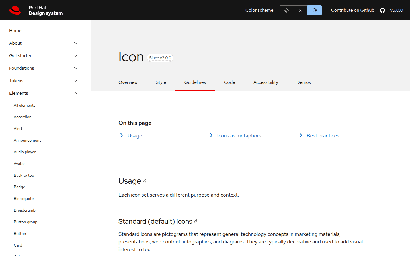
One critical principle is visual consistency. Hewlett Packard Enterprise (HPE), for example, emphasizes standardized sizing and color usage to maintain a unified look across their icons. This means defining a consistent stroke weight, corner radius, and level of detail. Another principle is clarity: icons must be immediately understandable. Red Hat recommends choosing commonly recognized icons when multiple options convey similar meanings, prioritizing user comprehension over novelty. Ensure your icons are solid and monochromatic, meeting typography contrast ratios for accessibility, as mandated by MnDOT’s design system.
Structuring for Scale: Grids and Keylines
A consistent grid and keyline system is the backbone of any scalable icon set. This invisible structure ensures that all icons, regardless of their specific form, share a common visual footprint. Google Material Design, for instance, uses a 24×24 pixel grid with specific keyline shapes (circles, squares, and vertical/horizontal rectangles) to guide icon construction. This means an icon representing a ‘home’ might fit within a square keyline, while a ‘play’ icon might adhere to a circular one.
Using a defined grid helps maintain optical balance and ensures icons appear uniform when placed side-by-side. When extending an existing set, designers can leverage these established keylines to create new icons that naturally blend in. This prevents the common issue of new icons looking visually disconnected from the rest of the system because they lack shared underlying geometry. It’s a foundational step that supports both current consistency and future scalability.
For example, if your system uses a 24×24 pixel grid with a 2px stroke, every new icon should adhere to these parameters. A simple ‘magnifying glass’ icon should have the same stroke weight and fit within the defined safe area as a ‘settings gear’ icon. This disciplined approach makes the entire set feel harmonious.
The Scottish Government Design System allows designers to extend their icon sets using Google Material keylines when necessary, demonstrating how a robust framework enables controlled expansion rather than limiting it.
Organizing Your Assets: Naming and File Structure
A modular system requires a clear organizational strategy for its assets. Structured naming patterns are crucial for discoverability and maintenance, especially as the icon library grows. A logical naming convention might include the icon’s category, its primary action, and any specific modifiers (e.g., action_add_filled.svg, navigation_arrow_right_outline.svg). This makes it easy for designers and developers to find the correct icon without guessing.
Beyond naming, a well-defined file structure ensures that icons are stored and accessed efficiently. Grouping icons by category, usage, or style within your asset library helps maintain order. Using SVG format is highly recommended for scalability, as it allows icons to be rendered crisply at any size without pixelation, making them ideal for responsive designs and future-proofing your visual assets.
Consider a folder structure like: /icons/actions/, /icons/navigation/, /icons/status/. Within each, files follow the naming convention. This systematic approach reduces friction in design and development workflows, preventing the common problem of designers spending valuable time searching for or recreating existing assets.
Implementing with Precision: Usage Guidelines
An icon system isn’t just about the icons themselves; it’s also about how they are used. Clear usage guidelines are essential to prevent misinterpretation and ensure consistent application across all platforms. This includes specifying appropriate sizing, spacing, color usage, and when to pair icons with text labels.
For instance, Wix restricts icon implementation to specific design system components like buttons and inputs. this helps icons are always presented within a controlled context, maintaining visual harmony and predictability. Guidelines should also cover accessibility considerations, such as providing alternative text for screen readers and ensuring sufficient color contrast. MnDOT’s design system, for example, requires icons to be solid and monochromatic, meeting typography contrast ratios for readability.
These guidelines extend to the interactive states of icons. How should an icon appear when hovered over, clicked, or disabled? Defining these states upfront ensures a consistent user experience and reduces ambiguity for developers. For example, a ‘delete’ icon might turn red on hover, providing immediate visual feedback to the user about the action’s consequence. Clear documentation of these states is as important as the icon’s initial design.
Anticipating Tomorrow: Extension and Evolution
A truly modular icon system anticipates future needs. It’s not a static library but a living one that can grow without losing its core identity. Establish a clear process for requesting and adding new icons. This might involve a design review, a user need validation, and adherence to the established grid and keyline principles.
For example, if a new product feature requires an icon not currently in the library, the process should guide designers to first check if an existing icon can be repurposed or if a new one needs to be created following the established visual style. This prevents the proliferation of one-off icons that don’t fit the system. The Scottish Government Design System exemplifies this by requiring evidenced user need for any new icon additions, ensuring that expansion is deliberate and serves a genuine purpose.
This forward-thinking approach ensures that as your brand evolves, your icon system can adapt gracefully, maintaining its integrity and effectiveness over time. It transforms iconography from a collection of individual images into a strategic brand asset.
Sustaining the System: Auditing and Maintenance
Even the best-designed modular system requires ongoing care. Regular audits of your icon library are essential to identify redundant icons, update outdated styles, and ensure all assets still meet current brand and accessibility standards. This maintenance phase is crucial for preventing bloat and ensuring the system remains lean and efficient.
During an audit, assess whether any icons are rarely used, if their meanings have become ambiguous, or if new visual trends necessitate minor adjustments to the overall style. This iterative process allows the icon system to remain relevant and effective, reflecting the brand’s current state while honoring its foundational principles. It’s a continuous cycle of review, refinement, and adaptation that keeps the system robust and ready for future challenges.
Consider setting a schedule for these audits, perhaps quarterly or bi-annually, depending on the pace of your brand’s evolution. This proactive approach helps catch inconsistencies before they become widespread problems. Documenting changes and decisions made during audits also creates a valuable historical record, aiding future designers in understanding the system’s evolution. this helps that the icon system remains a reliable and consistent visual language for your brand.
A consistent icon system is a visible decision that impacts how users perceive your brand. By investing in a modular approach, you build a resilient visual language that scales with your growth, ensuring clarity and recognition across every interaction. This strategic asset supports your brand’s journey, making every visual touchpoint clear and cohesive.
 Icon Template
 Logo Template
 Photo Template
 Logo Template