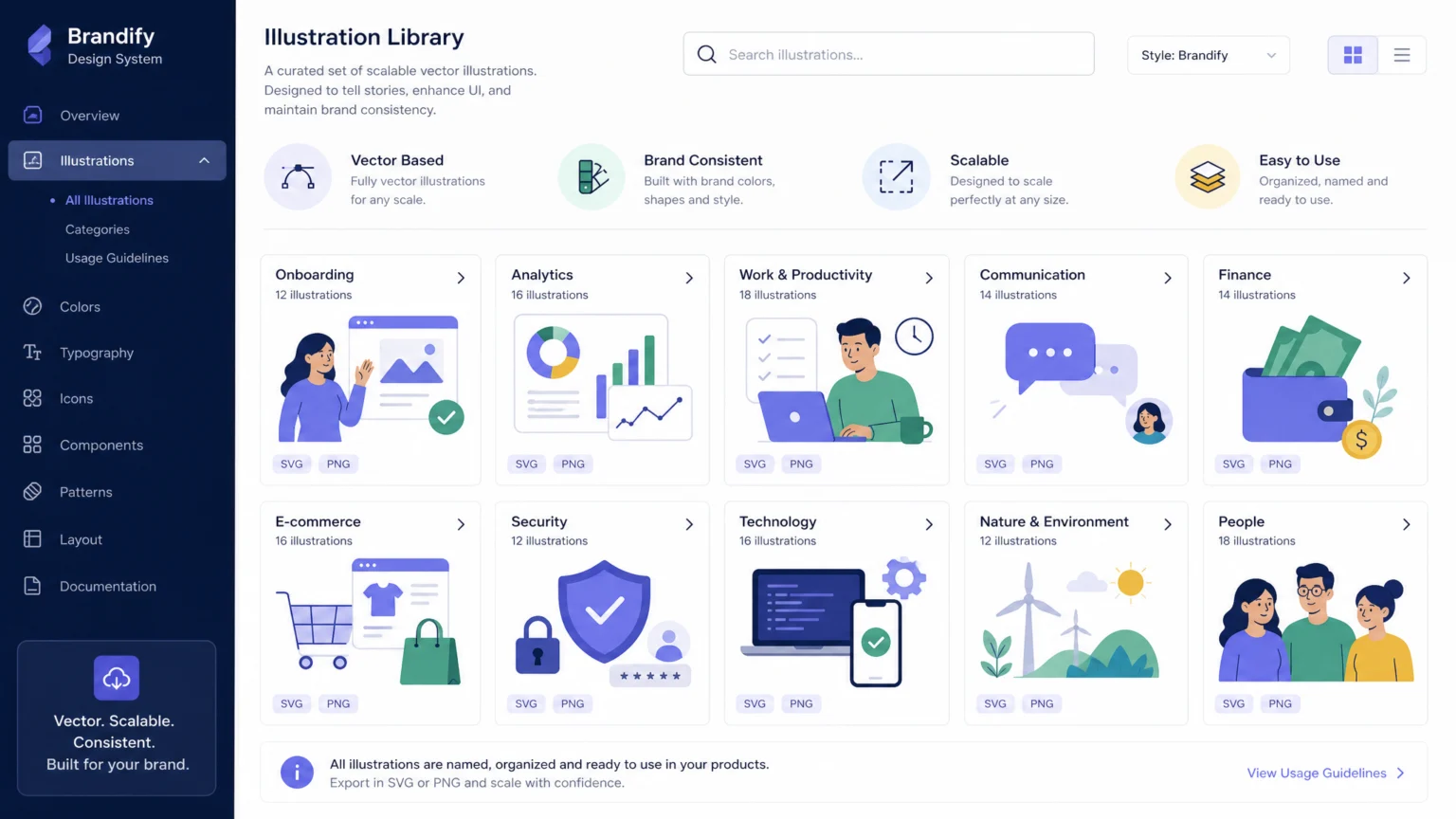
Imagine a brand’s visual language struggling to keep pace with its growth. What starts as a handful of custom illustrations can quickly become an unmanageable collection of disparate images, each slightly off-brand or difficult to adapt. This lack of consistency erodes recognition and forces designers to reinvent the wheel for every new campaign or product feature. The solution lies in a modular illustration library: a systematic approach that treats illustrations not as one-off art pieces, but as reusable components built on a defined visual language.
Consider a scenario where a new marketing campaign requires illustrations for a website, social media, and an email newsletter. Without a modular system, a designer might create three distinct illustrations, each with slightly different character styles, color palettes, or compositional rules. With a modular library, the designer assembles pre-approved characters, scenes, and motifs, ensuring every visual piece aligns perfectly with the brand’s established look and feel. This workflow outlines how to build such a system, ensuring your brand’s visual identity remains cohesive and scalable.
Define Your Illustration Style and Purpose
Before creating any assets, establish the core visual principles that will guide your entire illustration library. This foundational step ensures every illustration serves a clear purpose and aligns with your brand’s broader identity. Illustrations should clarify content or add personality, always used in conjunction with text to enhance understanding, not replace it. Consider the overall tone: is it playful, serious, informative, or abstract? The tone should resonate with your brand’s voice and target audience.
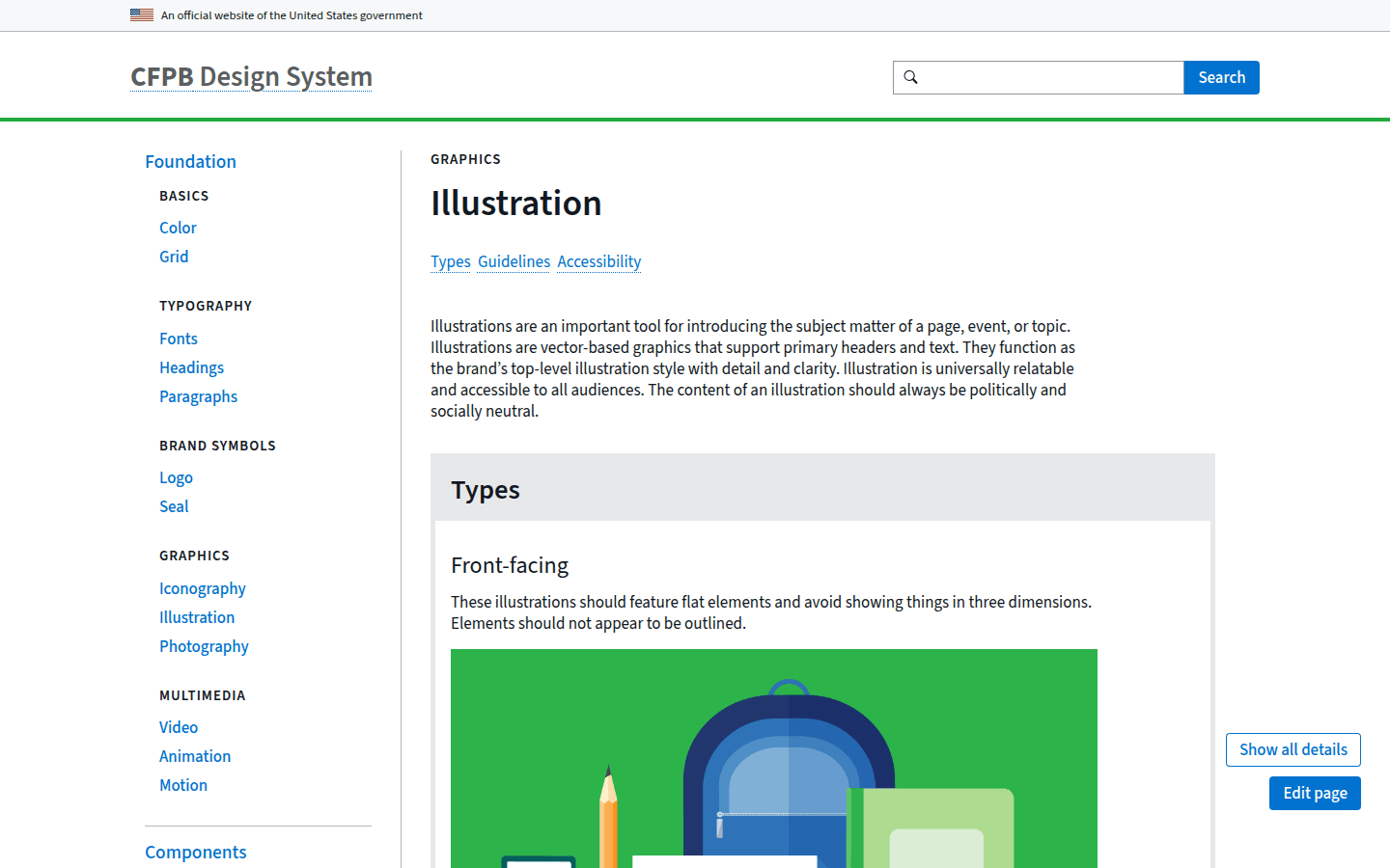
Next, set concrete rules for visual elements. For instance, the CFPB’s illustration guidance treats illustrations as vector-based brand assets and sets clear rules for color usage, composition, and shading. They advise using a limited palette of up to three to four colors and discourage complex effects like gradients, textures, multiply, or blurs for shading. These constraints, rather than stifling creativity, provide a clear framework for consistent output. Document these decisions thoroughly, including examples of what works and what doesn’t, to guide future creators. This documentation becomes the single source of truth for your brand’s visual identity. For a documented checkpoint, compare this step with Illustration – CFPB Design System.
Think about the specific emotions or messages your illustrations need to convey. Are they meant to simplify complex data, evoke a sense of community, or highlight innovation? Understanding these objectives will inform your stylistic choices, from line weight and shape language to the overall level of detail. A consistent style ensures that every illustration, regardless of who creates it, feels like it belongs to your brand. This clarity reduces ambiguity and speeds up the design process significantly.
Break Illustrations into Reusable Components
The essence of a modular system is its ability to be broken down into smaller, interchangeable parts. Identify the recurring elements within your brand’s visual storytelling. These reusable components act as building blocks for consistency across all illustrations. Common components include characters, scenes, shapes, and motifs. By atomizing your illustrations, you create a flexible system that can adapt to various contexts without losing its core identity.
For example, if your brand frequently features people, define a consistent character style: body proportions, facial features, and clothing details. Similarly, establish a library of common scene elements like landscapes, office interiors, or abstract backgrounds. These elements, when combined, form new illustrations that still feel cohesive. Think of it like a visual alphabet where each component is a letter, and you can form countless words and sentences while maintaining a recognizable script. This approach, as highlighted by 10turtle, emphasizes the importance of reusable components like characters, scenes, shapes, and motifs as building blocks for consistency. Another useful checkpoint is Brand Illustration System & Style Guide | 10turtle.
Consider the granularity of your components. Should a character’s arm be a separate component, or should the entire character be one unit? The answer depends on the level of flexibility and customization required. More granular components offer greater flexibility but demand more complex assembly rules. Less granular components are quicker to use but limit adaptation. Strive for a balance that supports your typical use cases while allowing for future expansion. This strategic decision impacts both efficiency and creative freedom within the system.
Establish a Clear File Organization and Naming Convention
A robust illustration library is only as effective as its organization. Without a logical structure, designers will struggle to find the right assets, leading to frustration and inconsistent usage. Start by creating a hierarchical folder structure. A common approach might be: Illustrations > Components > Characters > [CharacterName] or Illustrations > Scenes > [SceneType]. This structure should be intuitive and reflect how your team thinks about and uses these assets.
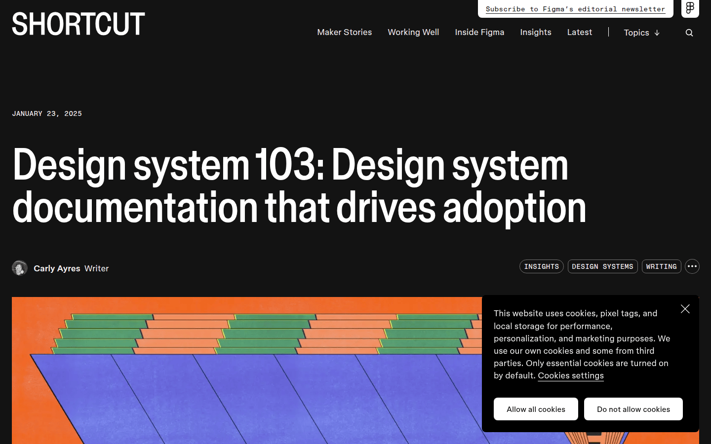
Implement a consistent naming convention for all files and layers. This might include prefixes for component types (e.g., char_avatar_male_01.svg, scene_office_desk_02.svg, motif_star_outline.svg) and version control. This systematic approach makes it easier for designers to find the right illustration for the right context, as highlighted in Figma’s design system documentation guidance. Ensure all assets are vector-based (SVG, AI, EPS) for scalability and ease of modification. Vector formats allow illustrations to be resized without loss of quality, crucial for diverse applications.
Beyond file names, consider metadata. Tagging illustrations with keywords related to their theme, purpose, or associated campaigns can significantly improve discoverability. For instance, an illustration depicting teamwork could be tagged with “collaboration,” “office,” and “productivity.” This rich metadata layer, combined with a clear folder structure and naming convention, transforms a collection of files into a truly searchable and usable library. Regular audits of your file structure and naming conventions will prevent decay and ensure long-term usability.
Document Usage Guidelines and Best Practices
A modular illustration library is incomplete without comprehensive documentation. This guide ensures that everyone using the system understands how to apply illustrations correctly and consistently. Your documentation should cover several key areas, acting as a manual for maintaining visual integrity across all touchpoints.
- Purpose and Context: Explain when and why to use illustrations. ServiceNow’s Horizon Design System emphasizes that illustrations should have a clear purpose and be used with text. This clarifies the role of illustrations within your overall content strategy.
- Compositional Rules: Detail how components should be combined. This includes guidance on relative sizing, balance with text, and using layering or background patterns to ground illustrations, as suggested by CFPB. Provide visual examples of good and bad compositions.
- Color Application: Reiterate the approved color palette and how it should be applied to different components. Specify primary, secondary, and accent colors, along with rules for their usage in illustrations.
- Accessibility: Provide guidance on alt text for web use and considerations for color contrast. Figma’s design-system documentation guidance recommends including accessibility guidance for all visual assets. this helps your illustrations are inclusive for all users.
- Correct and Incorrect Examples: Visually demonstrate proper usage alongside common pitfalls. This helps users quickly grasp the nuances of the system and avoid common mistakes.
- Change Log: Maintain a record of updates, additions, and deprecations to the library. This transparency helps users stay informed about changes and understand the evolution of the system.
- Implementation Details: Link to technical specifications or code snippets if illustrations are integrated into digital products. This is crucial for developers implementing the illustrations in various platforms.
Host this documentation in an accessible location, such as a dedicated section within your design system or a shared knowledge base. Make it easy to find, navigate, and update. Regular reviews and updates to the documentation are just as important as maintaining the assets themselves. this helps the documentation remains a living, useful resource for your team.
Plan for Expansion and Maintenance
A modular illustration library is a living system that will evolve with your brand. Plan for how new components will be added and how existing ones will be updated. Establish a clear process for requesting new illustrations or modifications to existing ones. This might involve a design review process to ensure new additions adhere to the established style guidelines. Without a clear process, the library can quickly become disorganized and inconsistent.
Regularly audit your library to identify underutilized or outdated assets. Deprecate components that no longer serve a purpose or don’t align with current brand guidelines. Encourage feedback from designers and other stakeholders to continuously improve the system. By treating your illustration library as an ongoing project, you ensure it remains a valuable and scalable asset for your brand’s visual communication. This proactive approach prevents design debt and keeps your visual language fresh and relevant.
Review your documentation quarterly to ensure it reflects the latest updates and addresses any recurring questions from users. A well-maintained library reduces design debt and empowers your team to create on-brand visuals efficiently. Consider assigning a dedicated librarian or team to oversee the library’s health and evolution. this helps accountability and consistent attention to this critical brand asset. A robust, well-managed illustration library is an investment that pays dividends in brand consistency, design efficiency, and overall visual impact.
 Icon Template
 Icon Template
 Photo Template
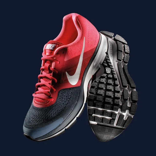 Photo Template