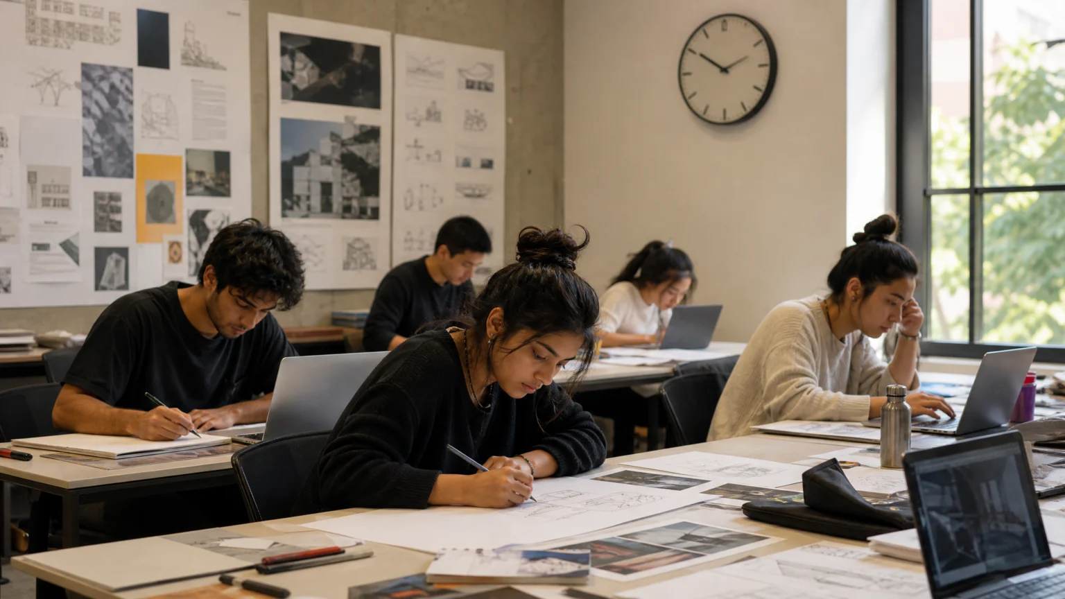
A blank artboard feels different when the clock starts before the idea arrives. That shift is small on paper and enormous in practice. In one hour, a student stops designing for approval in the room and starts designing for use in the world.
WKU put that tension at the center of its Design Jam, a competition for graphic design students to create a real-world portfolio project under time pressure. Participants waited for an unannounced project and then had an hour to complete it. The assignment turned speed into a filter: only clear decisions, relevant content, and audience awareness could survive.
Pressure changes what counts as good
Many student projects reward exploration first and application later. This brief reversed the order. Students had to make something practical enough for a portfolio and specific enough to function as communication, all inside a compressed window.
That matters because time pressure exposes habits. It shows who can read directions carefully, sort information into hierarchy, and choose what deserves emphasis. In that sense, the event mirrors a professional setting more honestly than an open-ended studio prompt.
DanceLogo has looked at similar value in real portfolio work for student design clubs, where the strongest learning happens around actual deliverables rather than simulated exercises. A fast brief adds another layer: timing forces intention.
The brief was narrow enough to be useful
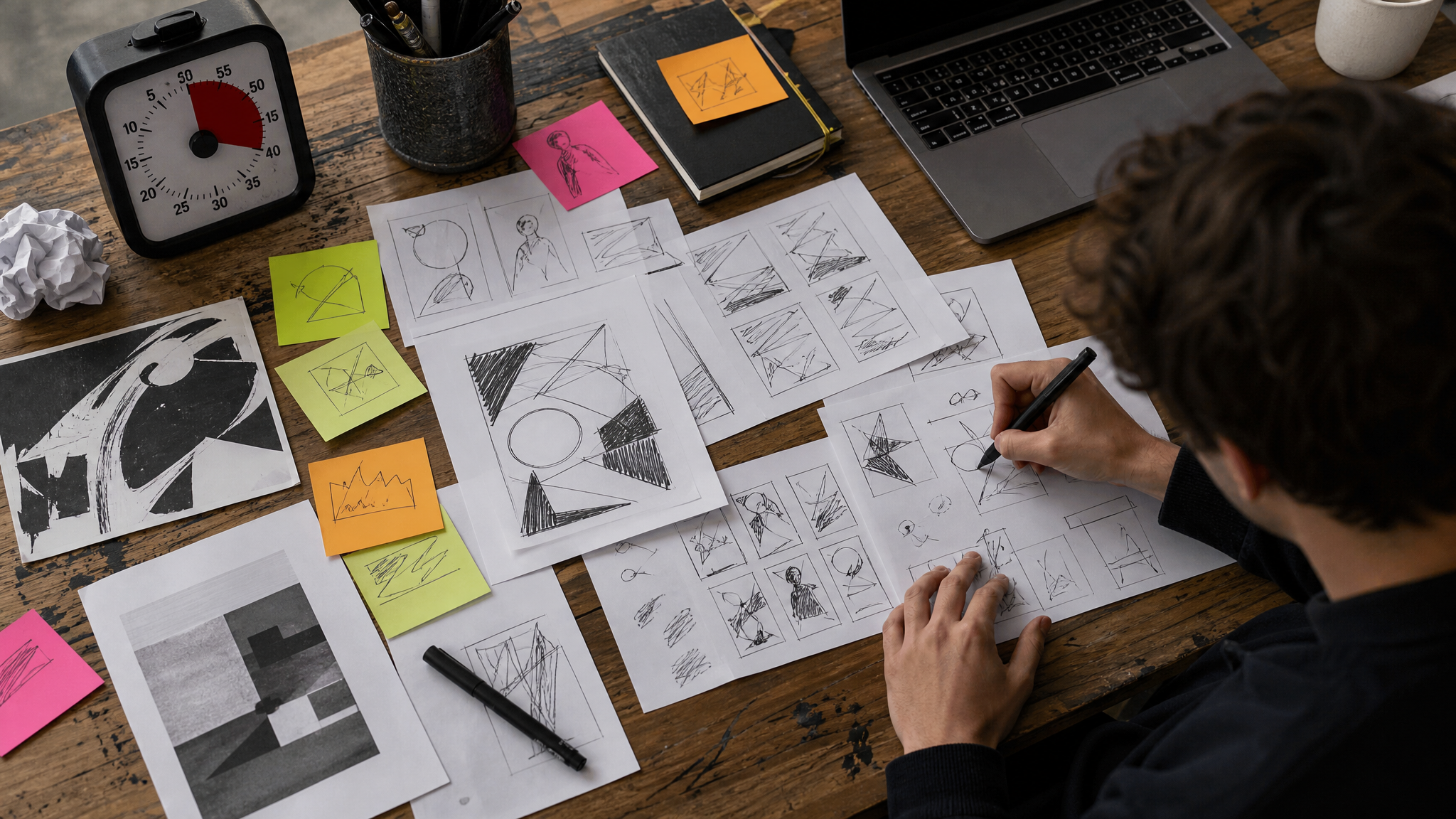
The task was to design a poster aimed at high school students about joining WKU’s Department of Art and Design majors. The poster had to include a list of majors, department contact information, and logos. Just as important, it had to speak to a high school audience.
That combination is exactly what makes a student brief worth doing. The requirements are concrete, but the visual solution is still open. Designers must decide how to balance required information with attraction, tone, and readability.
Posters are unforgiving in this way. They ask a designer to create immediate direction without losing detail. A viewer should understand the subject quickly, then find the next layer of information without strain. That is less about decoration than order.
Audience awareness became part of the design standard
One evaluative detail stands out: the winning approach was shaped through the lens of high school students while checking the listed criteria in the directions. That is a mature design instinct. It treats the brief as more than a checklist and the audience as more than a demographic label.
For student designers, this is one of the biggest professional thresholds to cross. A poster about art and design majors cannot rely on insider taste alone. It has to greet a younger viewer, reduce uncertainty, and make the path forward legible.
This is where many educational projects either sharpen or blur. If the audience is vague, the visual language usually becomes vague too. If the audience is named clearly, the designer can make smarter calls about scale, contrast, image choice, and the rhythm of information on the page.
That same issue appears in other public-facing systems. Color often sorts meaning before words do in a poster room, especially when a viewer is scanning quickly and deciding where to look first.
Faculty structure gave the event professional shape
The event was organized and hosted through WKU’s AIGA chapter by Associate Professor of Graphic Design Natalie Tyree and Assistant Professor of User Experience Design Leah Spalding. That pairing matters. Graphic design and user experience design approach communication from different angles, but both depend on clarity, prioritization, and user attention.
Placed inside an AIGA context, the competition also carried a professional frame beyond campus. AIGA is the largest and oldest national professional membership for design. That connection gives the event a stronger signature than a classroom contest built in isolation. It places student work in the wider culture of design practice, where briefs, constraints, and audience fit are everyday concerns.
The poster had a life after judging
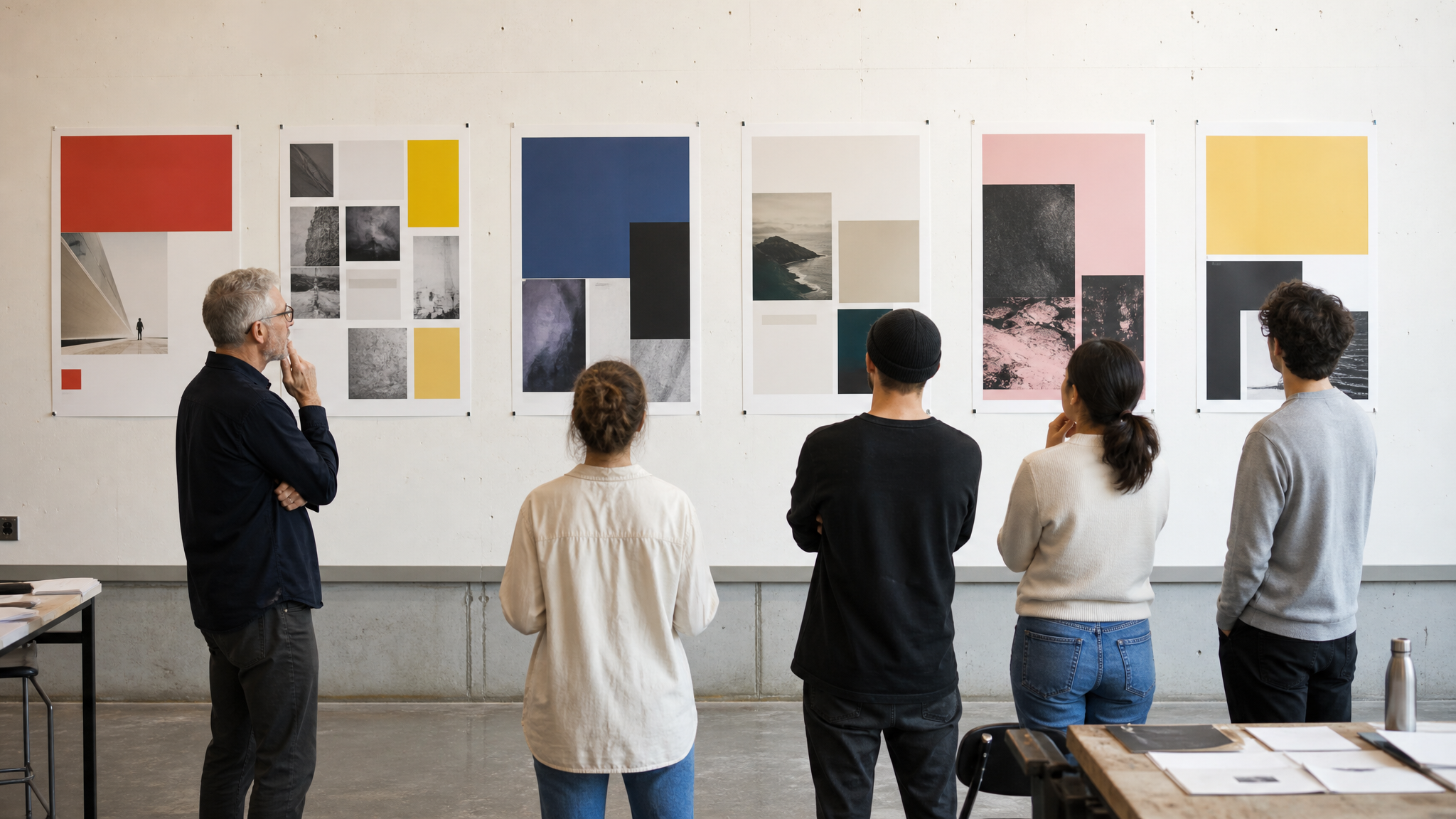
The winner received a $200 honorarium, and the design will be posted in high schools across Kentucky and Tennessee. That changes the meaning of the assignment immediately. The outcome is no longer a pinned critique artifact. It becomes a recruiting object that will meet real viewers in real places.
Distribution is a design teacher in its own right. Once a poster leaves the classroom, every choice carries more weight: type size, contrast, hierarchy, tone, and the balance between institutional information and invitation. A student can feel that difference. The work is no longer performing school; it is doing a job.
This is why real deployment matters so much in design education. Feedback from instructors is useful, but use in the wild is stricter. A hallway, bulletin board, or counseling office does not slow down for a clever idea that fails to communicate.
Professionalism here meant judgment, not polish alone
It is easy to mistake professionalism for finish. In reality, it often starts earlier. It begins with reading the brief closely, respecting constraints, and making each element earn its place.
In this case, professionalism meant understanding that high school students needed a clear invitation to consider WKU’s Department of Art and Design majors. It meant fitting majors, contact information, and logos into a poster that still felt coherent. It meant choosing what leads, what supports, and what can stay quiet.
Those are portfolio lessons, but they are also hiring lessons. Employers often look for evidence that a designer can solve a communication problem under limits. A one-hour challenge will not reveal everything, yet it reveals plenty: decision speed, composure, and the ability to hold content and audience in the same frame.
Small exercises can carry long-term value
The strongest student competitions do not imitate professional work through spectacle. They do it through stakes. WKU’s Design Jam gave students a short, demanding brief with a defined audience and a public outcome. That is enough to teach useful habits.
For educators, the takeaway is practical. A narrowly written prompt, real distribution, and visible criteria can produce stronger learning than a larger but vaguer assignment. For students, the message is equally direct: a portfolio grows when work has consequences.
Design education often talks about preparing students for the field. Exercises like this make the preparation visible. The hour is short, but the judgment it asks for is the same judgment professional designers use every day.
 Photo Template
 Icon Template
 Photo Template
 Logo Template