
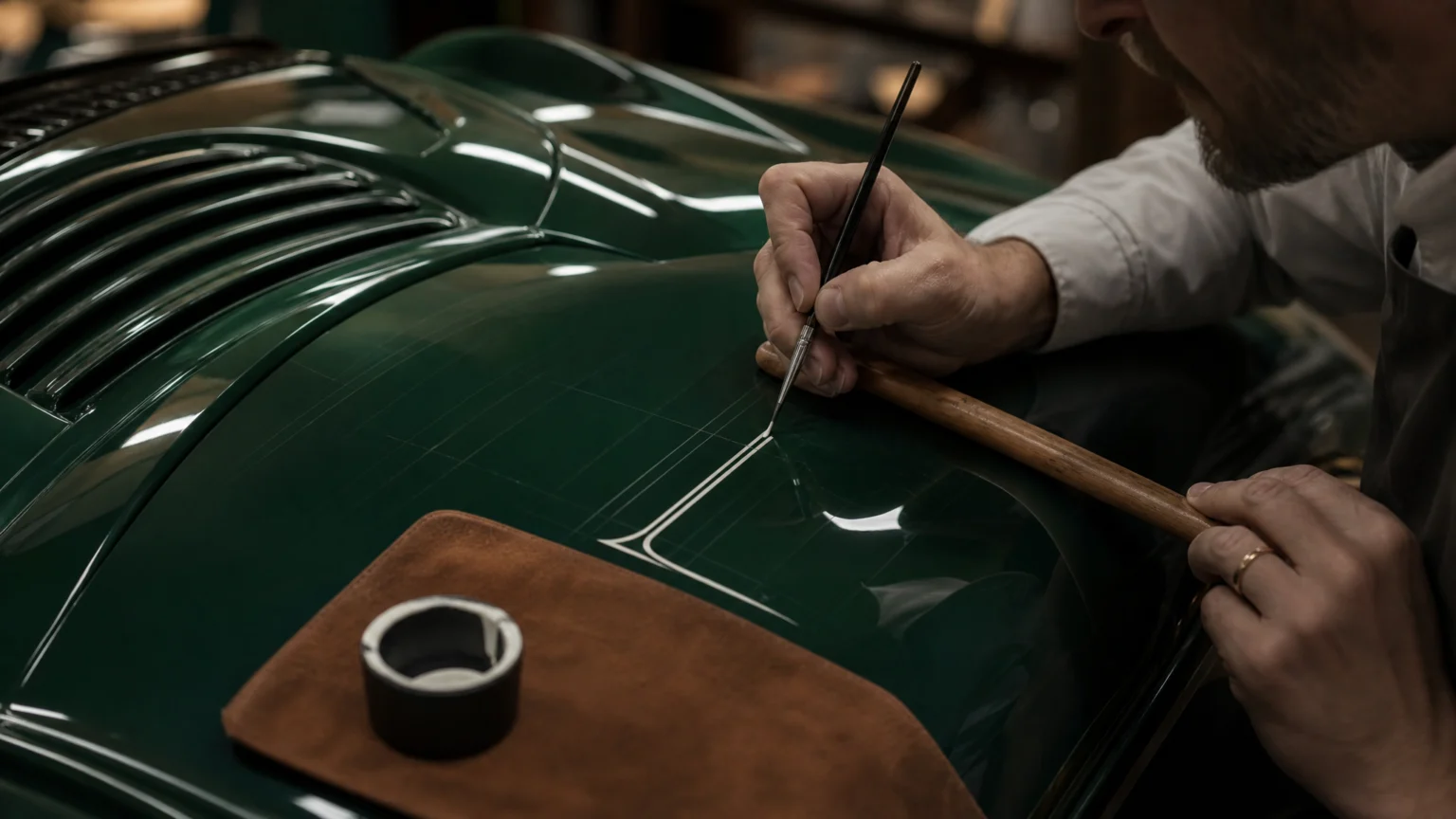
On a deep gloss surface, every small decision shows. A hand-painted logo on a luxury car cannot rely on texture, forgiving paper, or viewing distance; the line either belongs there or it does not.
That exposure makes the work unusually instructive. Layout, material, and hand control meet in one visible moment, and the eye reads proportion and finish almost at once.
Balance begins before paint appears
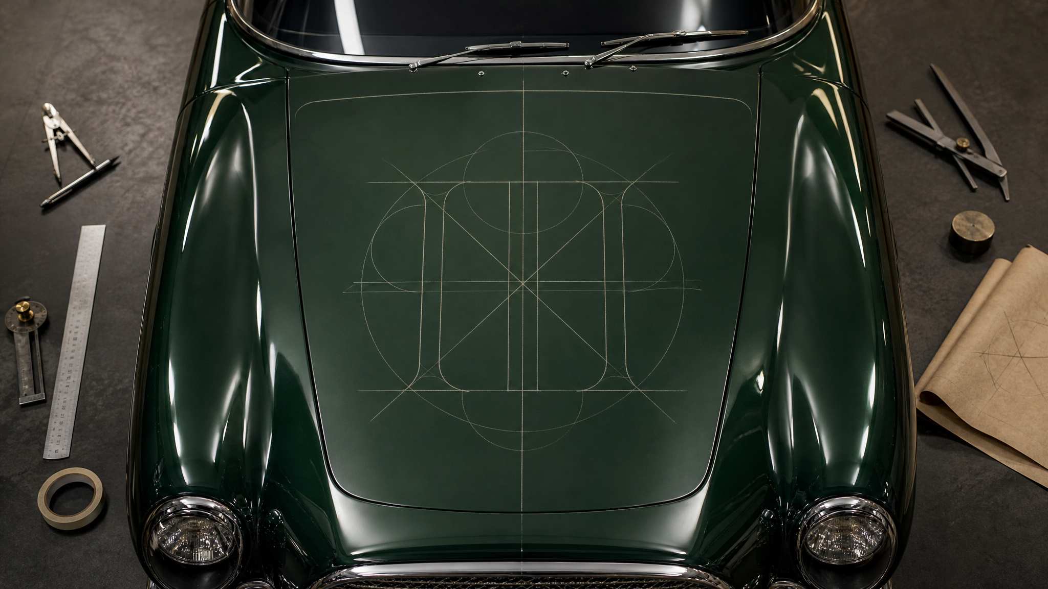
The most revealing detail comes before any paint touches the bodywork: symmetry is drafted with delicate, dry guidelines. That makes the job less about bravado with a brush and more about building a structure that can support visible precision.
A monogram that depends on absolute balance leaves little room for improvisation. On a polished hood, the centerline matters, spacing matters, and the direction of each letterform matters because reflection amplifies every shift. The calm result people admire usually starts in a quiet measuring stage.
The same principle travels well into other media. Work becomes easier when the underlying geometry is settled early, much like the disciplined setup behind an on-brand logo reveal workflow, where timing only works once the core form is stable.
Tool choice shapes the mark’s edge
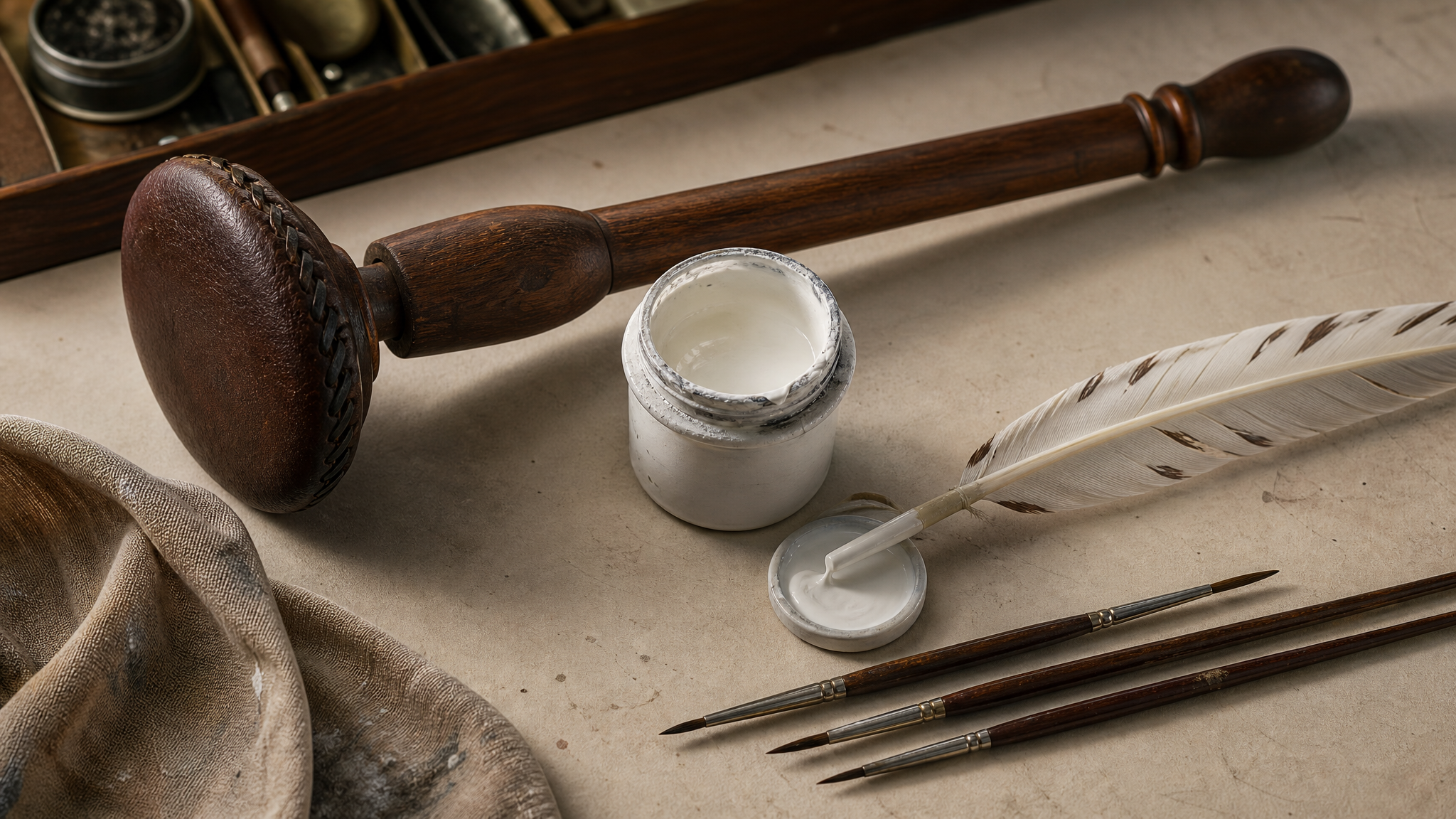
The craft details matter because they explain how control is produced: a traditional leather-padded mahl stick, a lettering quill, and high-opacity white enamel mixed to the consistency of warm honey.
A mahl stick stabilizes the hand without disturbing the finish. A lettering quill helps thin and thick transitions stay clear. Enamel at the right viscosity lets the line hold its edge instead of spreading, dragging, or drying with a dull boundary.
Strong brand work often looks inevitable after the fact, but that feeling is usually engineered through material decisions. The same idea appears in projects where physical cues carry identity before language does, as in material-led first impressions in footwear branding.
Pressure creates the real form
One of the clearest lessons here is that line quality comes from controlled pressure, not from mechanically tracing an outline. Each stroke begins with intentional pressure on the chisel edge of the brush, then moves through pressing, pulling, and lifting to square off each terminal.
That sequence helps explain why some lettering feels crisp while other lettering feels merely neat. A serif wordmark depends on how a stroke enters, swells, and exits. If pressure arrives too late, the form thins out; if the lift lingers, the terminal softens and the mark loses authority.
This is where viewers sense craft even if they cannot name it. They notice edges that look settled, corners that feel cut rather than fuzzy, and a visual rhythm made by repeated control rather than repeated correction.
Gloss raises the standard for accuracy
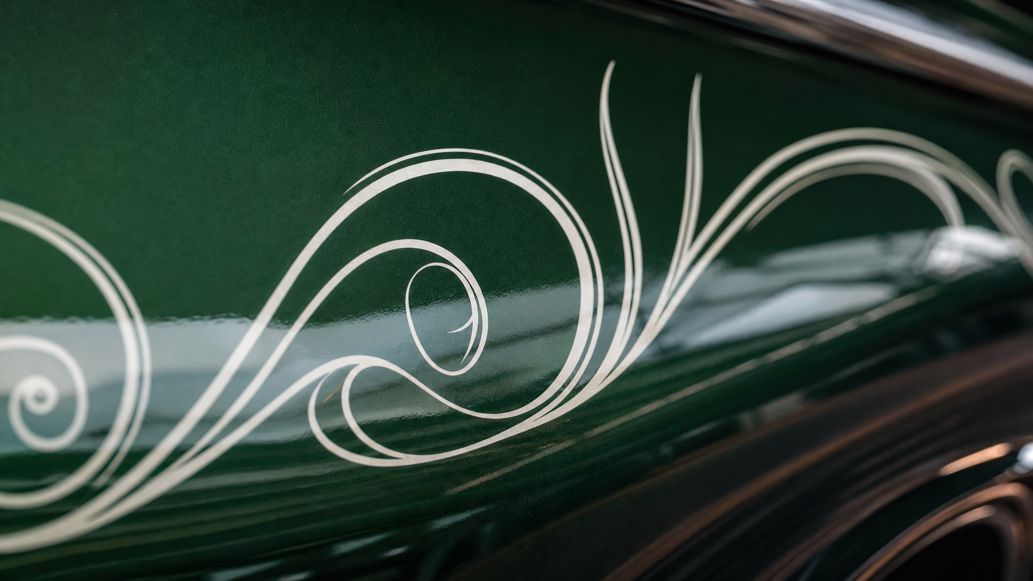
Painting on an ultra-luxury vehicle changes the stakes because the surface is already doing visual work. Deep green gloss reflects light sharply, so the painted wordmark has to stand beside that finish without looking temporary or timid.
When white pigment sits razor-sharp against a dark polished surface, contrast does more than improve legibility. It makes the mark feel integrated with the object. The logo stops reading like a sticker or later addition and starts reading as part of the car’s construction.
That distinction matters across branding. Some applications sit on top of a surface; others seem native to it. In motion or mockup presentations, the same question applies: does the mark feel pasted on, or does it seem anchored in the material world? Pages built for transparent logo animation are useful partly because they preserve that sense of placement across different backgrounds.
Luxury depends on finish more than volume
The final effect stands out because it looks as though it was inlaid by hand at the factory. That is a high compliment for any applied mark. It means the branding respects the object enough to meet its finish standard.
Luxury often relies on restraint. There is no need for visual noise when edge quality, spacing, and contrast already communicate care. A single well-painted word can do more than a crowded composition if it shares the same discipline as the product it touches.
This helps explain why premium identity systems often work through understatement. The performance is in the accuracy. The polish comes from alignment between brand character and fabrication quality.
Manual craft still sharpens digital habits
Even if your work never goes near enamel or a vehicle hood, this example clarifies a few useful habits. Build the skeleton first. Choose tools for the edge you need. Treat pressure and line endings as design decisions, not afterthoughts.
- Set symmetry early: guidelines reduce visible drift before execution begins.
- Match the tool to the form: brush shape and paint consistency influence the final letter more than many designers expect.
- Design the terminal: the end of a stroke often decides whether lettering feels deliberate.
- Respect the surface: gloss, reflection, and contrast change how precise a mark needs to be.
- Aim for belonging: the strongest branding feels native to the object, not simply attached.
Those lessons transfer neatly into screen-based work. If a logo animation ignores edge behavior, background interaction, or the way a mark enters and exits, viewers feel the mismatch right away. Specific tools like logo reveal animation work best when they reinforce the structure already present in the identity rather than trying to compensate for weak form.
A refined mark rarely succeeds because of decoration. It succeeds because proportion, material, and execution agree with each other.
That is the quiet lesson here. When preparation is exact, the tools are chosen well, and stroke control stays disciplined, the logo does not fight for attention. It settles into place and looks like it was always meant to be there.
 Photo Template
 Logo Template
 Photo Template
 Logo Template