
A sports mark has to land before anyone explains it. Then it has to survive the next beat, when fans start asking whether the symbol actually belongs to that city and that team.
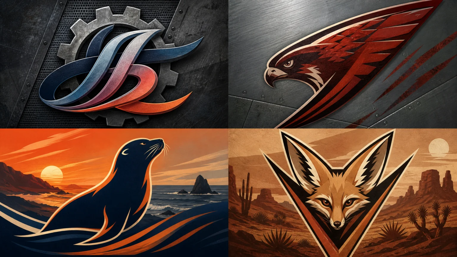
That tension runs through four new professional women’s hockey identities: Detroit Clutch, Hamilton Havoc, San Jose Sea Lions, and Vegas Vanguards. Each one leans on place. Each one tries to turn geography, industry, wildlife, or civic memory into a crest people can wear without hesitation.
Some of those ideas read instantly. Others divide opinion. That split is useful, because team branding is never judged as a quiet studio exercise. It gets tested in public, at speed, by people who expect the name, shape, and color to feel right on a jersey.
Detroit layers machinery with Motown cues
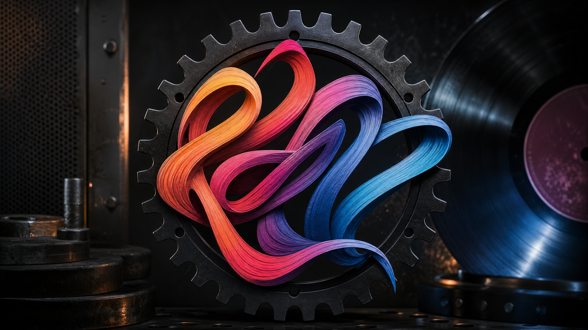
Detroit Clutch asks one emblem to carry several references at once. The name points to the city’s automotive industry, while the visual treatment adds loopy ombre letters associated with Motown history.
The wordmark sits inside a black gear, and that gear has 24 notches to represent the team’s 24 players. That detail gives the outer ring a job beyond decoration. The industrial frame is tied directly to the roster.
There is a clear contrast inside the mark. The gear suggests torque, metal, and precision, while the letters bring softness and flow. That can create a memorable visual rhythm, but it can also create friction if viewers want one sharper tone.
That helps explain the more polarizing response. Some viewers called the name terrible. Others found the logo visually uninteresting. In practical terms, when one crest tries to bridge multiple local references, every choice has to earn its place.
Hamilton keeps one local symbol at the center

Hamilton Havoc takes a tighter approach. Its logo centers on the peregrine falcon, the official bird of the city, and connects that emblem to Hamilton’s steel-mill beginnings through rust red color.
The result feels more unified. Animal symbols already carry direction naturally, and the city connection keeps the falcon from reading like a generic mascot. The rust red adds context without crowding the idea.
That kind of focus usually scales well. A single recognizable figure tends to hold up across jerseys, helmets, merchandise, and digital assets. The same preference for clarity appears in this look at modular icon systems that scale with brand needs.
Hamilton also shows some restraint. Steel is present through color and context, not through a pile of literal industrial symbols. That keeps the identity from turning into a civic collage.
San Jose lets the coast do the work
San Jose Sea Lions builds from the regional environment with fewer parts in motion. The logo depicts a sea lion against the California coastline, using orange and navy to represent the coastal setting.
The concept reads quickly. Sea lion, coast, color, region: the pieces line up without much effort. That does not automatically make it stronger than the others, but it does make the identity easy to read from a distance, which matters when a mark appears on fabric, in motion, or in a small digital crop.
The orange and navy pairing does useful work here. It gives the team a recognizable palette while still carrying environmental meaning. Color establishes setting before a viewer pauses to inspect detail, much like the sports-branding examples in our earlier piece on how sports brands turn memory into form.
San Jose’s mark suggests a steady design instinct: if the local cue is already distinctive, framing it clearly may be the better move than adding more symbolism. A coastline and a sea lion already provide enough character for a coherent system.
Vegas sharpens the mark with a letterform idea

Vegas Vanguards is built most visibly around a shape device. The logo draws from the Mojave desert through a kit fox, with ears shaped like a V.
That is efficient logo thinking. Mascot, landscape reference, and initial all meet in one image. It gives the crest a clean silhouette and a strong focal point.
The harder part is the name. Some fans were unsure what a vanguard was, and the nickname drew confusion. A smart visual device can support a word, but it cannot fully solve a naming choice that feels distant to part of the audience.
That issue shows up outside sports too. A mark can clarify a name, yet it cannot rescue every naming decision. If people hesitate over the term itself, the identity system has to work harder across introductions, merchandise, social posts, and motion assets. For teams planning animated reveals, concise concepts usually perform better because viewers need to understand the image before the effect begins, as seen in logo reveal animation systems and logo animation templates made for short-form brand use.
Fan reaction belongs in the evaluation
The public response to these teams matters because it shows how branding gets judged outside design circles. One person can dismiss a name as terrible while another calls a different identity the favorite of the group. That spread is part of the test, not a distraction from it.
Team identities live in conversation. They appear on social platforms, in arenas, on apparel, and in rivalry talk. People do not just inspect them. They use them.
That is one reason place-based branding remains so effective. Local references give fans something to hold onto. Automotive history in Detroit, the peregrine falcon and steel roots in Hamilton, the California coast in San Jose, and the Mojave desert around Vegas each offer a route into belonging.
Symbolism works best when it stays readable
The shared lesson across these four launches is not that every team should mine local culture as deeply as possible. It is that local meaning works best when it is translated into forms people can read quickly and repeat easily.
Detroit shows the ambition and risk of combining multiple references in one emblem. Hamilton shows the strength of a focused symbol with grounded color. San Jose shows the value of direct regional legibility. Vegas shows how a clever graphic move can sharpen a mark while a less intuitive name still creates drag.
These identities are useful because they show where recognition actually begins. It starts when name, shape, color, and city move together, and it holds only if the public keeps the connection alive.
 Photo Template
 Logo Template
 Photo Template
 Logo Template