
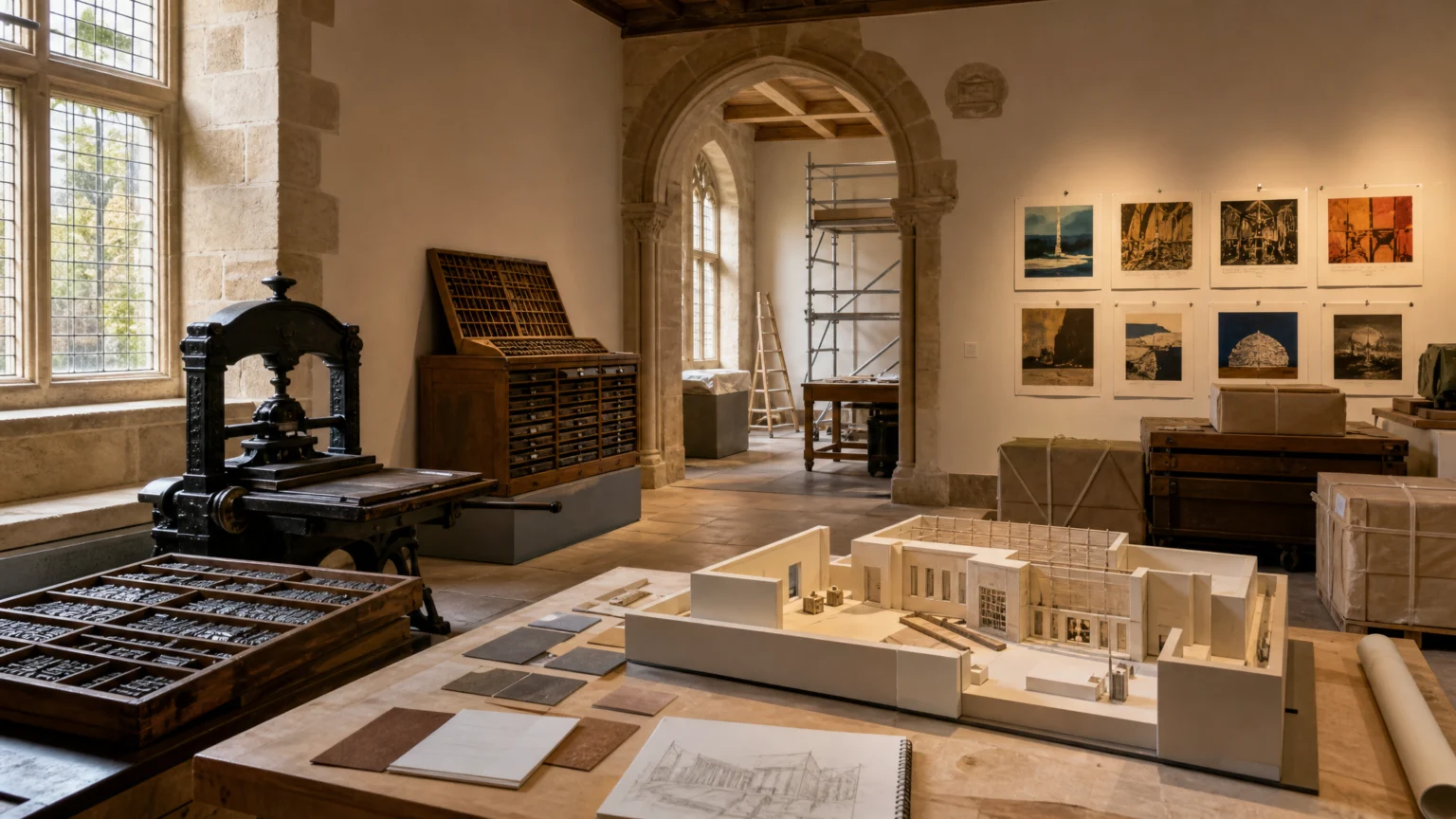
A museum can outgrow its own name long before it outgrows its collection. That tension is clear in Lyon, where a museum devoted to printing and graphic communication is preparing for a spring 2027 reopening after a major renovation, restoration, and exhibition redesign.
The scale of the work matters. Accessibility improvements, the restoration of a Renaissance building, the relocation of 32,000 objects, and a new permanent exhibition route suggest more than a construction project. They raise a design question that feels surprisingly current: how do you show the passage from lead type to digital applications without flattening it into a neat timeline?
A collection this broad changes the story
Printing museums are easy to picture as rooms of presses, drawers of type, and a respectful hush around technical heritage. This collection is wider. It includes books, typefaces, matrices, printing presses, advertising materials, packaging, scientific archives, antique objects, and contemporary graphic works.
That range shifts the frame. Graphic culture stops reading as a narrow craft history and starts to look like a connected field where editorial design, commerce, administration, manufacturing, and public information meet. A poster, a package, a form, and a book spread may sit on different surfaces, but they solve related problems of legibility, hierarchy, reproduction, and use.
The museum’s scope makes that even clearer because the collection now includes prints, photography, color printing, advertising, administrative documents, packaging, information design, editorial graphic design, and digital applications. Those categories are not side notes. They are the route most visual communication takes through everyday life.
That framing has practical value for anyone shaping an identity system or publication. Design is rarely one isolated object. It is a family of decisions carried across formats, materials, and audiences, each with its own constraints and timing.
From lead to light is a visual lesson
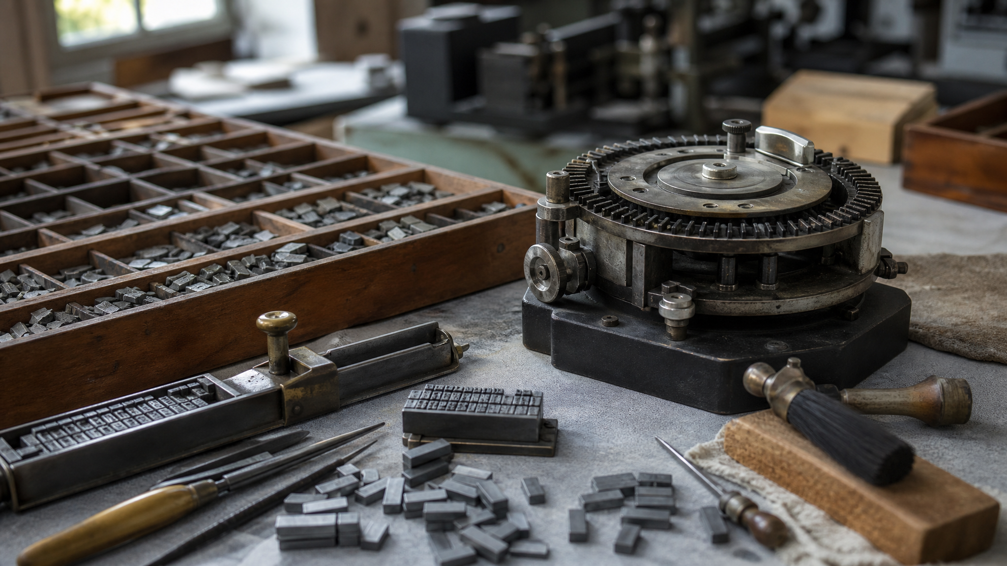
One of the strongest threads here is the transition from lead typesetting to photocomposition. In July 1944, two inventors filed patents related to photocomposition in Lyon. The Lumitype Photon stands as the emblem of that shift, with a 600-gram disk replacing part of the equipment that had previously depended on large quantities of lead type.
It is tempting to read that as a machinery story. The visual implications are the more useful part. When a technology changes, form changes with it. The speed of composition changes. The labor behind the page changes. The available precision changes. So do the economics of who gets to print, revise, distribute, and experiment.
A page grid, a headline, a catalog, a label, or a newspaper column all carry traces of production choices. The opportunity in 2027 is to make those traces visible instead of treating technology as a sealed backstage area.
That matters for digital designers too. New tools often arrive wrapped in convenience, but each one quietly edits the signature of the work. Some widen possibility. Others compress it into presets. Seeing an older transition clearly can sharpen how we judge our own.
Color printing belongs at the center
A significant portion of the collection is devoted to lithography and chromolithography, processes that helped spread color images through commercial, advertising, and popular printed materials. That is a useful reminder that color history is not decorative trivia. It is part of how visual persuasion became ordinary.
Color printing changed what could travel at scale. It gave brands, products, and public messages stronger presence. It made printed matter more immediate, more memorable, and often more emotionally charged. Once color entered broad circulation, the look of commerce changed with it.
For designers, the lesson is simple. A palette is never just a palette. It is also a record of ink behavior, substrate limits, registration accuracy, cost, and audience expectation.
That is why museums of graphic communication become more useful when they show process and outcome together. A chromolithographic print tells a richer story when it appears not just as an image, but as evidence of how color entered mass viewing habits and altered public attention.
Why public display matters during closure
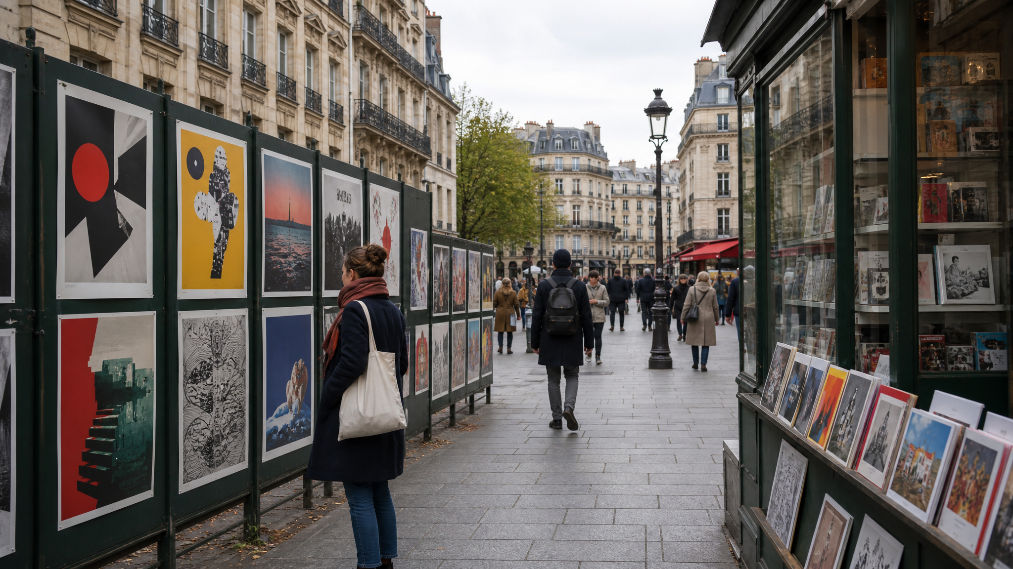
During the closure, the museum is experimenting with other ways of displaying graphic design. That choice suits the material. Posters, publications, typefaces, illustrations, and much of graphic design were made to circulate, to be handled, pasted, read, and encountered in shared spaces.
Placed around a city, these works move closer to their original conditions of use. A poster on a wall and a publication in a public setting recover something that a glass case can mute. Context returns. Scale returns. Direction returns.
This is an important curatorial move because graphic design rarely begins life as a singular art object. It enters streets, desks, counters, offices, homes, and transit points. It competes with distraction. It works at a glance or fails at a glance. Showing it beyond museum walls respects that condition instead of smoothing it away.
The same logic applies when designers present their own work. Mockups and clean slides have their place, but communication design becomes easier to read when it is shown in plausible environments. Meaning sharpens when use is visible.
- Posters gain force when seen at public scale rather than as thumbnails.
- Publications make more sense when sequence and handling are acknowledged.
- Typefaces become clearer when applied to lived information, not isolated specimen lines.
- Packaging reads differently when grouped as a retail field rather than a single hero object.
A new name can reset the frame
The 2027 project raises the possibility of a new name, though no future name is specified. That question goes well beyond signage. Naming determines the promise a cultural institution makes to the public.
If a museum is described too narrowly, visitors may expect a specialist archive and miss the living relevance of what is inside. If it is described too broadly, the subject can lose its edge. The strongest names hold the balance between accuracy and invitation.
In this case, the collection itself argues for a wider frame than printing alone. It covers editorial graphic design, information design, packaging, color processes, photography, advertising, administrative documents, and digital applications. A name that acknowledges graphic communication would better match the actual contents and help newer audiences recognize themselves inside the story.
That is a familiar branding problem. Identity is not decoration applied at the end. It is a structural choice about category, scope, and audience expectation.
Why the 2027 reopening matters to practicing designers
A reopening like this matters because it can resist a false split between heritage and current practice. The same institutional space can hold lead type, photocomposition, packaging, information design, and digital applications without forcing them into separate worlds. That continuity is the point.
Good design history does not freeze old tools in admiration. It shows what each technology made possible, what it constrained, and how visual language moved with it. That kind of exhibition can make contemporary work easier to read. It can also make current habits feel less inevitable.
- Study production alongside form. A design object makes more sense when you know how it was made and circulated.
- Treat packaging, editorial work, and information design as connected disciplines. They share problems of sequence, hierarchy, and reproduction.
- Respect display context. Graphic work changes when it returns to public space or use-based settings.
- Be precise about naming. Titles and categories shape how people understand the work before they encounter it.
For readers interested in how visual systems behave across formats, tools, and surfaces, it is useful to look at motion and static work side by side. Pages, signs, labels, interfaces, and animated marks all depend on sequencing and emphasis, even when the medium changes. DanceLogo’s tools for Logo Animator and Photo Animator sit in a different production landscape, but they speak to the same enduring question: how visual communication moves from method to audience.
By spring 2027, the museum will reopen with restored spaces and a redesigned route through its holdings. The real opportunity lies in how that route is drawn. If it works, visitors will not just see old equipment and finished artifacts. They will see how graphic communication keeps changing shape while staying tied to the same core task: making ideas visible, reproducible, and public.
 Logo Template
 Logo Template
 Icon Template
 Icon Template


