
Airport branding has to land fast. It needs to read at a distance, hold up on metal and signage, and still leave room for feeling. Spring Japan’s latest identity update works because it does not frame clarity and warmth as competing goals.
On October 26, Spring Japan announced a renewed brand logo and aircraft livery. The first Boeing 737-800 in the new livery, registered JA05GR, is planned to enter service by the end of the year. This is the airline’s fourth-generation logo, following the previous mark introduced in 2021 when the company joined the JAL Group and changed its name from Spring Airlines Japan to Spring Japan.
Recognition stays in place
The smartest choice here is restraint. Spring Japan keeps the existing 3S mark rather than starting over, so the identity holds onto recognition while expanding the meaning around it.
The 3S form represents Safety, Sincerity, and Smile. The new version adds JAPAN from the airline’s name and a J meant to express a commitment to Japanese quality. It also incorporates the cherry blossom motif used in the original logo, which gives the update a longer visual memory instead of making it feel like a reset.
That balance matters in transport branding. Airlines ask customers to trust systems before they experience service, so familiar signatures carry real weight. Keeping the central form steady while refining its context is often stronger than replacing it outright, much like the brand discipline seen when a name change forces an identity system to redraw its structure.
Each color has a job
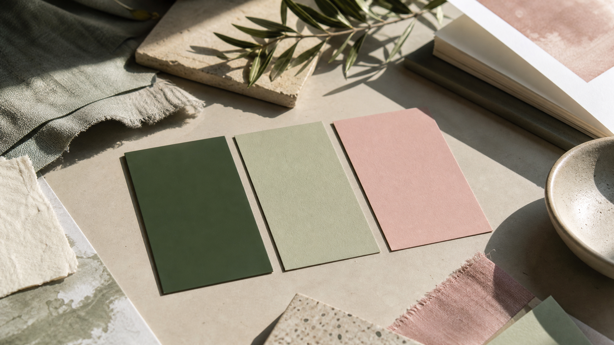
The identity uses three colors: deep green, light green, and pink. Each one has a specific role, which is why the palette feels organized rather than simply pleasant.
Deep green reflects the airline’s history. Light green is newly added and represents future evolution and the youthful energy of its employees. Pink, drawn from cherry blossoms, expresses the gentleness and warmth of spring.
A small palette often works best when every color does distinct work. Here, past, future, and emotion are sorted clearly enough to read quickly, similar to the way color can organize understanding before words arrive.
Letterforms carry the softer tone
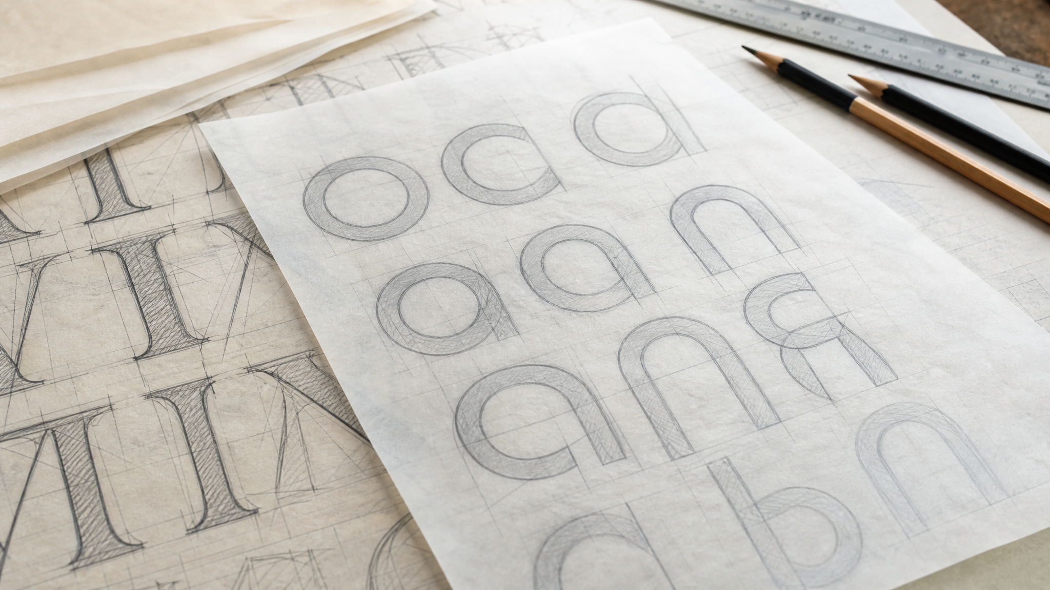
The type change may be the most useful detail for designers. Spring Japan shifts from a Mincho-style serif to a rounded Gothic-style sans-serif, and the reason is direct: better visibility at airports with a softer expression.
A bold typeface helps the name read more clearly in travel environments where distance, glare, and speed all work against legibility. The rounded curves keep that weight from turning severe. The result is a wordmark that speaks firmly while its edges stay approachable.
Too many identity updates try to add friendliness through slogans or illustration. Here, that feeling is built into the letters themselves. That usually lasts longer because it affects every application, from fuselage to counter sign.
The smile is tucked into one letter
Naoki Nagayasu, president and designer of FARVE Inc., created the design. He described the A in JAPAN as looking like it is smiling slightly, and the lettering as carrying charm and a smile.
That is a small move, but small moves often set the tone best for travel brands. A literal grin would feel childish. A slight lift inside a letter gives the logo a more human touch without interrupting readability.
The aircraft turns the brand into a full composition
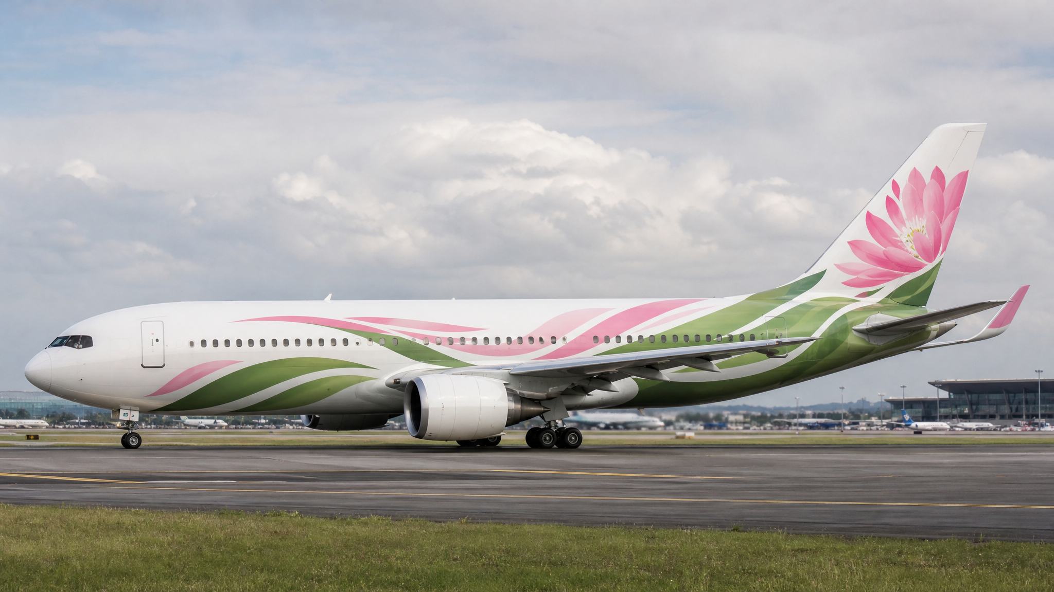
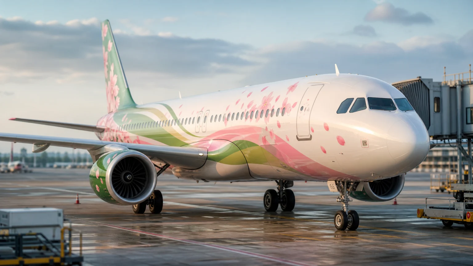
Aircraft liveries need to hold together both parked and moving. Spring Japan’s new exterior keeps the silhouette of the previous tail design while renewing the livery into a cohesive design that flows from front to rear.
The visual idea is cherry blossom petals dancing in the wind, with a large cherry blossom motif on the tail. The petals give the plane a clear sense of direction without relying on stripes or speed lines, while the larger blossom anchors the eye at the rear.
That front-to-rear flow matters more than it first appears. On an aircraft, disconnected graphics can make the body feel segmented. A continuous sweep helps the plane read as one composed object, not a tube with decorations attached. It is the same principle that makes a uniform sports system feel stronger when the logo stops acting like an isolated patch, as in this look at a jersey identity built as a full visual system.
The rollout extends past the plane
The update does not stop at the logo and livery. New colors will appear in the scarves worn by cabin attendants, and signage and counters will be updated in stages beginning at Narita Airport.
That extension matters because airline identity is experienced in fragments. A traveler sees a counter, then a staff uniform, then a gate sign, then the aircraft body. When those touchpoints share the same color logic and typographic voice, the brand feels dependable before boarding.
For design teams, that is where identity work proves itself: in environments, materials, and uniforms, not just in a mark on a presentation slide. If you are building symbols meant to travel across media, studying logo reveal animation or transparent logo animation can sharpen how you judge silhouette, continuity, and recognizability in motion.
Measured choices make the warmth believable
Spring Japan’s redesign works because each major choice handles more than one task. The retained 3S mark protects recognition. The added language ties the identity more explicitly to the airline’s name and quality promise. The color system connects history, future energy, and seasonal warmth. The rounded sans-serif improves visibility while softening tone. The livery turns cherry blossoms into a coherent path across the aircraft.
Nothing here feels overstated. In a category where trust, legibility, and national character all need to coexist, a measured solution often travels farther. Spring Japan’s new identity becomes gentler without losing structure, and clearer without becoming cold.
 Logo Template
 Icon Template
 Photo Template
 Logo Template