A campus poster has very little time to make its case. On a crowded wall or in a fast social feed, people notice almost immediately when a graphic feels considered and when it feels assembled.
That pressure is familiar to student clubs. They need more graphics, more often, across more channels, while AI has made quick image generation feel available almost everywhere. But the more revealing design choice is not speed. Many clubs are still holding onto visuals that feel personal and deliberate, and that says a lot about what audiences actually register.
Visible authorship makes templates useful
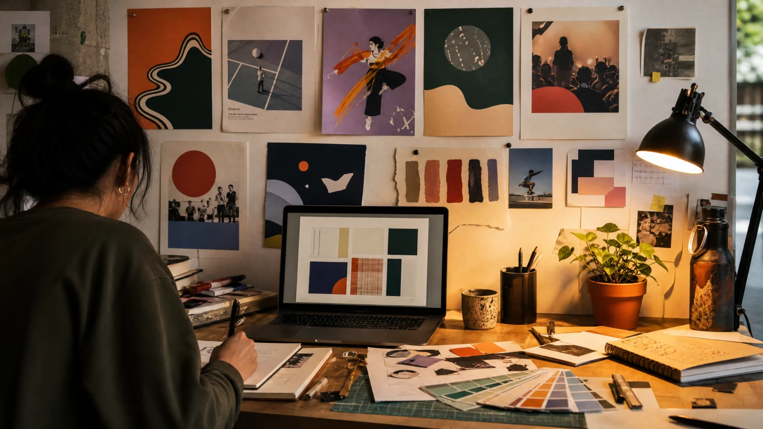
Club teams are not building every poster from scratch. Canva and Canva Pro appear repeatedly in their workflows, usually as starting points rather than finished answers. The practical move is simple: start with structure, then customize hard enough that the result carries a distinct signature.
That difference matters. Heavy modifications, brainstorming with other club members, and theme-specific edits turn a generic layout into communication that belongs to a real group. A template can save time, but it still needs a point of view.
That is one reason student design work often feels more alive than polished but interchangeable content. A poster for a club meeting does not need expensive effects. It needs clear direction, recognizable taste, and enough specificity that someone on campus can tell an actual person made it.
DanceLogo has looked at a similar tension before in When poster tools keep pace with the idea, where the best software choice is the one that does not flatten the thinking. The same principle applies here: speed helps only when it protects intent.
Material cues give a poster social context

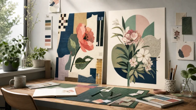
The references these clubs use are concrete. Makers describe paper-like objects, watercolor texture, a real life room, and floral designs for spring semester. Those are not random style fragments. They place the graphic in a season, a setting, and a mood.
A paper edge suggests touch. A room suggests place. A floral treatment tied to spring gives timing without extra explanation. Small visual choices like these help posters and social graphics feel situated rather than synthetic.
That is where many AI-generated visuals lose their footing. When texture arrives without purpose, it reads as surface. When theme grows out of a club’s own event, members, and calendar, it reads as intention.
Generic imagery weakens trust early
Several creators describe AI visuals as unoriginal, generic, or inauthentic. That reaction is less about the technology itself than about recognition. People are getting better at spotting imagery that feels assembled instead of considered.
Once that feeling appears, the message has to work harder. A student deciding which event to attend is already making a quick judgment from color, image, and hierarchy. If the graphic feels impersonal at first glance, the communication starts at a disadvantage.
An academic perspective sharpens the point: audiences are increasingly attuned to AI-generated imagery, especially when it does not feel personal and deliberate. For club communication, that sensitivity matters because these groups depend on participation, trust, and belonging. Visuals become part of that social performance.
This concern connects closely with How to Integrate AI Tools into Brand Identity Design Without Losing Authenticity. The useful question is not whether AI appears in the process. It is whether the finished work still feels owned by the people it represents.
Accessibility keeps style from taking over
One of the clearest values in these club workflows is accessibility. Simple, understandable visuals are treated as a design goal, not a compromise. That resets the conversation in a useful way.
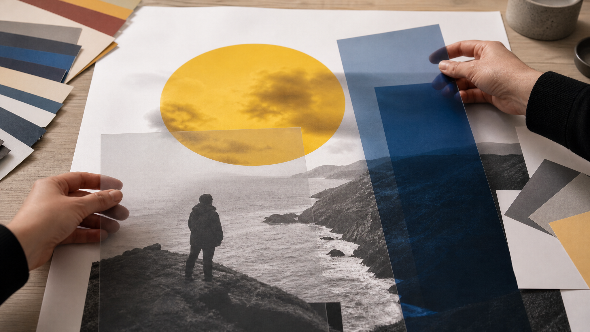
Design is communication before it is ornament. If a poster is difficult to parse, no amount of texture or trend can rescue it. Clubs working with busy students, crowded bulletin boards, and fast-moving social feeds need hierarchy that can survive a glance.
In practice, that means fewer decorative distractions and better control over contrast, layout, and message order. The strongest work often looks calm because key decisions were made early. It knows what the viewer needs first, second, and third.
For teams building repeatable social assets, logo animation templates can help extend a visual system without remaking it from scratch each time. The same rule still holds: motion should support clarity, not compete with it.
Brainstorming preserves shared meaning
Another notable pattern is collaborative thinking. Club representatives describe brainstorming with members while developing visuals. That may sound ordinary, but it solves a problem automation cannot solve by itself: shared meaning.
A club poster is rarely just an image plus details. It has to reflect who the group is, what kind of room people will walk into, and how formal or playful the invitation should feel. Those choices come from conversation, memory, and internal culture.
That is why even modest graphics can feel right when they emerge from a real team. A few informed choices about image style, color, and tone create coherence faster than an endless stream of generated options. Good process is often less about abundance than editing.
Efficiency helps, but ethics shapes the finish
There is no reason to pretend efficiency is irrelevant. Clubs often have limited time, rotating leadership, and constant posting needs. Quick tools are useful, and flexible platforms can reduce friction.
But efficiency, effectiveness, and ethicality belong together. That combination matters especially when visuals stand in for community. If a club image implies care, the process behind it should reflect at least some real care as well.
Ethics here does not need to sound abstract. It can mean resisting imagery that misrepresents a group. It can mean choosing understandable layouts over flashy confusion. It can mean avoiding a generic shortcut when the message depends on sincerity.
For clubs that want to add small moving elements to social posts, animated icons for social media work best when they reinforce the message path instead of distracting from it. A short accent can guide attention; too much motion can dilute it.
Campus graphics reveal the limit of shortcuts
Student club graphics are a revealing design case because the stakes are small enough to stay honest and personal enough to expose weak choices quickly. A poster on a campus wall does not have the protection of a giant media budget. It has to win attention through relevance, clarity, and feeling.
That makes this moment useful to watch. As AI spreads, clubs are showing that visual strategy is not simply a matter of generating more assets. It is still about choosing the right image language, adjusting it to a real audience, and keeping enough human texture in the final piece that people believe the invitation.
Tools can accelerate output, but they cannot automatically create authorship. For groups trying to gather people in a room, that difference is decisive.
 Icon Template
 Icon Template
 Icon Template
 Logo Template