
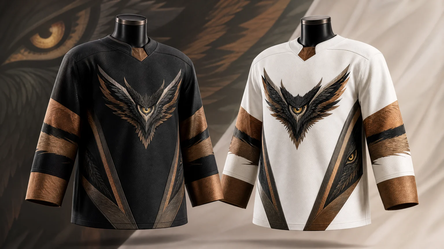
The easiest mistake in sports identity is letting the logo sit on the chest while the rest of the uniform says something else. The Vancouver Goldeneyes’ first home and away jerseys avoid that split by giving the mark work to do across the whole garment.
These newly unveiled jerseys prominently feature the Goldeneyes logo, built around a textured golden eye encircled by wings and pointing to the Pacific Northwest. The important part is not simple recognition. The design turns that emblem into a system.
One emblem doing several jobs
A strong team mark has to carry place, character, and use. Here, the eye creates a clear focal point, the wings broaden the silhouette, and the directional form ties the identity to the Pacific Northwest without extra ornament.
That economy helps the application feel convincing. A jersey has little spare room, so every visual decision needs to read at a distance, in motion, and under arena lighting.
Many sports identities lose force at this stage. They present a polished primary logo, then fill the rest of the uniform with generic striping. The Goldeneyes jerseys take the stronger route by repeating the core signature in smaller, functional ways.
Sleeve lines that extend the crest
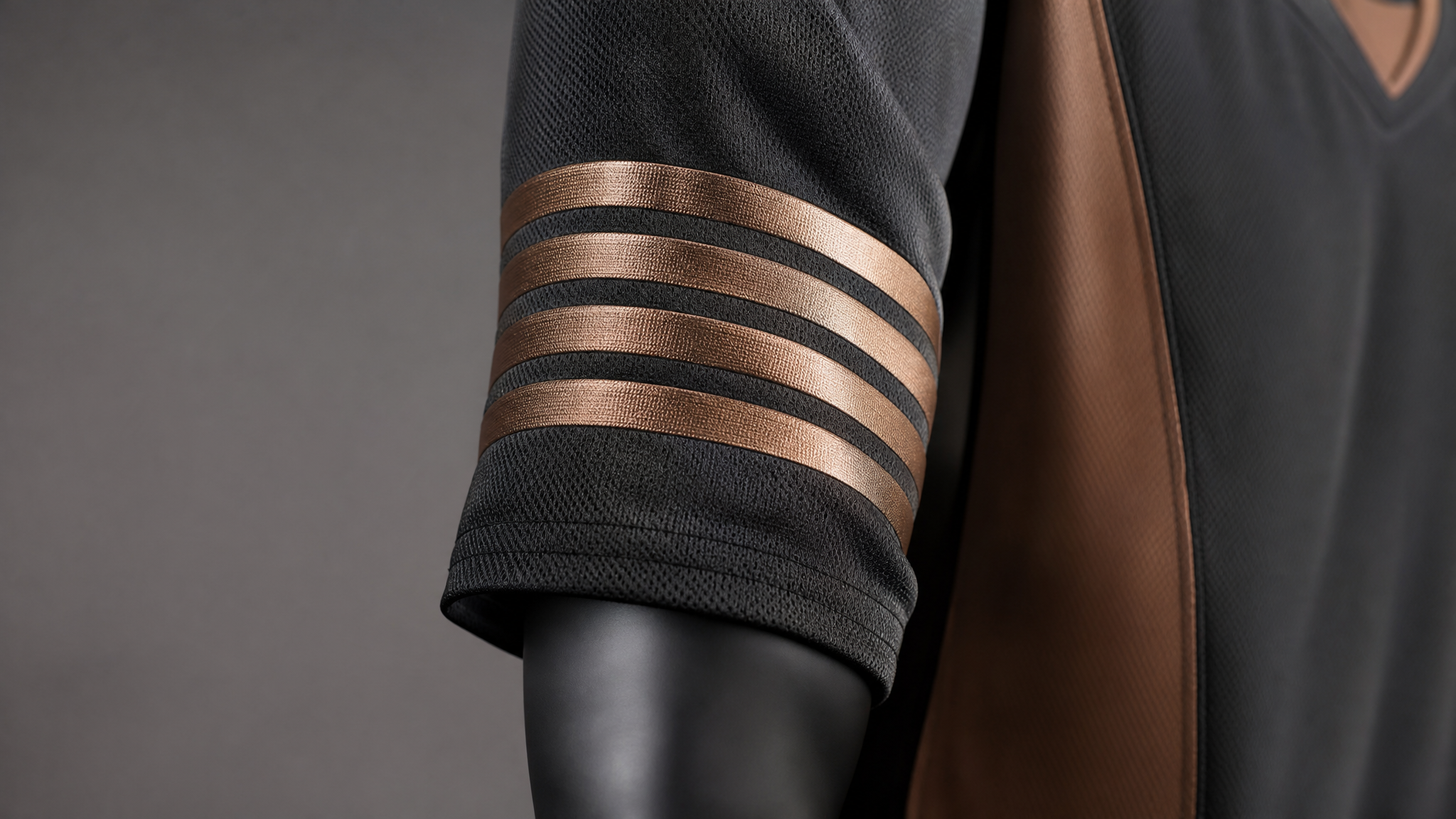
The five earthy bronze lines on each arm sleeve evoke the wings of the common goldeneye and the team’s logo. It is a modest detail, but it does real structural work. Rather than borrowing a random banding pattern, the sleeves carry the same visual logic outward.
The bronze matters too. It has weight and a natural cast that suits a bird-based identity better than a colder metallic treatment might. That keeps the jerseys from feeling overfinished while still giving them presence.
There is a practical lesson in that choice. When a secondary graphic comes directly from the primary mark, the whole kit reads with better rhythm. Fans may never name the connection, but they can tell the parts belong together.
Back numbers with a point of view
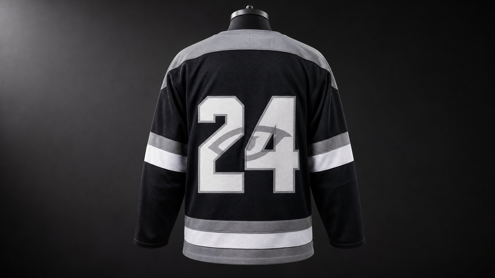
The numbers on the back of each jersey are adorned with the silhouette of the logo’s eye. That is the kind of move that separates a branded uniform from a decorated garment. Numbers are functional first, but during actual play and in photography from behind, they occupy a large share of the visual field.
Adding the eye silhouette gives the identity another point of continuity without asking the numbers to give up legibility. From the stands, the player ID stays clear. Up close, the number carries more character.
That layered approach follows a familiar pattern in durable sports systems: broad forms for instant reading, then finer detail for memory. It echoes the same logic behind sports brands that give fans something specific to remember.
Side panels that bring direction without clutter
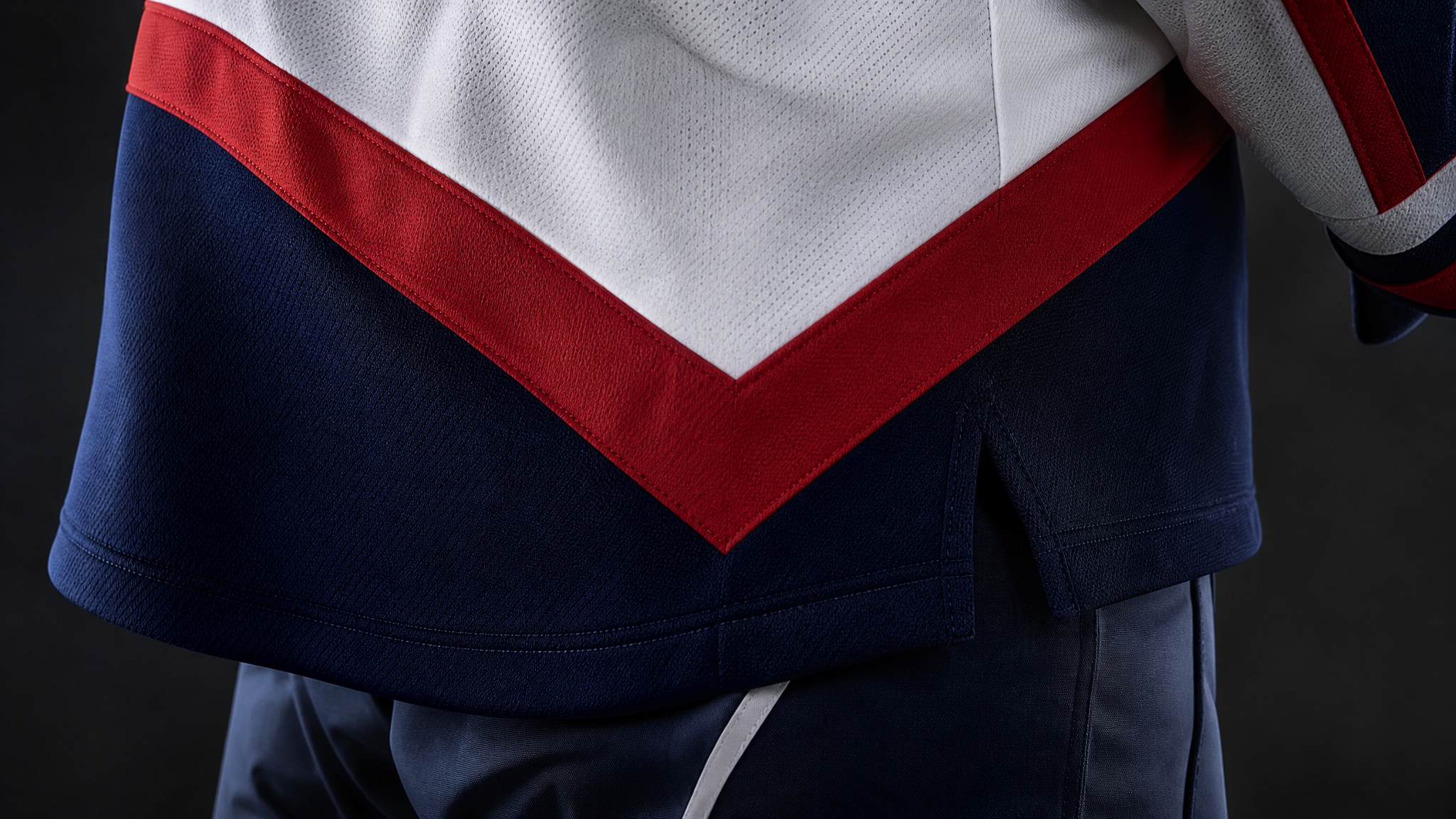
The most novel feature is the dynamic V-shaped blocking on the lower sides. It is described as a league first, and it earns that attention because one shape handles several ideas at once. It conveys motion and speed, alludes to the V in Vancouver, and references the team’s fan-favourite flying V postgame celebration.
That is a lot for one move to hold, yet it does not feel overloaded because the form stays simple. A strong jersey element often works this way: one clear shape, multiple associations. The V gives the uniform direction while keeping the body panels clean.
The distinction here is useful. Symbolism compresses meaning into a form people can recognize quickly. Clutter asks them to sort through unrelated cues. The V-blocking stays firmly on the first side of that line.
When a jersey detail points to the city, the mascot, and a fan ritual at the same time, it stops being trim and starts becoming identity.
Place and fan culture built into the garment
The Goldeneyes logo points to the Pacific Northwest, and the V-shaped blocking ties the design back to Vancouver and the team’s flying V celebration. Those links matter because sports identity works best when supporters can see themselves inside it.
That is also why the community language feels believable here. The jerseys are shaped around culture already attached to the team rather than a generic story added afterward. In practical terms, that makes the design easier to repeat across merchandise, social graphics, and arena visuals because the ideas are already concise.
For designers building systems beyond apparel, the principle is familiar. A mark becomes more useful when it can generate patterns, crops, silhouettes, and spatial cues without losing its signature. That is close to the discipline behind a modular visual library that scales without drifting off-brand.
A jersey system that feels finished
What makes these jerseys persuasive is not one hero feature. It is the relationship between crest, sleeves, numbers, and side panels. Each part repeats a shared visual language: eye, wing, V, place.
That consistency is easy to miss because it does not announce itself loudly. Still, it is the difference between a uniform that photographs well once and a system that keeps working across seasons, angles, and uses. If the team ever animates the crest for screens or in-arena moments, the winged eye and directional V already provide clean forms for a restrained logo reveal animation or short animated social logo treatment.
The broader lesson is straightforward. A sports logo becomes more convincing when it leaves the badge and enters the garment. The Vancouver Goldeneyes’ first jerseys do exactly that, and the result feels coherent from chest to cuff to back number.
 Photo Template
 Photo Template
 Photo Template
 Photo Template