
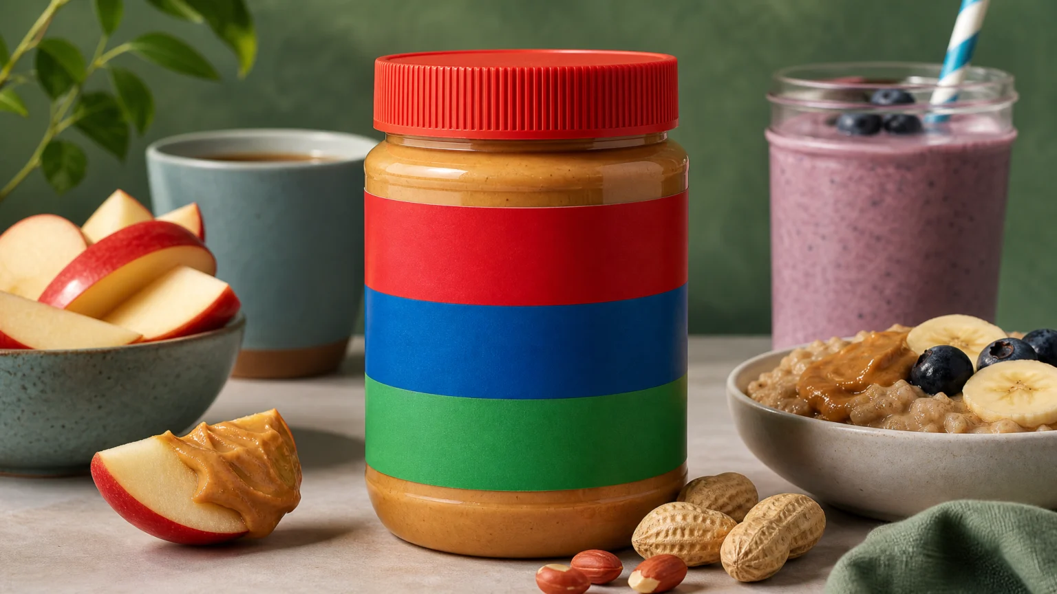
The red, blue, and green stripes do most of the work before a single letter appears. That kind of recognition is a gift for a brand, but it can also harden into a very specific idea of what the product is for.
That tension sits at the center of Jif’s recent logo rewrite. The campaign keeps the iconic striped banner in place while swapping the white letters for a rotating set of prompts: DIP, SIP, MIX. It is a small visual adjustment with a clear strategic aim.
Recognition was never the problem
Jif already had a rare advantage. 85% of consumers said they could recognize the logo from the red, blue, and green stripes alone. That means the structure is strong enough to hold attention even when the word inside changes.
The issue was not recall. It was meaning. When people saw those stripes, they thought of peanut butter and jelly sandwiches, which gave the brand a familiar place but also a narrow one.
Visual identity has to do more than mark ownership in moments like this. It has to redirect perception without throwing away the cues people already trust.
Why the rewritten letters work
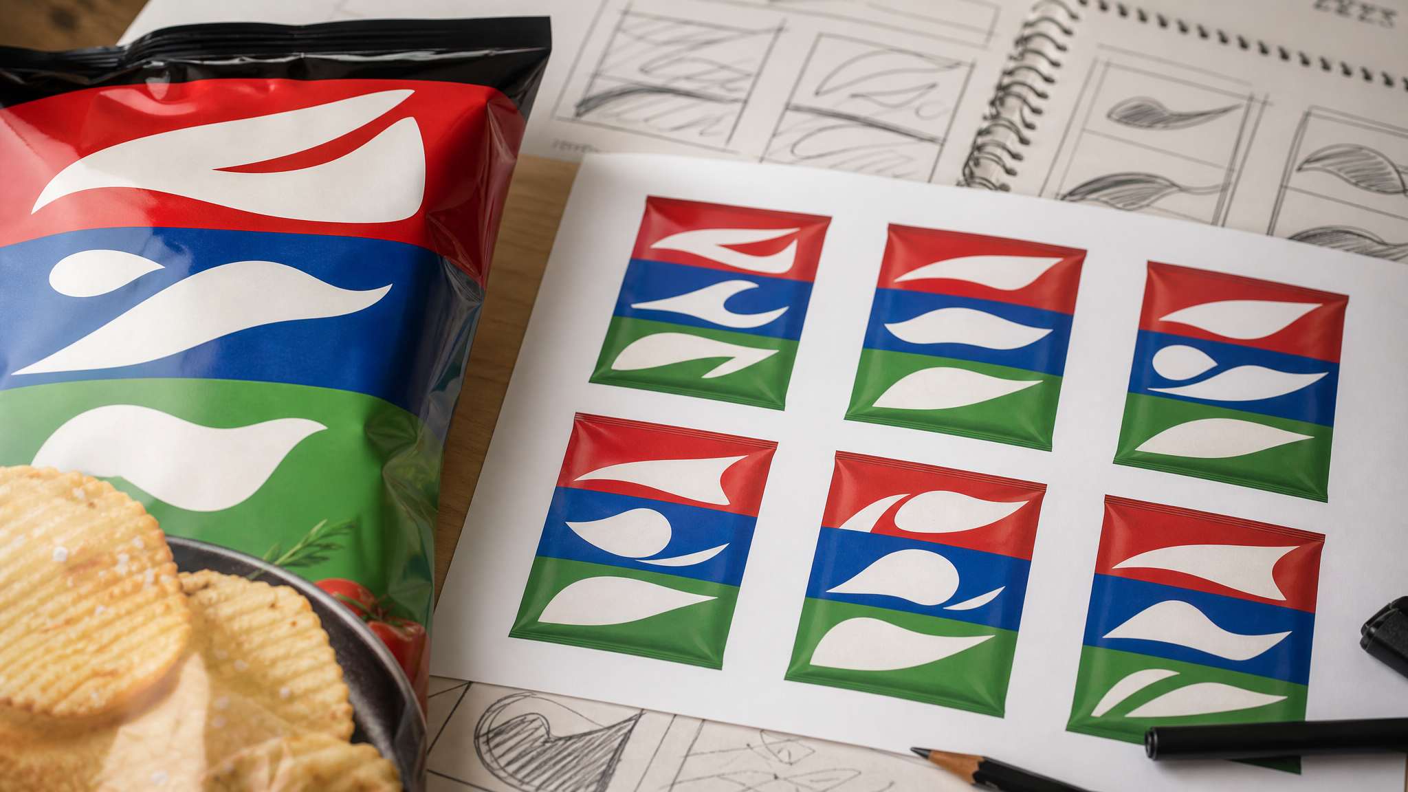
The smartest part of the device is its restraint. The tri-colour banner stays intact, so the eye lands on something known first, then registers the altered letters a beat later.
That sequence matters. Recognition comes before interpretation, and the new words create just enough surprise to widen the message without breaking the signature.
DIP, SIP, and MIX are also good visual choices. They are short, bold, and easy to read at a glance. They sit neatly inside the original letter area, so the rewrite feels designed into the system rather than pasted over it.
There is a practical lesson here for any identity built around a strong container shape. If the frame carries enough memory, the content inside it can flex. That kind of flexibility can create rhythm across a campaign while keeping the asset immediately identifiable.
A campaign device can reveal a larger system issue
Jif did not stop at campaign graphics. The brand is also unveiling a refreshed visual identity that modernizes its iconic tri-colour banner and packaging to reflect the many ways people enjoy the brand today.
That matters because packaging has to repeat the idea in ordinary use. A campaign can suggest a new role for the product, but the jar still has to support that story on shelf and at home.
If the package stays visually tied to one old habit, the broader message weakens. If the packaging updates while preserving the core banner, the repositioning has a better chance of lasting.
This is often where redesigns hold or collapse. A campaign can catch attention for a week. Packaging and identity set the long-term direction every time the product is picked up, stored, or spotted from across an aisle.
The system had enough elasticity
Not every logo could survive this kind of rewrite. Some marks depend so heavily on exact typography that even a minor edit would drain their identity.
Jif’s asset appears to have enough structure in the colored stripes that the lettering can move without losing recognition. That says something useful about how durable brand systems are built.
Distinctive assets work best when they are layered. Color, shape, banner form, package silhouette, and wordmark do not need equal weight, but more than one cue should be able to lead when another shifts.
That layered construction also helps in motion. A banner with clear color blocking can hold attention in short animated sequences, while changing words or cropped compositions can deliver different messages. Tools built for logo reveal animation or animated product photos work best when the underlying identity already has this kind of order.
Food cinematography carries the same idea
The execution goes beyond graphic design. The spots were produced with mechanical camera arms, extensive VFX, and highly detailed food cinematography.
Mechanical camera arms bring repeatable movement and exact timing. VFX helps ingredients and actions align with the changing prompts. Detailed food cinematography adds texture to the claim that the product belongs in more places than one classic sandwich.
Together, the films and the logo rewrites are pushing in the same direction. One expands the language through typography; the other expands behavior through image-making. The concept feels more convincing because both parts reinforce the same shift.
What brands with iconic assets can take from this
There is a common anxiety in identity work: once a mark becomes widely known, any change will damage recognition. Sometimes that is true. But the better question is not just whether people know the mark. It is what they think the mark means.
Jif’s approach shows a useful middle path. Keep the most recognizable visual structure. Change the smallest area needed to reframe use. Then support that move with a broader identity and packaging refresh so the message does not stay trapped inside campaign media.
- Protect the asset people recognize first. Here, the red, blue, and green striped banner carries major memory value.
- Alter one element with purpose. Rewriting the white letters creates novelty without erasing familiarity.
- Use short, concrete language. Words like DIP, SIP, and MIX read quickly and suggest action.
- Carry the idea through the full system. Packaging updates help the repositioning stay visible after the campaign ends.
- Match the message in production. Food cinematography, VFX, and camera control reinforce the expanded use cases visually.
A recognizable logo solves recall. A flexible logo system can solve perception.
That is what makes this update worth studying. It respects the memory built into the stripes, then asks the identity to do a little more. When the outer frame is this strong, a modest change in lettering can shift what people imagine doing next.
 Icon Template
 Photo Template
 Icon Template
 Photo Template


