

A tiny polished emblem can make a seat look sharper in the showroom. Put that same piece where an upper back, neck, or shoulder lands during entry, and the decision changes character.
That tension matters because the badge is doing two jobs at once. It acts as a brand signature, and it becomes part of a contact surface. Once those roles overlap, appearance is no longer the whole story.
Luxury signals often begin with material
There is a reason designers reach for metal. Painted plastic can carry the same shape and message, yet metal reads as more expensive. Polished chrome and machined aluminum carry weight, catch light cleanly, and suggest care and cost.
In branding terms, that choice makes sense. Material sets expectation before anyone touches the object, and it helps a mark feel permanent rather than applied.
That is also why this example is useful. The issue is not the emblem itself. The issue is placing a premium cue where the body meets it directly.
Where the eye approves, the body may object

A metal badge stitched into upholstery at headrest height sits in one of the most sun-exposed, skin-adjacent areas in the cabin. Metal is an efficient conductor of solar heat. In practice, a handsome insert can become a small hot plate against a shoulder blade.
That shift from display object to touch object happens through ordinary use. Someone opens the door, twists into the seat, and follows a familiar path. The emblem does not need to look aggressive to create a problem; it only needs the wrong position at the wrong temperature.
This is a reminder that user experience often turns on timing. A detail may seem harmless when viewed straight on, in controlled light, with no movement. The real performance begins later, when heat, posture, clothing, and entry motion join the scene.
Branding inside products needs spatial discipline
Interior branding works best when it respects zones of use. A mark can sit on a sill, panel, screen, or trim piece without asking the body to negotiate with it. Seatbacks are different because they are read visually and encountered physically, often in the same second.
That makes placement as important as finish. A raised emblem in a seatback is not just decoration embedded in fabric. It is a hard object introduced into a soft field, with a clear direction toward human contact.
Designers working across identity and product teams can take a useful lesson from that contrast. The moment a logo, badge, or insignia leaves packaging and enters a lived environment, its material behavior matters as much as its form.
A luxury cue earns its place when it survives contact with light, heat, and skin as well as it survives the showroom glance.
What current rules leave open
One revealing part of this case is that current safety rules do not address this specific issue. There is no federal safety standard limiting how hot a piece of interior trim is allowed to get while sitting in the sun.
That gap matters because compliance can create false comfort. A product can satisfy existing requirements and still create a poor or painful user experience in a very specific interaction. Safety frameworks set boundaries, but they do not replace careful design judgment.
For teams building physical products, this is a familiar blind spot. What is measurable and regulated tends to receive a full review. What feels obvious only after use can slip through unless someone actively tests for it.
The most useful question is a testing question
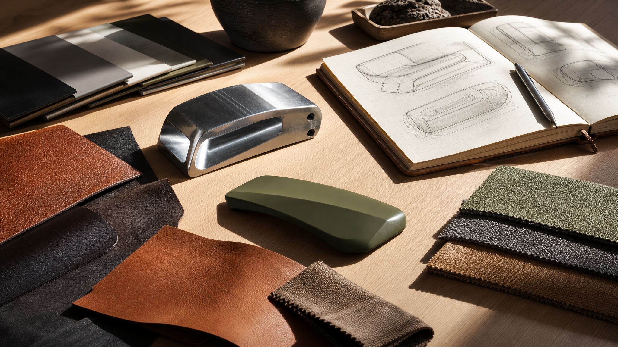
The strongest takeaway here is not about style. It is about process. A practical team would ask a simple question before production: what happens when this exact piece sits in summer sun and then meets bare or lightly covered skin during entry?
That is a testable condition, not an abstract concern. It asks the team to evaluate location, material, exposure, and body contact together rather than as separate checklists.
Good product governance often lives in these plain questions. Not every risk requires a new law or a dramatic redesign. Sometimes it requires one more prototype review, one more environmental test, or one more person in the room who thinks about use before prestige.
What designers can take from it
Small branding details often carry outsized visual value, which is exactly why they deserve more scrutiny. If a mark is raised, conductive, and placed near skin, the team should treat it as hardware with consequences, not as a graphic accent.
- Read the placement like a map of contact. Ask where shoulders, hands, legs, and clothing pass during normal use.
- Treat material as behavior. Metal does not only shine differently from plastic; it heats differently too.
- Test the real scenario. Sun exposure, parked conditions, and entry motion can reveal issues a studio review will miss.
- Separate premium appearance from premium experience. If the two conflict, the finish is not doing its job.
There is a broader lesson here for anyone shaping identity into objects. A badge is never just a symbol once it gains thickness, temperature, and position. It enters the choreography of use.
Design becomes more credible when visual intent and physical comfort move together. If they pull apart, even a handsome detail can start to feel careless.
Why this matters beyond one emblem
This is not really a story about one badge alone. It is about a recurring design habit: treating visible signals of quality as if they stop at the eye. In reality, every material choice continues into touch, heat, maintenance, aging, and habit.
That is especially true in products people inhabit rather than simply hold. Interiors ask more from branding because the user is surrounded by it, leans against it, and returns to it in different weather and states of attention.
For visual designers, this expands the brief. A mark can be beautifully drawn and correctly placed in compositional terms, yet still be wrong in context. The best branded details understand the body as part of the layout.
Teams exploring how visual elements change once they gain depth and motion often run into the same principle elsewhere: form needs to behave well in the environment it enters. That is true in physical objects, and it is also why designers pay attention to surface, contrast, and readability when building 3D logo animation or shaping branded assets inside a creative studio workflow.
The quiet standard is simple. A premium detail should look considered, feel considered, and remain considered after sunlight has had its say.
 Photo Template
 Icon Template
 Logo Template
 Logo Template


