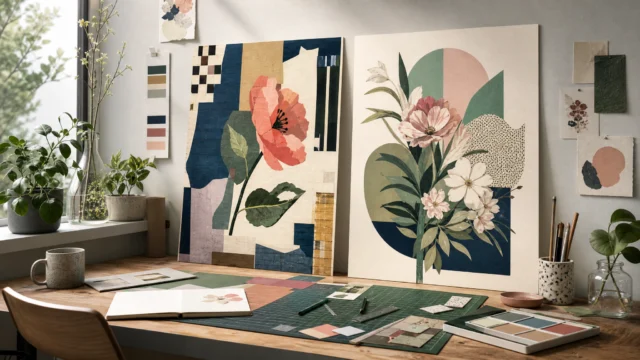
The memorable part was never a lavish print finish. It was a plain H in a circle, a sleeve with a cutout, and a run of objects that looked touched by real hands. With almost no money, the label built a visual identity people could recognize before they heard a note.
That changes the role of design. Artwork stops being packaging around the music and starts becoming part of the memory of the release itself. The world feels coherent because the mark, the sleeves, and the small details keep pointing in the same direction.
A logo resolved fast and stayed open
The mark began with a direct decision. The international symbol for a hospital is an H, so the logo became an H in a circle, and the basic form was resolved in about five minutes.
The useful part is not the speed for its own sake. A simple symbol holds when the association is immediate, the silhouette reads quickly, and the mark leaves space for a larger visual system to do the heavier work. Here, the logo set the tempo while the packaging built the richer signature around it.
That balance is easy to miss. Many identities overwork the center and underbuild the edges, but this one let a spare mark carry repeated use while sleeves, materials, and formats created the personality over time. If you like identities that stay disciplined at the core, this distillery mark built from two family emblems offers a related example.
Constraint shaped the packaging system
Budget affected the early artwork in direct ways. The team wanted something special, but could not afford expensive finishing methods such as spot varnishes.
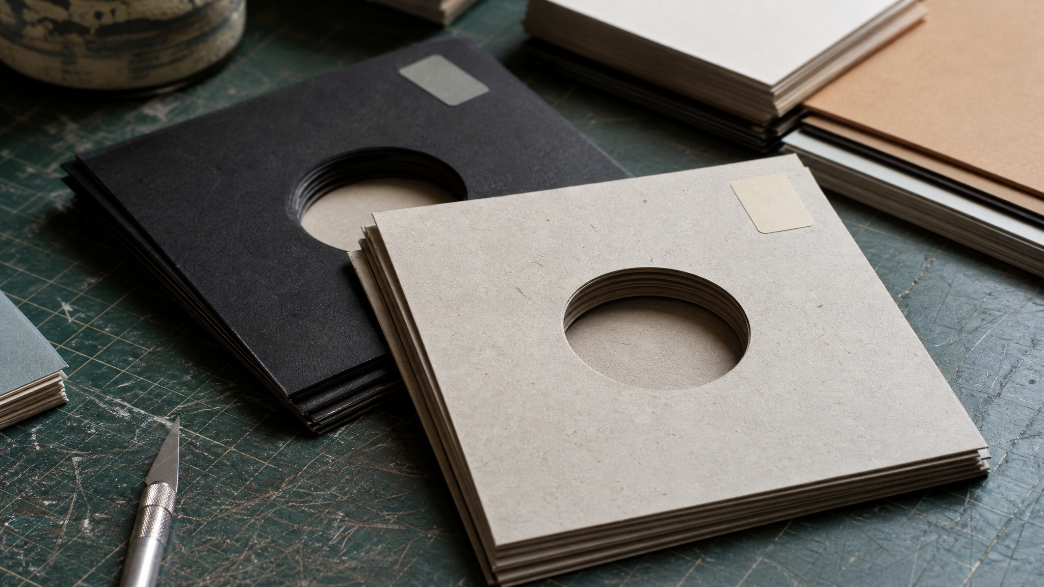
That limit led to a more distinctive package: die-cut H sleeves paired with prescription-style stickers. Those sleeves became part of the label’s visual identity for roughly its first ten years.
That matters because recognizability does not always come from premium production. Sometimes it comes from a repeatable structure, a strong outer shape, and one or two recurring components used with consistency. From across a room, that reads faster than a subtle finish ever could.
There is a practical production lesson here too. A cost-aware package can still feel authored when one memorable intervention gets repeated with care. For small-batch physical work, this guide to small-batch packaging dielines is a helpful companion.
Handmade methods kept the work specific

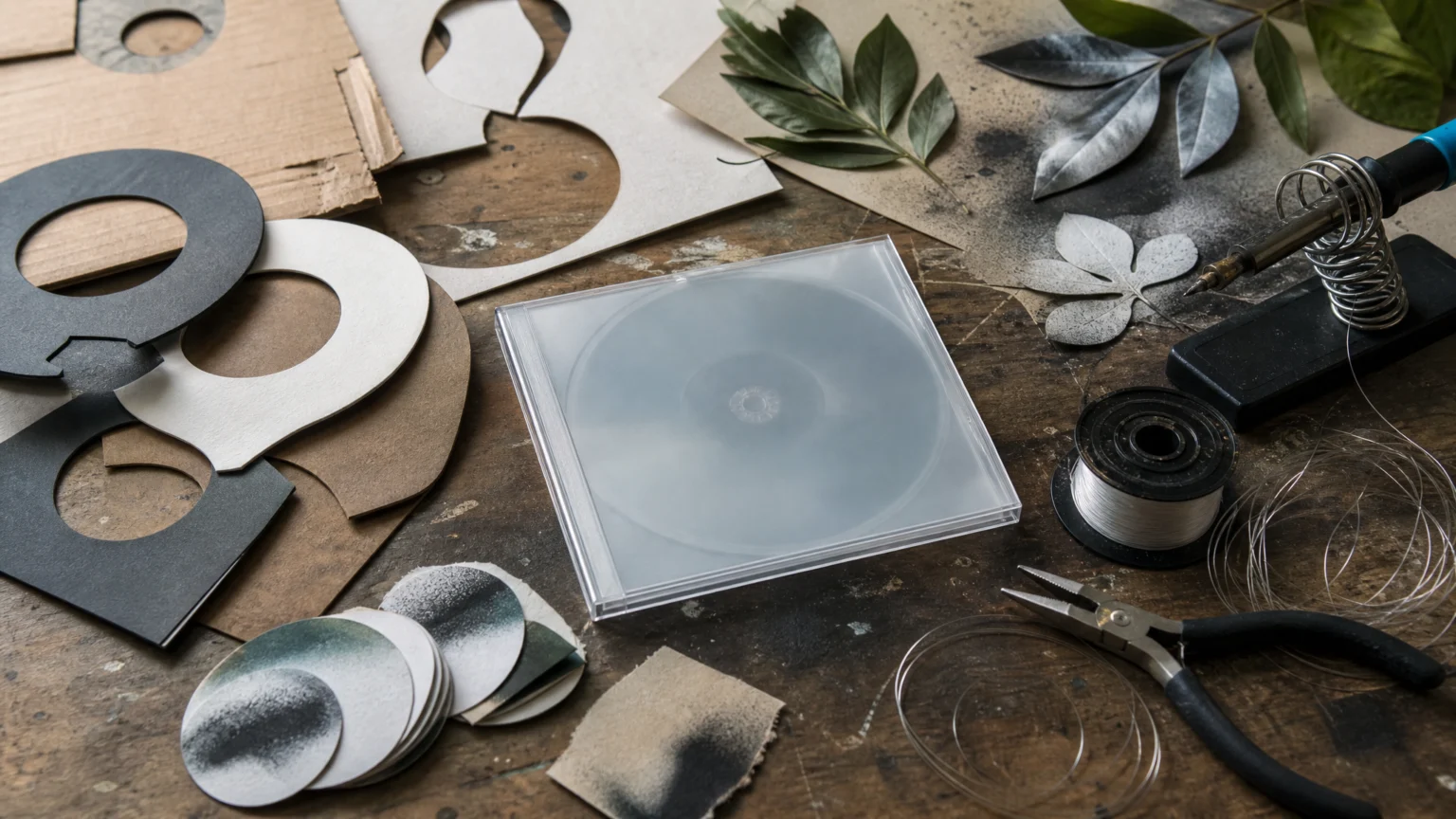
The archive includes unusually tactile making. A light was physically soldered together. Real leaves were collected and spray-painted blue. A wooden box was built and threaded with fishing wire.
Those choices explain why the artwork resisted the flat sameness that often settles over genre packaging. Physical construction brings in small irregularities of texture, scale, reflection, and spacing that software rarely invents on its own. The result feels present rather than generic.
Craft is not just a nice sentiment here. It changes the image itself. Edges feel handled, surfaces catch light unevenly, and compositions carry visible decisions instead of default settings.
The personality is in the imperfections.
That line works as a sharp test for any identity system. If everything is too clean, too centered, and too finished, the work can lose the human friction that helps it stick. Handmade collage photography and visual signature explores that same idea from another angle.
Difference was built on purpose
The team wanted work that did not resemble other drum and bass labels. That sounds obvious, but many category brands still reach for the same type, the same textures, and the same mood until they become hard to tell apart.
Standing apart usually takes more than new colors or extra noise. It comes from repeated decisions about what shape returns, which materials keep appearing, what kind of wit shows up, and how far the references sit from category expectation. That is where the identity gains its rhythm.
This body of work is instructive because it never chases neutrality. It commits to a point of view and lets each release perform that choice again.
Humour gave the packaging a social life
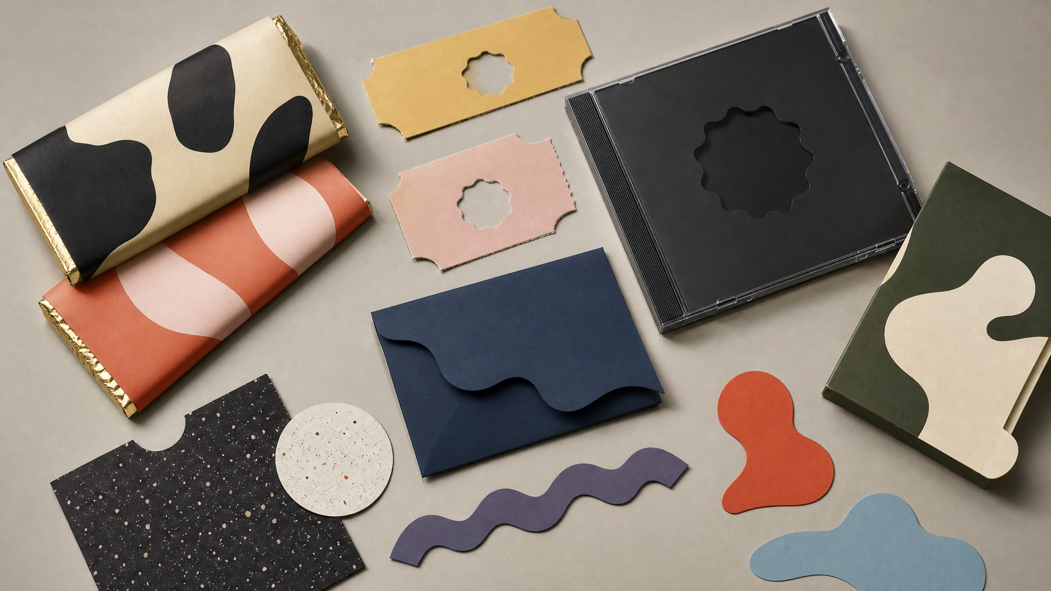
The packaging examples show a label comfortable with wit. There were actual chocolate bars, five genuine golden tickets, a die-cut S, an opaque black jewel case, and even a four-sleeve hospital map for a release titled NHS500.
These are not random stunts. They show packaging used as the meeting point between concept, object, and audience. Humour gives the identity a human timing: people show it to each other, keep it, and remember the release before they even press play.
For designers, the useful move is straightforward. If a brand has room for play, put it inside the artifact rather than leaving it to captions and campaigns. Material jokes, hidden references, and structural twists usually last longer than promotional lines.
The archive shows the system underneath
At first glance, handmade album artwork can look highly varied. Look longer and the pattern appears. The recurring H, the die-cuts, the stickers, the object-based concepts, the appetite for physical making, and the acceptance of imperfection add up to a coherent visual language.
That is how strong identities usually work. They do not repeat one picture. They repeat a way of making pictures. The system sits underneath the surface and guides decisions without forcing every release into the same performance.
This is especially useful for teams managing assets over time. A good archive does more than store files; it helps people see which choices are central and which can flex. Clear asset tagging and categorization gets easier when the brand’s recurring visual parts are truly specific.
Small brands can borrow the method, not the look
The lasting value here is not any single sleeve or the circle-H logo alone. It is the combination of direct symbolism, repeatable packaging structure, physical experimentation, and confidence in imperfection.
For a small label, studio, or product line, that can translate into a few practical moves:
- Choose one simple, legible core mark that can appear everywhere without strain.
- Build one recurring packaging device such as a cutout, sticker position, or structural wrap that people learn to expect.
- Use real materials when possible so the visuals carry texture that software alone may flatten.
- Leave room for wit when the concept supports it, especially in objects people can hold.
- Protect small irregularities if they add character rather than confusion.
There is a digital extension too. If a static identity already has a strong shape and tactile logic, motion should reinforce that clarity rather than overwrite it. A restrained logo reveal animation can echo the confidence of a simple mark, while photo motion effects can add depth to object-based artwork without sanding off its handmade feel.
The larger point is reassuring. Lasting identity does not require luxury production. It requires a symbol people can keep reading, a system they can keep recognizing, and enough conviction to leave the rough edges visible.
 Icon Template
 Photo Template
 Icon Template
 Icon Template