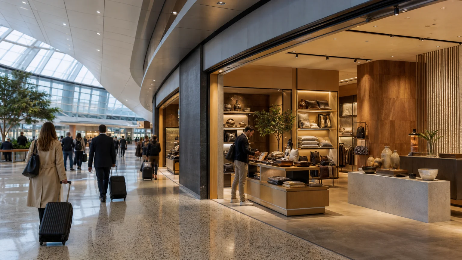
A traveler often sees the store before they decide they have time for it. That split second is the real brief in airport retail: read clearly from the concourse, then make the next step feel easy enough to take.
That is why these stores can look simple from a distance and still demand tight visual control behind the glass. The customer is hurried, the costs are high, and the store gets very little time to explain itself.
Visibility has to convert, not just announce
Airport retail is often justified as a branding environment as much as a sales channel. In plain terms, some of these stores operate like an expensive billboard with a billing counter attached.
The phrase sounds blunt, but it clarifies the design problem. A billboard can build recognition, while an airport store adds touch, trial, purchase, and even later return elsewhere. The brand stops being flat and becomes spatial, tactile, and measurable in ways traditional advertising cannot.
That changes the job of the storefront. It cannot rely on awareness alone. It has to turn visibility into a usable first impression, then into confidence quickly enough for a traveler to act.
That also helps explain why brands keep paying for airport space despite the cost. Remove the retail piece and you remove the moment when curiosity can turn into action.
Speed redraws the rules of good retail
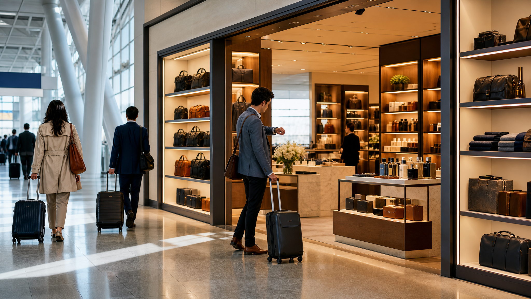
Airport shoppers are time-poor and driven by convenience. That single condition shapes almost every visual choice, from assortment clarity to the way products are grouped and faced.
In a mall, someone can browse, compare, drift away, and return. In an airport, the timing is tighter. A traveler needs to grasp what is being sold, why it is useful or giftable, and how quickly it can be bought.
Strong airport retail design strips out interpretive friction. Product categories need a clear hierarchy. Hero items need to read at a glance. The path from noticing to holding to paying should feel short.
For visual teams, this is less about decorating a premium location and more about editing it. Every surface should help the eye choose a direction.
Repeat travelers stop seeing static displays
People who pass through the same terminal regularly notice sameness sooner than many retailers expect. That is why frequent visual merchandising changes matter so much in airports.
Hidesign changes the storefront of its airport stores every month to keep regular flyers engaged. The logic is simple: a person who comes through the airport every week will stop registering a display that never changes.
There is a useful lesson here for any brand working in high-frequency environments. Familiarity supports recognition, but repetition without variation becomes visual wallpaper. The best systems keep a stable signature while making room for fresh product stories, seasonal gifting cues, and small shifts in emphasis.
That balance resembles the logic behind continuous brand presence. A brand stays coherent because its core assets are controlled, yet it stays alive because the presentation keeps moving.
Gifting changes the merchandise story
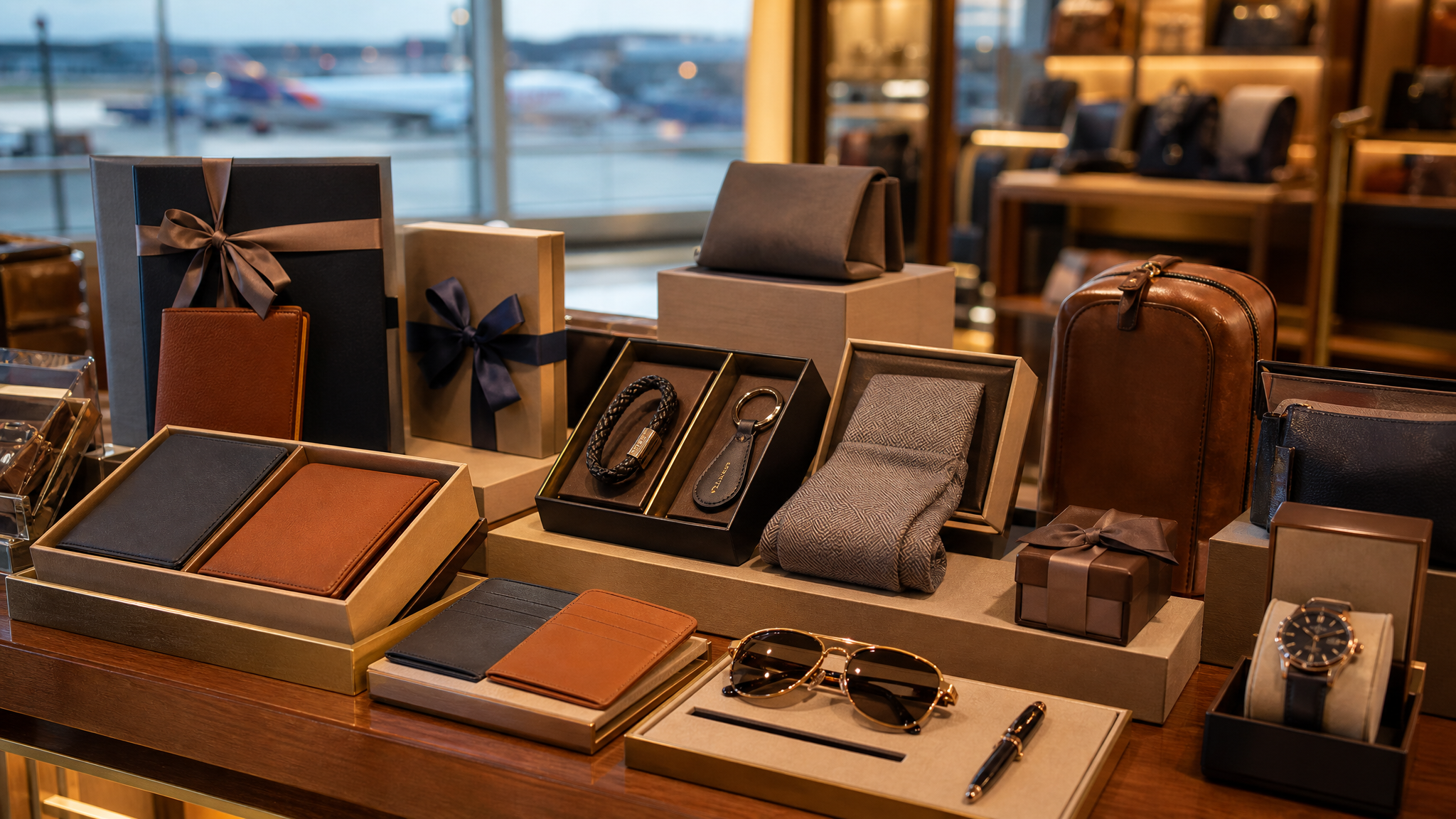
Airport retail is not ordinary retail placed near gates. Traveler behavior changes what sells, and that changes how the store should look.
For Hidesign, the merchandise mix in airports skews toward gifting, and those stores generate roughly twice the turnover of an average mall store. A gifting-heavy mix creates a different visual emphasis than a self-purchase environment. Products need to read as immediate, presentable, and easy to choose without long comparison.
Design can support that behavior with tighter product grouping, clearer value ladders, and packaging that looks resolved from a middle distance. The display should reduce hesitation. If the customer is buying for someone else, reassurance matters even more than novelty.
This is where packaging and retail staging start working as one system. The same principle appears in package design that resolves before the shelf test begins: when the object explains itself quickly, the shelf or store has less rescue work to do.
High costs make weak choices easier to see
Airport rents, minimum guarantees, revenue-share structures, staffing, and operating costs can make these stores significantly more expensive than conventional retail. Once those economics are in view, vague visual decisions stop looking harmless.
An unclear frontage, a muddled assortment, or a display that asks for too much attention all carry a real penalty. If the store exists partly for branding and partly for sales, both parts need to perform. Visibility without conversion is hard to justify, and conversion without distinct brand memory wastes the location.
That is why airport environments reward precise visual hierarchy. The frontage should announce the category. The first tables or shelves should confirm the promise. The checkout should feel near enough that the customer can estimate the effort immediately.
Good design does not erase difficult economics. It gives the store a better chance to earn them back.
Touch closes the gap faster than advertising can
One of the strongest arguments for airport retail is physical engagement. A traveler can see, touch, try, buy, and later remember the product in one compressed sequence.
That matters because airports gather attention in a particular way. People are constrained by gates, waiting periods, and security routines, yet mentally split between travel logistics and purchase decisions. In that setting, tactile proof can do what a poster cannot.
For brands, the implication is practical. The store should present products so that touching them feels invited rather than awkward. Materials, lighting, spacing, and counter placement all affect whether that moment happens naturally.
It also suggests a useful role for subtle motion in adjacent brand assets. Outside the store, a restrained animated logo for websites or other digital placements can extend recognition between booking, browsing, and post-trip follow-up, but the store itself still has to let the hand confirm what the eye noticed first.
An airport store works like a compressed brand system
The clearest way to understand airport retail may be this: it is a condensed brand performance. It has fewer seconds than a typical store visit, higher costs than many standard locations, and more pressure on first-read clarity.
That does not mean every airport shop should look loud. It means every visual element needs a job. The storefront attracts. The product mix answers. The layout shortens decision time. The tactile moment seals belief.
When those parts are aligned, airport visibility becomes more than exposure. It becomes a compact selling environment that can build memory and produce revenue at the same time.
When they are not, the store risks becoming exactly what critics fear: a very expensive sign with stock inside.
 Photo Template
 Icon Template
 Icon Template
 Logo Template