
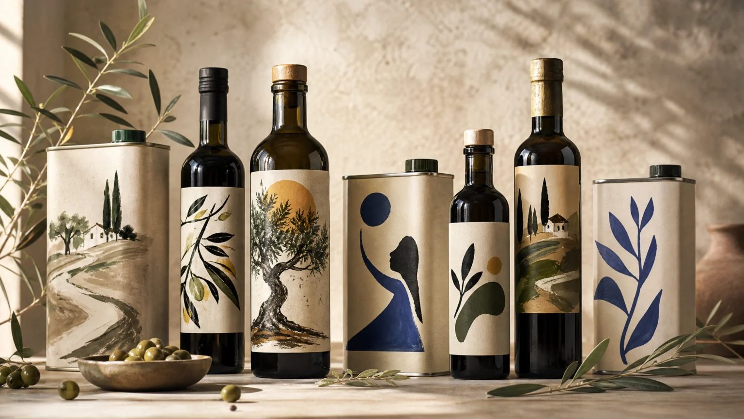
Most food packaging tries to steady the shelf by repeating itself. The same label logic, the same graphic voice, the same promise of order. This olive oil brand took the opposite route and found clarity in variety.
The product needed a brand identity, but the answer was not one fixed look. Bottles and cans became a site for commissioned illustration, with multiple artists shaping the packaging as an evolving surface rather than a closed system. That choice shifts identity away from rigid sameness and toward a recognizable attitude.
Packaging as a living visual language
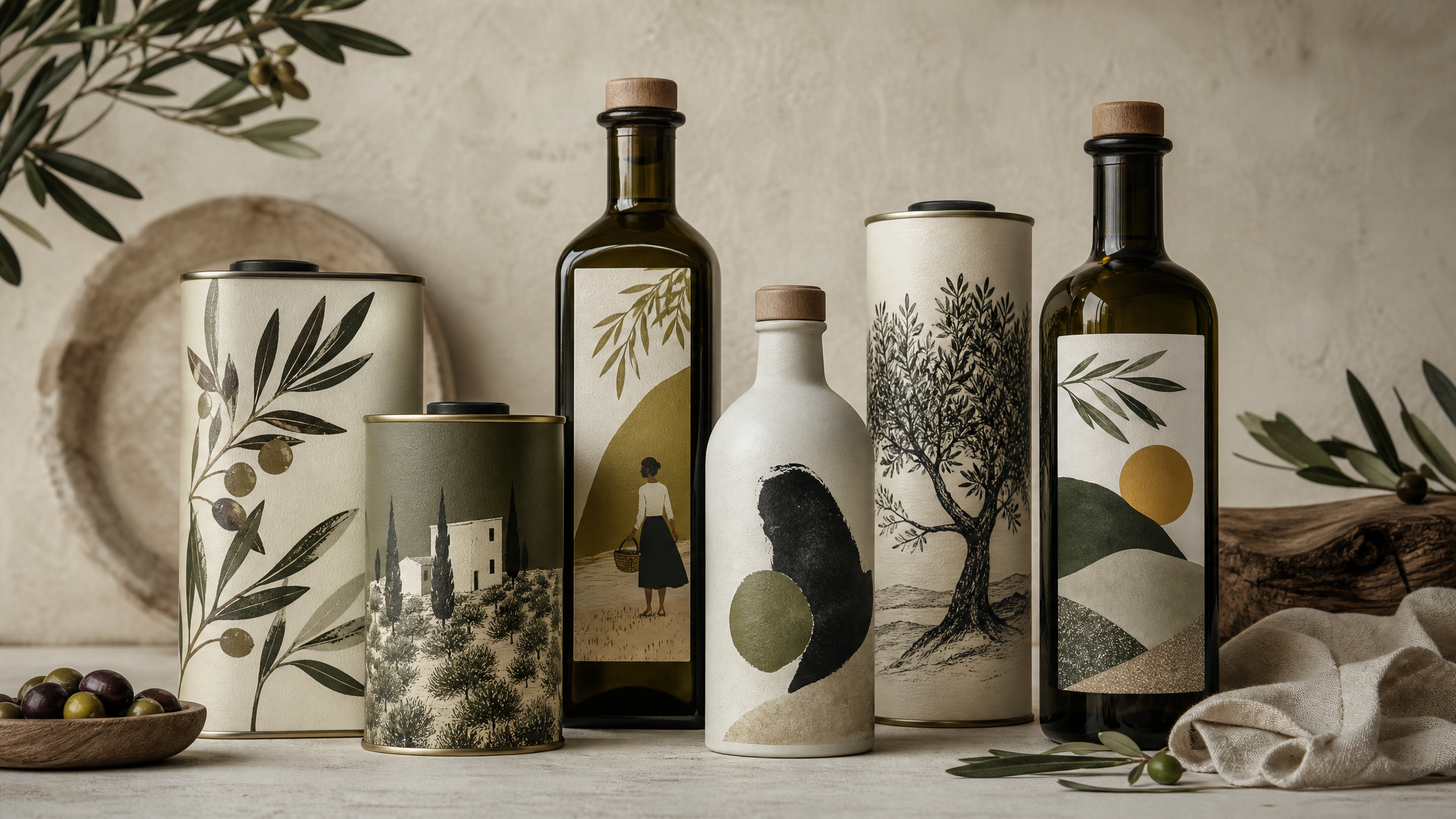
There is a practical tension at the center of this approach. A brand usually wants to be instantly identifiable, while illustration often brings individual style, surprise, and edge. Here, the brand resolves that tension by treating variety itself as the signature.
Instead of selecting one illustrator and freezing the system, the team commissioned a whole group of illustrators for labels across bottles and cans. The packaging stayed playful and open to change, and that evolving set of images became the defining visual language of the Greek olive oil brand. Consistency here does not come from repeating form. It comes from repeating intent.
That distinction matters for anyone building an identity system. A fixed logo, color block, or grid is only one route to recognition. A repeated curatorial point of view can do similar work, especially in a crowded category full of familiar premium cues.
Why the canvas idea changes the result
The philosophy behind the packaging is unusually clear. Juli had worked in a gallery, Tom used to make films, and neither saw a reason an olive oil can should be treated differently from a canvas. That decision reframes the package from container to creative surface.
Once the package becomes a canvas, different questions move forward. Instead of asking only how to look premium or authentic, the team can ask what kind of image world the product belongs in. The art is not decorative garnish added at the end. It becomes the public face of the brand.
That does not make the work less commercial. It makes the commercial decision more precise. If a shelf is full of products signaling quality in familiar ways, a package carrying commissioned artwork changes the timing. It slows the eye just enough to create interest, and that pause has value.
The logic also extends beyond packaging. Any brand trying to avoid an over-managed look can study the structure here: define the frame, then allow expression inside it. The frame might be format, material, art direction, or commissioning rules. The expression can shift without dissolving the identity.
The artists are the system
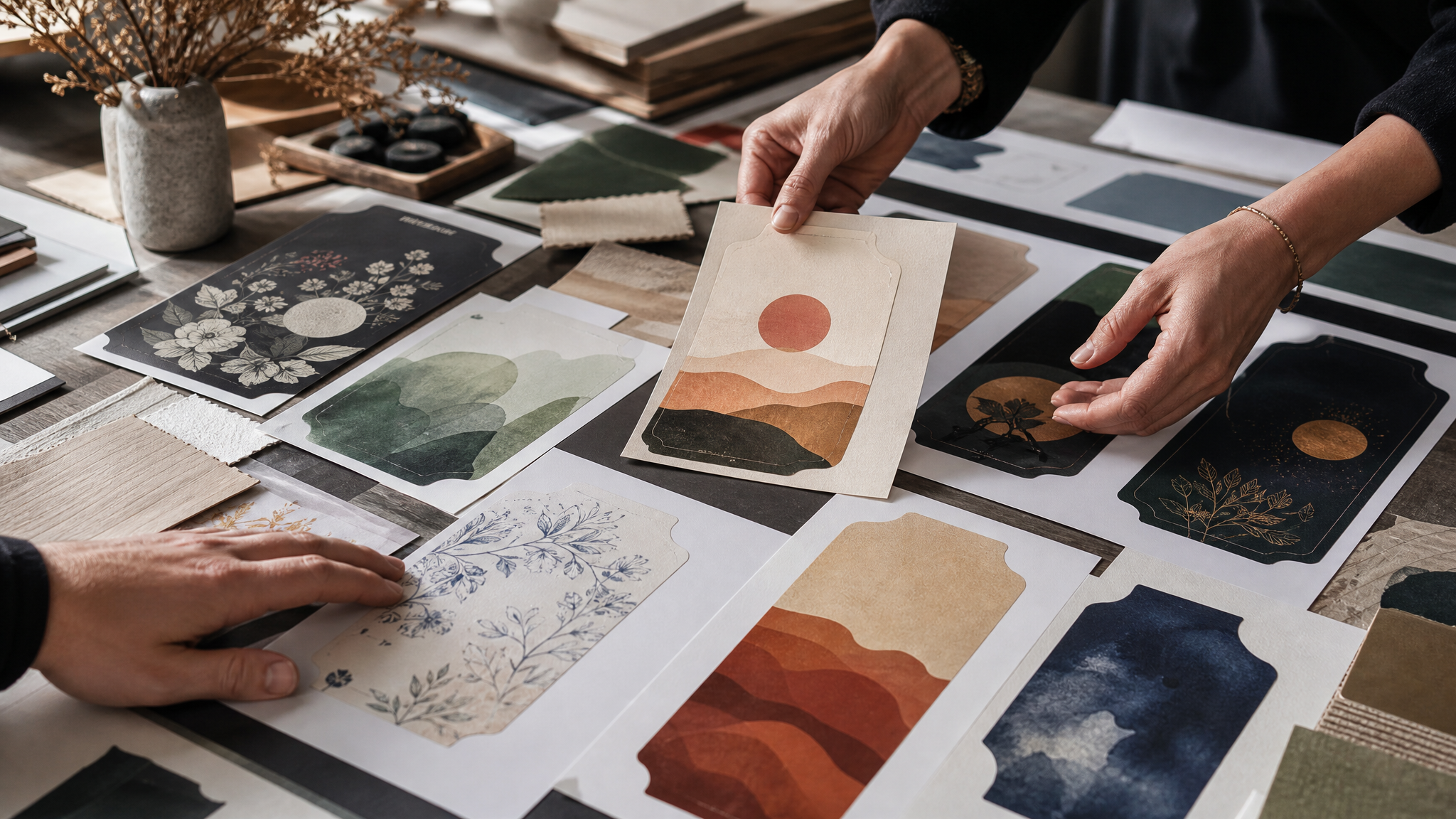
This strategy works because the artists are not incidental contributors. Their work is the brand language. Dóra Berczi, Enikő Katalin Eged, Zena Kay, Philipp Beck, Tine Damgaard, Eszter Kiskovács, Tamás Molnár, and Sandra Poliakov have all created labels for the bottles and cans.
That list matters because it shows the approach is not symbolic. It is operational. The brand identity is being built through actual commissions, with distinct hands contributing to a shared visual field.
There is a practical lesson in that. Multi-artist systems only hold together when the curation is disciplined. The brand needs a strong editorial eye to decide what belongs, what repeats, and what should remain unresolved. Variety without curation feels random. Variety with curation feels alive.
Why this stands out in food and packaging design
Olive oil is a category with heavy visual habits. Heritage cues, restrained typography, muted color, and regional signals often carry the load. There is nothing wrong with those tools, but they can flatten difference when everyone reaches for the same set.
This brand chose a more elastic system. By using commissioned illustration across bottles and cans, it made room for surprise while still staying in one lane. The packaging can evolve over time without reading like a redesign every season.
That is a subtle advantage. A total rebrand often interrupts memory. An evolving illustration program keeps memory intact while giving the audience something fresh to notice. The movement is cumulative rather than abrupt.
It also gives the brand more cultural reach. People may first encounter the product as olive oil, but they can keep thinking about it as an object worth looking at, collecting, or discussing. Packaging rarely gets that second life unless the visual decisions are doing more than identifying the contents.
Commercial proof matters
Plenty of expressive packaging earns admiration and stops there. Here, the design choice translated into real placement and preference. The olive oil is now used by Ottolenghi, Bubala, and The Dusty Knuckle.
That grounds the design in use, not just attention. Restaurants and food businesses make practical decisions about what they stock and serve. When a visually distinctive package also becomes the oil of choice in respected kitchens, the brand’s artistic stance starts to look less like a gamble and more like a well-judged system.
There is a broader lesson in that outcome. Expressive design does not need to sit opposite trust or product seriousness. If the work is clear, well curated, and rooted in a believable point of view, visual boldness can support credibility rather than compete with it.
What other brands can borrow from this approach
Not every brand should commission a rotating set of illustrators. But many brands could benefit from separating consistency from sameness. That shift opens better options, especially in categories crowded with nearly identical signals.
- Choose a principle, not just a style. A commissioning model can be more durable than a fixed aesthetic if the principle is clear enough.
- Design the frame carefully. Bottles and cans provided a stable structure here, allowing the artwork to change without breaking recognition.
- Curate with intention. Multiple contributors need a strong editorial hand or the system turns noisy.
- Let packaging do cultural work. A label can identify a product, but it can also set tone, attract a new audience, and shape memory.
There is also a useful restraint in this model. The packaging is playful, but the underlying idea is simple. That simplicity is why the brand can sustain many visual voices without losing itself.
When identity conversations get stuck on logos and locked systems, this olive oil brand offers another route. Keep the container real, keep the point of view steady, and let artists give the brand its changing face. Done well, that reads less like inconsistency and more like confidence.
 Icon Template
 Photo Template
 Logo Template
 Logo Template


