
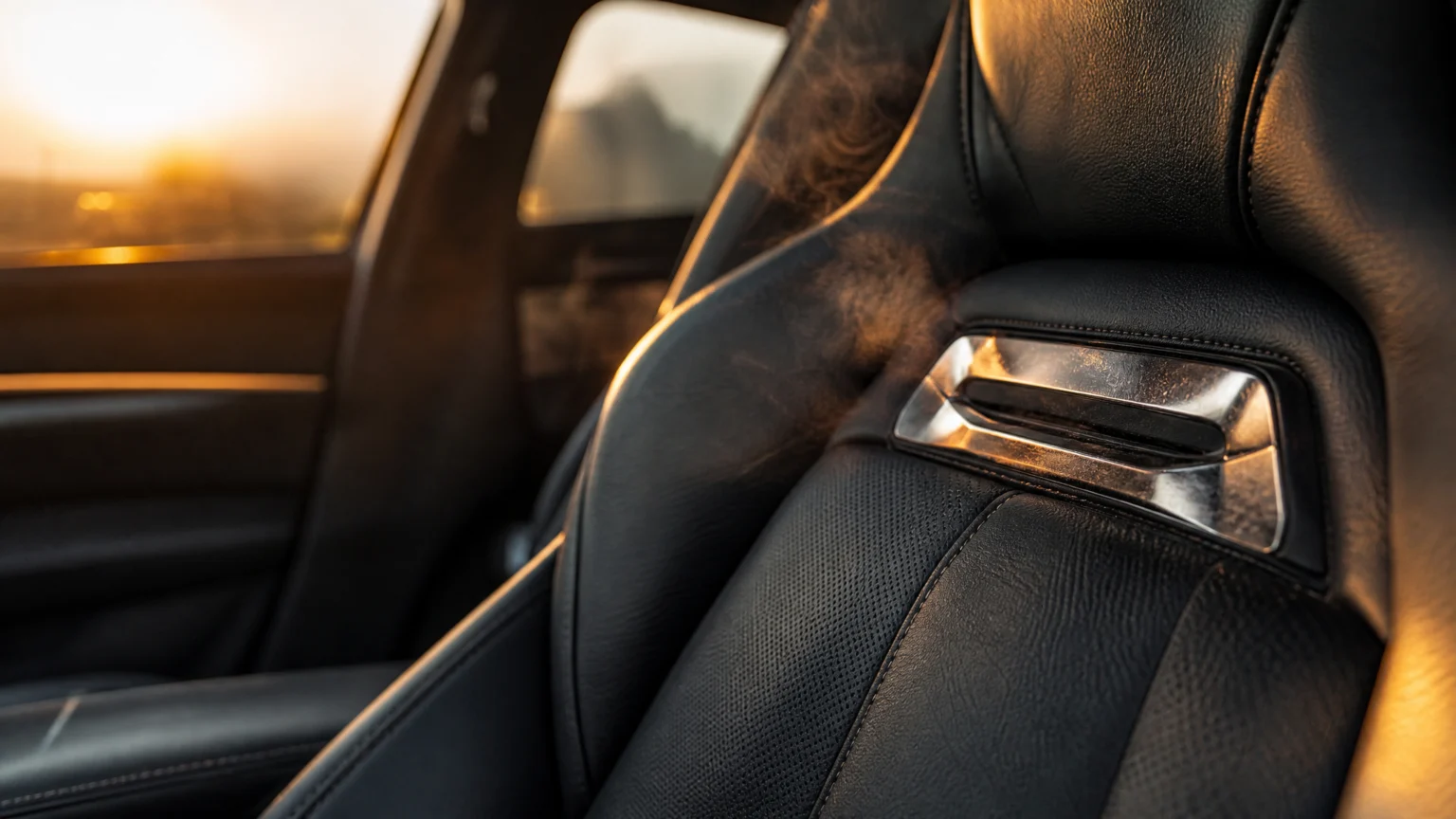
A metal badge in a car seat reads like a minor flourish until it stops acting like graphics and starts acting like hardware. That shift sits at the center of a class-action lawsuit alleging Mercedes-AMG seat badges became dangerously hot in the sun and caused logo-shaped burns.
What makes the case so unsettling for designers is how quickly the distance collapses between brand expression and bodily contact. A mark that usually lives on screens, grilles, packaging, or stitched surfaces was embedded into the place where a person leans, rests, and moves. The branding did not stay symbolic. It became material.
When a signature becomes a surface hazard
The lawsuit alleges that metal AMG seat badges heated up enough to injure owners. Plaintiffs want Mercedes to pay to have the metal AMG seat emblems removed, which clarifies the design issue: the concern is not branding in the abstract, but branding executed as a hard metal insert inside a seat.
That distinction matters. A seat is one of the most body-aware parts of a vehicle. It carries weight, absorbs heat, meets bare skin, and supports people for long periods. Any embedded element in that surface has to answer basic questions about temperature, placement, edges, and contact over time.
Luxury and performance brands often use small material cues to signal care and character. A metal badge can add contrast, catch light, and sharpen a cabin’s finish. But the visual payoff only holds if the detail respects the body first.
The body belongs in the brief
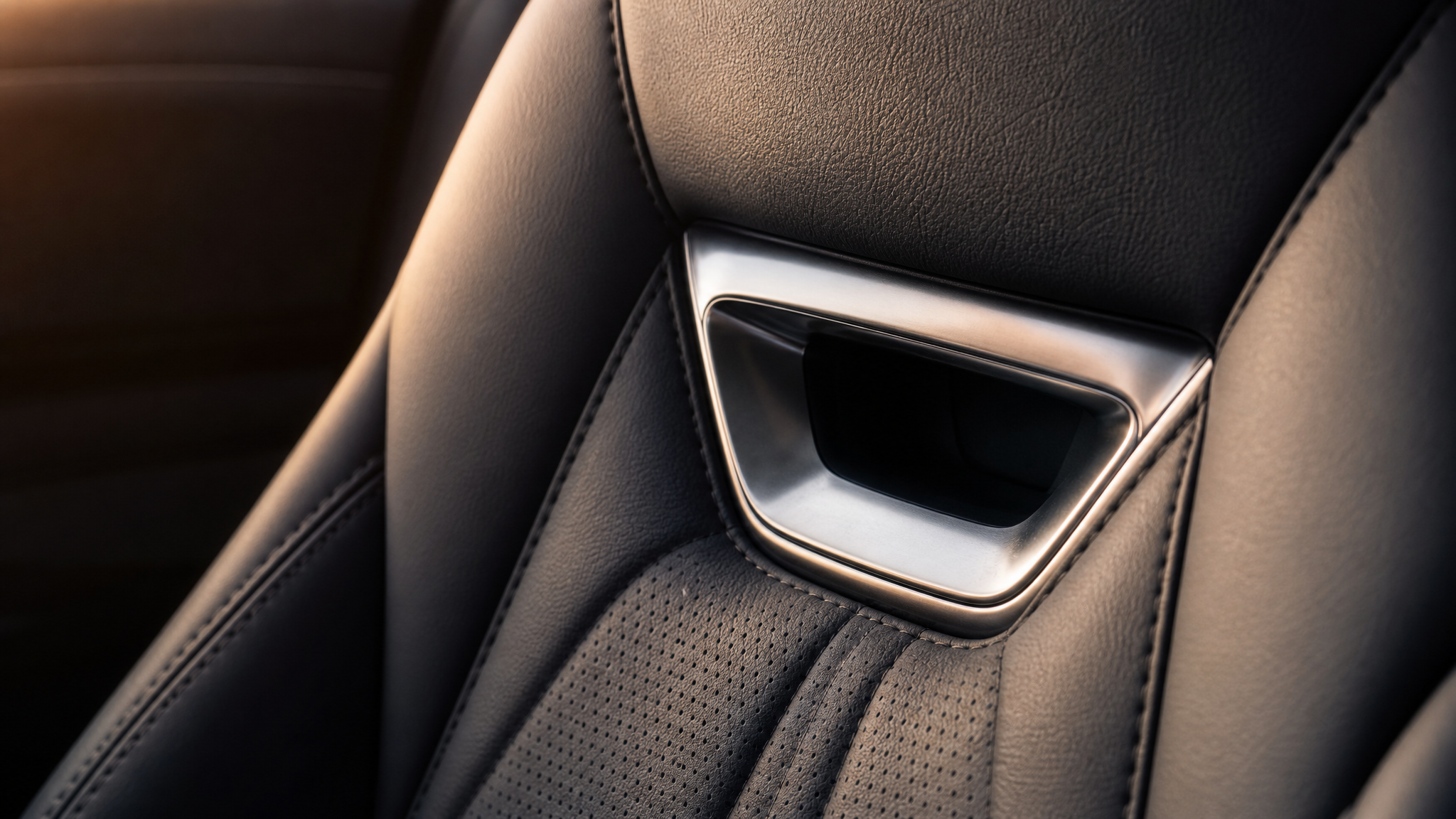
One plaintiff allegedly suffered an injury a doctor described as AMG inscribed, meaning the performance brand’s familiar logo had essentially been branded onto his back. It is a striking phrase because it merges brand identity and injury into the same image.
Designers often discuss placement, scale, and hierarchy. This case adds a simpler test. If a branded element sits where skin can meet it directly, the body is part of the brief from the start.
That may sound obvious, yet premium detailing can drift toward display value. The seat starts performing for the eye rather than serving the person sitting in it.
Why this choice feels different from decoration
There is a meaningful difference between a logo printed on a surface and a separate metal emblem embedded into one. Print, embroidery, embossing, and stitching usually stay closer to the seat’s existing material behavior. A metal insert introduces a new thermal and tactile condition.
That is why this story works as a broader critique of physical branding. A logo is never just a shape once it becomes an object. It gains temperature, weight, hardness, reflectivity, and thickness. Its direction in the composition may still feel elegant, but its physical presence now carries consequences.
The lawsuit names plaintiffs Gabriel Lahijani and Karendeep “Karina” Bath and cites case number 2:26-cv-08680, filed in the U.S. District Court of California’s Western division. Those specifics make the dispute concrete, but the design warning reaches beyond one automaker or one seat.
Less branding can be better design
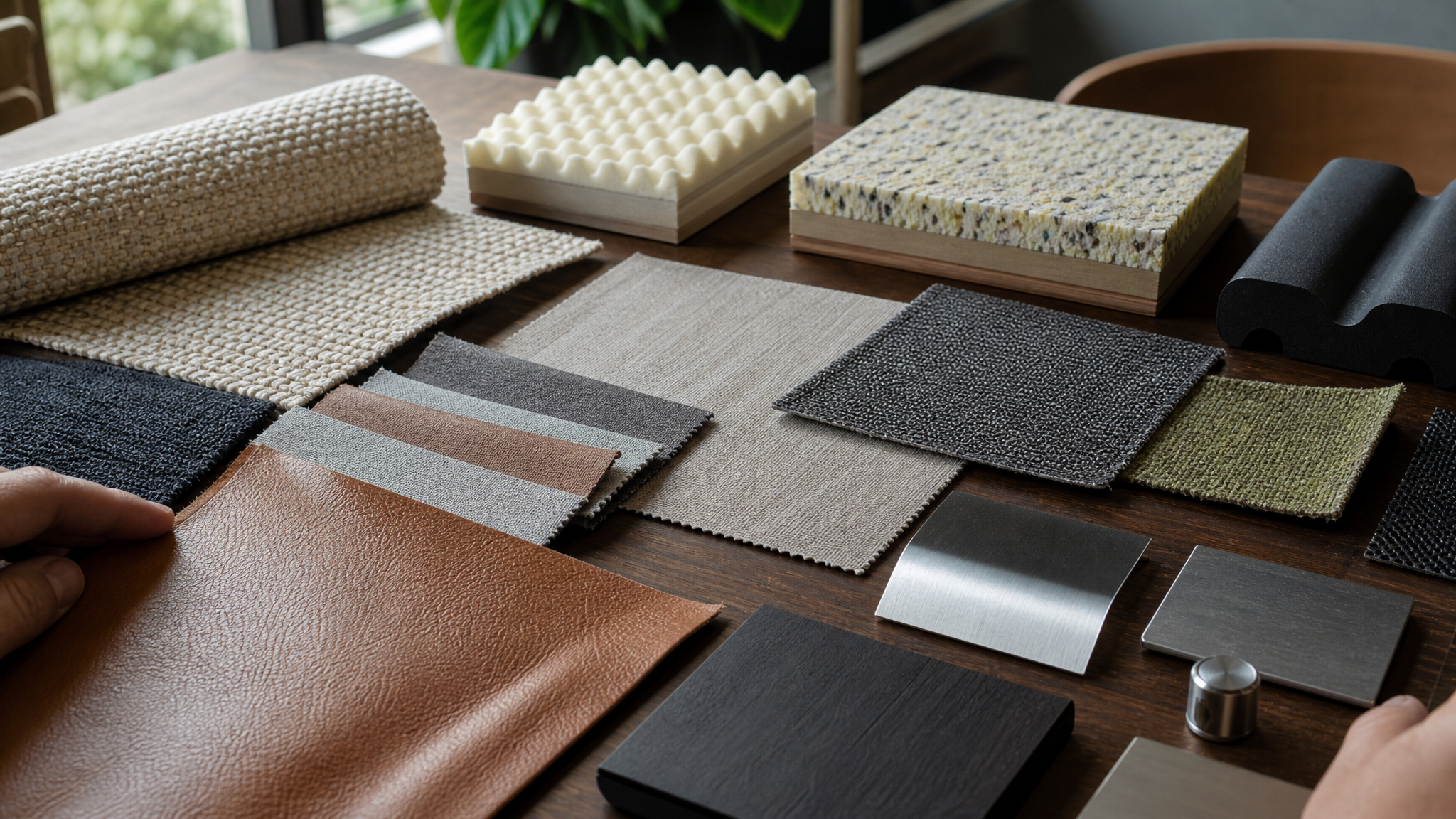
The clearest insight here is also the least flashy: there are places where a brand should step back. The seat already communicates quality through contour, material, stitching, support, and finish. It does not always need an extra hard emblem to announce identity.
Restraint is not a loss of character. Often it is what keeps character from turning clumsy. In identity work, the strongest mark is not the one repeated at every opportunity. It is the one placed with judgment.
This points to a familiar branding problem: recognition can become too literal, too frequent, or too narrow in its application. Here, the issue is more physical. The logo moved into a context where recognition alone was not the right measure of success.
What designers can take from the case
This dispute is a reminder that branded objects should be reviewed the way any functional component is reviewed. If a mark becomes a badge, plate, insert, or fixture, it needs more than visual approval. It needs contact thinking.
- Map touchpoints carefully. If the branded element sits where backs, legs, hands, or arms naturally rest, treat it as part of the human interface.
- Respect material behavior. Metal does not behave like leather, fabric, or foam. Mixing those materials changes comfort and heat response.
- Test the context, not just the detail. Sun exposure, long parking periods, and direct skin contact can turn a polished accent into a problem.
- Choose subtlety when the object already speaks. Form, craftsmanship, and fit often carry brand presence without an extra badge.
None of this requires abandoning visual signature. It asks for better choreography between identity and use. The strongest branded environments are the ones where people feel the brand’s care without having to physically feel the logo.
A small emblem, a large design warning
The lawsuit’s final critique lands cleanly: Mercedes-AMG may have found one place where less branding would have been better. That line works because it points to a common design temptation. When a mark is powerful, teams start assuming every surface can carry it.
But every surface has its own rules. Seats are intimate, not promotional. They deal in comfort, timing, temperature, and trust.
The practical lesson is straightforward. A brand detail earns its place when it supports the experience already happening in the object. If it interrupts that experience or harms the person using it, it is no longer a detail. It is a design failure with a logo attached.
 Logo Template
 Icon Template
 Icon Template
 Icon Template


