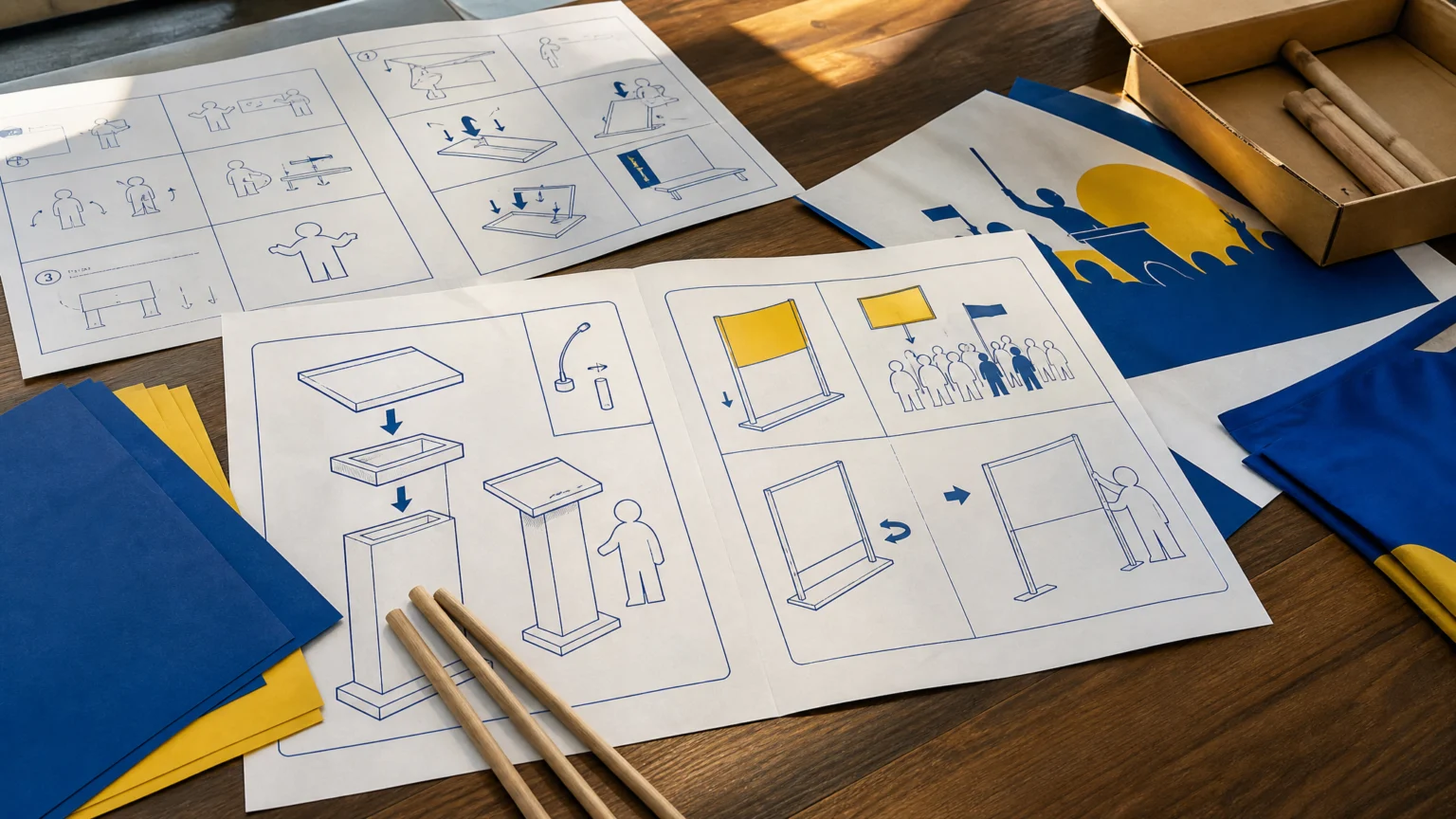
A color pairing and a diagram style can do a startling amount of work before a single word arrives. In retail, that kind of instant recognition is valuable. In politics, the same borrowed cues can become legally and reputationally fraught very quickly.
A Belgian political campaign used Ikea-inspired visual branding, including graphics resembling assembly instructions and the brand’s blue-and-yellow color scheme. The campaign, called the IKEA-PLAN, presented proposals to reform Belgium’s asylum and immigration system and leaned on those recognizable visual signals to frame the message.
The Court of Justice of the European Union ruled that Ikea could oppose the use of its branding and pursue legal action. The dispute is not finished, and Belgian courts will decide the final outcome.
Recognition does the heavy lifting
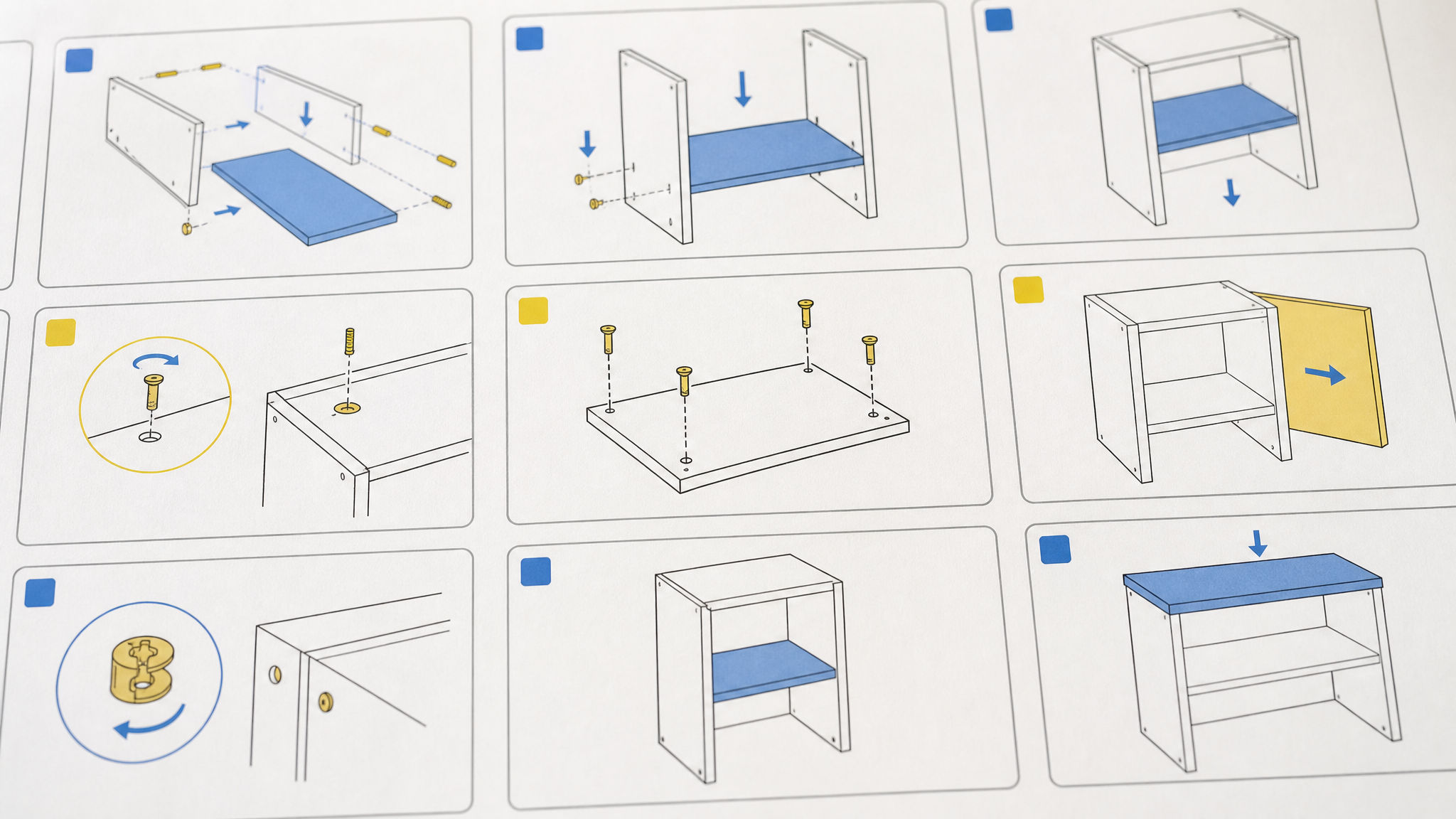
Designers see this effect all the time. A famous palette, a familiar layout, and a signature illustration style can establish meaning almost instantly. The audience does not need to pause and decode the reference. They already know it.
That speed is exactly what makes cases like this important beyond legal teams. Borrowed cues are rarely neutral. They carry memory, trust, and a chain of associations that the new message did not build for itself.
That same tension appears in when branding language becomes the dispute. Once a brand system becomes widely recognized, even partial imitation can transfer meaning in a single glance.
Political context changes the reading
This dispute sits at the intersection of trademark and branding rights versus freedom of expression. Vlaams Belang argued that its use of the branding was protected by freedom of expression.
The EU’s highest court took a balanced view. National judges must weigh freedom of expression against the rights and interests of a trademark owner, and neither right is absolute.
Context shifts the entire reading of a visual system. A retail identity used to sell furniture occupies one lane. The same cues, placed inside political campaigning, move into a much sharper and more contested setting.
Reputation can shift through adjacency

The court indicated that using a famous trademark to amplify an unrelated political message may harm brand reputation. In this case, it said the use of Ikea’s trademarks could cause significant detriment to the reputation of the brand.
That point matters for anyone working with identity systems. Harm does not depend only on confusion about who made something. It can also come from adjacency, where a brand appears tied to a message, issue, or cause far outside its own purpose.
That helps explain why strong brands protect even fragmentary assets so closely. Color, diagram structure, icon behavior, and visual timing may look incidental from the outside. In practice, they are part of the property.
Fame makes shorthand more risky
There is a common temptation to assume a well-known brand reference is acceptable if it is obvious enough to read as commentary. But fame can intensify the problem. The more quickly the public recognizes the cue, the more effectively that cue can boost the reach of an unrelated message.
The court indicated that using a well-known trademark primarily to increase the reach of an unrelated political message would not necessarily outweigh the retailer’s rights. That is a narrow legal point with a broad design implication: visibility is not permission.
For creative teams, the practical distinction is between recognizable and available. A visual shortcut may feel clever because it saves explanation. It may still carry legal and reputational cost precisely because it works so well.
Design discipline starts with the real need
When a team wants the authority or immediacy of an existing identity, the better question is usually what function they actually need. Is it clarity. Is it an instructional graphic language. Is it strong two-color contrast. Those goals can be met without borrowing someone else’s visual signature.
That discipline often produces better work anyway. A campaign or organization that builds its own graphic logic earns a more durable voice than one that depends on borrowed recognition.
- Audit the cues, not just the logo. Risk can live in color combinations, diagram styles, and familiar compositional structures.
- Test the context. A treatment that feels playful in one setting can become reputationally charged in another.
- Define the actual objective. If the goal is legibility, instruction, or contrast, build those qualities directly.
- Avoid borrowed fame as a reach tactic. If the visual idea works mainly because the audience already knows another brand, the concept may be too dependent on imitation.
That same discipline appears in broader identity work too. Two brands stay sharp when the split is real is useful here because it shows how distinct systems protect meaning when different audiences and purposes need clear separation.
The case is still moving
The Court of Justice of the European Union did not settle the dispute itself. Further proceedings in the Belgian courts will determine the final outcome.
Even now, the visual lesson is already clear. A famous brand system is more than a logo file. It is a coordinated set of cues that steers attention, shapes interpretation, and transfers associations with remarkable speed.
 Icon Template
 Logo Template
 Photo Template
 Logo Template