
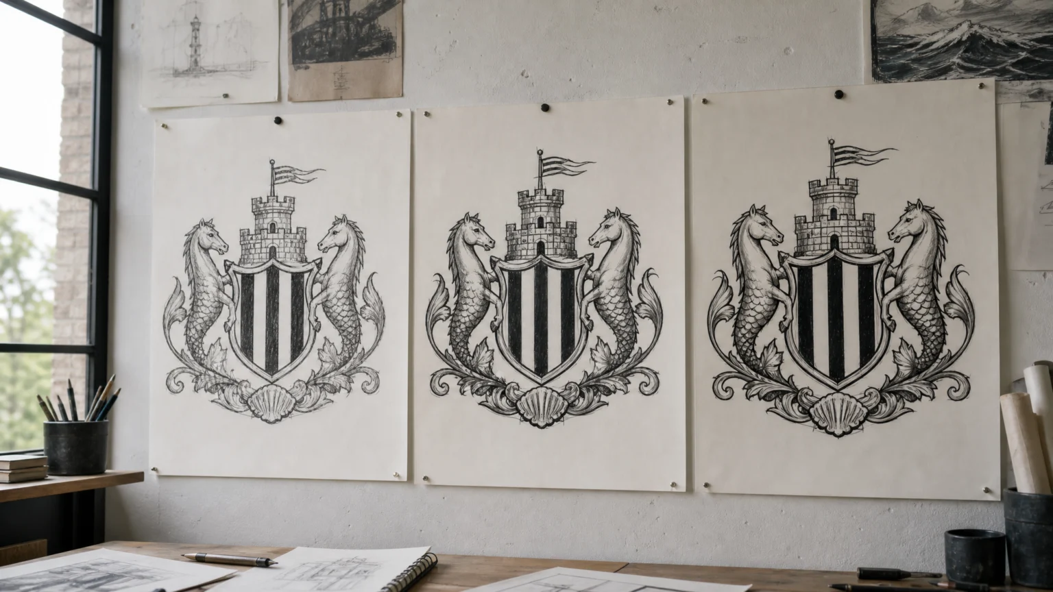
Three options should create contrast. When they read like minor edits of the same crest, the decision starts to feel less like a choice and more like a test of attention.
That is the tension in Newcastle United’s current logo redesign poll. Supporters are voting on three shortlisted options, yet many people are struggling to tell them apart. Once a poll feels harder to read than the designs themselves, the visual issue quickly turns into a trust issue.
Why the current crest is difficult to carry forward
Newcastle United’s existing badge carries a lot of heraldic detail. It is built from the city’s historic coat of arms: a central black-and-white striped shield, a Norman keep bearing a lion holding St George’s cross, two supporting seahorses tied to the city’s maritime history, and a blue banner carrying the club’s name.
That structure has weight, but it also has many parts to manage. The club’s stated reason for revisiting the badge is practical: the crest was designed in the late Eighties and now struggles to perform in a modern setting because its intricacies and irregularities make consistent, high-quality reproduction impossible.
That problem is easy to recognize. Fine lines, uneven silhouettes, stacked symbols, and decorative contours can look rich at large sizes, then start to break apart in small digital spaces, merchandise applications, social avatars, embroidery, and broadcast graphics. A badge can keep its history and still miss its daily jobs.
Why the poll is causing confusion
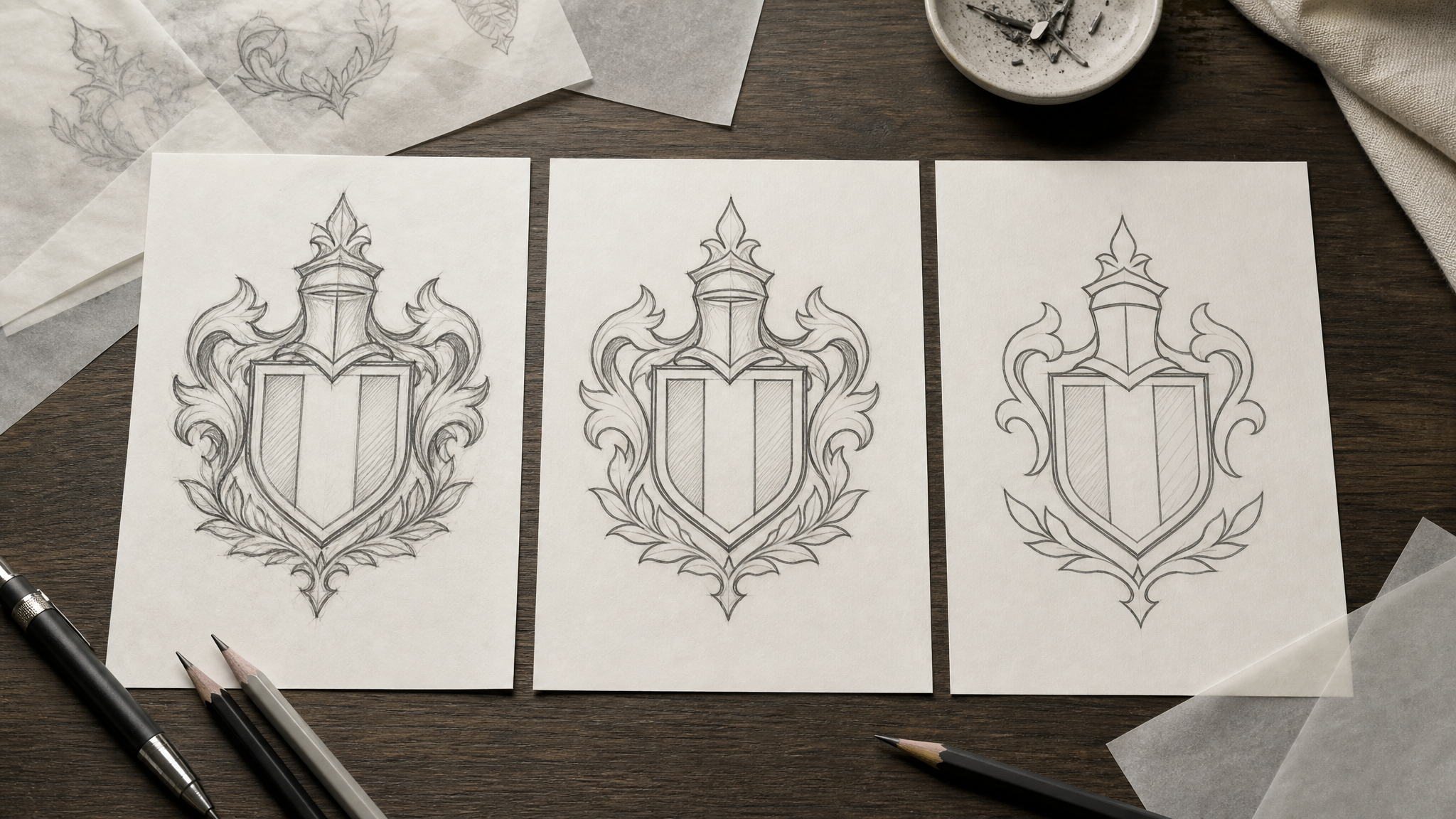
The three shortlisted redesigns all stay with the same basic concept as the current badge. They preserve the same underlying architecture and shared symbols rather than introducing a new direction. That restraint makes sense. When a crest carries decades of memory, a hard pivot usually meets immediate resistance.
But a narrow set of options creates its own tension. If the differences are too slight, the exercise can read less as consultation and more as confirmation. That is why some supporters see an illusion of choice, as if the decision has already been made and the poll is there to stage agreement.
This is not only a communications problem. It is a visual one. If three alternatives cannot show their own signature clearly enough for ordinary viewers to compare them, the set may be too compressed to support a meaningful vote.
Evolution can be right, but it still needs contrast
Newcastle United says it held dedicated supporter events and focus groups and worked with its Fan Advisory Board to sense-check the challenge and the possible routes forward before selecting the finalists. That process matters, especially because 84% of respondents preferred updating the existing crest rather than exploring a completely new design concept.
That figure explains the club’s restraint. Most supporters wanted evolution, not replacement. The shortlist follows that preference by staying close to the historic form rather than leaving it behind.
Still, there is a difference between evolution and near-indistinguishable variation. Good iterative identity design can keep the body of a mark intact while making changes that are legible: cleaner line weights, steadier symmetry, calmer detail, stronger spacing, sharper hierarchy, or a clearer silhouette at small sizes. Subtle redesign is still redesign. It needs visible intent.
This is where simplification often runs into resistance. People can agree that a crest is too complex, then reject cleaner versions because they feel cheaper or less considered. That concern is real. When detail disappears without enough structure replacing it, the result can look reduced rather than refined.
Small changes need to be visibly intentional if the public is meant to compare them.
What supporters are really reacting to
Fan criticism is easy to dismiss as nostalgia, but that misses the point. Supporters are not just evaluating form. They are measuring seriousness, care, and respect.
A football crest is not a disposable badge on packaging. It sits on shirts, scarves, stadium signs, digital channels, and memory itself. Every adjustment to proportion, ornament, or emphasis changes how the club appears in public and how its identity is carried from one generation to the next.
So when people joke that the options are almost impossible to distinguish, the joke carries a practical message. Viewers want enough difference to understand what they are choosing and enough continuity to feel the club has protected what matters. Without that balance, consultation starts to feel ceremonial.
There is a useful lesson here for any participatory branding process. If a vote is part of the plan, the options need a readable hierarchy of change. One might refine detail more aggressively. Another might preserve ornament but reorganize spacing. A third might simplify silhouettes for stronger small-scale reproduction. The point is not drama for its own sake. It is giving people distinct trade-offs they can actually evaluate.
Why modern reproduction keeps forcing this conversation
The club’s core argument about modern usability is hard to ignore. Logos now live in tiny app circles, motion graphics, ecommerce thumbnails, stitched patches, LED boards, and layered social formats. That environment rewards marks with cleaner edges, stable shapes, and dependable performance across sizes and surfaces.
Historic crests often come from a print-first era, where ornate detail could survive because reproduction conditions were narrower and more controlled. Once those same forms have to work across every screen and substrate, old inconsistencies become visible liabilities.
For teams thinking about what comes after simplification, motion can help show structure without adding clutter. A restrained treatment in logo reveal animation or a subtle system of animated logos for websites can show how well a revised crest holds together as a single form. If the mark only works when static and large, the redesign is probably incomplete.
The design lesson behind the noise
Newcastle United’s poll captures a familiar identity design problem in public view. Heritage marks need simplification for modern use, but the closer a redesign stays to the original, the harder it becomes to show the value of the change. Push too far and people feel dispossessed. Stay too close and people feel patronized.
The strongest redesigns solve that by making careful changes look unmistakably purposeful. They protect symbolic structure, remove friction, and improve reproduction without asking the audience to squint. That is the real brief here, and it asks for more than a cleaner drawing.
When three options feel like one, the issue is rarely aesthetics alone. It is clarity, trust, and the difference between asking supporters to participate and asking them to approve a decision already dressed for the ballot.
 Logo Template
 Logo Template
 Logo Template
 Logo Template


