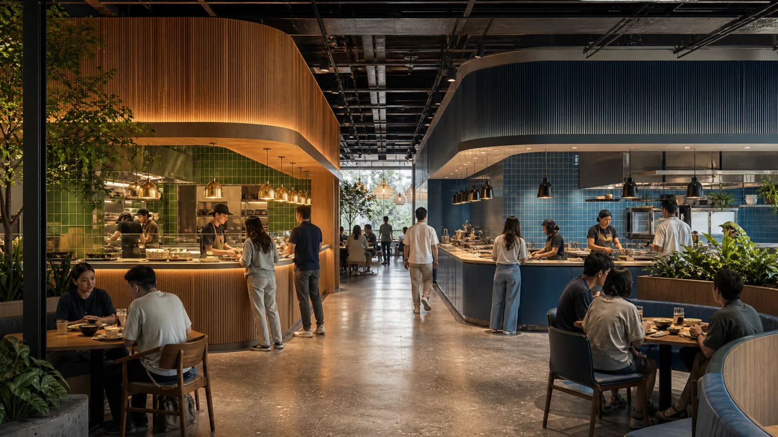
The first thing a shared restaurant has to solve is orientation. Put two concepts in one address, and every wall, counter, queue, and menu zone has to work harder.
That is what makes restaurant co-branding worth a designer’s attention even when the headline is economics. Brands are using shared space to grow, add revenue, and get more from each square foot. But if customers cannot tell where one concept ends and the other begins, the pairing loses clarity.
Co-branding turns growth into a spatial problem
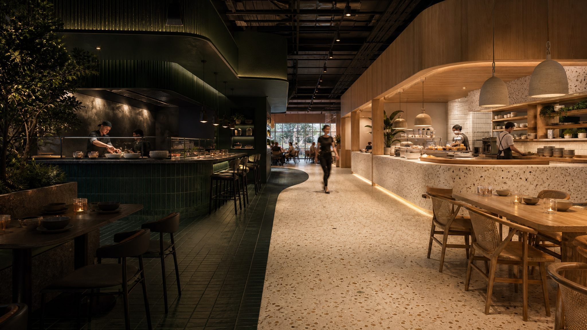
Restaurant chains are using co-branding in several forms. WOWorks is adding Frutta Bowls to restaurants operated under Saladworks, Garbanzo Mediterranean Fresh, and Barberitos. Kahala Brands is pairing Wetzel’s Pretzels with Cold Stone Creamery and SweetFrog. Gong cha is working with franchisees that operate other concepts under the same roof.
Those are business decisions, but they quickly become design decisions. Two brands in one room raise questions about entry sequence, sightlines, counter hierarchy, and customer expectation. Before the space can support sales, it needs a clear sense of direction.
Shared environments create a familiar visual tension. Unity helps the room feel intentional, while distinction helps each brand keep its signature. Too much sameness and the concepts blur. Too much separation and the space starts to feel pieced together.
Brand distinction is not optional in a shared restaurant
Gong cha’s team reviews real estate, traffic patterns, demographics, psychographics, store design, and layout. The goal is simple: customers need to clearly distinguish Gong cha from the other concept sharing the restaurant.
That requirement says a lot about how identity works in a co-branded setting. It is not just a logo on a wall. It lives in the path to the counter, the placement of fixtures, the contrast between service zones, and the timing of what the customer notices first.
This is where environmental branding proves its value. A shared lease does not need a shared visual voice. It needs a coordinated one.
What clear distinction often depends on
- Separate visual anchors so each concept has an obvious point of recognition.
- Thoughtful layout that prevents one offer from visually swallowing the other.
- Traffic planning that reduces hesitation at entrances, lines, and pickup areas.
- Consistent cues between brand promise and physical experience.
These are practical design decisions, not styling extras. A customer deciding between a bowl, a pretzel, a frozen dessert, or a tea order is reading the room long before reading every menu board.
More revenue per square foot changes how space gets valued
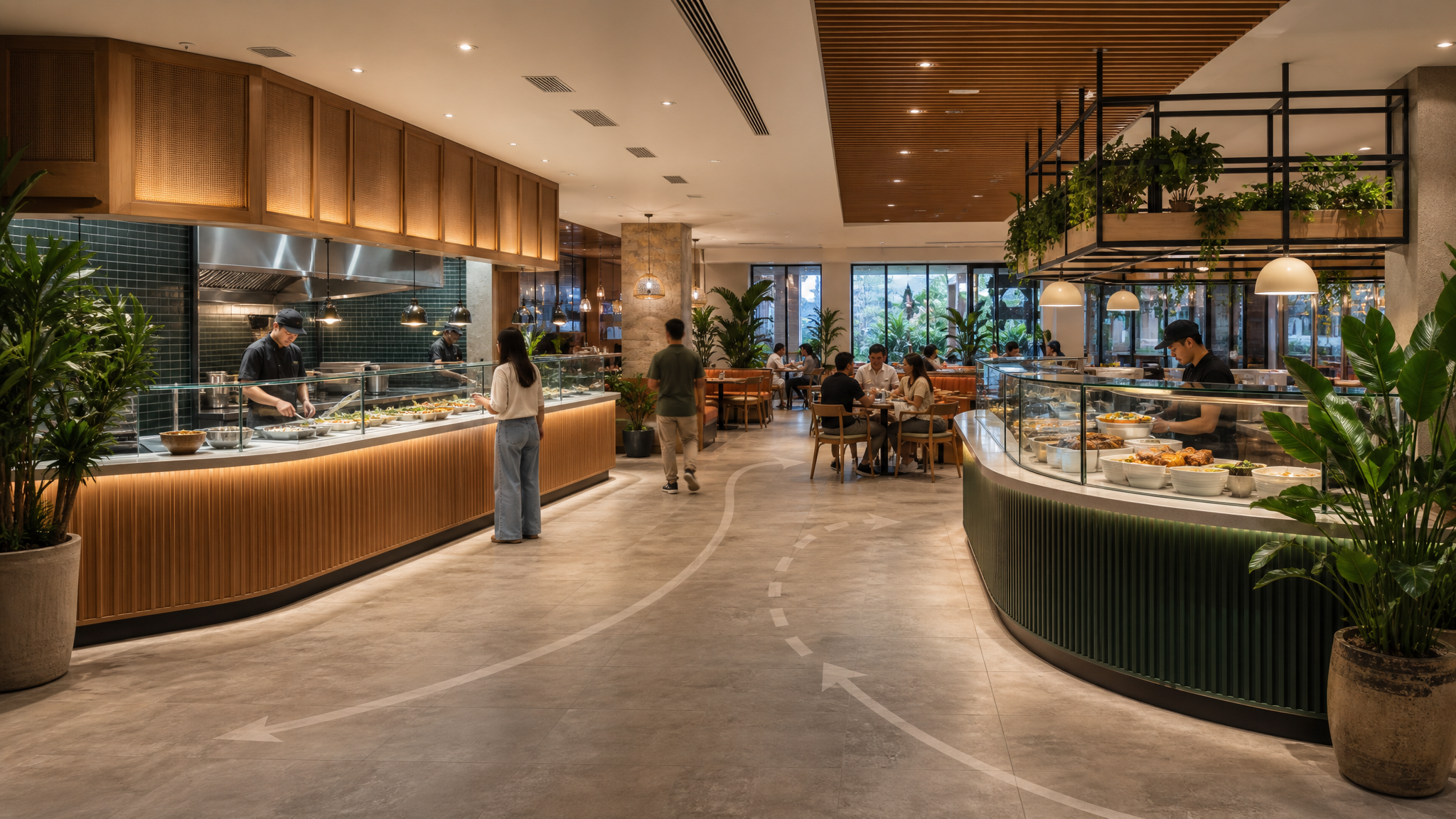
One of the clearest shifts in co-branding is economic, but it lands directly in the built environment. Operators need to produce more revenue from each square foot. That changes how extra space gets judged.
A Cold Stone franchisee that previously sought roughly 1,400 to 1,600 square feet might have passed on a bigger location to avoid paying for unnecessary space. Wetzel’s can turn those extra square feet into another source of sales. What once looked like surplus area can become active commercial territory.
For designers, that means space planning has to do more than fit equipment and seating. It has to reveal hidden capacity without making the room feel crowded or confused. The best co-branded spaces do not simply add another counter; they redistribute attention, function, and access.
The numbers explain why these pairings keep appearing
There is enough operational detail here to show why co-branding keeps gaining ground. WOWorks can add Frutta Bowls to an existing location for roughly $75,000. Frutta Bowls typically accounts for roughly 18 percent of total sales inside a co-branded restaurant. New Cold Stone-Wetzel’s restaurants are producing a sales mix of roughly 70 percent Cold Stone and 30 percent Wetzel’s.
Those figures help explain why brands are willing to solve the complexity of shared presentation. A second concept does not have to dominate the room to justify its place. It only has to contribute meaningful sales while fitting the physical and visual logic of the site.
That creates an important design implication: proportional sales do not automatically require proportional visual weight. A brand contributing 18 percent or 30 percent of sales may still need strong legibility at key decision points. Small operational roles can require outsized moments of recognition.
Good co-branding design is closer to choreography than collage
The weakest shared spaces feel additive. One brand is installed, then another is layered on top, and the result reads like a compromise. The strongest ones feel planned from the start, even when they are retrofits.
That difference comes from sequence. Customers enter, orient themselves, decide, order, wait, and collect. Each step benefits from a room that makes choices visible without creating visual noise.
A practical way to think about it is this:
- First, define recognition. Each concept needs to be identifiable at a glance.
- Then, define hierarchy. Customers need to know what is primary, what is secondary, and where to go.
- Then, define coexistence. Materials, fixtures, and layout should support both brands without flattening either one.
This is why co-branded design is rarely just about fitting two logos into one lease. It is about making two offers share a performance without stepping on each other’s cues.
There is also a broader lesson here for brand systems. Physical environments expose weak differentiation quickly. If two concepts need constant explanation once they occupy the same space, the design language probably is not carrying enough meaning on its own.
Why this matters beyond restaurants
This story sits mainly in franchising, growth, finance, and unit economics, but it still offers a useful lens for visual design. Co-branding puts pressure on the exact places where identity becomes tangible: layout, adjacency, customer flow, and distinction under constraint.
For designers working on retail, hospitality, kiosks, concessions, or mixed-use brand environments, the lesson is straightforward. Shared space does not reduce the need for identity. It increases the need for disciplined separation, clear hierarchy, and visual decisions that help people understand where they are and what is being offered.
When square footage gets expensive, branding stops being a surface treatment. It becomes part of how the business works.
 Icon Template
 Icon Template
 Icon Template
 Photo Template