
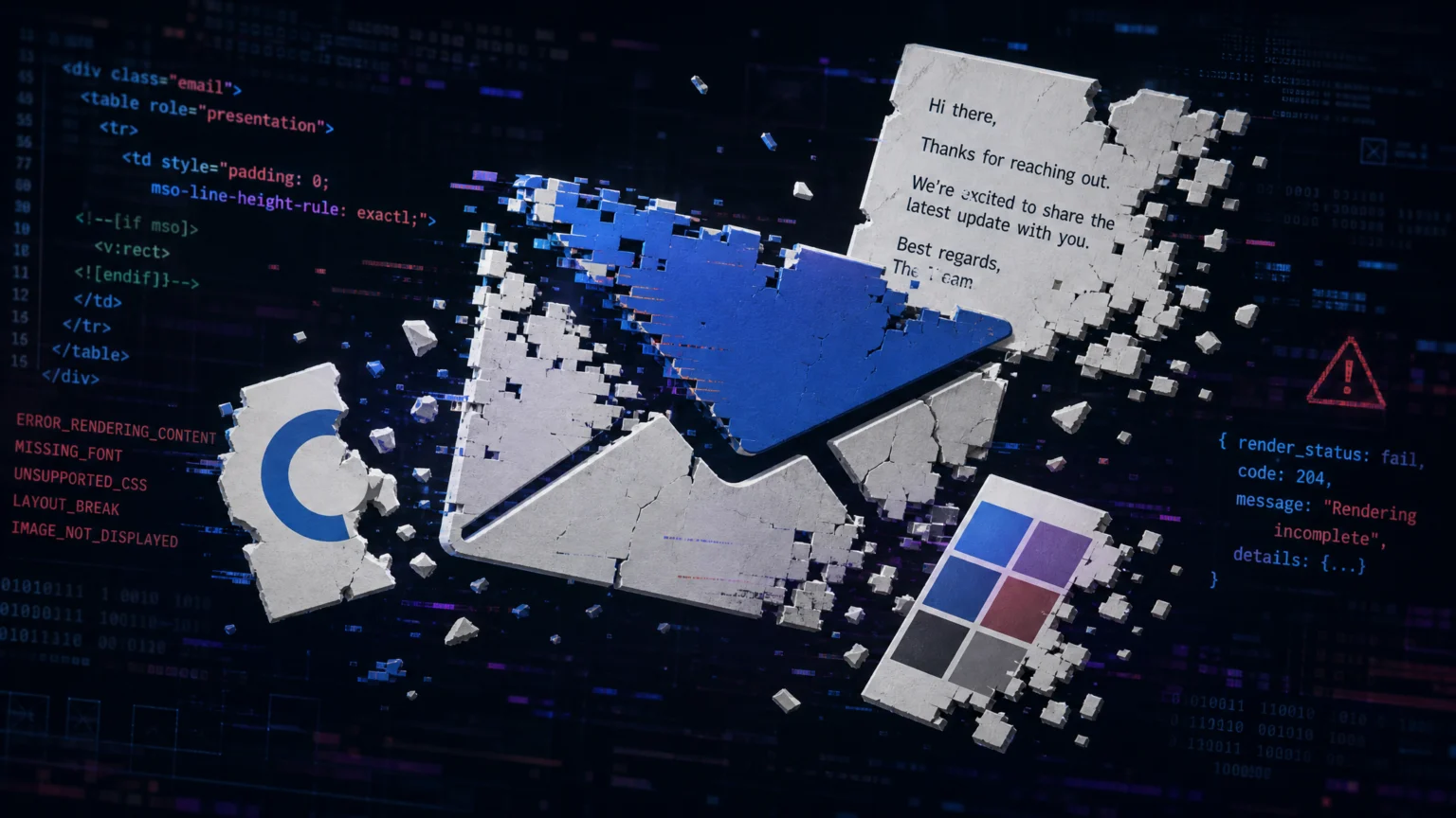
You send an email campaign, and it looks perfect in your preview. But when it lands in your audience’s inboxes, your carefully crafted logo is distorted, the brand font is replaced, or colors are completely off. This common frustration stems from the diverse ways email clients interpret HTML and CSS, leading to unexpected visual breaks.
Unlike web browsers, email clients don’t adhere to a single rendering standard. Each client—from Outlook to Gmail, on desktop or mobile—has its own quirks, often stripping or modifying code in ways that disrupt your brand’s visual integrity. Understanding these common rendering issues is the first step to ensuring your emails consistently reflect your brand.
1. Distorted or Missing Images
One of the most immediate visual breaks is when images, especially logos, appear distorted, incorrectly sized, or fail to load entirely. This often happens because email clients handle image dimensions and loading differently. Without explicit instructions, an email client might guess at dimensions, leading to stretching or shrinking, or simply fail to display the image if it can’t resolve the source.
The Fix: Define Dimensions and Provide Fallbacks
Always include explicit width and height attributes in your image tags. This helps maintain the email’s layout even if the image doesn’t load, preventing layout shifts that can make an email unreadable. For example, instead of just <img src="logo.png">, use <img src="logo.png" width="200" height="50" alt="Your Brand Logo">. Additionally, many email clients block images by default. Providing descriptive alt text ensures that even if your logo doesn’t appear, its purpose and brand identity are still communicated. Hosted image URLs are also more reliable than local file paths, as they improve delivery rates and ensure images are accessible from any client. Consider using a Content Delivery Network (CDN) for image hosting to further enhance loading speed and reliability across different geographical locations, which can be critical for global campaigns. SendGrid’s documentation provides practical advice for cross-platform HTML email design, including image handling.
2. Font Substitution and Inconsistent Typography
Your chosen brand typeface is a key part of your visual identity. When email clients replace it with a generic system font, the message loses its intended tone and professionalism. This occurs because email clients only display fonts that are installed on the recipient’s device or are explicitly supported as web fonts. Relying solely on custom web fonts without fallbacks is a common pitfall, as many email clients, particularly older versions of Outlook, simply ignore @font-face rules.
The Fix: Implement a Robust Font Stack
To prevent unexpected font substitution, use a font stack that includes web-safe fallback fonts. A font stack lists your preferred brand font first, followed by several progressively more generic, widely available alternatives. For instance, font-family: 'Brand Font', Arial, sans-serif; tells the email client to try “Brand Font” first, then Arial if the brand font isn’t available, and finally any generic sans-serif font. this helps readability and maintains a consistent visual hierarchy even when your primary font isn’t supported. For critical headlines or branding elements where exact font rendering is paramount, consider converting text to images. While this increases email size and reduces accessibility, it guarantees visual fidelity. You can learn more about building robust typography systems in email in this article on How to Build an Ecommerce Typography System for Product Pages.
3. Inaccurate Brand Colors
Brand colors are crucial for recognition and mood. When your carefully selected brand blue appears as a different shade, or a vibrant red looks muted, it dilutes your brand’s impact. Color shifts often happen due to how email clients process color values, especially when using named colors or shorthand hex codes. Some clients might also apply their own default styling, overriding your CSS if not declared with sufficient specificity or in the correct format.
The Fix: Use Hex Color Codes Consistently
The most predictable way to render colors across email clients is to use full hexadecimal color codes (e.g., #RRGGBB). While named colors like “red” or shorthand hex codes like #F00 might work in some contexts, they can be interpreted inconsistently. Always specify colors using their full six-digit hex code (e.g., #FF0000 for red) for maximum consistency. this helps that the exact color value is communicated to every client, reducing the chance of unintended shifts. For background colors, ensure they are applied directly to table cells or elements rather than relying on inherited styles, which can be stripped. iContact’s knowledge base offers further insights into maintaining brand consistency, including color usage, across various devices.
4. Layout Breakage and Unresponsive Design
An email that looks perfect on a desktop might appear completely broken on a mobile device, with text overlapping images or columns collapsing incorrectly. This is a common issue because email clients have varying levels of support for responsive design techniques and CSS properties. Modern CSS features like Flexbox and Grid, while standard for web development, are often poorly supported or ignored in email clients, forcing developers to use older, more robust methods.
The Fix: Embrace Table-Based Layouts and Inline CSS
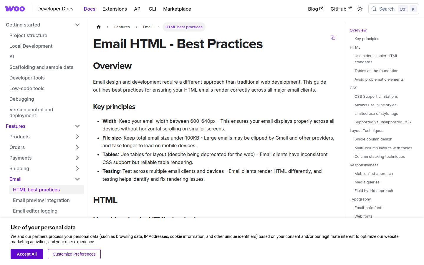
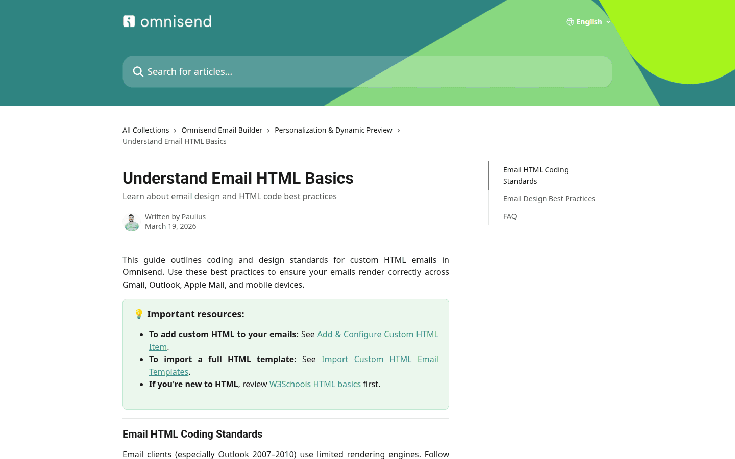
While modern web design favors CSS Grid and Flexbox, email development often requires a return to more traditional, robust methods. Table-based layouts, though seemingly outdated for web, provide a stable framework that renders consistently across many email clients. Nesting tables allows for complex column structures that adapt better to different screen sizes. Additionally, using inline CSS for styling (e.g., <p style="color:#333; font-size:16px;">) is often more reliable than external stylesheets or <style> blocks, as some clients strip these out. For responsive behavior, use media queries within a <style> block in the <head>, but be aware that support varies. Always test thoroughly across different clients and devices. Tools like Litmus or Email on Acid can simulate how your email will appear across hundreds of client/device combinations, saving significant time and preventing post-send issues. WooCommerce’s developer documentation provides excellent guidelines for robust email HTML, particularly concerning layout and image attributes.
5. Unreliable Image Hosting and Loading
Sometimes, images simply don’t load, appearing as broken placeholders. This can be due to security settings in email clients that block external content, or issues with how the image is hosted or referenced. If your hosting server is slow, unreliable, or not configured for high traffic, images might time out before loading, especially on slower connections.
The Fix: Host Images Securely and Reference Correctly
Ensure all images are hosted on a reliable, publicly accessible server with an HTTPS connection. Using secure (https://) URLs for your images can prevent them from being blocked by stricter email client security settings. Avoid embedding images directly into the email HTML as base64 data, as this can increase email size and trigger spam filters. Instead, link to externally hosted images. Before sending, double-check all image URLs to confirm they are correct and the images are accessible. Using a dedicated image hosting service or a CDN can significantly improve reliability and loading speed. These services are optimized for delivering content quickly and securely, reducing the chances of broken images. MailGenius offers best practices for email HTML, emphasizing reliable image hosting.
Consistent Testing is Key
The variability across email clients means that a “set it and forget it” approach to email design will inevitably lead to brand inconsistencies. The most effective way to ensure your brand assets render correctly is through rigorous, consistent testing. Use tools that allow you to preview your email across a wide range of clients and devices before every send. This proactive approach allows you to catch and fix issues before they reach your audience, preserving your brand’s visual integrity and professional appearance.
Consider creating a dedicated email style guide that outlines approved HTML structures, CSS properties, and fallback strategies for all brand assets. This guide can serve as a reference for all email creators, ensuring consistency across campaigns and reducing the likelihood of rendering errors. Regularly review and update this guide as email client capabilities evolve. By focusing on explicit coding, robust fallbacks, and thorough testing, you can significantly reduce the instances of broken brand assets in your email campaigns and ensure your brand always looks its best, no matter where it lands.
 Logo Template
 Icon Template
 Photo Template
 Icon Template