

A close name can create more trouble than a weak logo. In higher education, where initials, city references, and campus shorthand carry real weight, a small shift in lettering can change the whole reading.
That tension sits at the center of a branding and trademark dispute between two Indiana universities. The University of Indianapolis sued Indiana University over its use of the name IU INDY, arguing that it is too close to its federally registered trademark UINDY.
Similarity gets louder in shared context

Names do not appear in isolation. They show up on signs, websites, apparel, admissions materials, and social posts, then move into local conversation. When two institutions operate in the same state and anchor their identity in abbreviated letterforms tied to Indianapolis, the visual and verbal distance between them matters more.
Here, the overlap is easy to spot. Both names compress into short uppercase units. Both point toward Indianapolis through the ending Indy. Both depend on quick recognition rather than long-form reading.
The University of Indianapolis registered UINDY in 2003. In early 2024, Indiana University sought to register IU INDY for its Indianapolis campus.
Why this becomes a branding problem before a legal one
Trademark disputes can sound technical, but the design issue is straightforward. If people can mistake one identity for another, the brand system has lost clarity. That can happen through sound, spacing, abbreviation, or the simple feeling that separate options collapse into one.
The complaint frames the issue as likely consumer confusion, mistake, and deception among the relevant consuming public, and says the similarity has caused irreparable harm. That language belongs to the law, but it also describes a familiar branding failure: the audience cannot cleanly tell one institution from the other.
For designers, the useful point is simple. Distinctiveness is not just about polish. It is about separation. A mark needs enough visual and verbal room to hold its own identity under pressure, especially in crowded categories with similar naming habits.
Short names narrow the margin for error
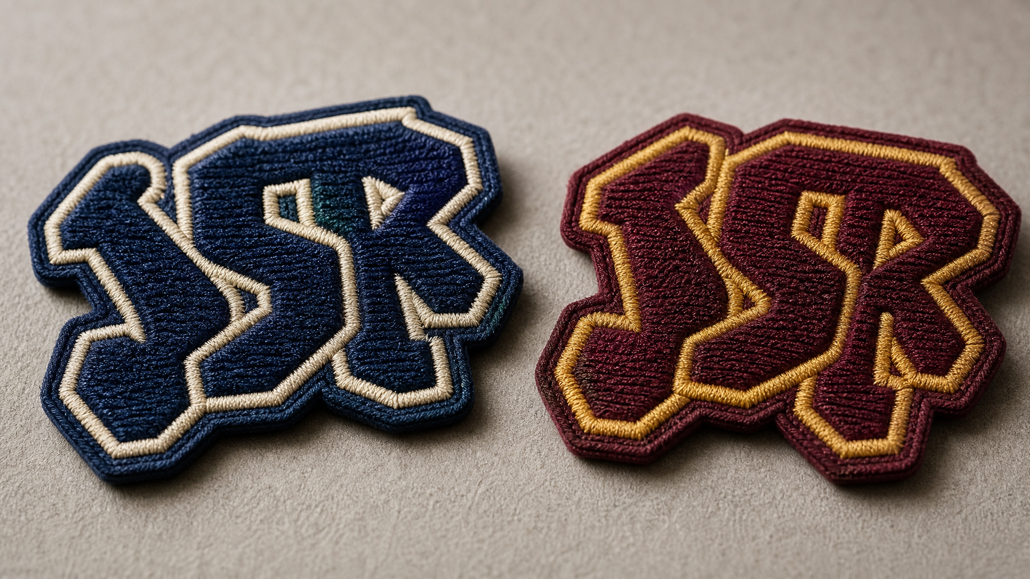
Abbreviated identities work because they are quick. They fit on merchandise, sit neatly in digital layouts, and match everyday speech. But brevity comes with risk. When a brand trims itself to a tight cluster of letters, every character carries more weight.
That is especially true when the structure is familiar: initials plus place. Once a system leans on a common pattern, distinctiveness has to come from careful choices in order, sound, spacing, and visual signature.
In this dispute, the names are not identical. But branding conflicts do not require exact copies to create trouble. Nearness is often enough, particularly when the audience meets the brand quickly, out of context, or from memory.
Higher education has its own naming habits
Universities carry layered identities. There is the formal institutional name, the campus name, the athletics name, the alumni shorthand, and the local nickname. That complexity can make a rebrand feel tidy on paper and muddy in public.
A campus may want a shorter label to sharpen recognition or clarify direction. Yet in higher education, those choices sit inside a category already crowded with initials and geographic markers. The move that feels efficient internally can read as too close externally.
This case also fits a broader pattern of brand-identity conflicts across universities. Similar legal battles in recent years have included Baylor University v. Boston University over a similar logo and Drake University v. Des Moines Area Community College over branding. The common thread is clear: institutions with long histories still collide when visual territory gets tight.
What brand teams can take from it

The practical lesson is not simply to search trademarks at the end of a project. Distinction should shape the naming process from the start. If a proposed identity depends on local shorthand, compressed initials, or a familiar city suffix, that is the moment to test how much independent meaning the brand can actually hold.
- Test spoken confusion. Say the names aloud in ordinary conversation, not just in presentation rooms.
- Test fast reading. Look at abbreviated forms on signs, apparel, and mobile headers where people scan rather than study.
- Test local context. Shared geography increases the chance that audiences will connect nearby names.
- Test memory. If someone hears the name once and recalls a different institution, the system needs more separation.
These checks sound basic, but they often reveal the issue early. A brand does not fail only when a logo looks weak. It can fail when its naming architecture invites the wrong association.
Distinctiveness is a structural choice
It helps to think of identity as more than surface treatment. Typography, color, and motion can support recognition, but they cannot fully rescue a name that sits too close to a neighbor. Structure comes first: what the brand is called, how it is shortened, and how it travels through real use.
That is why disputes like this matter beyond the courtroom. They show that brand strategy is not abstract planning detached from design. It is the groundwork that determines whether visual systems can perform clearly once they meet the public.
When two names share letters, place, and audience, distinction stops being a nice quality and becomes the central job.
For universities, the stakes are unusually visible. Recruitment, fundraising, apparel, campus signage, and community reputation all depend on clean recognition. A naming choice that seems efficient can create friction across every touchpoint if the public reads it as someone else.
Before refining the mark or building the campaign, make sure the identity has enough distance to stand on its own. The strongest brands do not just look distinct. They leave little doubt about whose name has entered the room.
 Icon Template
 Logo Template
 Logo Template
 Logo Template


