When Digital Clarity Becomes Print Pixelation
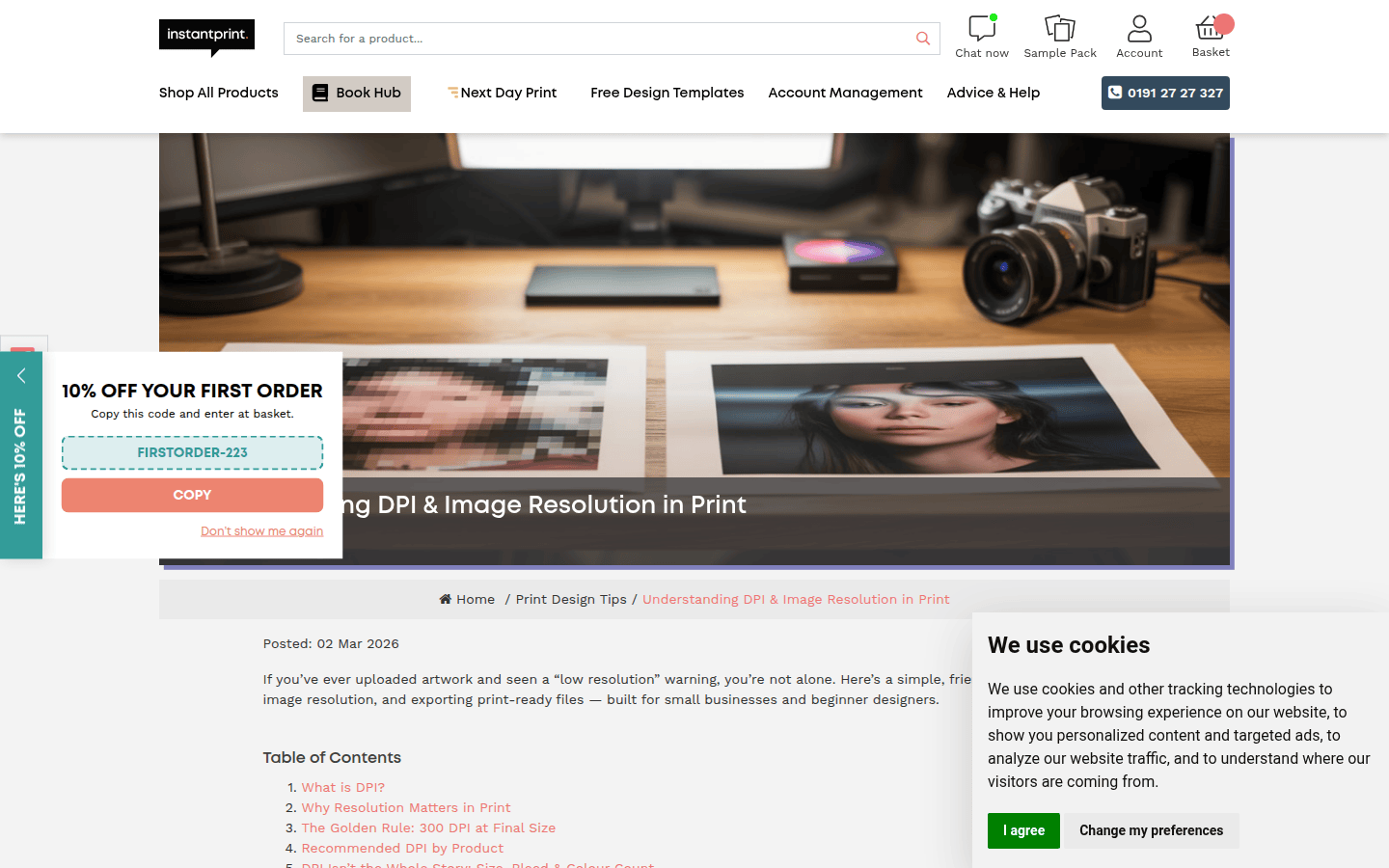
It’s a common frustration: a logo that looks sharp on screen appears fuzzy or pixelated when printed. What seems like a simple transfer from digital to physical often introduces unexpected visual compromises. The issue usually isn’t with the original design itself, but with how the digital file is prepared for a print workflow. Understanding the differences between screen display and print production is the first step to ensuring your brand assets maintain their intended clarity.
The problem often lies in a mismatch between the asset’s native format and the printer’s requirements, or in overlooked export settings. For instance, a logo designed for web might use a low-resolution raster format, which is fine for screens but inadequate for print. Or, the color profile might shift unexpectedly, leading to dull or inaccurate hues. These issues are preventable with correct file preparation. A clear visual decision at the export stage translates directly to a professional and consistent brand presence in print.
Vector vs. Raster: The Core of Print Clarity
The most fundamental distinction in digital artwork is between vector and raster files. This choice dictates how an image scales and, critically, how it appears in print. Vector artwork, composed of mathematical paths and points, is ideal for logos, typography, and line art because it can be scaled indefinitely without losing quality. Each curve and line remains crisp, regardless of size. This is why a small logo on a business card can also be blown up to a billboard size without pixelation. Raster images, on the other hand, are made of a grid of pixels. Photographs are the most common example. When a raster image is enlarged beyond its original resolution, these individual pixels become visible, leading to a blocky, pixelated appearance. For a documented checkpoint, compare this step with How to Prepare Artwork for Print.
For print, always prioritize vector formats for your brand’s core identity elements like logos and icons. If you must use a raster image, ensure it is prepared at a sufficiently high resolution for the intended print size. Consider the final output size and viewing distance. A large banner viewed from a distance might tolerate a lower effective resolution than a business card examined up close. Always confirm with your print provider if you are unsure about the optimal format or resolution for a specific project.
DPI Requirements: Matching Resolution to Output
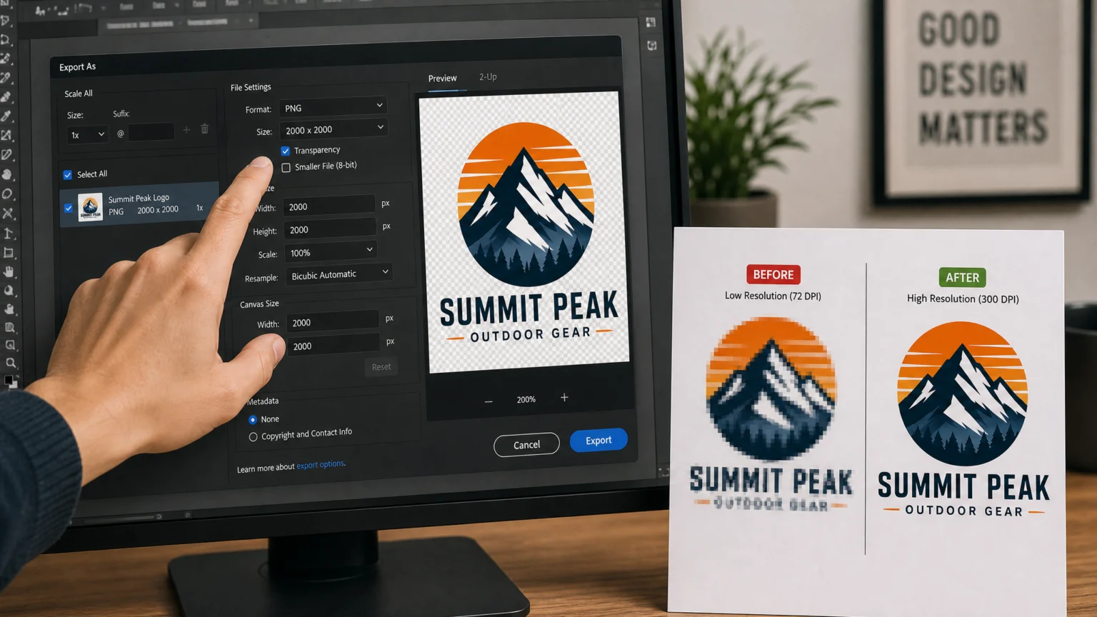
Dots Per Inch (DPI) is a critical metric for print quality. It refers to the density of ink dots a printer places on a physical surface. A common mistake is assuming screen resolution (often 72 PPI, or pixels per inch) is sufficient for print. For high-quality print materials that will be viewed up close, such as brochures, business cards, or packaging, a resolution of 300 DPI at the final print size is standard. This density ensures sharp details and smooth gradients. For large-format prints, like banners or billboards, where the viewing distance is greater, a lower effective resolution might be acceptable, but this should always be confirmed with your printer. Exporting at too low a DPI will result in pixelated or blurry images, while exporting unnecessarily high can lead to excessively large file sizes without a noticeable quality improvement. Another useful checkpoint is Print File Setup Guide: Bleed, Margins & Resolution.
Before exporting, confirm the exact DPI requirements with your print provider. This prevents both under-resolution issues and bloated files. Remember that simply increasing the DPI of a low-resolution image in your software will not add detail; it will only make the existing pixels larger, resulting in a blurry image. The original image must have sufficient pixel data. If you are working with stock photography, always download the highest resolution available. For custom photography, ensure your camera settings are appropriate for the intended print size and quality.
Color Mode Mismatches: RGB vs. CMYK
The color mode used in your design file significantly impacts how colors reproduce in print. Digital screens display colors using the RGB (Red, Green, Blue) model, which combines light to create a broad spectrum of colors. Print, however, typically uses the CMYK (Cyan, Magenta, Yellow, Black) model, which mixes inks. When an RGB file is sent to a commercial printer, it often undergoes an automatic conversion to CMYK. This conversion can lead to noticeable shifts in color, as the CMYK gamut (the range of colors it can reproduce) is generally smaller than RGB. Bright, vibrant RGB colors, especially certain blues and greens, may appear duller or muted in CMYK print.
To avoid unexpected color shifts, design your print assets directly in CMYK color mode whenever possible. If you start in RGB, convert to CMYK before sending to print and review the color changes carefully. Most professional design software offers a preview of CMYK output. Pay particular attention to brand colors. If your brand guidelines specify Pantone or spot colors, ensure these are correctly implemented in your file, as they offer a more consistent color reproduction across different print runs and materials than process CMYK.
Bleed and Safe Zone Errors: Preventing White Edges
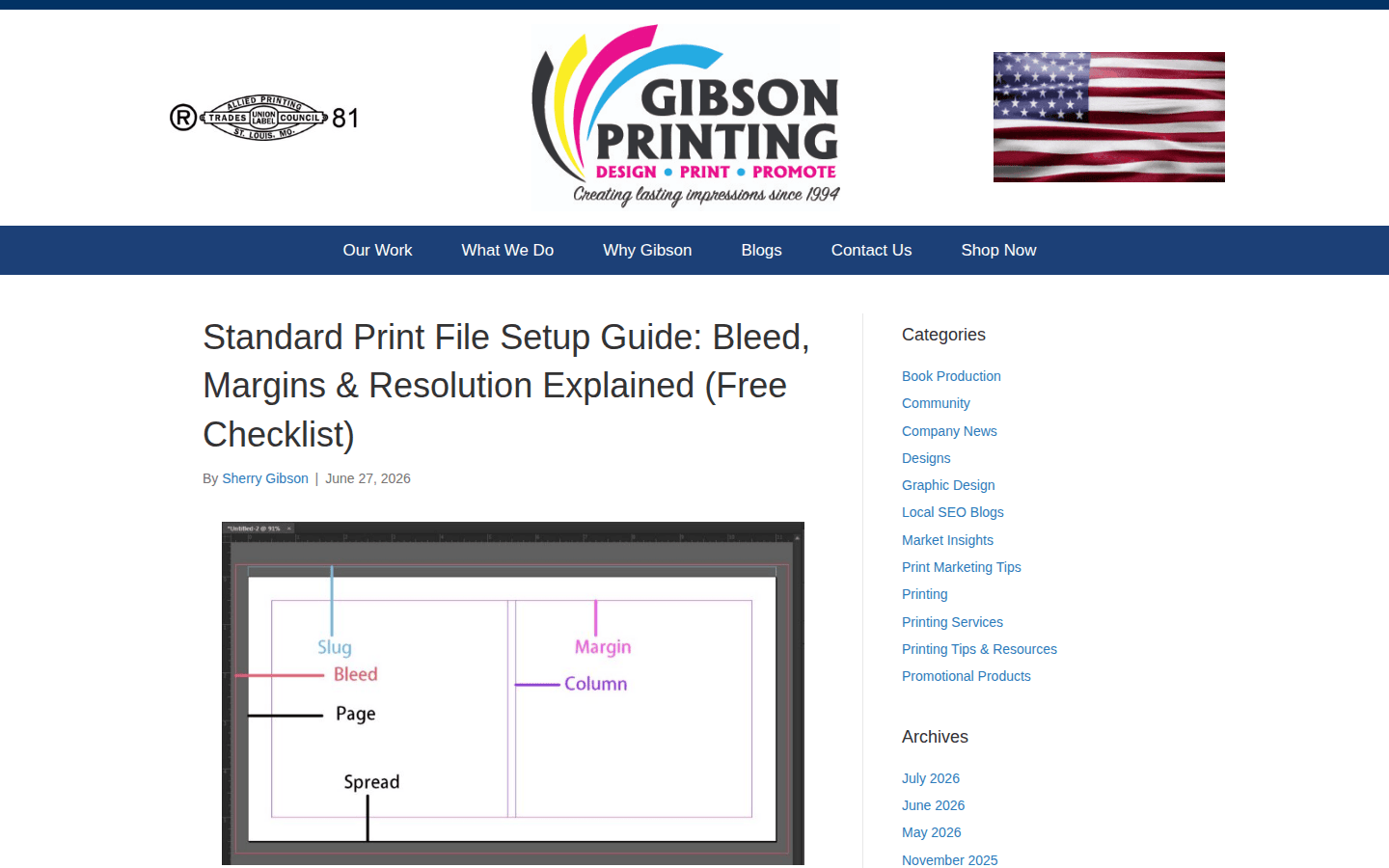
When a design is printed and then trimmed to its final size, minor variations in the cutting process can occur. This is where bleed and safe zones become crucial for maintaining a professional appearance. Bleed refers to the portion of your design that extends beyond the trim edge. Typically, this is about 0.125 inches (3 mm) on all sides. Including bleed ensures that if the cut is slightly off, there won’t be an unsightly white sliver along the edge of your printed piece. The safe zone, conversely, is an inner margin where all critical content (text, logos, important imagery) should be placed to ensure it isn’t accidentally cut off or too close to the edge.
Failing to add bleed can result in unintended white borders, while placing essential elements outside the safe zone risks them being trimmed. Always set up your document with the correct bleed and safe zones from the outset, as specified by your printer. Many design programs offer templates or guides for setting up bleed and safe zones automatically. Double-check these settings before finalizing your design, especially for projects with tight margins or intricate layouts. A common oversight is forgetting to extend background colors or images into the bleed area, leading to a thin white line after trimming.
Incorrect Export Presets and File Types
Even with correct resolution and color settings, choosing the wrong export preset or file type can undermine your print quality. Different file formats are optimized for different purposes. For most commercial print jobs, a high-quality PDF is the preferred file format. PDFs can embed all necessary fonts, images, and color profiles, ensuring consistency across different systems. Many design applications offer specific PDF/X standards (e.g., PDF/X-1a, PDF/X-4) which are designed for reliable print production. These presets often handle compression, font embedding, and color conversion automatically.
Avoid sending native design files (like .ai or .psd) unless specifically requested, as they can lead to font or link issues. Similarly, steer clear of web-optimized formats like JPG or PNG for print unless they are high-resolution raster images for specific purposes, and even then, a PDF is often a more robust choice. Always include crop marks if your printer requires them, which help guide the trimming process. Before sending your final file, perform a preflight check using your design software or a dedicated preflight tool. This step can identify potential issues like missing fonts, low-resolution images, or incorrect color profiles before they become costly printing errors. Confirming these details with your printer before production begins can save time and resources.
Final Checks for Print Success
Before you send your files to the printer, take a moment for a final review. Check that all fonts are embedded or outlined to prevent text reflow issues. Verify that all images are linked correctly and are not missing. Confirm the final dimensions of your artwork, including bleed. A small checklist can prevent common mistakes. For example, if you’re printing a brochure, ensure the page order is correct for folding. If it’s a packaging design, confirm the dieline is accurate and all elements are within the safe zones. These meticulous steps ensure your brand assets translate flawlessly from screen to print, maintaining the professional image you’ve worked to build.
 Logo Template
 Icon Template
 Logo Template
 Logo Template