
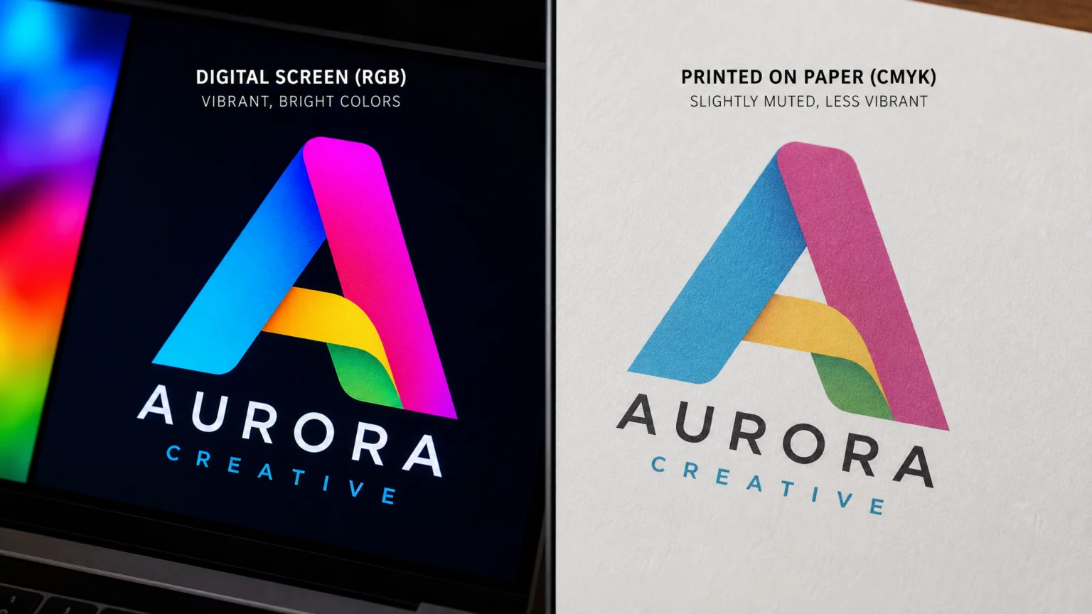
A brand’s visual identity relies on consistent color, yet many designers and marketers encounter a frustrating reality: the colors that look perfect on a screen often shift dramatically when printed. This isn’t a random occurrence; it’s a fundamental difference in how digital displays and physical printers create color. Understanding this distinction is the first step toward achieving reliable brand consistency across all your touchpoints.
The core of the problem lies in two distinct color models: RGB and CMYK. Digital screens, like your monitor or phone, generate color by emitting light, using a Red, Green, and Blue (RGB) additive model. Printers, conversely, create color by absorbing light, mixing Cyan, Magenta, Yellow, and Key (black) (CMYK) pigments in a subtractive process. Each model has its own gamut, or range of colors it can reproduce, and these gamuts do not perfectly overlap.
The Fundamental Difference: RGB vs. CMYK
RGB, an additive color model, starts with darkness and adds light to create color. When red, green, and blue light are combined at full intensity, they produce white. This model allows for a wide spectrum of bright, vivid colors, often seen in digital photography and web design. Think of a brightly lit LED screen; it’s actively projecting these colors.
CMYK, on the other hand, is a subtractive model. It begins with a white surface (like paper) and subtracts light through ink absorption. Combining cyan, magenta, and yellow inks theoretically produces black, though in practice, a ‘Key’ (black) ink is added to achieve richer blacks and improve detail. This process inherently limits the vibrancy and range of colors compared to RGB, as pigments cannot emit light.
The Role of Color Management Systems
To bridge the gap between these two color worlds, color management systems (CMS) are essential. These systems exist to make color data interpretable across different devices and conversions, aiming for more consistent reproduction. At the heart of a CMS are ICC profiles, which describe the color behavior of specific devices, whether it’s your monitor, a digital camera, or a particular printing press. These profiles connect device-specific colors to a standard, device-independent color space.
When you convert an RGB image for print, the CMS uses ICC profiles to transform the color data. This process maps the colors from the larger RGB gamut to the smaller CMYK gamut, attempting to find the closest possible match. Without this managed conversion, colors can shift unpredictably, leading to unexpected results in your printed materials.
Calibrating Your Digital Workflow
Achieving consistent color begins with a calibrated digital workflow. Your monitor is the primary window into your design, and if it’s not displaying colors accurately, all subsequent decisions will be flawed. Regular monitor calibration using a hardware calibrator ensures that your screen accurately represents colors according to a known standard. This step is critical for making informed color choices and predicting print outcomes.
Beyond calibration, setting up your design software with the correct color profiles is vital. For print projects, working in a CMYK color space from the outset, or at least converting to it early in the process, allows you to see how colors will translate. While some designers prefer to work in RGB for its wider gamut and convert at the end, understanding the limitations of CMYK during the design phase can prevent surprises.
Conversion Best Practices for Print
When converting from RGB to CMYK, the goal is to minimize color shifts. One common pitfall is relying on default conversion settings without understanding their impact. Different rendering intents within your software (e.g., perceptual, relative colorimetric) handle out-of-gamut colors differently. Perceptual rendering attempts to preserve the visual relationship between colors, even if it means shifting all colors slightly, while relative colorimetric aims for exact matches for in-gamut colors, clipping out-of-gamut ones.
For brand consistency, it’s often best to work with your printer to define specific CMYK values for your brand colors. Many brands establish a spot color system, such as Pantone, which provides a universal reference that can be matched more precisely across different print runs and materials. This bypasses some of the complexities of CMYK conversion for critical brand elements.
Proofing Techniques for Accuracy
Even with careful calibration and conversion, the final print can still hold surprises. This is where proofing becomes indispensable. A soft proof allows you to simulate the print output on your calibrated monitor, giving you a preview of how colors might appear. While useful, it’s not a substitute for a hard proof, which is a physical print made on the actual paper stock using the intended printing process.
Hard proofs are crucial for critical projects. They allow you to catch color discrepancies before a full print run. Comparing your hard proof to a color-accurate reference, like a Pantone swatch book, helps confirm that your brand colors are being reproduced faithfully. This step provides the most reliable indication of final print quality and ensures alignment with your brand’s visual standards.
Communicating with Your Print Vendor
Effective communication with your print vendor is a non-negotiable part of achieving color consistency. Provide them with your exact brand color specifications, ideally in CMYK values and any corresponding spot color references. Share your ICC profiles if you’ve created custom ones, and discuss their preferred profiles for the specific paper and printing process you’re using. A good print partner will understand the nuances of color management and work with you to achieve the desired outcome.
For example, if your brand uses a very bright, saturated blue that is difficult to achieve in CMYK, your printer can advise on whether a fifth spot color would be necessary or if there’s a specific CMYK build that offers the closest approximation. This proactive dialogue minimizes guesswork and reduces the likelihood of costly reprints due to color inaccuracies.
Maintaining Consistency Across Mediums
The goal of color management is not to make RGB and CMYK identical, but to ensure that your brand’s visual identity remains consistent and recognizable across all mediums. This means accepting that a color might look slightly different on a backlit screen versus a printed brochure, but that difference should be predictable and within acceptable brand guidelines. A well-managed workflow minimizes these variations.
By understanding the underlying mechanisms of color reproduction, implementing calibration, carefully managing conversions, utilizing proofing, and maintaining clear communication with vendors, you can take control of your brand’s color destiny. Your brand’s visual impact relies on this attention to detail, ensuring that its colors resonate as intended, wherever they appear.
 Icon Template
 Photo Template
 Photo Template
 Photo Template


