
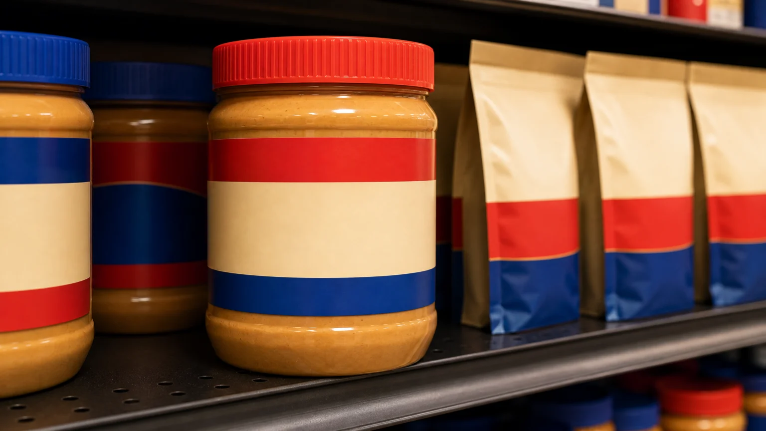
A familiar grocery logo rarely gets this kind of restraint. Jif’s first major refresh in more than 30 years works because it removes visual weight instead of adding noise.
The redesign revives the brand’s signature tri-color banner and removes the dated drop shadow from the letters. On a package, that kind of edit changes the whole feel. A shadow can pin a mark to an earlier era; taking it away lets color, shape, and spacing carry the logo again.
Cleaning the logo without emptying it
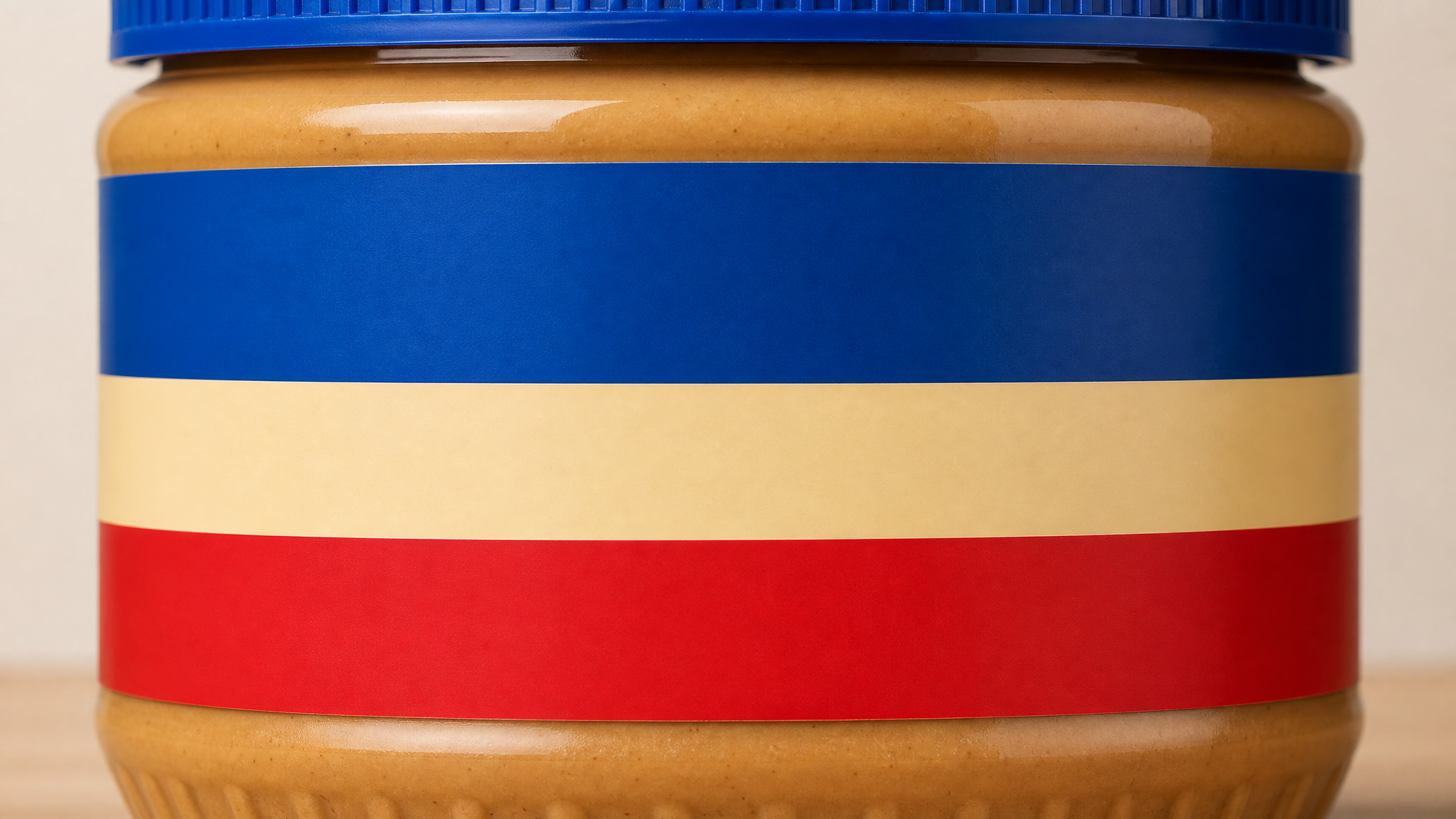
Jif is not starting over. The refresh keeps the parts shoppers already know, then adjusts them so the mark reads more cleanly on a shelf and online. That balance matters for a household name with decades of memory built into a jar.
The revived tri-color banner does important work because it holds recognition without extra decoration. It gives the logo a clear frame and a familiar signature. Removing the drop shadow makes the letters feel flatter in the best way: more direct, less dated, and easier to reproduce across print, retail photography, and digital screens.
The shelf is only part of the job now
Jif’s cleaner, bolder look is built to stand out both on shelves and online. That dual demand changes how a legacy brand has to draw itself. A jar seen from several feet away and a product tile seen on a phone need different kinds of clarity, yet the same logo has to serve both.
Drop shadows once helped create contrast and apparent depth in print-heavy settings. Today they can soften edges, muddy small-scale reproduction, and make a wordmark feel less precise on screens. Stripping that effect away does not make the identity cold. It makes it legible in more places.
This is why reduction often feels more current than embellishment. A cleaner mark usually reproduces better, scales better, and sits more comfortably inside crowded retail systems. It also leaves more room for the rest of the package to speak.
The refresh broadens the story beyond sandwiches
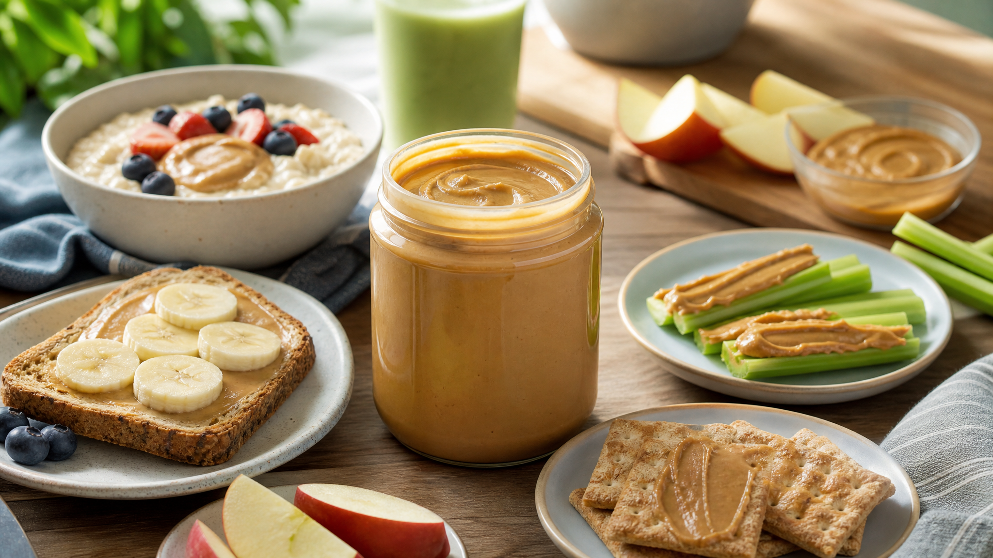
The visual update does not stop at the logo. New imagery across packaging highlights more ways to enjoy the brand throughout the day, shifting the story from one classic use toward a wider routine. That is a packaging decision as much as a marketing one, because imagery tells shoppers what a product belongs with before any copy does.
For a pantry staple with a deeply established habit attached to it, that matters. If peanut butter lives inside a narrow mental frame, broader food imagery can gently open it back up. A package can suggest breakfast, snacks, or quick meals through props, crop, and emphasis alone.
Naming changes support that move. As part of the refresh, Jif To Go will become Jif Dippers. The newer name feels more specific about use, and names that describe behavior often help a line read faster in-store.
Heritage shows up in what stays
The smartest part of this refresh may be its restraint. Jif is honoring iconic elements people know and love while bringing new energy to the shelf. In design, heritage is not a sepia filter or a backward glance. It is the discipline to know which elements still carry equity and which ones only carry age.
That distinction is where many redesigns stumble. Teams remove too much and lose memory, or preserve too much and keep the clutter. Jif appears to have chosen a middle path: retain the recognizable banner, sharpen the lettering, and let the package system expand around it.
Strong redesigns rarely ask people to relearn everything at once. They keep the recognizable core, then reorganize the surrounding cues. That is often how a brand gains freshness without giving up trust.
Why packaging imagery matters as much as the mark
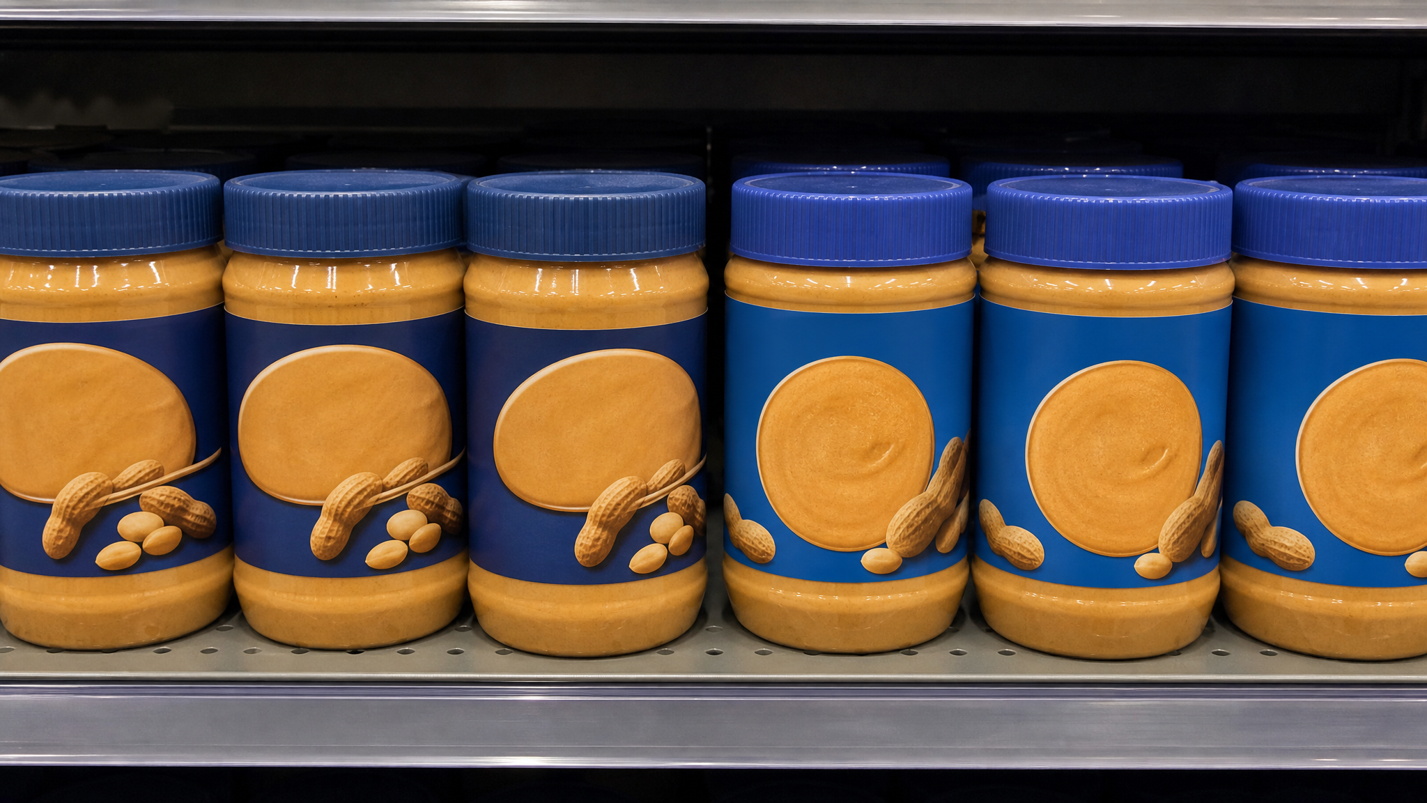
A logo can open recognition, but packaging imagery often finishes the sale. By adding new imagery that highlights more moments of use throughout the day, Jif widens the package’s range without forcing a new identity. The mark stays familiar while the package context becomes more expansive.
This is especially useful in categories where products can disappear into routine. New imagery can refresh attention, create appetite, and invite different meal associations. It gives the package a second job beyond identification: suggestion.
For designers, that is the practical lesson here. When a legacy mark already performs well, the biggest opportunity may sit in the system around it. Photography, naming, hierarchy, and color fields can do strategic work while the central logo remains largely intact.
What the rollout timing tells us
Products featuring packaging with the new look begin shipping in October 2026 and will transition to shelves in waves through the fall and early winter. That phased rollout is ordinary in consumer packaging, but it also shapes how the redesign will be perceived. For a period, old and new packaging may coexist across stores and regions.
That overlap makes restraint even more valuable. When a refresh is evolutionary rather than abrupt, shoppers can still find the product quickly while absorbing the new look over time. Familiar color structure and a recognizable logo shape help smooth that handoff.
Designers sometimes focus so heavily on the reveal that they miss the transition. In retail, the transition is part of the design. A package has to survive comparison against its own previous version, often on the same shelf, under uneven lighting, beside competitors that are not making room.
A useful model for legacy brand updates
Jif’s refresh offers a clear example of how to modernize a mature identity without flattening its personality. Keep the remembered structure. Remove effects that date the mark. Let packaging imagery carry new usage cues. Rename where clarity improves speed.
None of those moves are flashy on their own. Together, they show good judgment. The brand gets cleaner, bolder, and broader, while the parts people recognize remain steady.
 Icon Template
 Photo Template
 Logo Template
 Logo Template


