
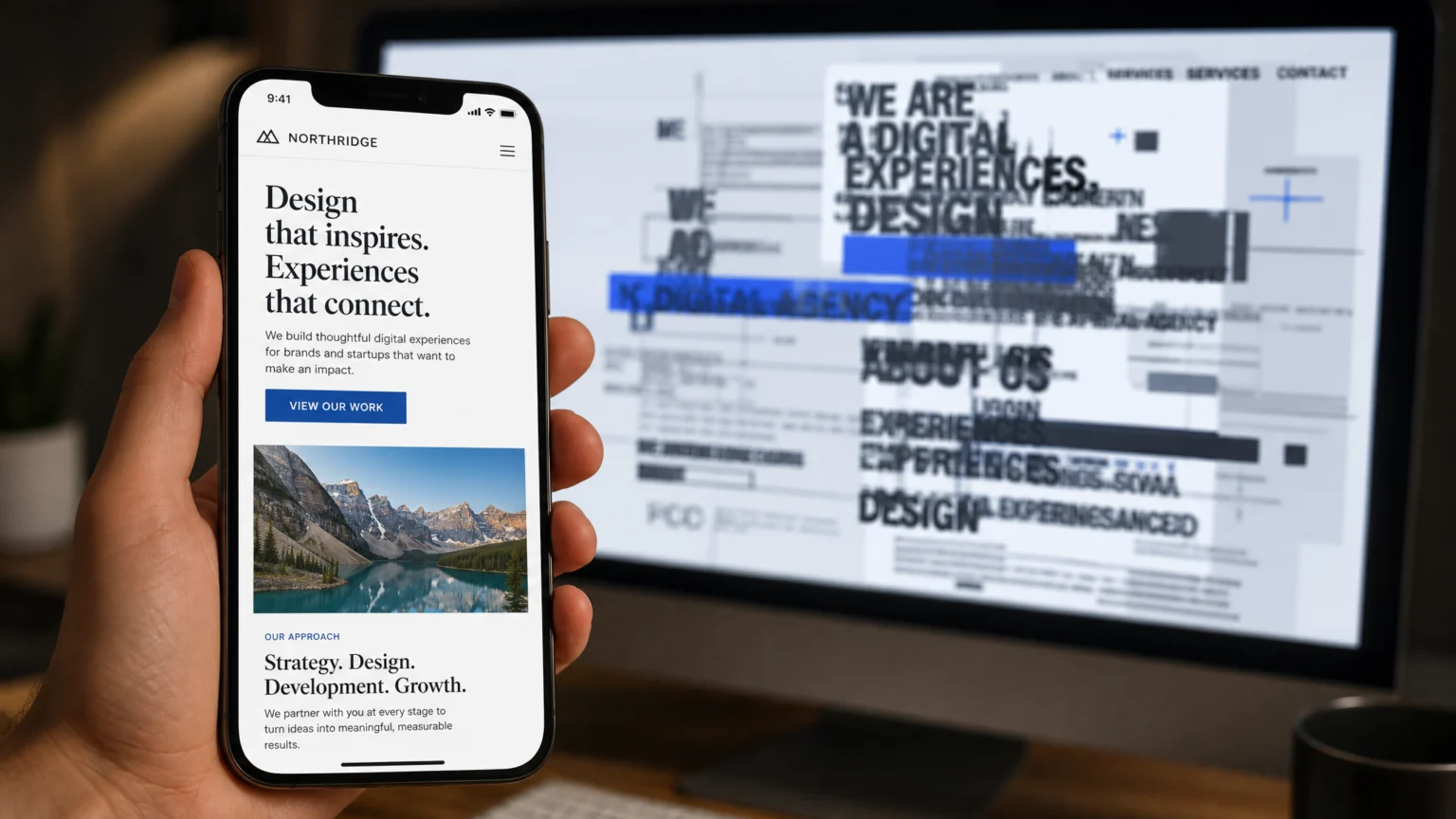
You’ve designed a beautiful website, carefully chosen your typefaces, and set your layouts. Everything looks perfect on a desktop monitor, but when you pull it up on a phone, the text is either too small to read, awkwardly large, or breaks in unexpected places. This common frustration stems from how browsers interpret and render typography on diverse mobile screens, often leading to a disjointed visual experience. The core of the problem usually lies in a mismatch between your design assumptions and the fluid nature of mobile environments.
Unlike static print layouts, web content must adapt. When it comes to typography, this means ensuring not just legibility but also accessibility and a consistent reading flow across devices. Fixing these issues requires a systematic approach to how fonts are sized, spaced, and rendered. Let’s explore the common pitfalls and how to resolve them, ensuring your mobile typography is as polished and readable as its desktop counterpart.
Confirm the Viewport Is Set Correctly
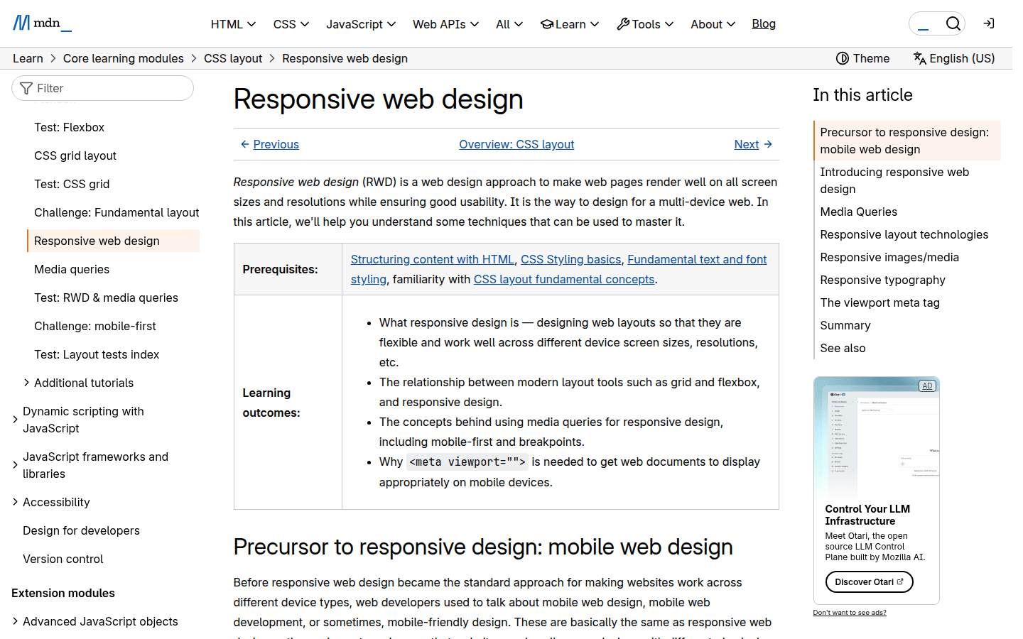
One of the most fundamental reasons mobile typography can appear broken is an improperly configured viewport. Without the correct viewport meta tag, mobile browsers might render your page as if it were on a desktop, then scale it down to fit the smaller screen. This results in tiny, unreadable text that users have to pinch-to-zoom, defeating the purpose of responsive design.
To ensure your page renders at the intended mobile width, include the following meta tag in the <head> section of your HTML: <meta name="viewport" content="width=device-width, initial-scale=1.0">. This tag instructs the browser to set the viewport width to the device’s width and to set the initial zoom level to 1.0. Without this, all other responsive typography efforts may be undermined, as the browser won’t know how to correctly interpret your CSS for mobile dimensions. Mozilla’s MDN Web Docs provide detailed guidance on responsive design principles, emphasizing the importance of this initial setup.
Use Fluid or Responsive Sizing Instead of Fixed Text Sizes
Relying solely on fixed pixel units (px) for font sizes often leads to poor mobile experiences. Text that looks appropriate at 16px on a desktop can be too small on a phone or too large on a tablet. Fluid typography, which adapts font sizes based on the viewport, offers a more flexible solution.
Implement responsive sizing using CSS viewport units (vw, vh) or relative units like em and rem. Viewport units, such as 1vw (1% of the viewport width), allow text to scale proportionally with the screen size. For example, setting a heading to font-size: 5vw; will make it larger on wider screens and smaller on narrower ones. Alternatively, using em or rem in conjunction with media queries provides granular control. You might set a base font size for different breakpoints:
body { font-size: 16px; }
@media (max-width: 768px) { body { font-size: 14px; } }
@media (max-width: 480px) { body { font-size: 12px; } }
This approach ensures text remains legible and appropriately scaled across various device sizes, preventing both cramped and overly expansive typography. The goal is to create a comfortable reading experience without requiring the user to manually adjust zoom levels. Consider how different font families might behave with these scaling methods; some typefaces maintain legibility better than others at smaller sizes.
Verify Text Spacing Changes Do Not Break Content or Functionality
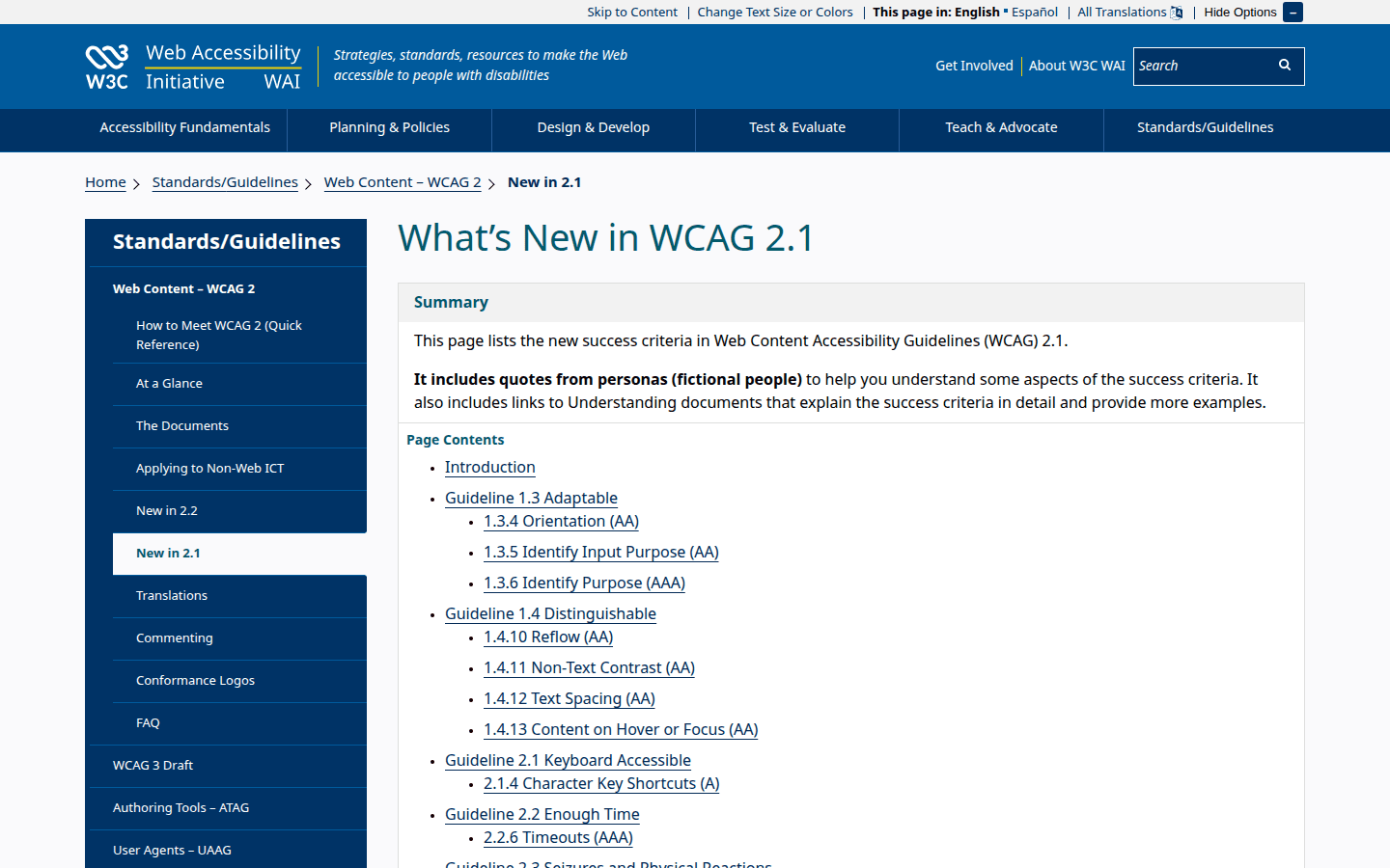
Accessibility standards, specifically WCAG 2.1 Success Criterion 1.4.12, mandate specific minimum text spacing values to improve readability for users with cognitive disabilities. These include a line height of at least 1.5 times the font size, paragraph spacing of at least 2 times the font size, letter spacing (tracking) of at least 0.12 times the font size, and word spacing of at least 0.16 times the font size. While these are minimums, allowing users to override default spacing in their browser or through assistive technologies is crucial.
The challenge arises when these user-applied spacing adjustments cause content to overlap, disappear, or break the layout, rendering parts of the page unusable. To troubleshoot this, test your site by manually increasing these spacing properties in your browser’s developer tools or by simulating accessibility settings. Ensure that when line height, letter spacing, word spacing, and paragraph spacing are increased, the layout remains fluid and all content remains visible and functional. This often means designing with flexible containers and avoiding fixed-height elements that could clip text.
Check That Layouts Still Work at 200% Text Resize
Another critical accessibility requirement from WCAG 2.1 (Success Criterion 1.4.4) is that text must be able to resize up to 200% without loss of content or functionality. This means users should be able to zoom in on your text without horizontal scrolling becoming necessary or content disappearing off-screen. Many designers test for mobile responsiveness at default zoom levels but overlook this crucial accessibility check.
To test this, zoom your browser to 200% on a mobile device or use your desktop browser’s zoom function while in responsive mode. Observe how elements reflow. Do text blocks expand vertically, or do they overflow their containers? Do navigation menus become unmanageable? Common issues include text overlapping images, buttons becoming too large to fit, or content columns collapsing into an unreadable mess. Addressing this often involves using relative units (em, rem) for padding, margins, and widths, rather than fixed pixels, allowing elements to scale gracefully with text size increases. This practice is vital for ensuring your design is inclusive and usable for everyone.
Test Line Height, Word Spacing, and Letter Spacing on Small Screens
While general text sizing is important, the subtle nuances of line height, word spacing, and letter spacing (kerning/tracking) can significantly impact mobile readability. What looks balanced on a large screen can become cramped or excessively loose on a smaller viewport, especially with longer words or narrow columns.
On mobile, slightly increasing line height (line-height) can improve readability by providing more vertical white space between lines, making it easier for the eye to track from one line to the next. Conversely, excessive letter spacing (letter-spacing) can make words fall apart, while too little can make them blur together. Test different values for these properties directly on target mobile devices. Pay attention to how different font weights and styles render. For instance, a bold headline might need less letter spacing than a light body text. Adjust these values using media queries to fine-tune the typography for specific screen sizes, ensuring optimal legibility and visual comfort.
Implementing a Robust Mobile Typography Strategy
Beyond these five fixes, a comprehensive mobile typography strategy involves several additional considerations. First, prioritize web-safe fonts or those served efficiently via a content delivery network (CDN) to minimize load times on mobile networks. Heavy font files can significantly slow down page rendering, leading to a poor user experience. Tools like Google Fonts offer a wide selection of optimized typefaces that are easy to implement.
Next, consider the contrast ratio between your text and its background. WCAG guidelines recommend a minimum contrast ratio of 4.5:1 for normal text and 3:1 for large text. This is even more critical on mobile devices, where screen glare and varying ambient light conditions can severely impact readability. Use online contrast checkers to verify your color choices meet these standards.
Another often-overlooked aspect is the length of your lines of text. On mobile, excessively long lines force the reader’s eye to travel too far, making it difficult to find the start of the next line. Conversely, very short lines can break up sentences awkwardly and disrupt reading flow. Aim for an optimal line length of 45-75 characters per line for body text on mobile. This can often be achieved by adjusting container widths or using CSS columns.
Finally, remember to test thoroughly on actual devices. Emulators and browser developer tools are excellent for initial checks, but they cannot fully replicate the nuances of different screen sizes, resolutions, operating systems, and user interactions. Gather a range of devices—from older smartphones to the latest models—and test your typography across various scenarios. Pay attention to touch targets for interactive text elements, ensuring they are large enough for easy tapping without accidental activation. This hands-on testing will reveal real-world issues that might otherwise go unnoticed, allowing you to refine your mobile typography for a truly seamless user experience.
 Photo Template
 Photo Template
 Logo Template
 Logo Template