
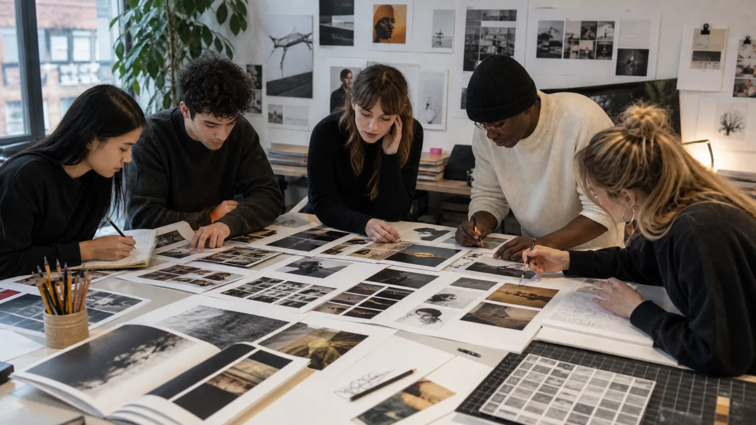
A magazine starts to feel credible long before a reader names why. Usually it happens in the quiet decisions: the way a department page settles, how a headline gives the eye somewhere to land, how one spread hands off to the next without a jolt.
That is what makes Ohio University’s VIS Magazine worth studying. The student-produced publication from the School of Visual Communication won first place in the design category of the 2026 Association for Education in Journalism and Mass Communication Student Magazine Contest, and the reasons behind that result are useful far beyond a classroom.
What the winning issue got right
The award recognized the magazine’s third issue, The Heroes Issue. Its focus was visual communication leaders and the influence of storytelling across generations.
That theme could easily have drifted into pages that felt too broad or overly reverent. Instead, it gave the design a clear frame. In a publication centered on people whose work and mentorship shaped a field, clarity matters more than ornament.
When that balance works, readers notice the people and the stories first. The design still carries authority, but it does it through structure, restraint, and steady direction.
Why collaboration mattered as much as talent

VIS was produced through coordination across three courses. Students worked across editorial content, photography, art direction, typography, and production.
That detail explains a lot about the final result. Good magazines rarely come from isolated brilliance. They come from teams making connected decisions under pressure, where a photograph changes a spread, a headline changes spacing, and a late edit changes hierarchy.
When text, image, and production develop in conversation, the issue feels composed rather than assembled. That shared authorship is often what gives a publication its visual signature.
The four design pressures that define real magazine work
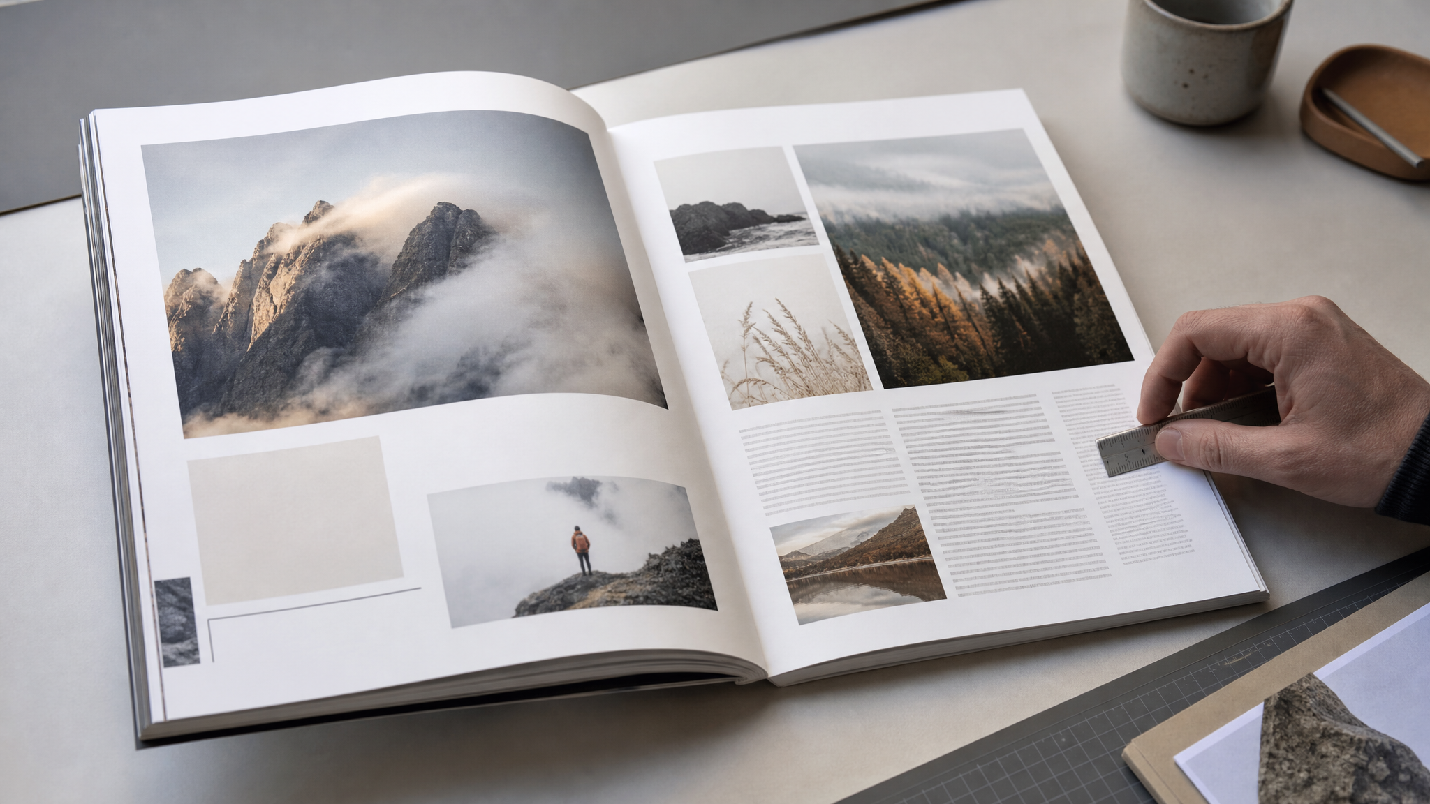
The team had to make difficult decisions about hierarchy, pacing, typography, and visual consistency while responding to photographs, stories, feedback, and deadlines. It is a short list, but it covers the work that turns a class project into a credible editorial object.
Hierarchy
Hierarchy decides what the reader sees first, second, and third. In magazine design, that includes more than headline size. It reaches into decks, captions, section labels, body copy, and the white space that gives each element room to speak.
Weak hierarchy makes every element compete at once. Strong hierarchy creates an order that feels natural on the page.
Pacing
Pacing is hard to teach because it reveals itself across the whole issue, not on one spread. It lives in contrast: dense pages against open ones, large images against quieter moments, features against departments.
Variation keeps the reader alert, but timing keeps the issue coherent. For a themed issue about influential figures, that balance mattered. The design needed room for reflection without letting the magazine become visually heavy.
Typography
Typography sets tone before a reader fully processes meaning. In a magazine about visual communication leaders, type choices had to feel confident, legible, and organized.
A publication loses credibility quickly when fonts fight each other, scales drift, or body text looks mechanically placed instead of edited for reading. If judges responded to polished grids and typography, that suggests consistency in both the architecture of the page and the detail inside it.
Visual consistency
Consistency is not sameness. It means a reader can move from one section to another and still feel held by the same publication.
Branded sections, recurring structures, and stable graphic logic create that continuity. The best systems leave enough room for variation while keeping the issue legible as a whole.
What professional judges actually noticed
One judge described VIS as expertly done with all the classic hallmarks of a professional publication. The praise was concrete: departments, editorial hierarchies, branded sections, and polished grids and typography.
That is worth pausing on. The compliment was not about novelty or trendiness. It was about craft: how sections are built, how pages relate, how type behaves, and how branding stays present without crowding the editorial voice.
Professional-looking editorial design usually wins by reducing friction. The reader spends less energy decoding the page and more energy engaging the story.
Why the competition context gives the win weight
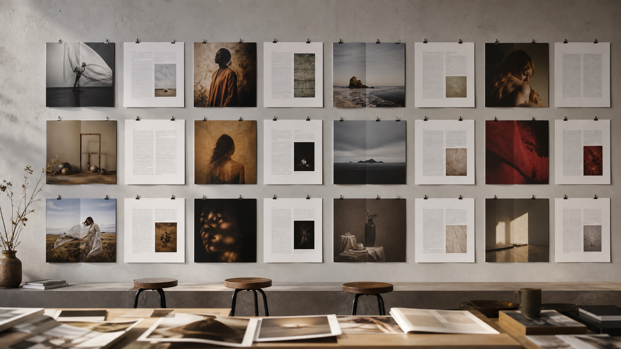
The 2026 contest received 221 entries from 22 schools in 11 categories. Fifteen working journalists and media professionals judged work produced between June 2025 and June 2026.
Those numbers matter because they place the result inside a broad field of comparable student work. This was a judged competition with a sizable entry pool and working professionals applying editorial standards.
That makes the first-place finish instructive for designers outside higher education too. Clear hierarchy, strong sectioning, polished type, and disciplined grids still read clearly across contexts.
A second signal from visual journalism
VIS Magazine also received six awards in this year’s Society for News Design competition. That competition honors excellence in visual journalism, including publication design, graphics, photography, art direction, and digital storytelling.
Taken together, those recognitions suggest a publication that held up under more than one lens. It worked as a magazine design object, and it also stood inside a broader conversation about visual journalism where image editing, storytelling structure, and art direction are judged in relation to each other.
That overlap matters. Editorial design is strongest when it does not behave like a layer added at the end. It works best when the disciplines move in concert.
What designers can learn from this win
- Build systems early. Grids, section logic, and type rules create room for better decisions later.
- Let theme shape structure. A strong editorial concept should influence sequencing, not just the cover or opener.
- Treat departments seriously. Judges noticed them, which means readers likely did too.
- Design for response, not control. Real publication work means adjusting to photographs, edits, feedback, and deadlines without losing coherence.
- Polish is cumulative. Professional quality usually comes from many modest decisions handled well.
VIS Magazine’s first-place finish is a useful reminder that publication design is a discipline of relationships: text to image, spread to spread, section to whole, idea to form. When those relationships are handled with care, the result feels calm, assured, and complete.
 Icon Template
 Photo Template
 Logo Template
 Logo Template


