Imagine a brand launch where the carefully chosen primary blue appears vibrant on the website but dull and lifeless on printed brochures. Or consider a digital campaign where the text on a banner is nearly invisible to users with color vision deficiencies. These common scenarios highlight a critical challenge for designers: maintaining brand consistency and accessibility across diverse media without stifling creative exploration. The tension between established brand guidelines and the need for fresh visual approaches often leads to time-consuming manual adjustments and rework.
AI-powered color palette generators offer a practical solution, bridging the gap between strict brand constraints and creative freedom. These tools can suggest harmonious color combinations, automatically check for contrast ratios, and flag potential accessibility issues, significantly streamlining a process that traditionally demands extensive manual testing. what matters is selecting a generator that integrates these capabilities seamlessly, empowering designers to make informed decisions that uphold brand integrity and inclusivity.
Adobe Color: Prioritizing Accessibility and Brand Themes
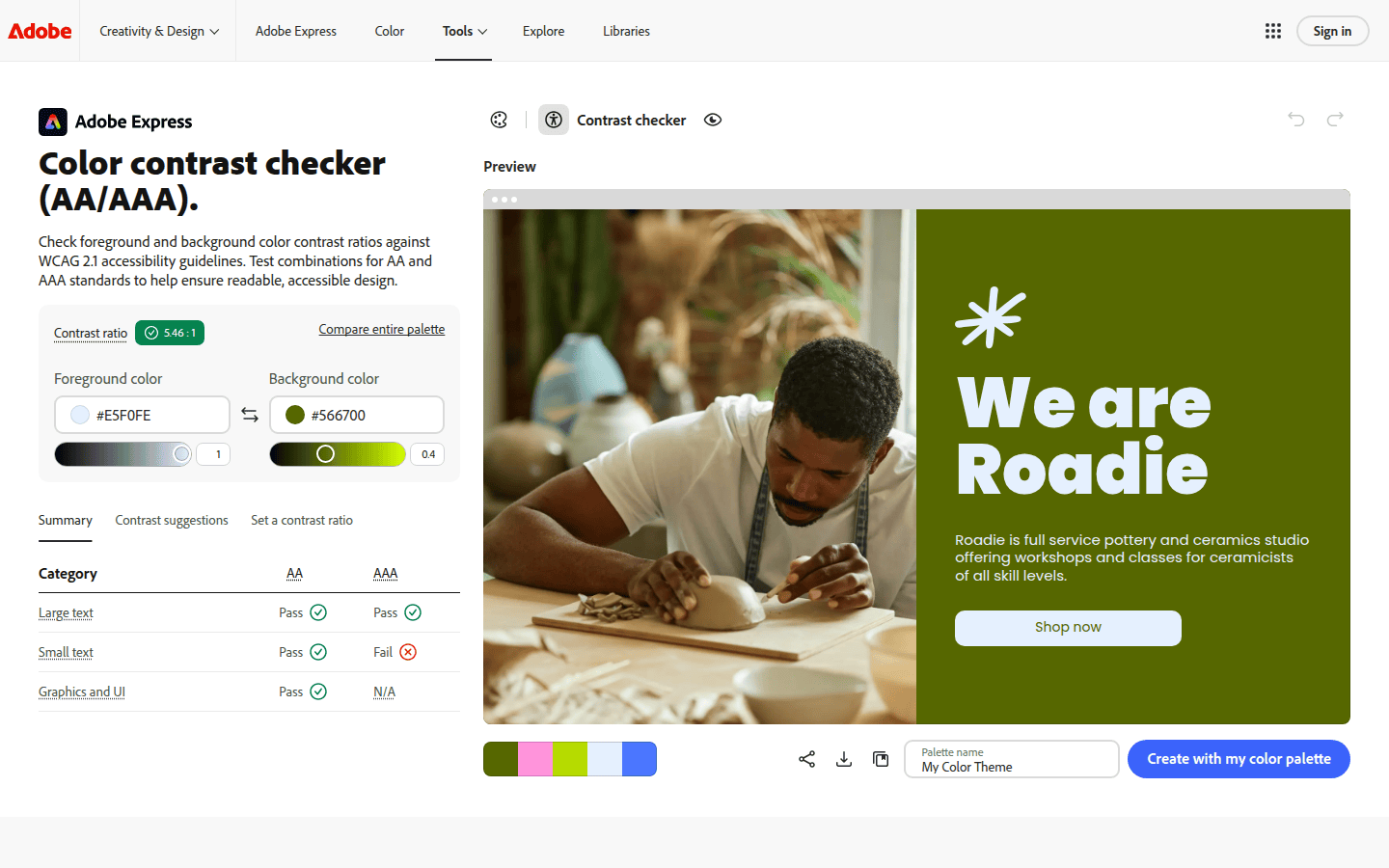
Adobe Color stands out as a robust tool for designers focused on inclusive design. Its integrated Color Contrast Checker directly references WCAG AA and AAA contrast thresholds. This feature is invaluable for ensuring that text and background color combinations meet recognized standards, preventing readability issues for users with visual impairments. Designers can proactively verify color choices against accessibility guidelines, embedding inclusivity from the project’s start.
Beyond basic contrast checks, Adobe Color provides guidance on creating cohesive color themes and resolving potential color-blindness issues. This proactive approach helps designers make informed decisions early in the process, rather than addressing problems late in the design cycle. By baking accessibility into the initial color selection, Adobe Color supports maintaining brand consistency, ensuring that brand colors are not only aesthetically pleasing but also functional for a wider audience. This integration means fewer revisions and a more efficient workflow for accessibility-conscious brands.
For example, if a brand’s style guide specifies a particular shade of green, Adobe Color can help identify complementary colors that maintain sufficient contrast for UI elements or text overlays. It can also suggest alternative shades within the brand’s palette that perform better under various accessibility simulations, ensuring the brand’s visual identity remains strong and accessible across all touchpoints. This level of detail helps designers confidently expand a brand’s color usage without compromising its core principles.
Khroma: AI-Assisted Exploration with Accessibility Signals
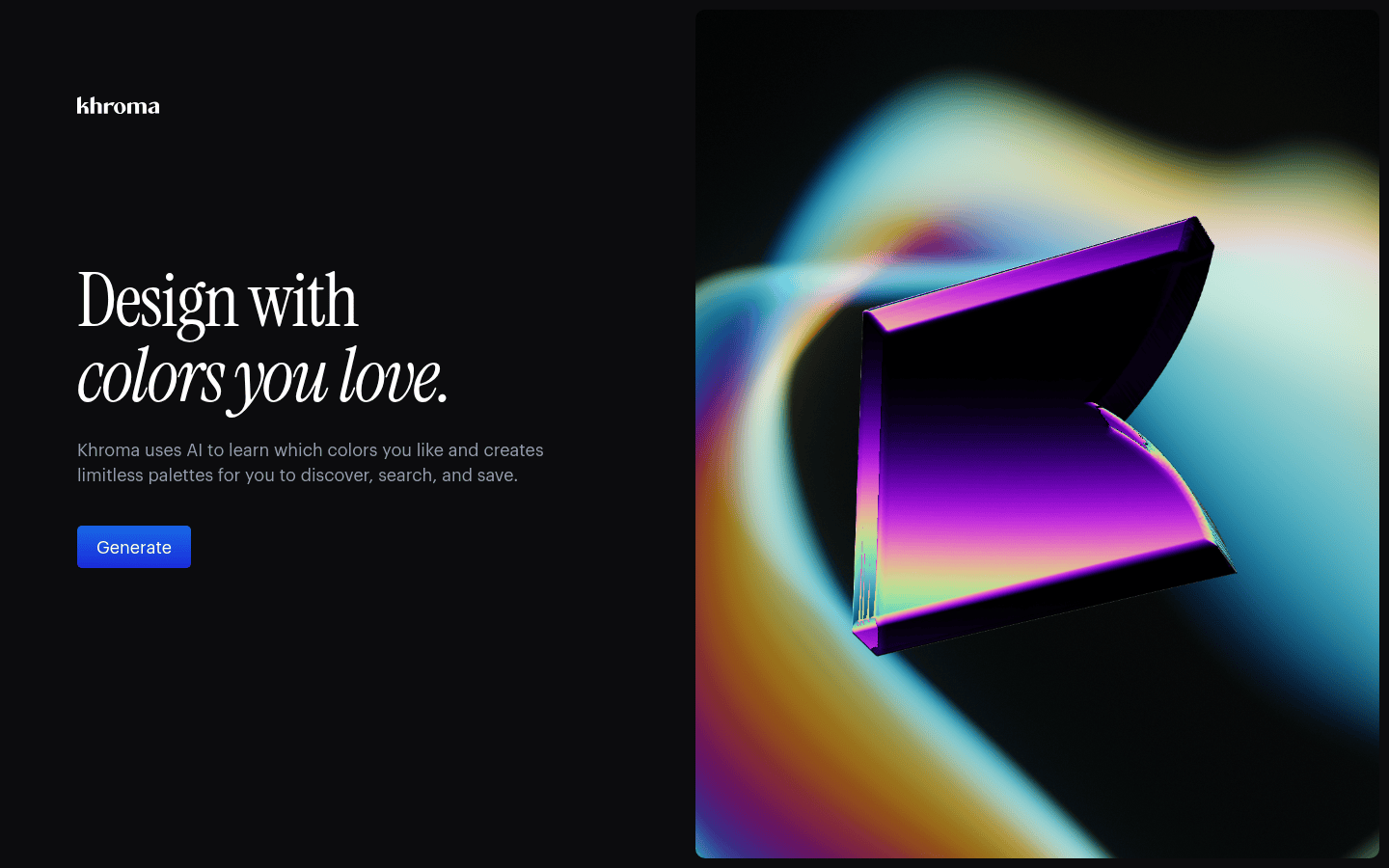
Khroma offers a distinct approach to palette generation, positioning itself as an AI color tool for designers. Unlike tools that start with a single base color, Khroma learns a designer’s preferences through an initial selection process. This personalized learning enables it to generate palettes tailored to individual aesthetic tastes. For each color pair suggested, Khroma provides essential details: color names, hex codes, RGB values, and CSS code. Crucially, it also includes a WCAG accessibility rating for each pair, integrating accessibility directly into the creative exploration phase.
This detailed feedback allows designers to quickly assess the viability of a color combination for various applications, from web interfaces to print materials. The AI-driven suggestions can help overcome creative blocks while ensuring that new palettes remain within acceptable accessibility parameters. This aligns perfectly with brand guidelines that often include accessibility as a core requirement. For instance, a designer might input a brand’s primary and secondary colors, and Khroma can suggest complementary shades that maintain contrast ratios suitable for body text or interactive elements, all while learning and adapting to the designer’s evolving style.
Consider a scenario where a brand needs to expand its digital marketing assets with new color combinations. Khroma can take the brand’s existing palette, learn the designer’s preferred stylistic nuances, and then generate a series of fresh, yet brand-aligned, palettes. Each suggestion comes with immediate accessibility feedback, allowing the designer to iterate rapidly and confidently. This reduces the back-and-forth typically associated with ensuring both aesthetic appeal and functional compliance, making the creative process more efficient and less prone to accessibility oversights.
Coolors: Quick Palette Browsing with Accessibility-Aware Labels
Coolors provides a more immediate and visual approach to color palette discovery, proving especially useful for designers seeking rapid inspiration or quick variations. Its public palettes page allows users to browse a vast collection of generated palettes. Each palette is accompanied by on-white, on-black, and color-blind-friendly labels. These labels offer an at-a-glance indication of how a palette performs in different contexts and for various users, simplifying the initial selection process.
While Coolors may offer less explicit guidance on brand-specific constraints compared to Adobe Color or Khroma, its strength lies in rapid exploration and visual assessment. A designer can quickly identify palettes that visually resonate with a brand’s aesthetic and then use the accessibility labels as a first-pass filter. This is particularly helpful when a brand’s guidelines allow for more flexibility within a defined color family, enabling designers to explore variations that are both fresh and accessible without extensive manual checking. It’s an excellent tool for brainstorming sessions or when a quick visual refresh is needed.
For example, if a brand needs to develop a seasonal campaign that uses a slightly different color mood but must remain within its established visual identity, Coolors can quickly present hundreds of options. The designer can filter these options based on the accessibility labels, ensuring that even experimental palettes meet basic readability requirements. This rapid prototyping capability allows for broader creative exploration without sacrificing fundamental design principles. It empowers designers to quickly test ideas and gather visual feedback before committing to more detailed accessibility audits.
Integrating AI Color Tools into Your Brand Workflow
Selecting the right AI color palette generator depends on your specific brand guidelines and design workflow. For brands with stringent accessibility requirements, Adobe Color offers comprehensive contrast checking and guidance. It ensures that every color decision is informed by WCAG standards, which is crucial for maintaining an inclusive brand presence. Its detailed feedback helps designers build accessibility into the foundation of their color choices, reducing the need for later remediation.
For designers who need a balance of AI-driven creative exploration and immediate accessibility feedback, Khroma presents a compelling option. Its ability to learn preferences and provide detailed WCAG ratings for each color pair streamlines the process of generating new, compliant palettes. This is particularly useful for projects requiring fresh visual directions within established brand color families, allowing for innovation without straying from core brand values. Khroma acts as a creative partner, suggesting paths that are both novel and compliant.
If your workflow benefits from rapid visual browsing and quick checks for general accessibility, Coolors provides an efficient solution. Its labeled palettes allow for quick discovery and initial filtering, making it ideal for brainstorming or finding variations on existing brand themes. While it may require more manual verification for strict brand compliance, its speed and breadth of options can kickstart the creative process and provide a strong starting point for further refinement. It’s a great tool for generating initial concepts and exploring broad aesthetic directions.
Ultimately, the most effective tool is one that complements your specific design process, helping you make visible decisions that balance brand consistency with creative freedom and accessibility. Consider your team’s existing tools, the complexity of your brand guidelines, and the typical project turnaround times. A tool that integrates smoothly into your current workflow will yield the greatest benefits, ensuring that your brand’s visual identity remains strong, cohesive, and accessible to all audiences. Experiment with these options to see which best supports your brand’s unique needs and creative aspirations.
 Logo Template
 Icon Template
 Photo Template
 Photo Template