A men’s shoe can read as modern, formal, or hand-finished before anyone asks the price. That tension gives this New York showcase its interest: the event is built for market entry, but first impressions still belong to surfaces, construction, and finish.
On December 1–2, a Portuguese footwear showcase will take place in New York during FFANY Market Week. Its role is practical and direct: connect Portuguese footwear companies with American buyers, distributors, and retailers, and support entry into the US market.
That commercial setup also creates a useful design lesson. When several labels appear side by side, differences in leather, colour handling, edge treatment, and build quality stop reading as minor details and start functioning as brand signature.
Material starts the brand story early
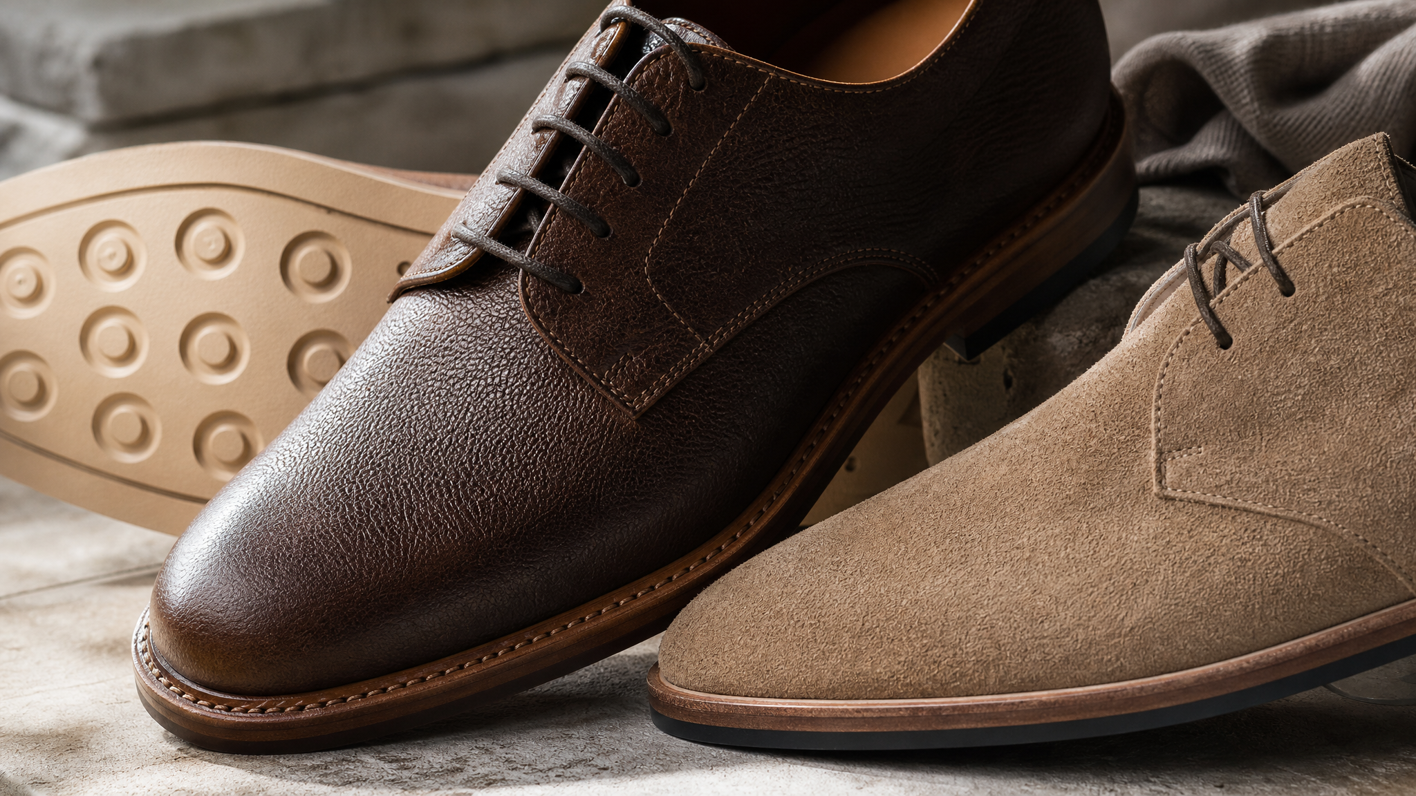
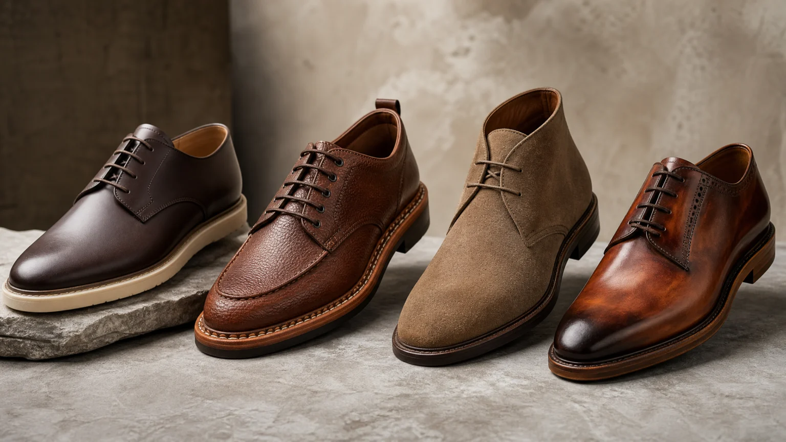
The featured labels are described with brief but revealing cues. Ambitious combines traditional shoemaking expertise with contemporary design and technological innovation. Centenário is associated with Goodyear welted footwear. Last Sole is handcrafted using premium leather and suede. Moshion stands out for hand-applied colours, individual finishes, and distinctive patinas.
Each description sets a different visual hierarchy. Contemporary design and technological innovation suggest cleaner lines and tighter editing. Goodyear welting directs attention to construction, durability, and the visible edge where craft becomes legible. Premium leather and suede bring texture forward. Hand-applied colour and patina make variation part of the appeal rather than something to conceal.
That is a useful reminder for designers. Brand identity does not begin with a logo on a box. It often begins earlier, in the grain of the material, the softness or firmness of a silhouette, and the way a finish catches light across the upper and sole.
Construction gives the eye something to trust
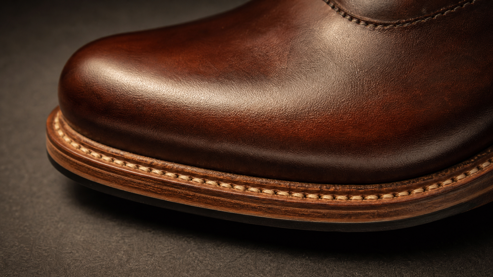
Goodyear welted footwear matters visually because it gives the object an honest seam to read. The build is not just technical information. It creates a visible border that signals weight, permanence, and care.
That principle carries well beyond footwear. In packaging, apparel, and product graphics, people respond when the thing is built in a way the eye can verify. A useful parallel appears in this look at honest scale and perspective in product mockups: credibility improves when visual cues match the physical reality the viewer expects.
For a footwear label entering a new market, that matters. Buyers may not know the full history of each company, but they can read consistency in the outsole, welt, stitching, and profile almost immediately. Good construction gives branding a steadier direction because the object itself is already making the case.
Surface finish can outtalk copy
Last Sole’s use of premium leather and suede and Moshion’s hand-applied colours and patinas point to two distinct kinds of visual appeal. One leans on tactile richness and material restraint. The other uses finish as a more expressive layer, where colour variation and individual treatment create personality.
This is where many brands either overtalk or overstyle. If the leather already looks rich and the suede already gives the shoe depth, heavy storytelling can feel unnecessary. If hand-applied colour creates one-off character, sterile photography or flat ecommerce presentation can strip away the very thing that makes the product memorable.
The same problem appears whenever brands rely on generic imagery that smooths every object into the same polished tone. Stronger alternatives to generic stock photography matter here because products with visible craft need images that preserve irregularity, texture, and edge detail rather than erase them.
Contemporary design still needs proof
Ambitious is framed through a blend of traditional shoemaking expertise, contemporary design, and technological innovation. That combination works because it avoids a common trap: using modern as a styling word without substance behind it. When tradition and innovation appear together, the result suggests a label trying to move forward without discarding the discipline that makes the product convincing.
Visually, that usually means reducing noise rather than reducing character. Cleaner forms, sharper proportions, and edited palettes can communicate modernity, but only if the object still feels resolved in the hand. Contemporary design lands best when the viewer can sense both precision and comfort in the same movement.
For creative teams building launch assets, this has a practical implication. If a shoe’s differentiator is the meeting point between heritage craft and newer design thinking, motion should clarify that contrast instead of decorating it. A restrained logo reveal animation or carefully paced product sequence can support the message, but only if material and shape remain the lead actors.
The showcase format makes comparison sharper
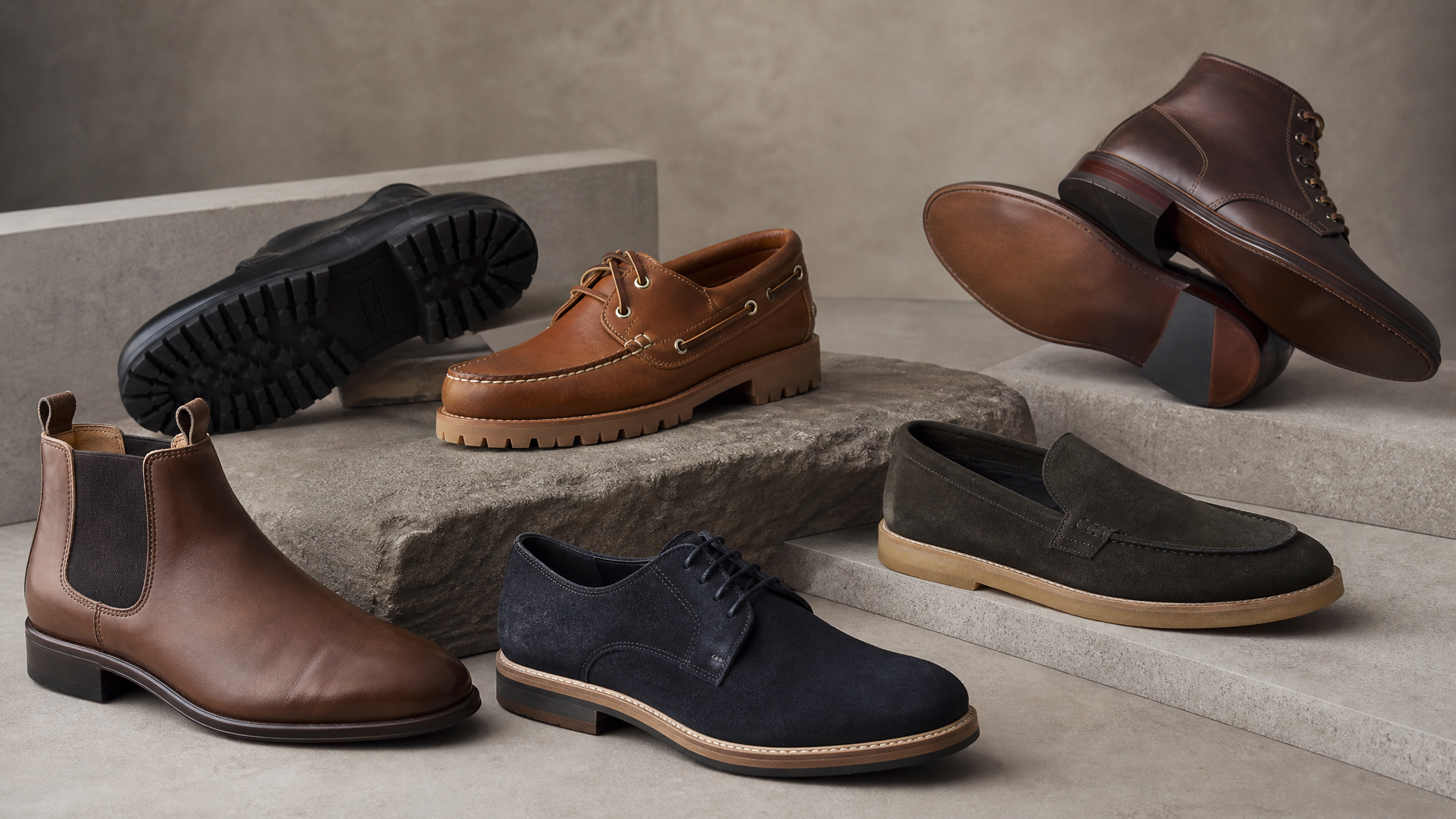
Because the New York event is built as a showcase, every participating label is read against its neighbours. That pressure is useful. It forces each brand to answer a simple visual question: what can a buyer recognise in seconds?
In that setting, broad claims matter less than specific cues. Welted construction. Premium leather and suede. Hand-applied colour. Distinctive patina. Contemporary design joined to traditional shoemaking knowledge. These details give buyers anchors they can remember after moving through a crowded floor.
There is a practical lesson in that compression. When presentation time is short, clarity improves when one or two visible strengths do most of the work. Too many competing claims flatten into noise; one clear attribute with supporting detail creates better recall and better timing.
Craft needs the right visual frame
Footwear with subtle material differences asks for careful image-making. Suede needs enough shadow to stay soft. Leather needs highlights that describe shape without turning glossy. Patina needs close views that reveal variation, not lighting that wipes it out. Construction details need angles that show how parts meet.
That makes presentation part of positioning, especially when a brand is entering a new market. If the product’s value lives in finish and build, still imagery and motion assets should be selected with equal care. For brands planning digital launch materials after an event like this, animated product photos can help reveal texture, edge, and form in a controlled sequence without overcrowding the frame.
A good brand description can open the door, yet material evidence closes the gap between interest and belief. In men’s footwear, identity often arrives through the leather, welt, suede, colour, and finish long before a label introduction is complete.
 Logo Template
 Logo Template
 Photo Template
 Logo Template