

A flashy launch can fill the top of the funnel and still leave very little behind. That is the tension running through many AI products right now: they attract attention quickly, convert strongly, and still struggle to be chosen again. This is less a visibility problem than a preference problem.
That changes the design brief. If acquisition is already doing its job, the brand no longer has to prove the product is new or technically impressive. It has to make the product feel personally useful, legible, and worth returning to.
Subscription data across more than 75,000 developers in RevenueCat’s State of Subscription Apps 2026 helps frame the issue. AI apps show a Year 1 revenue premium of about 41 per cent over non-AI apps, yet they retain far worse. In plain terms, they convert brilliantly, then too often fail to become a second choice, a third choice, or a habit.
Strong acquisition can mask weak attachment
Many AI products still introduce themselves through capability claims. The interface promises speed, intelligence, automation, generation. Those words may help someone install the app or start a trial, but they do not automatically create attachment.
Once many tools can produce roughly similar outputs, differentiation starts to thin out. The visual and verbal system has to do more than announce the ingredient. It needs to show what makes this product distinct in use, and why its way of working fits a particular person.
That follows a broader design lesson we have seen elsewhere: a system often works harder than a badge. Sound does more brand work when it lives in the system because people remember repeated experience more than a decorative signal. AI branding is moving in the same direction.
Onboarding is where preference begins
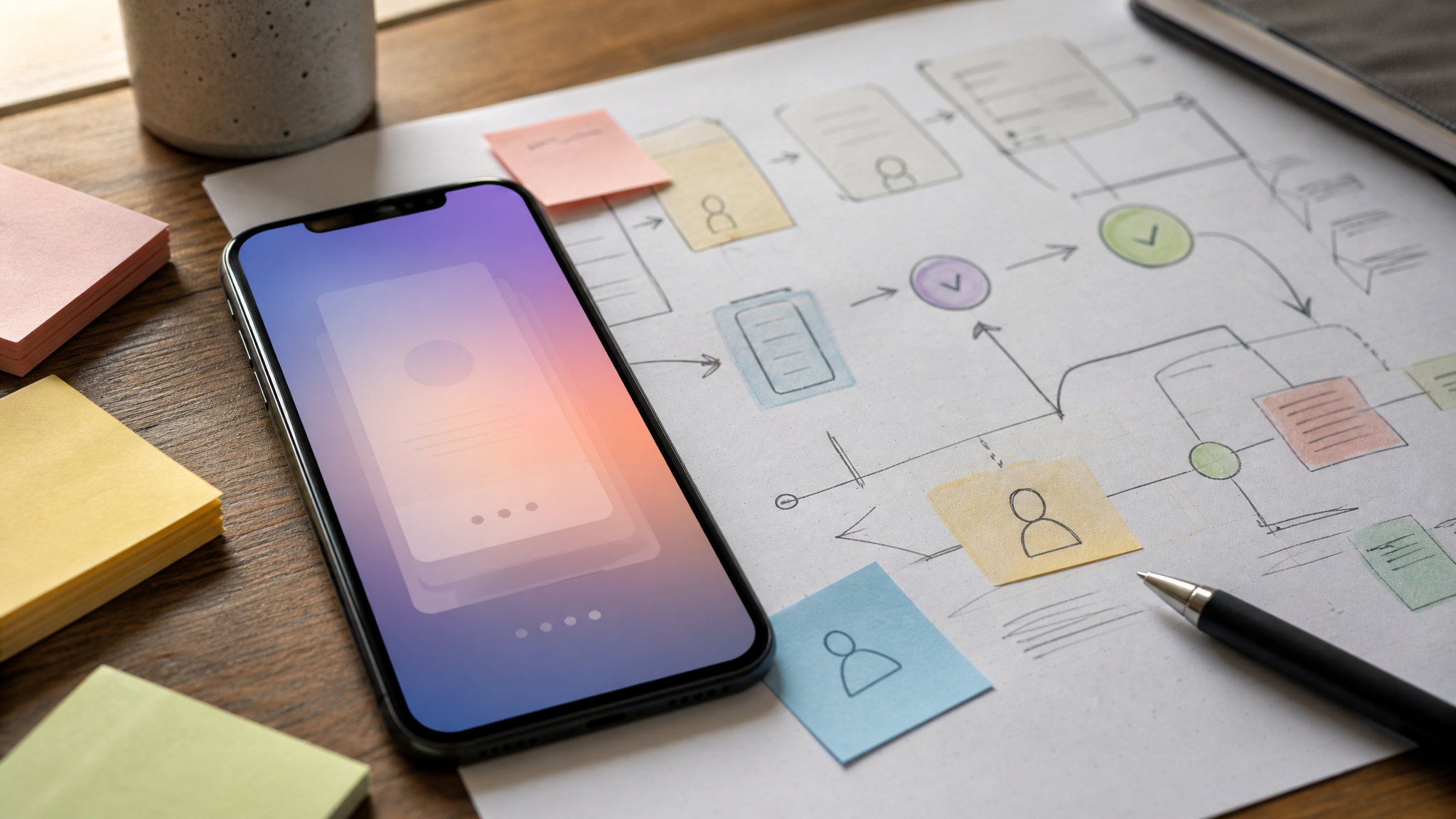
Onboarding is not just setup. It is a brand surface, and probably the most important one a product owns. The first two weeks are where a person decides whether the thing is really for them.
That makes onboarding a full design problem. The sequence, the prompts, the defaults, the examples, the empty states, and the follow-up messages all shape trust. Good onboarding does not simply explain features. It establishes direction, reduces ambiguity, and lets the user feel understood before asking for loyalty.
If repeat choice is weak, this is one of the first places to look. A polished landing page can win the click, but a vague first-run experience will flatten the whole performance. Brands that want retention need onboarding to carry a clearer signature than the launch campaign.
Model language is losing persuasive force
The word AI is losing value as a positioning device. It is becoming less like a benefit and more like an ingredient. For designers and marketers, that is a useful distinction, because ingredients rarely build preference on their own.
Consumer sentiment is moving the same way. Recent US consumer research from Fractl found that the share of people who viewed AI as more helpful than traditional search fell from 82 per cent to 54 per cent in a year, while the openly sceptical group grew from 3 per cent to 17 per cent.
When a term loses persuasive force, repeating it across headlines, buttons, and hero graphics usually makes the brand look late rather than clear. A better move is to reduce abstract technology language and give more space to concrete outcomes, familiar tasks, and evidence of fit.
Specific knowledge beats generic capability

The stronger story is not what the model can do in theory. It is what the product knows about a specific user after a month of use. That accumulated knowledge is much harder to copy, and much easier for a customer to value.
For brand design, this affects messaging and interface choices at the same time. Screenshots, product tours, lifecycle emails, and in-app prompts should show recognition: preferred formats, repeated tasks, remembered context, saved decisions, useful defaults. The timing of those cues matters because they turn intelligence from a claim into a felt benefit.
This is also one place where motion can help, if used sparingly. A small guided sequence, a subtle state change, or a well-paced onboarding cue can make the product’s memory visible. Animated icons for apps are most useful here when they clarify states and reduce friction, not when they decorate a promise the product has not yet earned.
Narrower audiences create sharper positioning
General claims sound large, but they are often hard to remember. Specific positioning sounds smaller, yet it tends to stick. A product built for a clearly defined user group gives the brand sharper edges, clearer language, and more believable examples.
One concrete niche example points to Indian clinical practice, down to the formulary a doctor actually prescribes from and the languages patients speak. That level of detail does more than improve relevance. It creates recall because the brand starts to describe a real working context rather than an abstract user category.
Design teams can apply the same principle visually. Show the setting, the vocabulary, the workflow, the constraints, and the forms of output that belong to a real audience. The more grounded those choices become, the less the brand has to rely on broad AI theatre.
There is a related lesson in When regional detail stops looking small: specificity often reads as confidence when it is handled with care. Brands become memorable when they stop sanding away the details that make them useful to somebody in particular.
Preference grows through remembered use
For AI products, the practical question is no longer how to announce the intelligence. It is how to make the product remember the person, then show that memory in ways that feel helpful. That is a branding question as much as a product question.
When repeat choice is the problem, the answer usually will not be a louder hero line or a shinier demo. It will be better first-use design, clearer positioning, and stronger evidence that the product’s knowledge grows with the relationship.
That is where brand preference starts to look less like persuasion and more like accumulated proof. A person comes back because the product has learned their needs, reduced effort, and made the next step easier than the last.
For teams shaping these experiences, even a lightweight visual system can support that feeling. Animated logos for websites work best when they introduce a consistent tone at key brand moments, then step aside so the product itself can carry the relationship.
 Logo Template
 Logo Template
 Icon Template
 Logo Template


