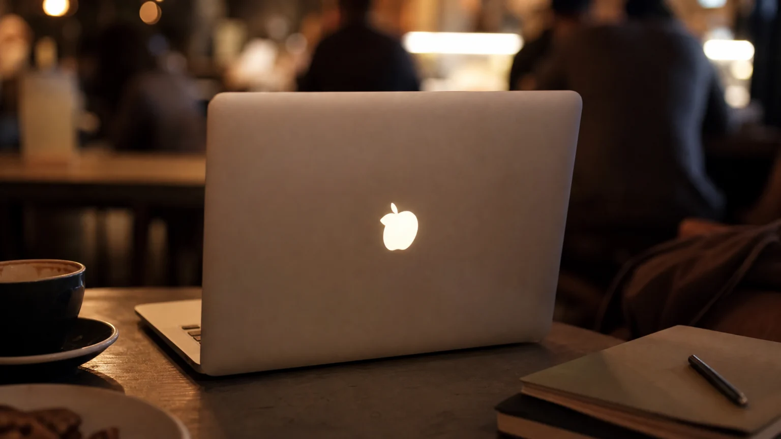
The old glowing laptop logo worked because the light never felt added. It seemed to belong to the object from the start, passing through a cutout instead of announcing itself with extra hardware or decorative shine. That small decision made the mark conspicuous while keeping the surface calm.
It also turned the back of a laptop into a public-facing sign. Across café tables and lecture halls, the lid became visible to other people while using light the display was already producing. Few brand gestures feel this economical and this memorable at once.
When the lid became the audience-facing surface
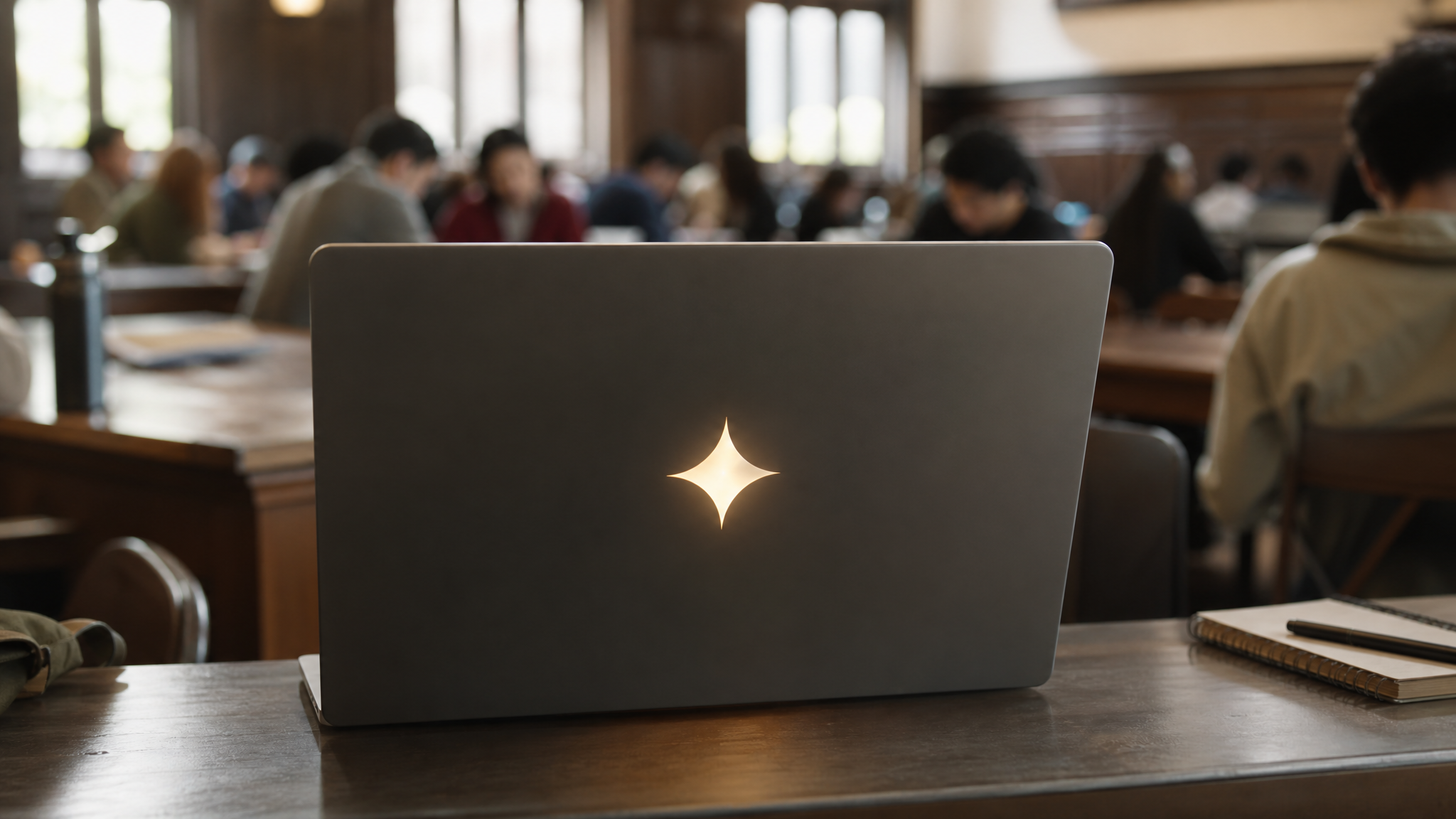
Orientation changed the job of the mark. Early laptop versions of the Apple logo faced the user, then in 2001 Apple flipped the orientation so the apple appeared upright to anyone looking at the back of an open screen.
That single change redirected the logo outward. Instead of acting like a private badge for the owner, it started reading as a sign for the room. Once the lid had that role, the glowing insert made even more sense.
The result was ambient advertising in the plainest possible form: a familiar silhouette in other people’s field of view, lit from within, with no separate battery-powered gimmick attached.
Restraint gave the effect its staying power
Many visibility tricks rely on adding more—more contrast, more shine, more motion. This one worked by subtracting. A simple cutout shape let a soft backlight pass through, and that was enough.
That restraint is part of why the effect stayed sharp in memory. In daylight, the logo remained polished and recognizable. When the screen came on, it changed state quietly and at the right timing.
The same principle often helps on screen. A mark tends to read better when light, depth, or movement feels native to the object rather than laid over it afterward. That is part of why a clean logo reveal animation feels convincing when the action grows from the form itself.
The restoration method respects the original idea

The current do-it-yourself approach to restoring the glow on some MacBooks is notable for the same reason. It does not depend on added LEDs or new wiring. It recreates the old effect by reopening a path for the screen’s own backlight.
The method is specific: remove the polished logo insert, fill the opening with clear epoxy, and cut an opening in the black sheet behind it so light from the display can leak through. Procedural details include removing the LCD, using an iPhone screen protector as a mold face, pouring epoxy, and then cutting the black layer behind the logo area.
Even if you never open a laptop, the visual lesson is useful. Strong modifications often recover a hidden relationship between surface and structure instead of piling on separate parts.
Craft decides if the glow looks clean or crude
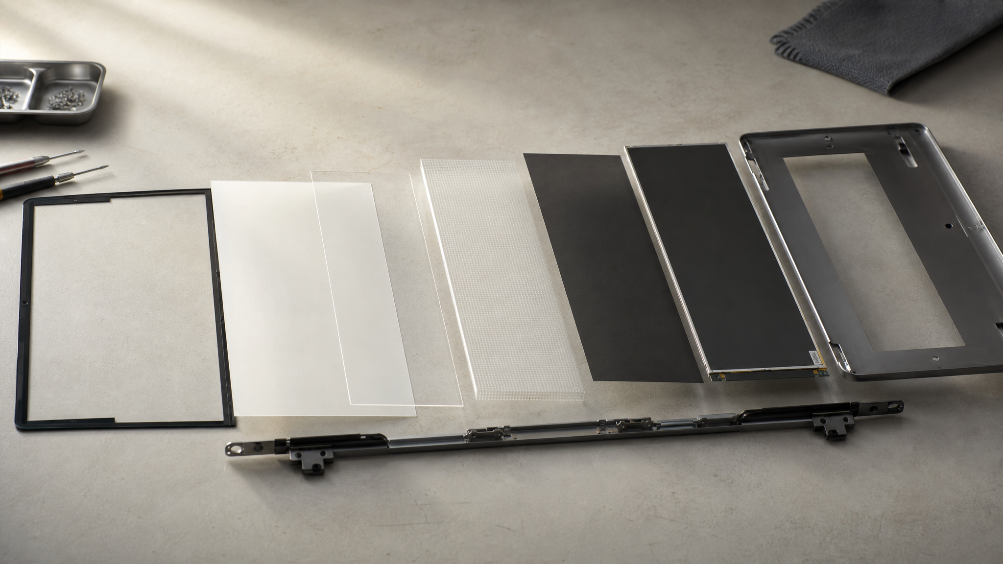
A glowing logo can tip into novelty quickly. Clear epoxy helps avoid that when the fill stays flush and transparent, because it restores a smooth exterior plane instead of leaving the mark looking like a rough window. The screen protector matters for the same reason: it helps preserve a crisp face.
This is where iconography meets making. The logo has to stay clean when the display is off, then carry light evenly when it is on. If the fill clouds, bubbles, or sits unevenly, the effect stops feeling composed and starts reading like damage.
The same standard applies in presentation work. Surface honesty matters, which is why evaluating product mockups for honest scale and perspective comes down to checking whether an effect respects the object it sits on.
Compatibility belongs to the visual story
This restoration is not universal. Any MacBook with a backlit LCD has a light source directly behind the logo area, which makes the basic concept possible on those machines. The MacBook Neo and later OLED and MiniLED Pro models are different, and Mini-LED machines use a different internal stack.
That limit matters beyond repair. Visual identity is always tied to production reality, and an iconic look on the outside can depend on a very specific layering of materials behind the surface.
Before promising an effect across a product line, check the substrate, the lighting method, and the assembly. The same logo can behave very differently once construction changes.
Brand memory often forms around side effects
People remember the glowing Apple logo because it felt effortless. The light was already there. The logo orientation had already been corrected for public viewing. The laptop was already present in shared settings where strangers could see it.
Together, those conditions built memory through context rather than volume. The mark glowed at the edge of work, study, and travel, turning a private device into a small recurring signal in public space.
Design systems often miss this kind of opportunity when they focus only on the primary interface. Sometimes the memorable brand moment sits on the reverse side, in the idle state, or in the reflection of an existing behavior. That is close to what happens when graphics start doing architectural work in the city.
Digital work can use the same logic
Very few teams need a glowing physical logo. Many need a better sense of where emphasis should come from. The principle travels well: let attention emerge from built-in properties before adding decorative noise.
On screen, that can mean revealing a mark through existing contrast, depth, or transparency instead of forcing a flashy overlay. It can also mean choosing transparent logo animation so the logo feels integrated with its background rather than boxed away from it.
The old glowing laptop mark still feels instructive because it solved visibility with economy. It found a public-facing surface, corrected the logo’s direction for that audience, and let borrowed light do the work.
 Logo Template
 Icon Template
 Photo Template
 Logo Template