
Why Accessible Dashboards Are Essential for Every User
Imagine a critical business dashboard where key performance indicators are only distinguished by subtle color changes. For a user with color blindness, this visual cue is ineffective, potentially leading to missed insights or incorrect decisions. Similarly, a complex data table without proper semantic roles or keyboard navigation can render the data inaccessible to screen reader users, effectively locking them out of vital information. These scenarios highlight a common challenge: a dashboard that looks clean to one designer might be a maze for another user. Visual hierarchy, color contrast, and interactive elements all contribute to how easily someone can perceive and navigate information. When designing dashboards, the goal isn’t just aesthetic appeal or data density; it’s clarity for every user, including those who rely on assistive technologies. Overlooking accessibility from the start can lead to significant redesign efforts later, or worse, exclude a segment of your audience entirely. The right design tool can help designers catch these issues early, embedding accessibility considerations directly into the workflow.
Consider a public health dashboard displaying regional infection rates. If the map uses a gradient from light green to dark green to show severity, users with certain types of color blindness might struggle to differentiate between moderate and high-risk areas. An accessible design would incorporate additional visual cues, such as distinct patterns or numerical labels, alongside the color. this helps that the critical information is conveyed through multiple channels, making it robust for diverse visual needs. Similarly, if a dashboard’s interactive filters can only be operated with a mouse, users who rely on keyboard navigation or voice control are excluded from customizing their view. Designing for accessibility means anticipating these varied interaction methods and building interfaces that accommodate them from the ground up. This proactive approach not only expands your audience but also improves the overall usability for everyone.
Figma: Comprehensive Accessibility Features and AI Auditing
Figma has positioned itself with a strong focus on accessibility, actively working towards WCAG 2.2 AA compliance. This commitment extends to various aspects of the design process, making it a robust choice for accessible dashboard creation. Its platform includes settings for screen readers, focus navigation, and enhanced contrast, which are crucial for users with visual impairments or those who navigate without a mouse. These features allow designers to simulate and test how their dashboards will be perceived and interacted with by a wider audience, ensuring a more inclusive outcome.
One of Figma’s notable offerings is its AI Accessibility Checker, integrated directly into Figma Design. This tool audits designs for common accessibility issues such as contrast ratios, text legibility, touch target sizes, and color-blindness concerns. This automated feedback loop helps designers identify and rectify problems proactively, rather than waiting for manual audits or user testing. For example, the checker can flag a low-contrast text element on a button, prompting the designer to adjust the color palette before the design progresses to development. This integration streamlines the accessibility review process, making it a natural part of the design workflow.
For prototyping, Figma supports screen reader navigation in its desktop browser and desktop app, though not on mobile or mobile web prototypes. This allows designers to test the flow and experience of a dashboard with assistive technology users in mind. Figma’s guidance on site accessibility also emphasizes the importance of alt text for images, clear labels, hiding decorative content, and using semantic roles like “region” for distinct dashboard areas, ensuring a well-structured experience for screen readers. When designing a complex dashboard with multiple data visualizations, using semantic roles helps screen reader users understand the purpose and relationship of different sections, preventing confusion and improving navigation efficiency.
Beyond its built-in tools, Figma’s collaborative nature further supports accessible design. Teams can easily share and review designs, allowing accessibility specialists or users with disabilities to provide direct feedback within the design file. This iterative feedback loop is invaluable for refining dashboard designs to meet diverse user needs. The ability to comment directly on specific elements and suggest changes in real-time ensures that accessibility considerations are addressed throughout the design lifecycle, rather than being an afterthought. This collaborative environment fosters a culture of inclusive design, where every team member contributes to creating a more accessible product.
Adobe XD: WCAG Alignment and Voice Control Integration
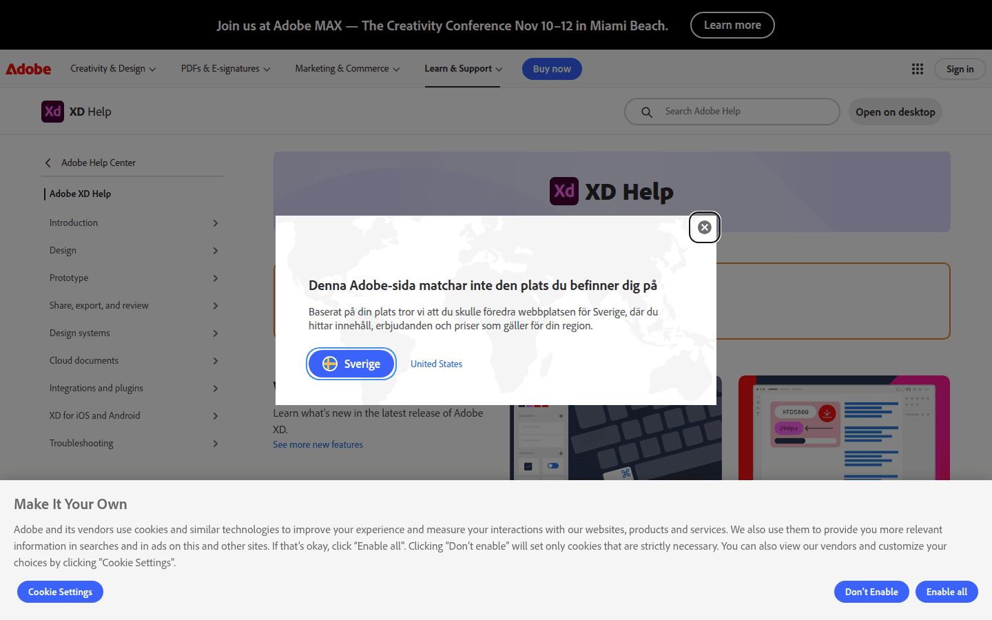
Adobe XD aims to conform to WCAG 2.1 AA success criteria, providing a solid foundation for accessible UI design. While its feature set for accessibility might differ from Figma’s, it offers distinct advantages, particularly for users within the Adobe ecosystem. Its commitment to these standards means designers can build dashboards with confidence, knowing that the tool supports fundamental accessibility principles. This alignment helps ensure that the resulting interfaces are usable by a broad spectrum of users, including those with disabilities.
A key feature in Adobe XD is its documented integration with macOS Voice Control. This allows designers to use voice commands for core design functions, including drawing tools, managing layers, adjusting properties, and navigating menus. This can be particularly beneficial for designers with motor impairments, offering an alternative input method that streamlines the design process. For example, a designer could verbally command XD to “draw a rectangle” or “change fill color to blue,” significantly reducing reliance on mouse-based interactions. This level of integration empowers designers with diverse abilities to participate fully in the design workflow.
Adobe also publishes Accessibility Conformance Reports based on the VPAT 2.x template, which include references to Section 508, WCAG 2.2 AA, and EN 301 549, demonstrating its commitment to broader accessibility standards. These reports provide transparency regarding the tool’s accessibility capabilities, allowing organizations to assess its suitability for their compliance requirements. When creating dashboards in Adobe XD, designers should focus on applying best practices for semantic structure and interactive element labeling. While it may not have an integrated AI checker like Figma, designers can leverage third-party plugins and manual checks to ensure contrast, keyboard navigation, and logical content order. For instance, designers can use plugins to check color contrast ratios or manually tab through a prototype to verify keyboard focus order, ensuring a smooth experience for all users.
Adobe XD’s integration with other Creative Cloud applications also offers workflow advantages. Designers can seamlessly move assets between XD, Photoshop, and Illustrator, maintaining a consistent design language and accessibility considerations across different stages of a project. This interoperability can be particularly useful when creating complex dashboard components that require detailed graphic design or illustration work. By maintaining accessibility standards throughout this ecosystem, designers can ensure that even highly customized visual elements contribute to an overall accessible dashboard experience. The familiar interface and integrated tools make it a strong choice for teams already invested in the Adobe suite.
Selecting the Right Tool for Your Accessible Dashboard Project
The choice between Figma and Adobe XD for accessible dashboard design often comes down to specific workflow needs and the depth of integrated accessibility features required. Both tools offer foundational support, but their strengths lie in different areas. Understanding these distinctions is key to making an informed decision that aligns with your team’s priorities and project demands.
Figma excels with its explicit WCAG 2.2 AA compliance efforts and the convenience of an AI Accessibility Checker. This makes it a strong contender for teams prioritizing automated visual audits and extensive screen reader testing within the design environment. If your team frequently works with large, complex dashboards and needs to quickly identify and fix visual accessibility issues, Figma’s integrated checker can significantly accelerate your workflow. Its focus on collaborative design also means accessibility considerations can be integrated across team members more seamlessly, fostering a shared responsibility for inclusive design.
Adobe XD, with its WCAG 2.1 AA alignment and macOS Voice Control integration, provides robust support for designers who benefit from alternative input methods. It fits well into existing Adobe creative suites, offering a familiar environment for many designers. If your team includes designers with motor impairments or those who prefer voice commands, XD’s native integration can be a powerful asset. While it might require more manual attention or external tools for comprehensive visual accessibility checks, its core features support the creation of compliant interfaces, especially when combined with diligent manual testing and third-party plugins.
Ultimately, the best tool is the one that empowers your team to consistently build dashboards that are perceivable, operable, understandable, and robust for all users. Evaluate your project requirements for automated checks versus manual control, and consider how each tool integrates with your broader design and development pipeline. A truly accessible dashboard begins with intentional design decisions, supported by tools that make those decisions visible and testable. Prioritize tools that not only meet compliance standards but also foster a design process that inherently considers the diverse needs of every potential user, ensuring your dashboards deliver clarity and utility to everyone who interacts with them.
 Logo Template
 Photo Template
 Logo Template
 Photo Template