A tasting can explain a product. It rarely explains a worldview.
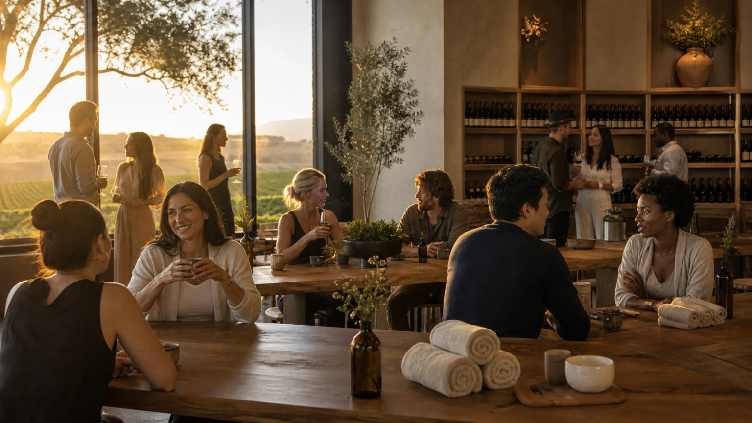
That gap helps explain why many wine brands are moving away from the standard pour-across-the-counter format and toward experiences built around people gathering, lingering, and returning. From sauna retreats in Sonoma to youth-led wine festivals in Slovenia, the emphasis is shifting from simple consumption to shared time, place, and participation.
For designers and brand teams, this is more than an events trend. Identity does not live only on bottles, cartons, websites, or shelf talkers. Sometimes the clearest brand signal appears in the room itself: who is welcomed, what is offered, how long people stay, and what kind of memory they carry home.
Experience carries more of the brand story
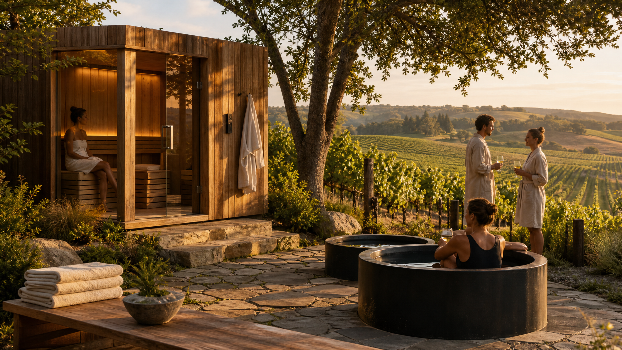
The clearest change is the format. Traditional tastings still matter, but many wineries are putting more weight on hospitality programs and event concepts that feel closer to cultural programming than retail sampling.
Merriam Vineyards offers wellness-led elements including saunas, cold plunges, and facials. Donkey & Goat keeps a rolling events calendar with gatherings such as Sapphic Speed Dating and Baltic Bards nights. Clos Apalta extends the visit through accommodation, meals, and activities including horse riding, hiking, tennis courts, stargazing, and mountain biking.
These choices shift attention from a narrow transaction to a fuller brand environment. The bottle remains the signature object, but the surrounding setting gives it context, tone, and direction. The question becomes more than whether someone likes the wine. It becomes whether they feel at home in that world.
That distinction matters visually. Once a brand is expressed through hospitality, programming, and place, design decisions have to hold together across menus, invitations, wayfinding, social posts, printed collateral, staff presence, and the atmosphere of the site itself. A useful parallel appears in event brands that do more than point people around; the identity has to support behavior, not just identification.
Some values need a room, not a label
Many of the values wine brands want to communicate are difficult to compress into small packaging panels. Terms such as lower alcohol, low sugar, female-led, BIPOC-owned, regenerative, and organic may fit on a label, but they do not always become meaningful there.
In person, those ideas gain texture. People can meet hosts, notice the guest mix, experience the hospitality standards, and read the brand through lived detail instead of condensed claims. The message becomes less declarative and more embodied.
For brand builders, that creates a practical design implication: some identity work should be shaped as an encounter rather than a statement. A regenerative ethos, for example, lands differently when guests move through a property, share a meal, or join an activity than when they scan a few printed words. Timing matters. Values often persuade best when they arrive through sequence and experience, not through a block of copy.
This is one reason static visual systems increasingly need motion-ready extensions. Event invitations, social recaps, and short hospitality clips often carry the emotional proof that packaging cannot. When a winery needs to present that atmosphere online, tools for animated logos for social media can help a visual identity move with the same restraint or warmth as the physical experience itself.
Audience fit becomes part of the visual system
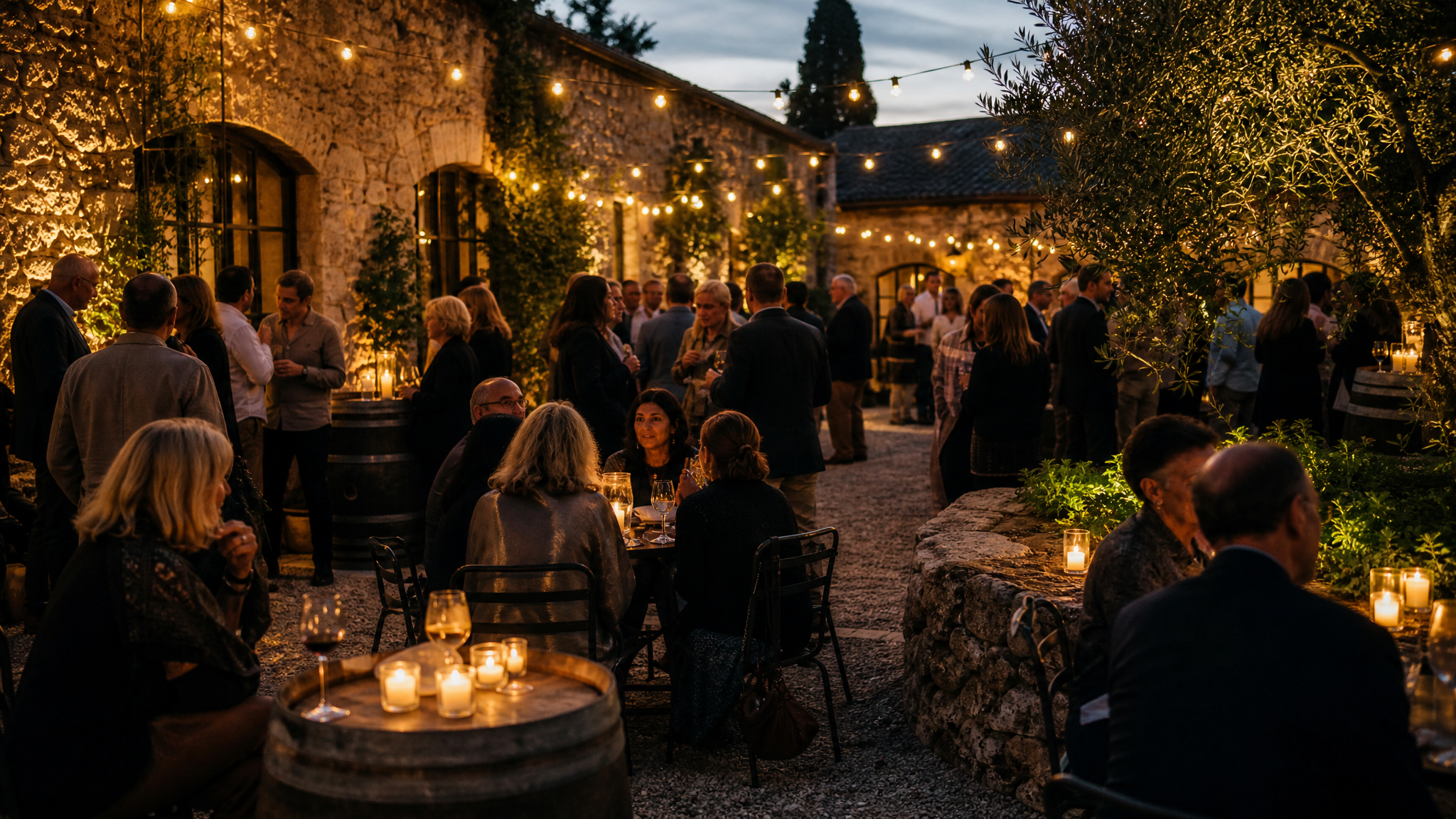
Tailoring experiences to specific audiences is not easy, but it creates the possibility of a richer relationship between producers and wine enthusiasts. The examples here span wellness retreats, Italian cultural immersion, and festivals aimed at people under 30. Each one asks a different audience to enter through a different door.
That makes audience strategy inseparable from brand design. A winery cannot look and sound exactly the same across every context if the goal is genuine cultural engagement. The core identity should stay legible, but its performance has to adjust.
In practical terms, that may mean different photography styles, different event naming conventions, different spatial cues, or different content formats for different groups. The challenge is to vary the invitation without losing the house style. Brand teams dealing with this tension may find it useful to think less in terms of one campaign and more in terms of a modular system, similar to the logic behind continuous brand presence across many touchpoints.
The design question is simple to ask and hard to answer: what stays constant when the audience changes? Usually the answer is not everything. It is a set of stable cues strong enough to survive different settings.
Hospitality programming is affecting loyalty and revenue
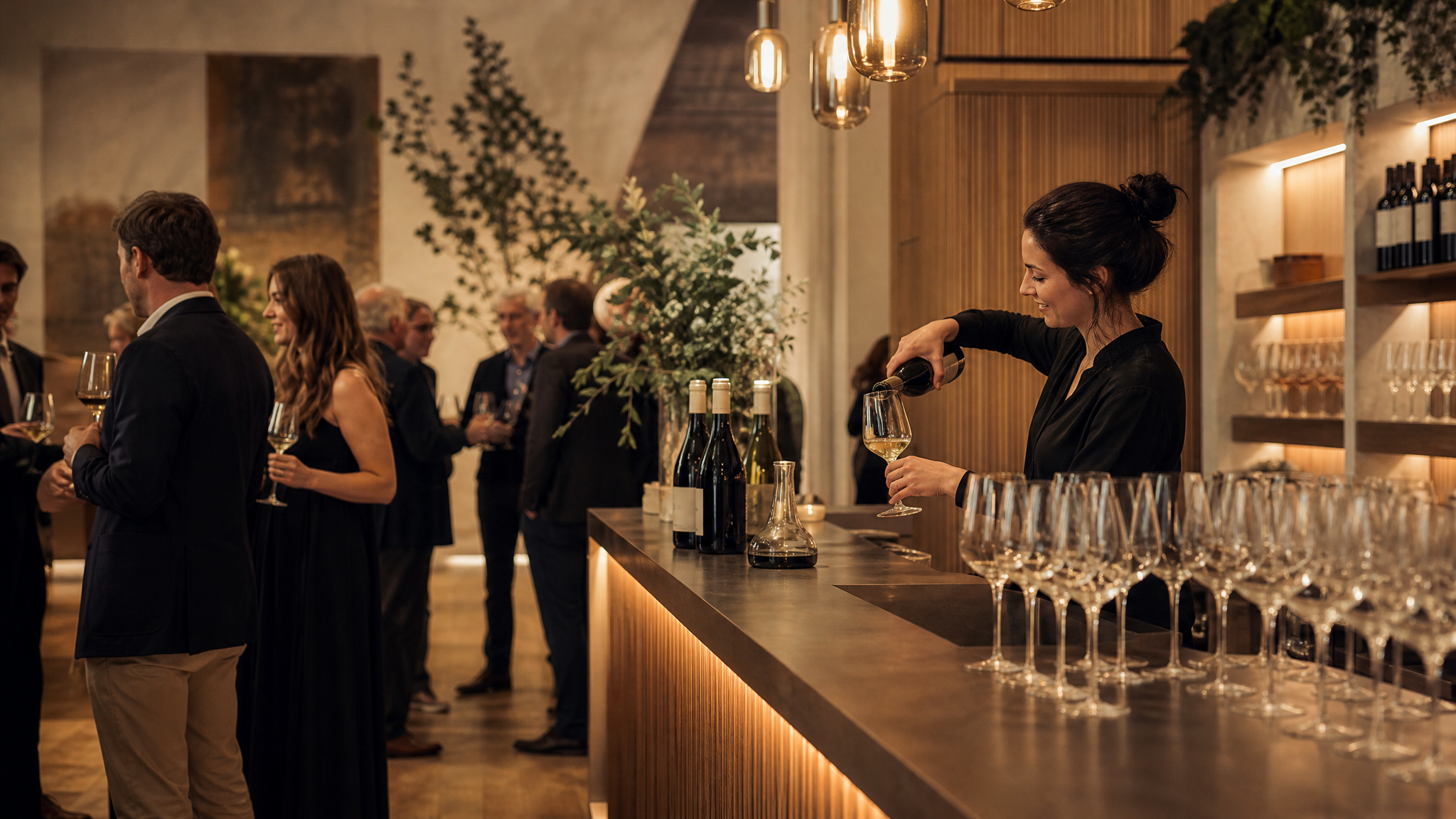
This shift is not only cultural. It is tied to customer retention and commercial results.
Experience-led formats appear to be driving new wine club memberships. Donkey & Goat offers an especially clear signal: sales volume is down, while revenue is up, with that increase tied directly to by-the-glass sales at events.
That matters because it reframes event design as core brand infrastructure rather than promotional extra. If people join clubs, spend more on site, or return because the experience feels distinct, then the event calendar is doing work that advertising alone cannot do. It becomes part of the revenue model.
For creative teams, the lesson is to treat hospitality assets with the same care given to packaging or digital storefronts. Event identities should be easy to deploy, photograph well, and feel coherent across repeats. If a concept is likely to recur, a small reusable motion or photo system can help maintain consistency across announcements and recaps; social media photo animation is one useful format when the goal is to give recurring event imagery a recognizable pace without rebuilding everything from scratch.
The edges of the visit deserve design attention
The strongest examples do not stop at a headline concept. They consider the full arc of arrival, participation, and afterglow.
Accommodation, meals, outdoor activities, and themed gatherings all expand the number of moments where a brand can either feel intentional or fall apart. The edges matter: booking confirmation, welcome materials, on-site signage, menus, staff scripts, post-event recap imagery, and club follow-up. These are often treated as secondary pieces, yet they are where coherence becomes believable.
That is why experience-led branding asks for a broader design lens. A label can still be beautiful on its own. But once a winery builds community around itself, beauty is no longer enough. The visual system has to support hospitality, memory, and return visits with the same clarity it brings to the bottle.
When products become harder to distinguish at a glance, people look for belonging, not just preference. The brands that understand this are designing spaces, rituals, and invitations that let their values be felt before they need to be explained.
 Icon Template
 Icon Template
 Logo Template
 Photo Template