The brief gets more exact the moment a poster has to leave the studio wall. Once it needs to hang across campus and stand in for a whole event, every choice has to carry farther and say more with less.
That is what makes the current MAGD 210 project at the University of Wisconsin-Whitewater so instructive. Students in MAGD 210: Visual Design for Digital Media are designing posters for the annual MAGD Expo, turning a midterm into public-facing communication instead of a private exercise.
Public use tightens the brief
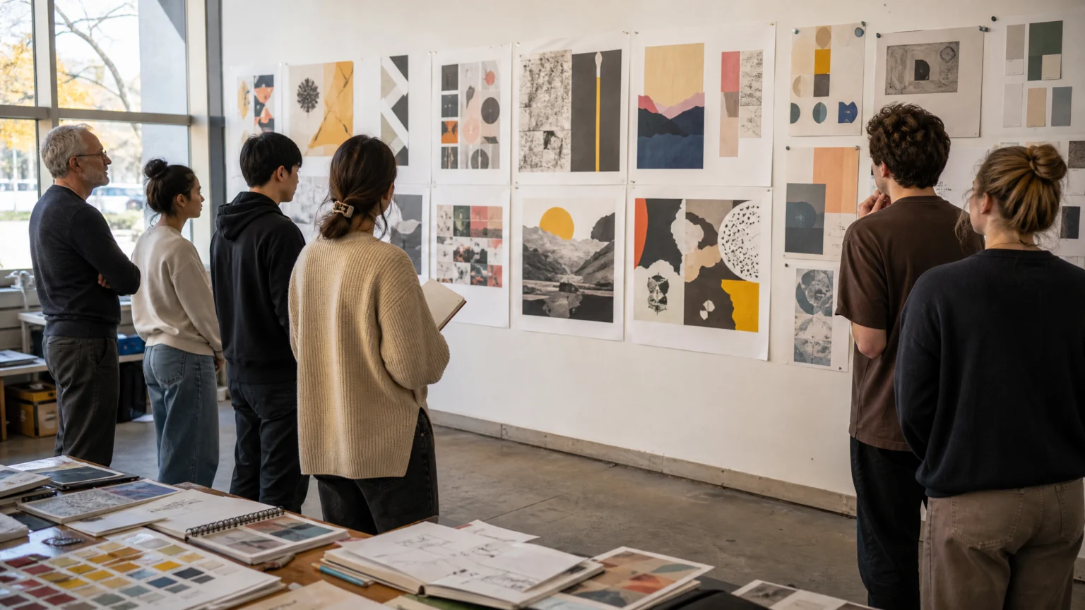
Professor Xiaohong Zhang assigned the poster designs as the midterm project for both sections of MAGD 210 this semester. The assignment gives students a direct way to apply the visual design skills learned in class while creating promotional material for a university event.
That change matters because a poster for real display has a different job than a classroom piece. It has to build hierarchy, set direction, and catch attention before anyone explains it.
The MAGD Expo adds a useful constraint. It is an annual juried showcase featuring student work in game development, animation, and digital media, so the poster cannot lean too far into one visual language without narrowing the event it represents.
One identity has to cover several disciplines

A showcase like this asks students to solve a familiar brand problem: how one visual signature can represent several kinds of work at once. Game development, animation, and digital media do not automatically share the same textures, moods, or graphic habits.
The strongest answer usually has enough character to feel memorable and enough restraint to stay inclusive. That is where student work often sharpens, because image, type, color, and composition have to perform together instead of arriving as separate good ideas.
That same tension appears in event brands that carry more than basic wayfinding. A poster for a juried student showcase is more than an announcement; it is the event identity meeting the public for the first time.
Faculty voting changes the pace of the assignment
After submission, MAGD faculty members review the posters and vote to determine which design will represent this year’s expo. That single decision gives the project a different rhythm from an ordinary critique.
Students are not designing only for a grade. They are designing within a selection process, where one poster has to persuade reviewers that it can speak clearly for the event.
That often favors stronger structure. Faculty review can expose work that depends too heavily on novelty and reward work that holds up through repeated viewing, practical use, and mixed audiences.
Campus display turns critique into visibility
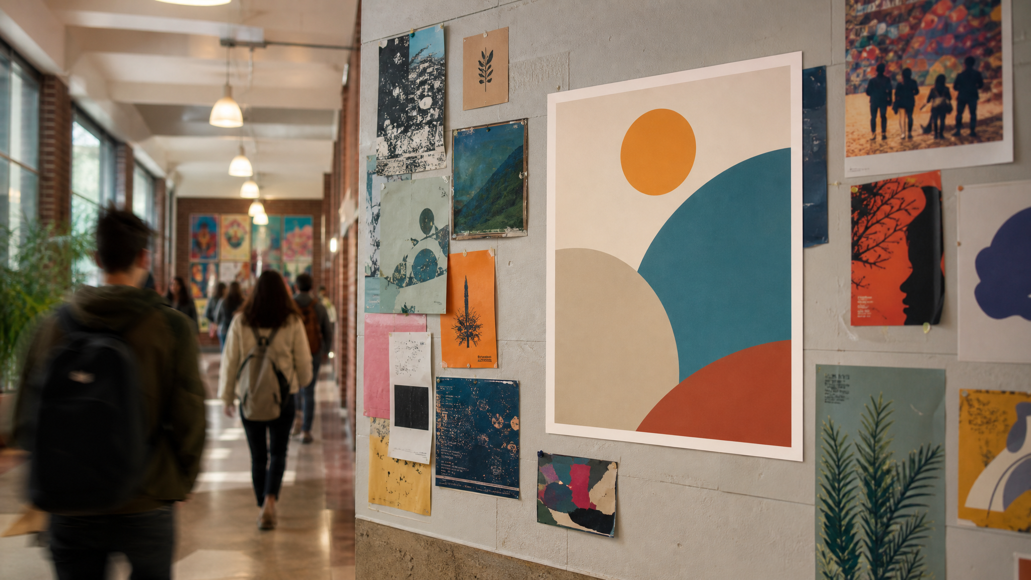
The chosen poster will be printed and displayed around campus. For the selected student, that means public visibility attached to a real artifact, not just a finished assignment.
Recognition matters, but the more useful lesson is practical. A poster on campus has to work at different distances, in different lighting conditions, and beside other announcements competing for attention.
That is one reason poster projects still teach so well. They push students past the screen and into circulation, scale, and repeated encounters. For campus communications, color’s role in sorting meaning inside a poster environment becomes hard to ignore.
Audience awareness matters more than software fluency
The project gives students experience creating work for a real-world purpose. It lets them see how design can be used to communicate with and attract an audience, which is a more durable lesson than mastering any single tool.
That is the part many early designers need most. Professional design is rarely about making an isolated image that looks impressive on its own. It is about reading the brief, understanding the audience, and shaping a message that stays clear once it leaves the maker’s hands.
Poster assignments are especially effective here because weak priorities show up quickly. If the event is annual, juried, student-centered, and rooted in digital media, the poster has to organize those facts rather than crowd them.
Useful pressure improves judgment
There is a healthy kind of pressure in knowing that one design may represent the expo across campus. It pushes students to edit harder, test hierarchy, and think about how a viewer reads before reading deeply.
That pressure is often where classroom learning starts to turn into professional instinct. The questions get better: What carries from a distance? What establishes the event quickly? What feels specific enough to matter and broad enough to belong to the whole showcase?
When a poster has to stand in public, clarity stops being a classroom preference and becomes part of the job.
That is why projects like this tend to produce more than a finished deliverable. They build judgment and turn visual skills into communication skills.
A modest poster brief can carry lasting value
A university expo poster may sound modest, but it contains many of the constraints designers meet later in studios, agencies, and in-house teams. There is a client-like need, a mixed audience, a review process, a single selected outcome, and a visible final use.
For students, that mix is hard to reproduce through hypothetical exercises alone. A brief with an actual destination asks for better choices and gives better feedback in return.
The MAGD 210 assignment works because it places design between an event and the people it hopes to reach. Once that connection is real, the work usually gets sharper.
 Logo Template
 Icon Template
 Logo Template
 Logo Template